Skip to content

Deploying a Vue Static Front-End to AWS

This article was written over 18 months ago and may contain information that is out of date. Some content may be relevant but please refer to the relevant official documentation or available resources for the latest information.

Deploy a Vue Static Front-End to AWS

The Amazon Web Services (AWS) ecosystem is a massive field of over 200 services, capable of getting your projects up into the cloud in no time. To help introduce you to such a massive field, I want to show just how quickly you can deploy a static front-end using AWS.

Today, we will scaffold out a Vue project, and deploy it to AWS with a custom domain name, secured with SSL/TLS (HTTPS), and pushed to a content delivery network (CDN). This knowledge will help you start tinkering with the many of the services AWS has to offer.

Dependencies

To follow this guide, you will need:

Why deploy to AWS?

Right off the bat, I want to say that deploying a static front-end to AWS is NOT the easiest way to deploy a static website! Here are a few tools that can get the job done a LOT more easily than how we will be doing it today.

Even AWS has a solution to compete with the growing array of front-end deployment tools: AWS Amplify, which they describe as being the, "Fastest, easiest way to build mobile and web apps that scale".

We won't be using Amplify, or any of those other tools though. The goal of manually deploying to AWS is to give us a better understanding of the underlying AWS services.

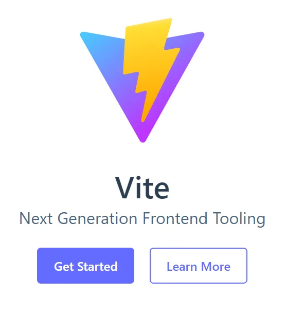
ViteJS, our build tool

We can deploy any static front-end, so in this article, we will use ViteJS as our front-end tooling to generate a Vue front-end.

Vite Logo

Scaffolding out a Vue application with Vite is as simple as running a single command, and following the prompts:

For npm: npm init @vitejs/app For yarn: yarn create @vitejs/app

Vite CLI

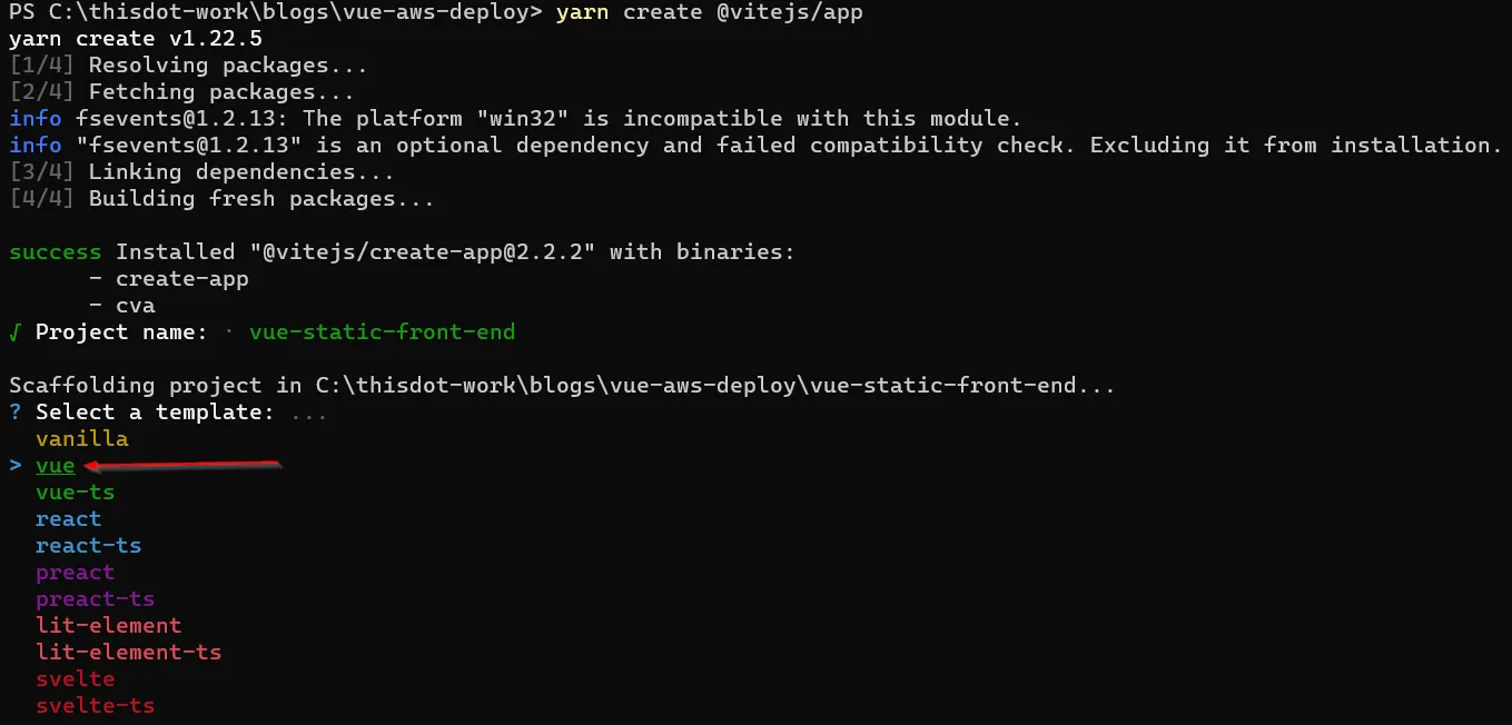
While Vite offers us the option to use many different front-ends, we will choose Vue.

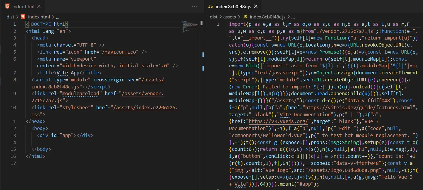
After running yarn create, cd into the created directory, and run yarn to install all of the dependencies, and then run yarn build.

After doing this, we will have a production static deployment bundle that we can deploy using AWS.

Vite Static Build

AWS Services

There are 4 AWS services that we will use to deploy our static build:

  • Simple Storage Service (S3)
  • CloudFront
  • Amazon Certificate Manager
  • Route 53

Each of these services will work in some way with each other to provide the full solution we need to deploy our static web app.

Simple Storage Service (S3)

Amazon S3 will be the workhorse of our deployment setup. Amazon describes their services as, "Object storage built to store and retrieve any amount of data from anywhere." We will be using S3 to store our deployment bundle in a cheap and scalable manner.

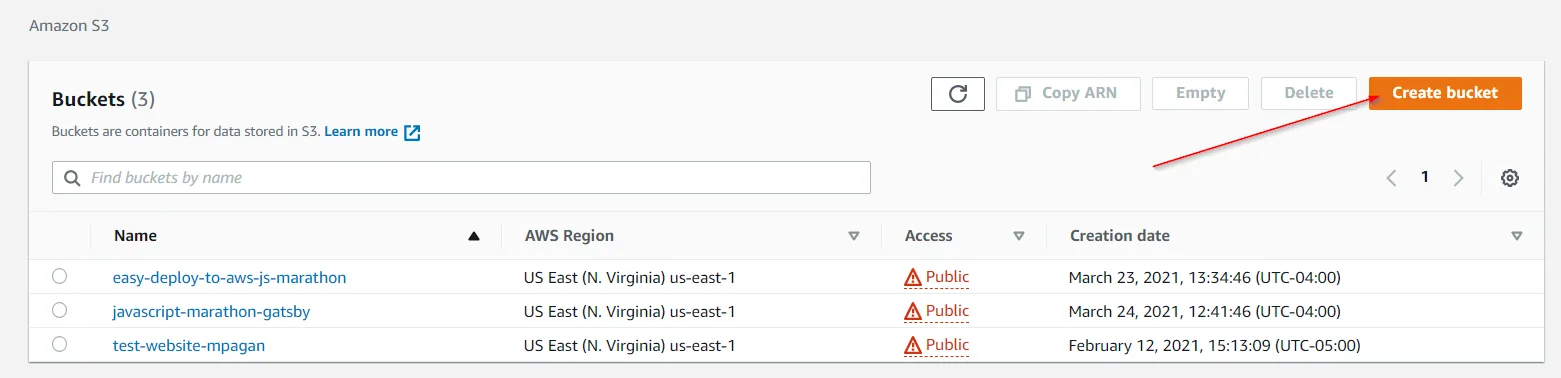
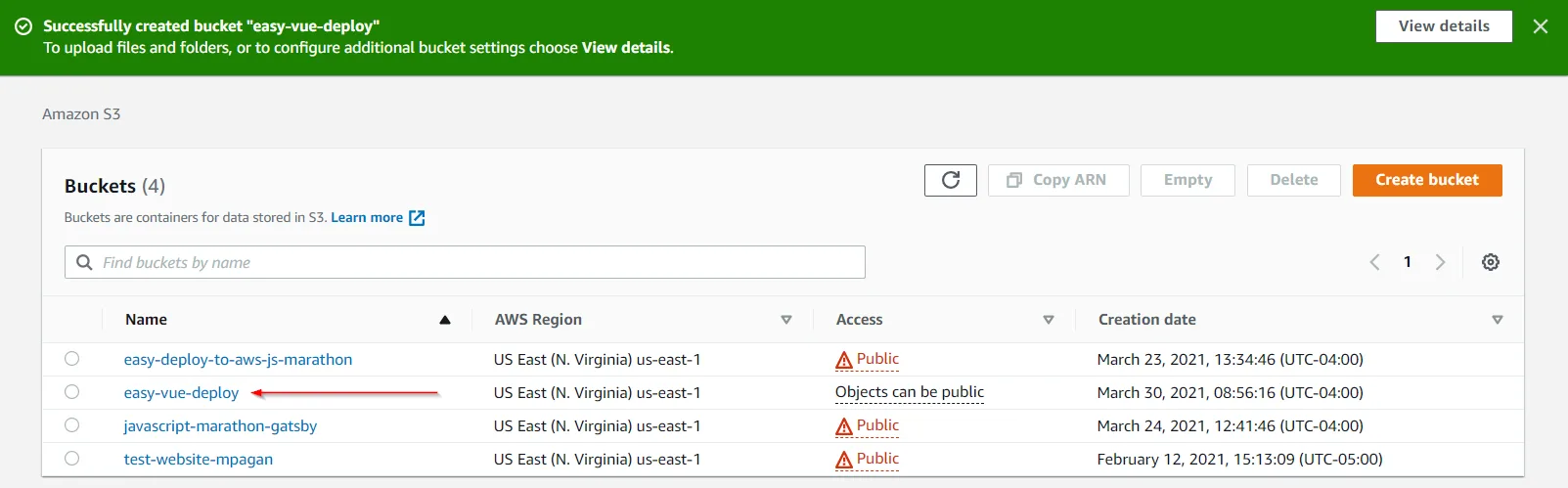
To deploy our bundle to S3, go to your AWS console, and load up the S3 service. From there, click on 'Create Bucket'.

Create Bucket Button

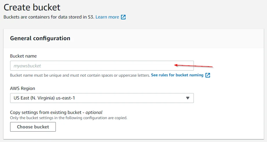
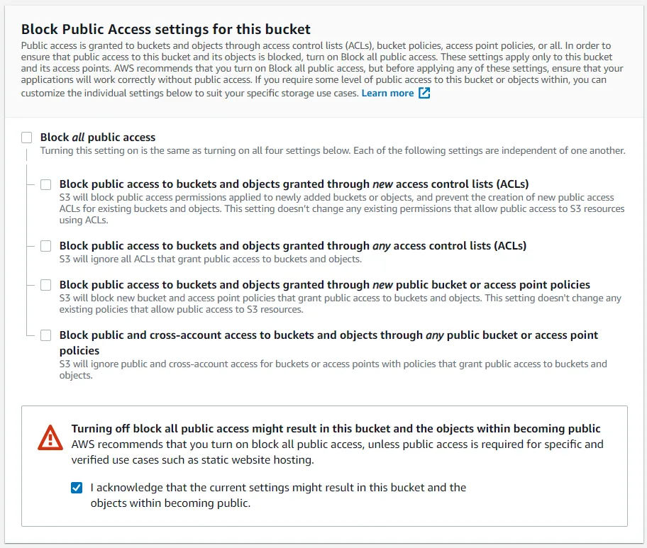
After that, give your bucket a name and assign it a region, ensure to unblock all public access to this bucket (we want the anyone on the web to be able to see our site), and then create the new bucket.

Bucket Name
Public Access Settings

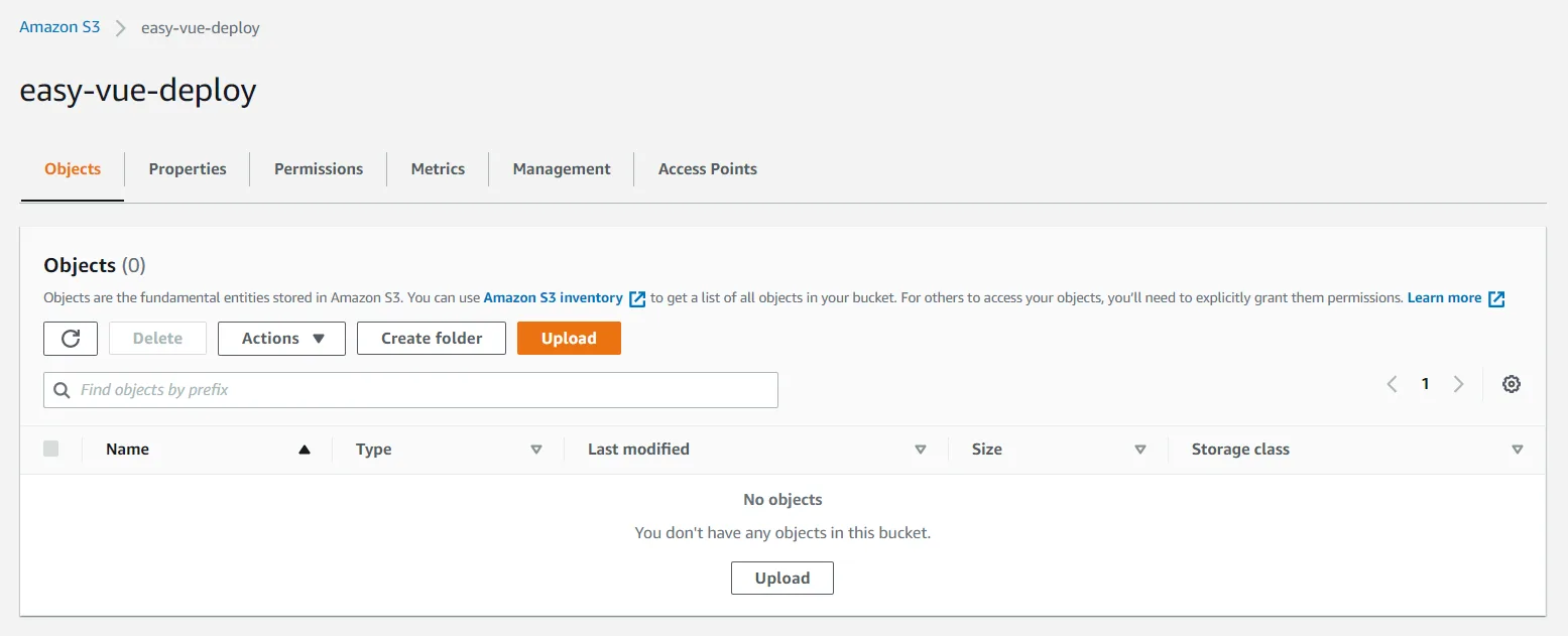
You will now have a new, empty bucket! Let's fill it with the production bundle ViteJS created for us earlier.

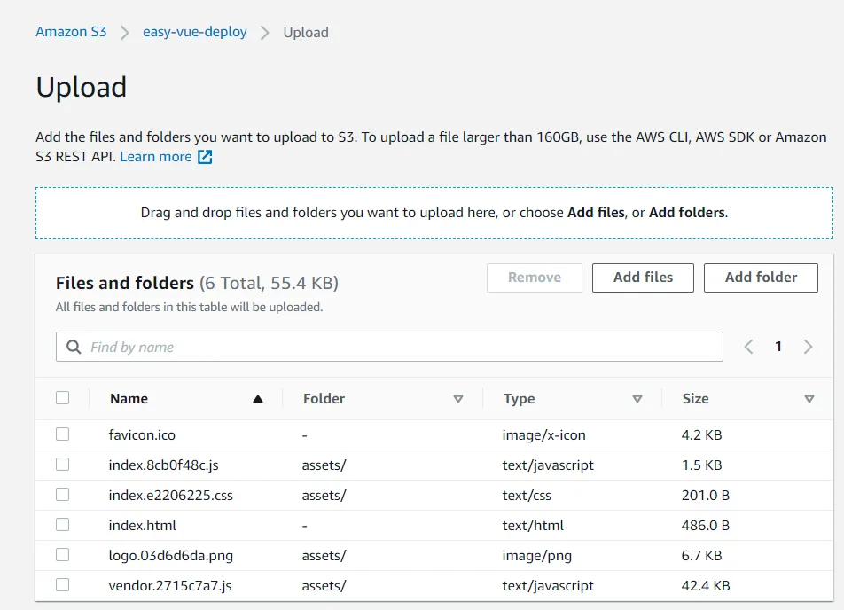
Select your bucket, click 'Upload', drag and drop all of the bundled files in the dist directory that ViteJS generated for us, and then upload all of them.

Bucket Created
Bucket Upload Button
Uploaded Content

We now have content in our bucket. In order to allow the public to see this content, we need to enable static web hosting, and add a bucket policy to allow anyone to retrieve objects from our bucket.

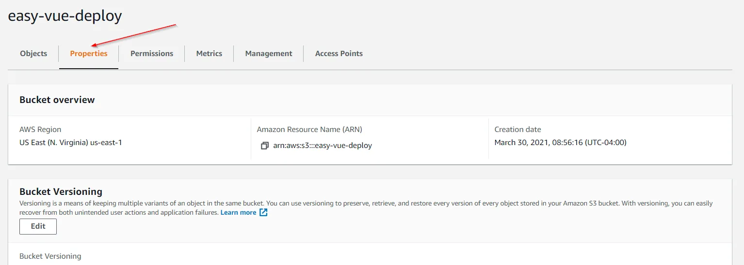
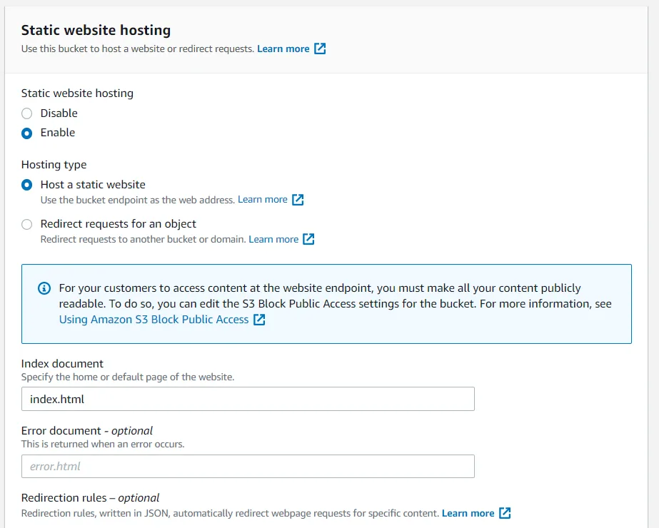
To enable static web hosting, go to your bucket's properties, and scroll all the way down to see the static hosting settings. Edit the settings and enable hosting, along with setting the index document to index.html.

Bucket Properties
Edit Static Host Settings

To add the needed bucket policy, go to your bucket's permissions (instead of properties), and edit the bucket policy to include the following:

{
  "Id": "Policy1617109982386",
  "Version": "2012-10-17",
  "Statement": [
    {
      "Sid": "Stmt1617109981105",
      "Action": [
        "s3:GetObject"
      ],
      "Effect": "Allow",
      "Resource": "arn:aws:s3:::easy-vue-deploy/*",
      "Principal": "*"
    }
  ]
}
Bucket Policy

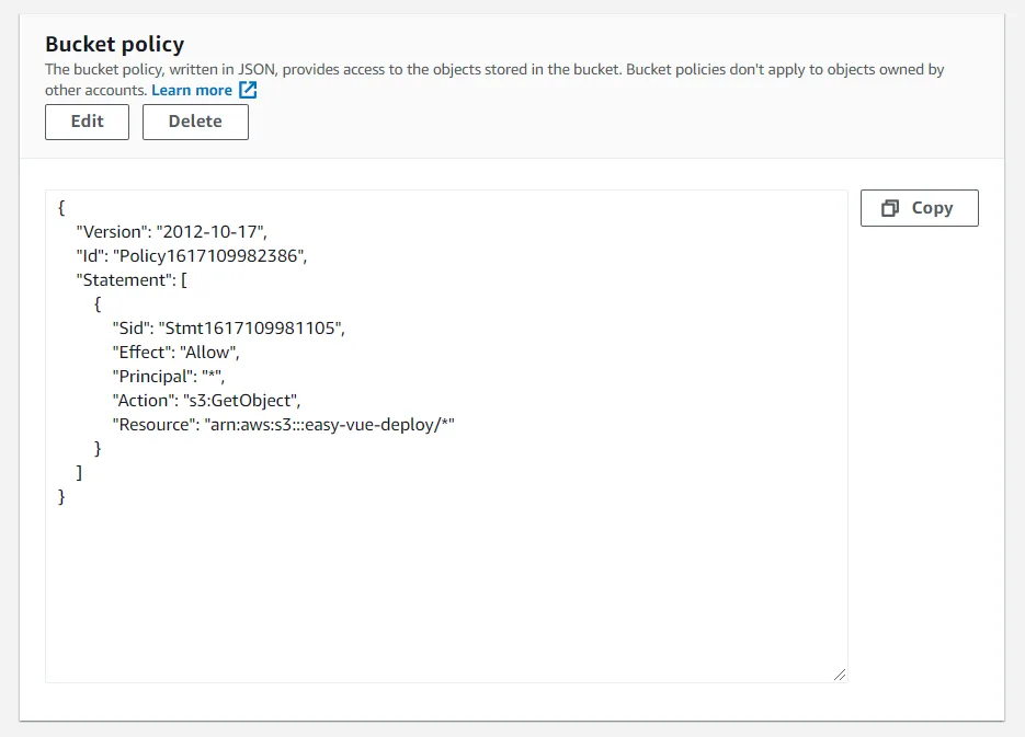
You'll need to edit the "Resource" line to use your bucket name. This example uses the bucket name of easy-vue-deploy.

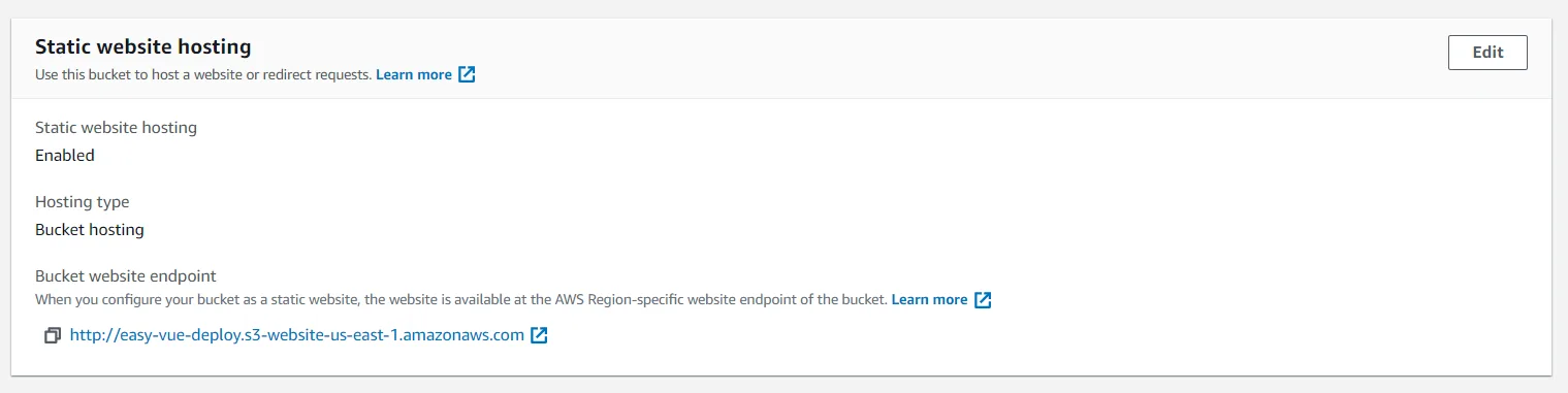
After all of this is done, you will see an endpoint that you can click on to test your deployment. Just go to your bucket properties, and scroll down.

S3 Endpoint
S3 Deploy

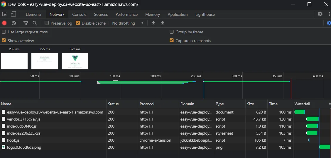
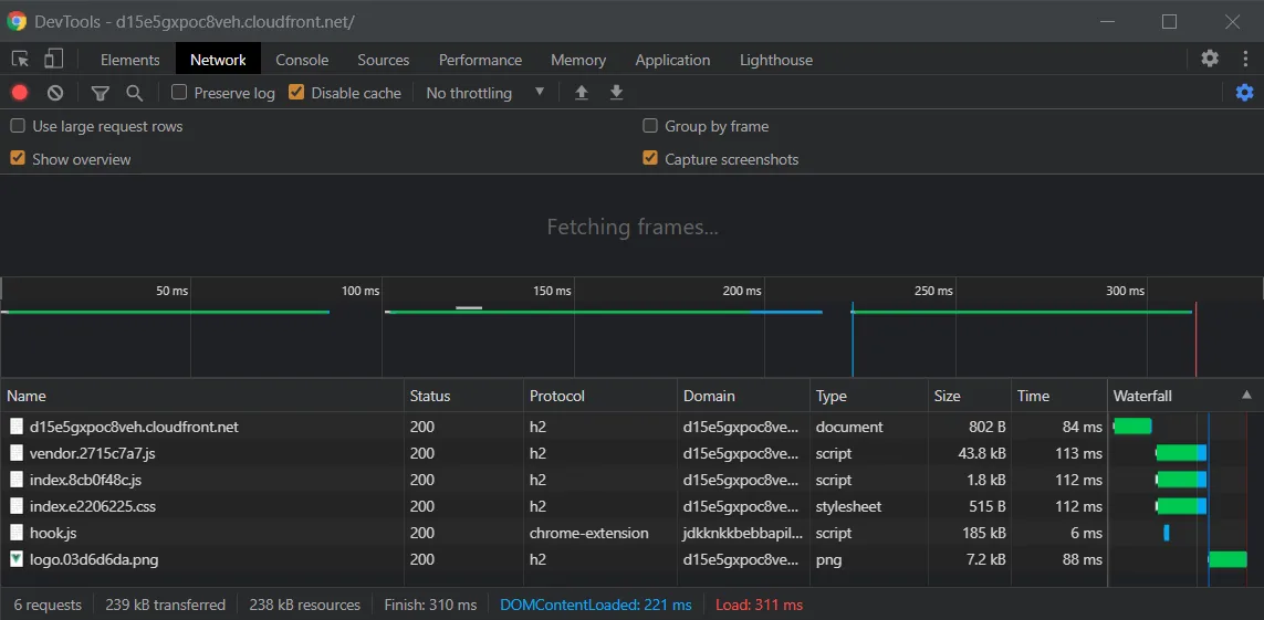
We have now successfully deployed a ViteJS bundled to the web! You'll notice that this endpoint isn't protected via HTTPS, nor is it as fast as we want it to be. If you peek at the DevTools, you'll see that we are using http/1.1 as our protocol, and we are having a load time of around 360ms on average.

S3 Bucket Performance

We are going to fix these things by serving our content through a CDN.

CloudFront

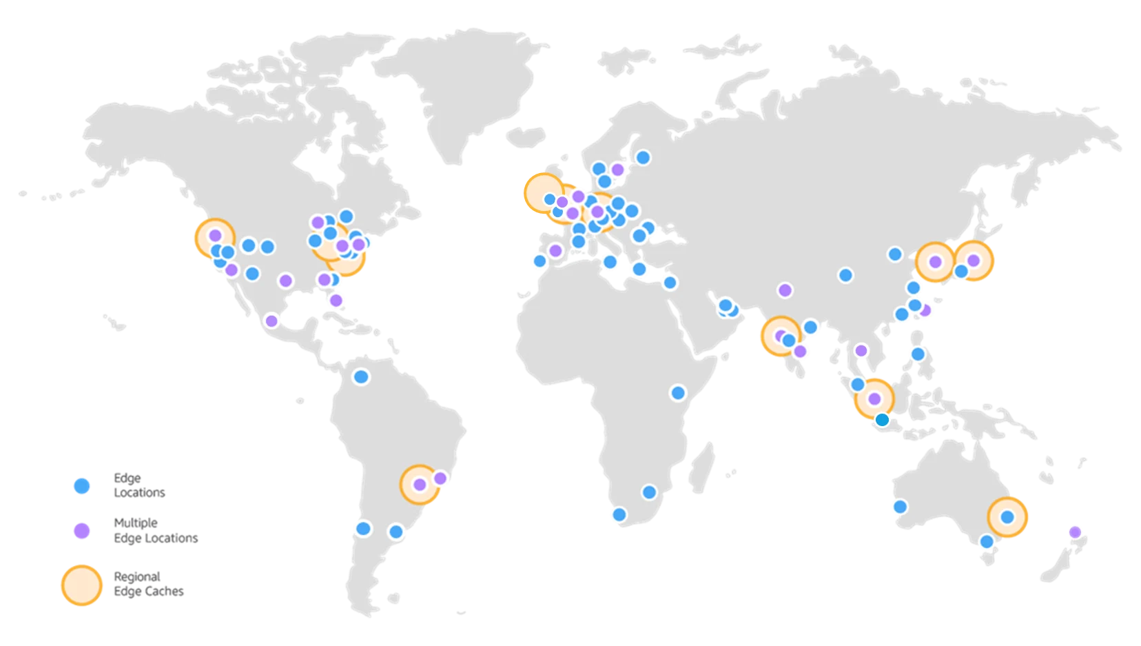
CloudFront is AWS's global content delivery network. It can work seamlessly with any AWS origin (like our S3 bucket we made earlier) to cache content in over 225+ Points of Presence, enabling a SUPER fast user experience. Let's enable this for our deployment.

CloudFront Points of Presence

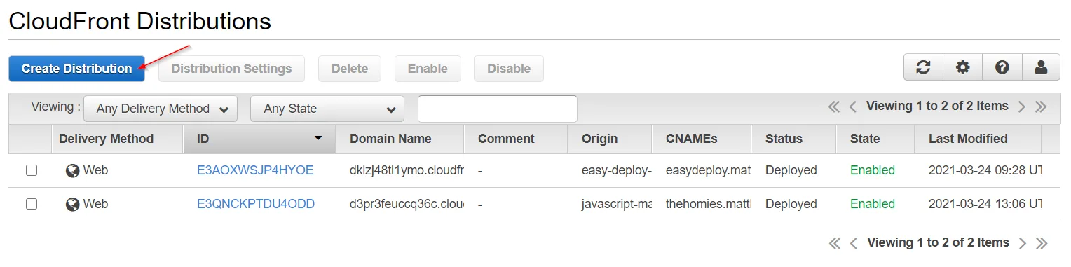
Go to the CloudFront service, and get started by creating a distribution.

Create CloudFront Distribution

We are going to populate X things:

  • Origin Domain Name
  • Origin ID
  • Viewer Protocol Policy
  • Default Root Object

Selecting the Origin Domain Name should display a dropdown list of available AWS origins, one of them being the S3 bucket we made. Select that.

Selecting our Origin Domain Name will auto-populate the Origin ID.

CloudFront Distribution Settings

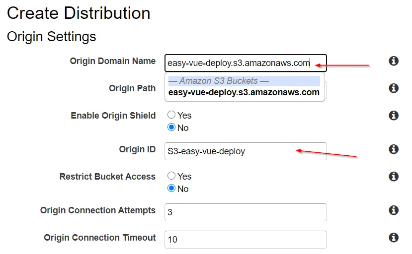
Change the Viewer Protocol Policy to redirect HTTP to HTTPS.

Viewer Protocol

Finally, set the Default Root Object to be index.html, and create the distribution. This process takes a few minutes to complete as I imagine AWS is populating its edge locations with our site's content.

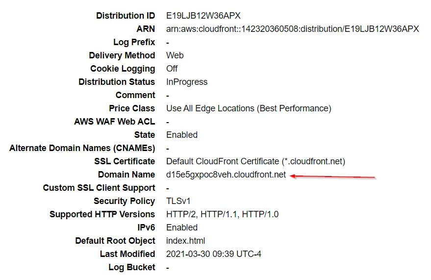
After the distribution is created, we can test out the deployment by selecting our distribution and going to the CloudFront domain name it generated for us.

Deploy Info
Finished CloudFront Deploy

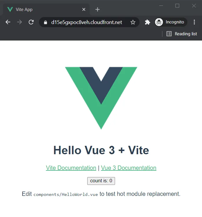
We can see that the site is protected by HTTPS, and even see a boost to our site's performance in the DevTools with the site loading about 50ms faster for me, along with using the http/2 protocol.

CloudFront DevTools

Now, in order to grant our site a custom domain, we will need 2 more services: Amazon Certificate Manager, and Route 53.

Amazon Certificate Manager (ACM)

If you're familiar with working on Linux servers and using Certbot, then ACM is going to be a breeze. This service is what we will use to provision an SSL/TLS certificate for our custom domain name.

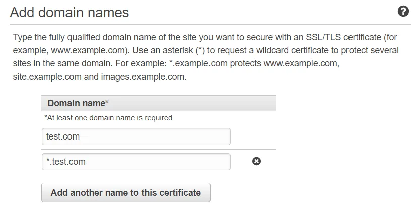
Go to the ACM service, request a public certificate, and add the domain names to the request. If you want to create a certificate valid for all subdomains, add another domain name to the certificate, and prefix your domain with an asterisk *.

Add Domains

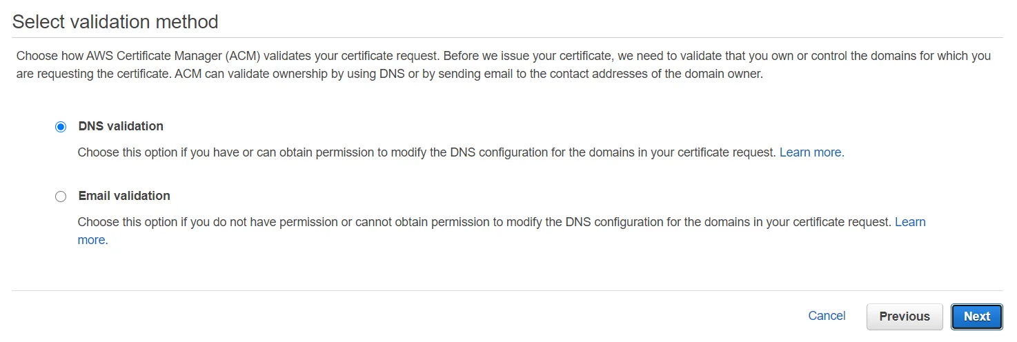
After this, we'll need to validate that we own the domain we're requesting a certificate for. We can choose DNS or Email validation. For this example, let's use DNS validation.

DNS Validation

After that, skip adding tags for now (tags can help you organize AWS resources when you have a lot of them), and finish the request for the certificate to set the request in progress. You'll be greeted with a screen asking you to add a CNAME record in the DNS configuration of your domain.

CNAME records to add

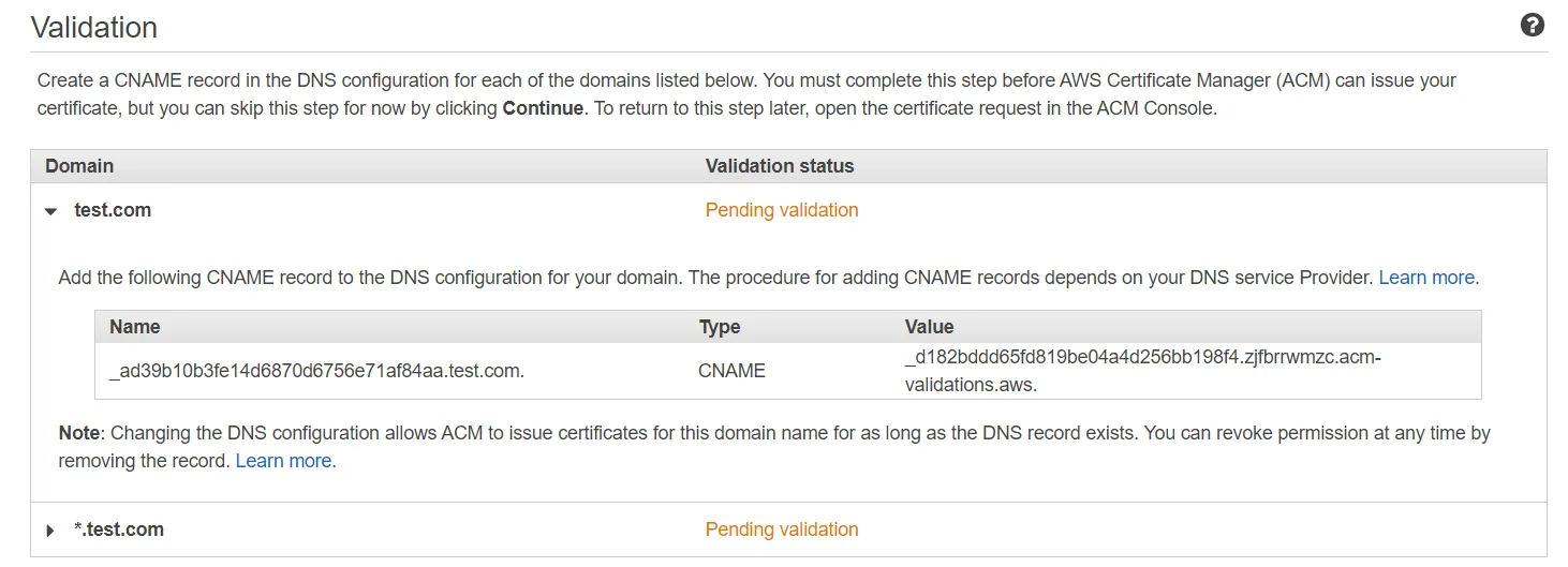
We can add our CNAME records in Route 53.

Route 53

AWS describes Route 53 as, "a reliable and cost-effective way to route end users to Internet applications." What we'll do in Route 53 depends on where you bought your domain name.

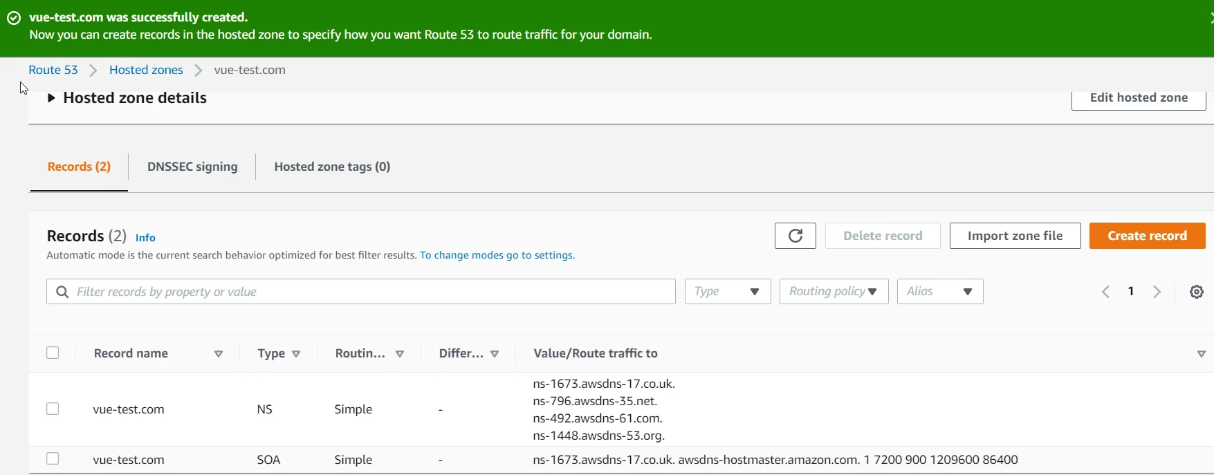
If you bought your domain name from outside of Route 53, you'll need to create a hosted zone in Route 53 to create nameservers you can point your domain to. I bought my domain, matthewpagan.com, from GoDaddy for example, so I needed to create a hosted zone, and then edit my GoDaddy nameservers to point to the nameservers generated by Route 53.

If you need to create a hosted zone, go to the Route 53 service, create a hosted zone (the only information you'll need is your domain name), take note of the nameservers generated, and switch your nameservers at your domain registrar.

Hosted Zone

After you've either created your hosted zone, or bought your domain name through Route 53, you can then create a CNAME record with the information provided by Amazon Certificate Manager (ACM) to verify that you control your domain. This takes a few minutes after you create the CNAME record.

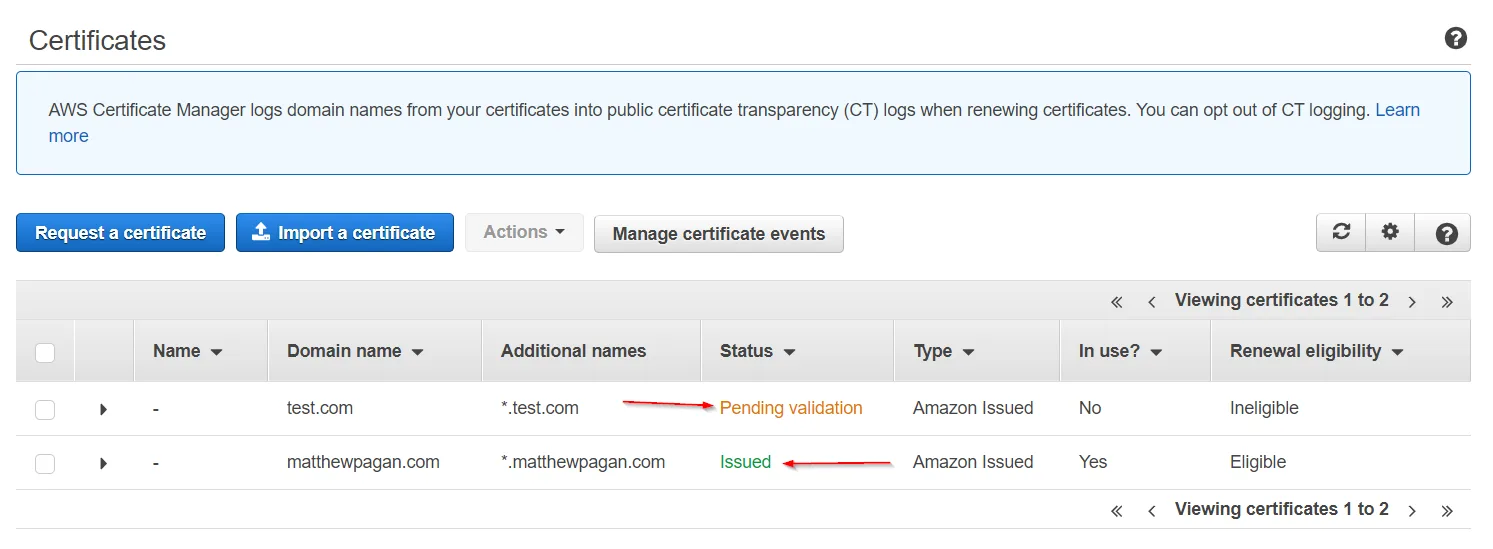
To check the status of the validation, go to ACM, and look at the status of your certificate.

When the certificate is successfully issued, the status of your certificate should change from 'Pending Validation' to 'Issued'

Issued Certificate

Add domain to CloudFront distribution

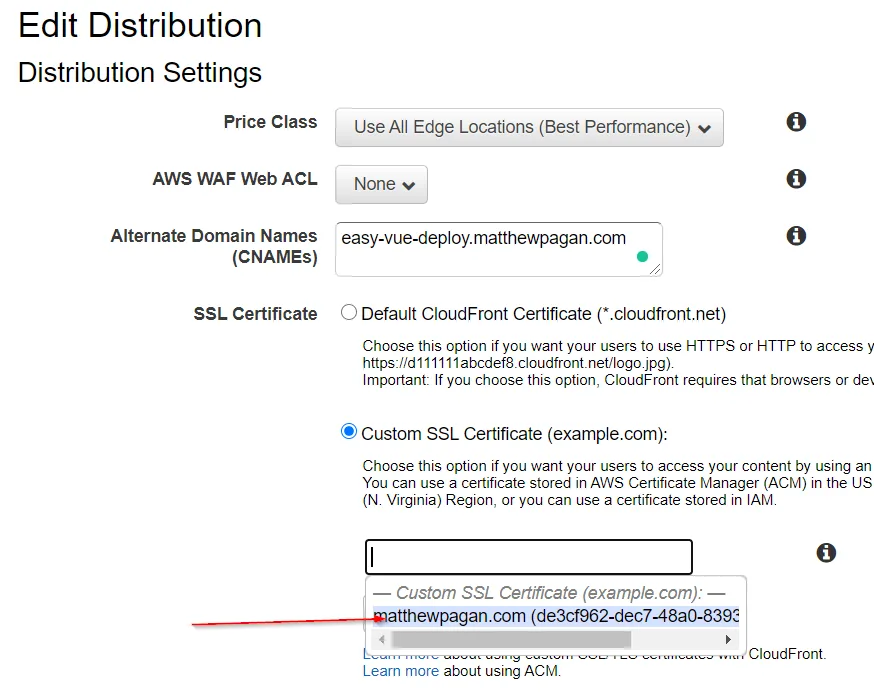
Once we have a valid certificate for our domain name, we are going to apply that domain/sub-domain to CloudFront. Go to the service, select your distribution, and edit the settings.

Set the Alternate Domain Names to your desired domain/sub-domain that you recently acquired the valid SSL/TLS certificate for, select 'Custom SSL Certificate' instead of the default CloudFront certificate, select your certificate from the generated dropdown, and save these changes.

CloudFront Domain

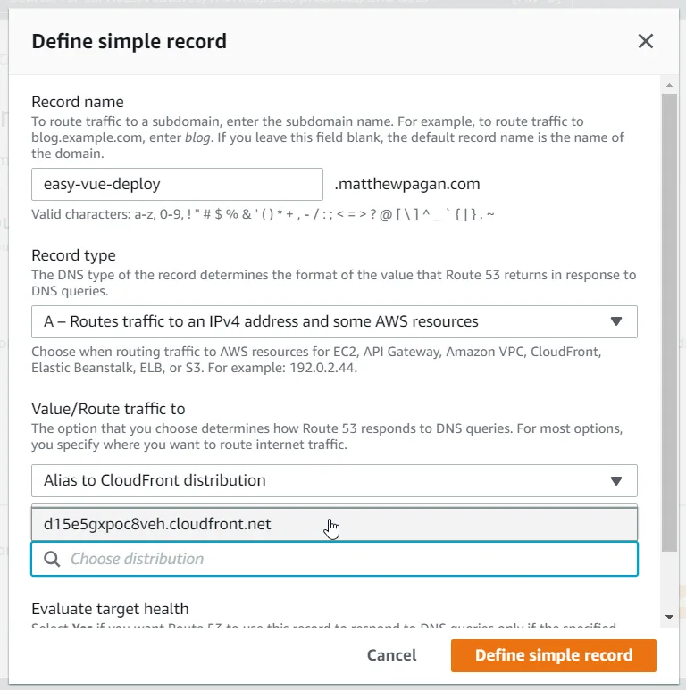
Create A record in CloudFront pointing to CloudFront CNAME

Now, we can point to that CloudFront distribution in Route 53. Create an A record in Route 53 for your domain/sub-domain, and point it to the CloudFront distribution. You'll know things are working because your distribution should display itself when you go to select a distribution to point to.

Route 53 A Record

Conclusion

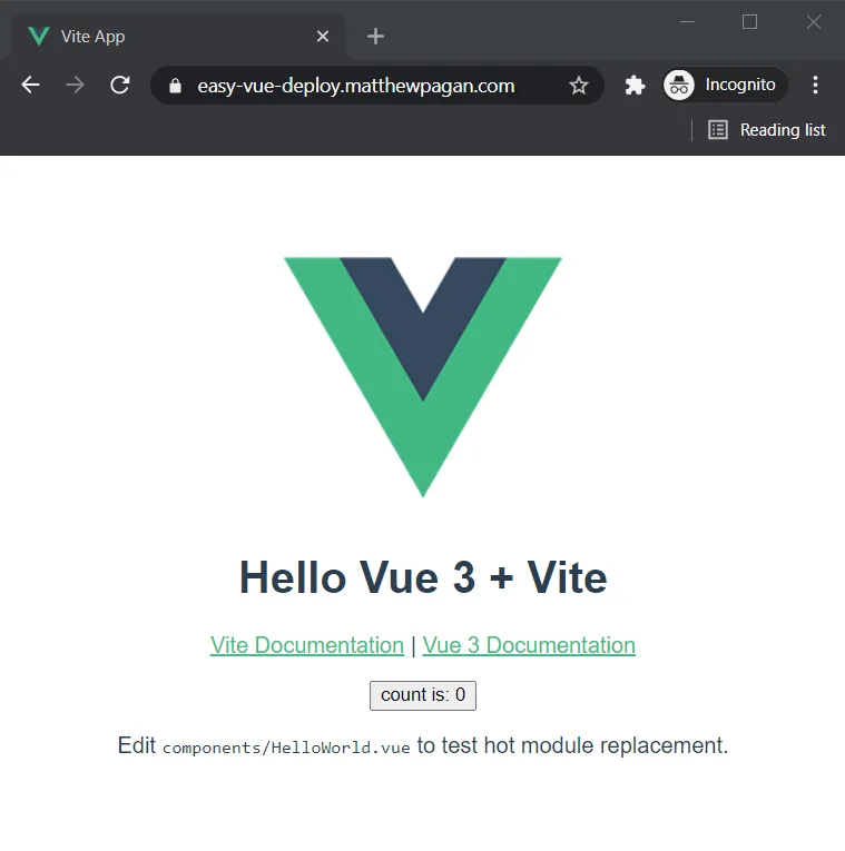
After following the above steps, we now have a deployed Vue static front-end, protected by SSL/TLS, using a custom domain name, backed by a CDN, and hosted by AWS!

Finished Deployment

While there certainly are easier ways to deploy static content online, by going through and manually setting up AWS services yourself, you should have a deeper understanding of the moving parts. You may even be able to move into the deep end, and try deploying some back-end solutions for your front-end to consume!

This Dot is a consultancy dedicated to guiding companies through their modernization and digital transformation journeys. Specializing in replatforming, modernizing, and launching new initiatives, we stand out by taking true ownership of your engineering projects.

We love helping teams with projects that have missed their deadlines or helping keep your strategic digital initiatives on course. Check out our case studies and our clients that trust us with their engineering.

You might also like

Awesome 3D experience with VueJS and TresJS: a beginner's guide cover image

Awesome 3D experience with VueJS and TresJS: a beginner's guide

Awesome 3D experience with VueJS and TresJS: a beginner's guide Vue.js developers are renowned for raving about the ease, flexibility, and speed of development their framework offers. Tres.js builds on this love for Vue by becoming the missing piece for seamless 3D integration. As a Vue layer for Three.js, Tres.js allows you to leverage the power of Three.js, a popular 3D library, within the familiar and beloved world of Vue components. This means you can create stunning 3D graphics and animations directly within your Vue applications, all while maintaining the clean and efficient workflow you've come to expect. TresJS is a library specifically designed to make incorporating WebGL (the web's 3D graphics API) into your Vue.js projects a breeze. It boasts several key features that make 3D development with Vue a joy: - Declarative Approach: Build your 3D scenes like you would any other Vue component, leveraging the power and familiarity of Vue's syntax. This makes it intuitive and easy to reason about your 3D elements. - Powered by Vite: Experience blazing-fast development cycles with Vite's Hot Module Replacement (HMR) that keeps your scenes updated in real-time, even as your code changes. - Up-to-date Features: Tres.js stays on top of the latest Three.js releases, ensuring you have immediate access to the newest features and functionality. - Thriving Ecosystem: The Tres.js ecosystem offers many resources to enhance your development experience. This includes: - Cientos: A collection of pre-built components and helpers that extend the capabilities of Tres.js, allowing you to focus on building your scene's functionality rather than reinventing the wheel (https://cientos.tresjs.org/). - TresLeches: A powerful state management solution specifically designed for 3D applications built with Tres.js (https://tresleches.tresjs.org/). You can try TresJS online using their official Playground or on their StackBlitz starter. But now, let's dive into a quick code example to showcase the simplicity of creating a 3D scene with TresJS. Setup First, install the package: npm install @tresjs/core three And then, if you are using Typescript, be sure to install the types: npm install @types/three -D If you are using Vite, now you need to modify your vite.config.ts file in this way to make the template compiler work with the custom renderer: ` Create our Scene Imagine a 3D scene as a virtual stage. To bring this stage to life, we need a few key players working together: 1. Scene: Think of this as the container that holds everything in your 3D world. It acts as the canvas where all the objects, lights, and the camera reside, defining the overall environment. 2. Renderer: This is the magician behind the curtain, responsible for taking all the elements in your scene and translating them into what you see on the screen. It performs the complex calculations needed to transform your 3D scene into 2D pixels displayed on your browser. 3. Camera: Like a real camera, this virtual camera defines the perspective from which you view your scene. You can position and adjust the camera to zoom in, zoom out, or explore different angles within your 3D world. - To make our camera dynamic and allow canvas exploration, we are going to leverage the client's OrbitControls component. Below are our examples. You will see that we just include the component in our canvas, and it just works. 4. Objects: These actors bring your scene to life. They can be anything from simple geometric shapes like spheres and cubes to complex models like characters or buildings. You create the visual elements that tell your story by manipulating and animating these objects. Starting from the beginning: to create our Scene with TresJS we just need to use our component TresCanvas in our Vue component's template: ` The TresCanvas component is going to do some setup work behind the scenes: - It creates a WebGLRenderer that automatically updates every frame. - It sets the render loop to be called on every frame based on the browser refresh rate. Using the window-size property, we force the canvas to take the width and height of our full window. So with TresCanvas component we have created our Renderer and our Scene. Let's move to the Camera: ` We just have to add the TresPerspectiveCamera component to our scene. NOTE: It's important that all scene-related components live between the TresCanvas component. Now, only the main actor is missing, let's add some styles and our object inside the scene. Our Vue component will now look like: ` And our scene will be: A Mesh is a basic scene object in three.js, and it's used to hold the geometry and the material needed to represent a shape in 3D space. As we can see, we can achieve the same with TresJS using the TresMesh component, and between the default slots, we are just passing our object (a Box in our example). One interesting thing to notice is that we don't need to import anything. That's because TresJS automatically generates a Vue Component based on the three objects you want to use in PascalCase with a Tres prefix. Now, if we want to add some color to our object the Three.js Material class comes to help us. We need to add: ` Conclusion Tres.js not only supercharges Vue.js applications with stunning 3D graphics, but it also integrates seamlessly with Nuxt.js, enabling you to harness the performance benefits of server-side rendering (SSR) for your 3D creations. This opens the door to building exceptional web experiences that are both interactive and performant. With Tres.js, Vue.js developers can leverage a declarative approach, cutting-edge features, and a vast ecosystem to bring their immersive web visions to life. If you want to elevate your Vue.js projects with a new dimension, Tres.js is an excellent choice to explore....

Understanding Vue.js's <Suspense> and Async Components cover image

Understanding Vue.js's <Suspense> and Async Components

In this blog post, we will delve into how and async components work, their benefits, and practical implementation strategies to make your Vue.js applications more efficient and user-friendly. Without further ado, let’s get started! Suspense Let's kick off by explaining what Suspense components are. They are a new component that helps manage how your application handles components that need to await for some async resource to resolve, like fetching data from a server, waiting for images to load, or any other task that might take some time to complete before they can be properly rendered. Imagine you're building a web page that needs to load data from a server, and you have 2 components that fetch the data you need as they will show different things. Typically, you might see a loading spinner or a skeleton while the data is being fetched. Suspense components make it easier to handle these scenarios. Instead of manually managing loading states and error messages for each component that needs to fetch data, Suspense components let you wrap all these components together. Inside this wrapper, you can define: 1. What to show while the data is loading (like a loading spinner). 2. The actual content that should be displayed once the data is successfully fetched. This way, Vue Suspense simplifies the process of handling asynchronous operations (like data fetching) and improves the user (and the developer) experience by providing a more seamless and integrated way to show loading states and handle errors. There are two types of async dependencies that can wait on: - Components with an async setup() hook. This includes components using with top-level await expressions. *Note: These can only be used within a component.* - Async Components. Async components Vue's asynchronous components are like a smart loading system for your web app. Imagine your app as a big puzzle. Normally, you'd put together all the pieces at once, which can take time. But what if some pieces aren't needed right away? Asynchronous components help with this. Here's how they work: - Load Only What's Needed: Just like only picking up puzzle pieces you need right now, asynchronous components let your app load only the parts that are immediately necessary. Other parts can be loaded later, as needed. - Faster Start: Your app starts up faster because it doesn't have to load everything at once. It's like quickly starting with the border of a puzzle and filling in the rest later. - Save Resources: It uses your web resources (like internet data) more wisely, only grabbing what’s essential when it's essential. In short, asynchronous components make your app quicker to start and more efficient, improving the overall experience for your users. Example: ` Combining Async Components and Suspense Let's explore how combining asynchronous components with Vue's Suspense feature can enhance your application. When asynchronous components are used with Vue's Suspense, they form a powerful combination. The key point is that async components are "suspensable" by default. This means they can be easily integrated with Suspense to improve how your app handles loading and rendering components. When used together, you can do the following things: - Centralized Loading and Error Handling: With Suspense, you don't have to handle loading and error states individually for each async component. Instead, you can define a single loading indicator or error message within the Suspense component. This unified approach simplifies your code and ensures consistency across different parts of your app. - Flexible and Clean Code Structure: By combining async components with Suspense, your code becomes more organized and easier to maintain. An asynchronous component has the flexibility to operate independently of Suspense's oversight. By setting suspensible: false in its options, the component takes charge of its own loading behavior. This means that instead of relying on Suspense to manage when it appears, the component itself dictates its loading state and presentation. This option is particularly useful for components that have specific loading logic or visuals they need to maintain, separate from the broader Suspense-driven loading strategy in the application. In practice, this combo allows you to create a user interface that feels responsive and cohesive. Users see a well-timed loading indicator while the necessary components are being fetched, and if something goes wrong, a single, well-crafted error message is displayed. It's like ensuring that the entire puzzle is either revealed in its completed form or not at all rather than showing disjointed parts at different times. How it works When a component inside the boundary is waiting for something asynchronous, shows fallback content. This fallback content can be anything you choose, such as a loading spinner or a message indicating that data is being loaded. Example Usage Let’s use a simple example: In the visual example provided, imagine we have two Vue components: one showcasing a selected Pokémon, Eevee, and a carousel showcasing a variety of other Pokémon. Both components are designed to fetch data asynchronously. Without , while the data is being fetched, we would typically see two separate loading indicators: one for the Eevee Pokemon that is selected and another for the carousel. This can make the page look disjointed and be a less-than-ideal user experience. We could display a single, cohesive loading indicator by wrapping both components inside a boundary. This unified loading state would persist until all the data for both components—the single Pokémon display and the carousel—has been fetched and is ready to be rendered. Here's how you might structure the code for such a scenario: ` Here, is the component that's performing asynchronous operations. While loading, the text 'Loading...' is displayed to the user. Great! But what about when things don't go as planned and an error occurs? Currently, Vue's doesn't directly handle errors within its boundary. However, there's a neat workaround. You can use the onErrorCaptured() hook in the parent component of to catch and manage errors. Here's how it works: ` If we run this code, and let’s say that we had an error selecting our Pokemon, this is how it is going to display to the user: The error message is specifically tied to the component where the issue occurred, ensuring that it's the only part of your application that shows an error notification. Meanwhile, the rest of your components will continue to operate and display as intended, maintaining the overall user experience without widespread disruption. This targeted error handling keeps the application's functionality intact while indicating where the problem lies. Conclusion stands out as a formidable feature in Vue.js, transforming the management of asynchronous operations into a more streamlined and user-centric process. It not only elevates the user experience by ensuring smoother interactions during data loading phases but also enhances code maintainability and application performance. I hope you found this blog post enlightening and that it adds value to your Vue.js projects. As always, happy coding and continue to explore the vast possibilities Vue.js offers to make your applications more efficient and engaging!...

How to make Videos with React using Remotion cover image

How to make Videos with React using Remotion

How to make Videos with React using Remotion We've written a blog post discussing how React truly is a "Learn Once, Write Anywhere" library. In that article, we talked about how we aren't limited to rendering React components to the DOM. In this post, we'll discuss how we can leverage our knowledge of developing React components and create Videos, using Remotion. If you already know [React] and follow along with this post, you'll walk away with a custom .mp4 video of you're own creation, and the knowledge of how to customize it to you're heart's content. Remotion Remotion is a suite of libraries for creating videos programmatically with React. Just like react-dom is used to provide an interface between React components, and rendering to the DOM, Remotion is used to provide an interface between React and rendering to Video. > If you know React, you can make videos. > -- Remotion Documentation This is exciting because it allows developers to re-use their knowledge of the React library for yet another purpose. Let's dive in and see how we can start rendering some videos! Initializing a Remotion Video Project Creating a new Remotion video is as easy as a 1 line command: npm init video Running this command gives the user access to a few default templates for Remotion video development: - Hello World - Blank - Hello World (Vanilla Javascript) - React Three Fiber - Still Images - Text to Speech The Hello World templates are fantastic places to go if you are a hands-on learner and like playing around with your code in a live dev environment. They're how I learned to use Remotion. They're packed with such great logic, that I'd encourage you to run a template before moving on and exploring them a bit to see how things are laid out. That being said, I want to go over things rather slowly, so I'm going to create a repo from the Blank template, add a few development features (linting, husky, prettier, etc), and use that as a starting point. If you want to develop with these features and want a similar starting point, clone the repo here and you can see every commit from beginning to end. This is the exact commit after I finished installing linting to the Blank template. The Blank Remotion Template If you cloned the repo I mentioned above, you'll be working in the Blank template, with a few additional dev features. The main 2 files are: - src\index.tsx: This is similar to the index file of a regular create-react-app. It uses a render function to take a React component, and render it to the desired output, in this case, a .mp4 video. We won't be looking in here. - src\Video.tsx: This is the main entry point of our video. Think of this as the App component in a create-react-app project. It's here that we layer together React components to create our Remotion video. This is where we will start to focus our attention. The Composition component The entry point file Video.tsx introduces us to our first Remotion component, Composition. ` We can see this component in action by running npm start and checkouting out our development environment: The Remotion development environment has 4 important sections: - Compositions: The left main column. This is a list of all defined Composition components in Video.tsx. The Blank template defines a single Composition, with an id == 'Empty' - Scenes: The bottom left column. We haven't talked about scenes yet... - Composition Render: The main dev zone. This is the development render of the currently selected Composition. - Composition Timeline: This is a timeline of scenes rendered in the currently selected Composition. The Composition component has a few important properties: - id: This is the name given to the Composition, used to identify the component in the development environment. - component: This is the component that the Composition renders. Different compositions can render the same component, for responsiveness for example. - durationInFrames & fps: A Composition is not defined by how long it is in time, but by how many frames it is made up of, and how fast those frames are rendered. - width & height: Together, these define the aspect ratio of our video. You could define an HD Composition with a 1920/1080 width/height, or a square still from a single frame of a Component with a 200/200 width/height for example. - defaultProps: This is the props object passed into the component when the Composition is rendered. This repository defines a super small empty component as the component-to-render for the Empty composition. Let's rename our component to HelloWorld, and create a full-fledged component to render. We'll render a simple, 4-second video, of the text "Hello, World!", in high definition, at 60fps. src/Video.tsx ` src/components/HelloWorld.tsx ` To render this to .mp4 you need to have ffmpeg installed. Adjust the package.json build command and instruct the CLI to render our HelloWorld composition, and run npm run build to create our first video! Here's a link to what this would render. It's nothing crazy, but with previous React knowledge, and with the help of Remotion, we have created a 4 second long, 60fps, 4K video! Simple animations with interpolate Rendering some static text to video doesn't make for an exciting video, so let's learn how to reach into the state of the application, and adjust the style of our text, depending on the current frame. Here are the 2 hooks we'll use to accomplish this: - useCurrentFrame: This hook returns the current frame number. - interpolate: This hook helps the user change values throughout several frames. It takes in 3 arguments, the current frame (from useCurrentFrame), a tuple designating the start and end frame for the interpolation, and another tuple defining the start and end values for the frame duration. Using these 2 hooks, we can define what the opacity of our text should be, as a function of the current frame: ` Here's a link to what this would render. We aren't rendering static text anymore. Now we have a real video! The Sequence component Videos can be made up of MANY moving parts though. Our current video only has 1 moving part, but let's add some complexity to the video and split this into 2 parts. To do this, we need to take advantage of the Sequence component. > Using a Sequence, you can time-shift certain parts of your animation and therefore make them more reusable. Sequences are also shown in the timeline and help you visually understand the structure of your video. > -- Remotion Docs We can use sequences to help us break apart our logic even further, and we can also view these sequences on our composition timeline. Here are some important props for the Sequence component: - from (required, number): The frame that the Sequence children start at. The initial frame for them is 0. - durationInFrames (optional, default: Infinity): This is how many frames a sequence is displayed. - name (optional): Name your sequences to label them in the development environment. - layout (optional, default: 'absolute-fill'): Sequences are positioned absolutely initially, use this to handle layout manually. Let's animate our "Hello, World!" a bit more: src/components/HelloWorld.tsx ` With a few sequences, we are now separating our animations, and labeling them in our dev environment. Here is the render uploaded to YouTube. Putting the 'World' in 'Hello, World!' Being able to render text is amazing, but in the animation world, models aren't drawn manually with code. Instead, they're generated using software, such as Blender for example. One of the tools we can render with using Remotion is React Three Fiber. Just like Remotion lets us render to a Video format, React Three Fiber allows us to render React components into ThreeJS, a WebGL library. With a bit of React Three Fiber logic and a publicly available model of our planet, we can put the 'World' in 'Hello, World!' Hello, World! Going into how to work with React Three Fiber is a bit out of the scope of this post, but I wanted to show just what the developer is capable of with Remotion, and rendering a spinning planet with JSX is pretty amazing. src/components/HelloWorld.tsx ` Conclusion React truly is a "Learn Once, Write Anywhere" language. The DOM is nowhere close to the only render target React is capable of. With Remotion, we've learned how to slap together some JSX and hooks, and render actual videos, programmatically. Feel free to clone the repo and play around with the logic. If you've followed along with this post, you can now proudly state that you can literally render "Hello, World!" with React!...

Implementing Dynamic Types in Docusign Extension Apps cover image

Implementing Dynamic Types in Docusign Extension Apps

Implementing Dynamic Types in Docusign Extension Apps In our previous blog post about Docusign Extension Apps, Advanced Authentication and Onboarding Workflows with Docusign Extension Apps, we touched on how you can extend the OAuth 2 flow to build a more powerful onboarding flow for your Extension Apps. In this blog post, we will continue explaining more advanced patterns in developing Extension Apps. For that reason, we assume at least basic familiarity with how Extension Apps work and ideally some experience developing them. To give a brief recap, Docusign Extension Apps are a powerful way to embed custom logic into Docusign agreement workflows. These apps are lightweight services, typically cloud-hosted, that integrate at specific workflow extension points to perform custom actions, such as data validation, participant input collection, or interaction with third-party services. Each Extension App is configured using a manifest file. This manifest defines metadata such as the app's author, support links, and the list of extension points it uses (these are the locations in the workflow where your app's logic will be executed). The extension points that are relevant for us in the context of this blog post are GetTypeNames and GetTypeDefinitions. These are used by Docusign to retrieve the types supported by the Extension App and their definitions, and to show them in the Maestro UI. In most apps, these types are static and rarely change. However, they don't have to be. They can also be dynamic and change based on certain configurations in the target system that the Extension App is integrating with, or based on the user role assigned to the Maestro administrator on the target system. Static vs. Dynamic Types To explain the difference between static and dynamic types, we'll use the example from our previous blog post, where we integrated with an imaginary task management system called TaskVibe. In the example, our Extension App enabled agreement workflows to communicate with TaskVibe, allowing tasks to be read, created, and updated. Our first approach to implementing the GetTypeNames and GetTypeDefinitions endpoints for the TaskVibe Extension App might look like the following. The GetTypeNames endpoint returns a single record named task: ` Given the type name task, the GetTypeDefinitions endpoint would return the following definition for that type: ` As noted in the Docusign documentation, this endpoint must return a Concerto schema representing the type. For clarity, we've omitted most of the Concerto-specific properties. The above declaration states that we have a task type, and this type has properties that correspond to task fields in TaskVibe, such as record ID, title, description, assignee, and so on. The type definition and its properties, as described above, are static and they never change. A TaskVibe task will always have the same properties, and these are essentially set in stone. Now, imagine a scenario where TaskVibe supports custom properties that are also project-dependent. One project in TaskVibe might follow a typical agile workflow with sprints, and the project manager might want a "Sprint" field in every task within that project. Another project might use a Kanban workflow, where the project manager wants a status field with values like "Backlog," "ToDo," and so on. With static types, we would need to return every possible field from any project as part of the GetTypeDefinitions response, and this introduces new challenges. For example, we might be dealing with hundreds of custom field types, and showing them in the Maestro UI might be too overwhelming for the Maestro administrator. Or we might be returning fields that are simply not usable by the Maestro administrator because they relate to projects the administrator doesn't have access to in TaskVibe. With dynamic types, however, we can support this level of customization. Implementing Dynamic Types When Docusign sends a request to the GetTypeNames endpoint and the types are dynamic, the Extension App has a bit more work than before. As we've mentioned earlier, we can no longer return a generic task type. Instead, we need to look into each of the TaskVibe projects the user has access to, and return the tasks as they are represented under each project, with all the custom fields. (Determining access can usually be done by making a query to a user information endpoint on the target system using the same OAuth 2 token used for other calls.) Once we find the task definitions on TaskVibe, we then need to return them in the response of GetTypeNames, where each type corresponds to a task for the given project. This is a big difference from static types, where we would only return a single, generic task. For example: ` The key point here is that we are now returning one type per task in a TaskVibe project. You can think of this as having a separate class for each type of task, in object-oriented lingo. The type name can be any string you choose, but it needs to be unique in the list, and it needs to contain the minimum information necessary to be able to distinguish it from other task definitions in the list. In our case, we've decided to form the ID by concatenating the string "task_" with the ID of the project on TaskVibe. The implementation of the GetTypeDefinitions endpoint needs to: 1. Extract the project ID from the requested type name. 1. Using the project ID, retrieve the task definition from TaskVibe for that project. This definition specifies which fields are present on the project's tasks, including all custom fields. 1. Once the fields are retrieved, map them to the properties of the Concerto schema. The resulting JSON could look like this (again, many of the Concerto properties have been omitted for clarity): ` Now, type definitions are fully dynamic and project-dependent. Caching of Type Definitions on Docusign Docusign maintains a cache of type definitions after an initial connection. This means that changes made to your integration (particularly when using dynamic types) might not be immediately visible in the Maestro UI. To ensure users see the latest data, it's useful to inform them that they may need to refresh their Docusign connection in the App Center UI if new fields are added to their integrated system (like TaskVibe). As an example, a newly added custom field on a TaskVibe project wouldn't be reflected until this refresh occurs. Conclusion In this blog post, we've explored how to leverage dynamic types within Docusign Extension Apps to create more flexible integrations with external systems. While static types offer simplicity, they can be constraining when working with external systems that offer a high level of customization. We hope that this blog post provides you with some ideas on how you can tackle similar problems in your Extension Apps....

Let's innovate together!

We're ready to be your trusted technical partners in your digital innovation journey.

Whether it's modernization or custom software solutions, our team of experts can guide you through best practices and how to build scalable, performant software that lasts.

Prefer email? hi@thisdot.co