“We were seen as amplifiers, not collaborators,” Ashley Willis, Sr. Director of Developer Relations at GitHub, on How DevRel has Changed, Open Source, and Holding Space as a Leader
Ashley Willis has seen Developer Relations evolve from being on the sidelines of the tech team to having a seat at the strategy table.
In her ten years in the space, she’s done more than give great conference talks or build community—she’s helped shape what the DevRel role looks like for software providers. Now as the Senior Director of Developer Relations at GitHub, Ashley is focused on building spaces where developers feel heard, seen, and supported.
> “A decade ago, we were seen as amplifiers, not collaborators,” she says. “Now we’re influencing product roadmaps and shaping developer experience end to end.”
DevRel Has Changed
For Ashley, the biggest shift hasn’t been the work itself—but how it’s understood.
> “The work is still outward-facing, but it’s backed by real strategic weight,” she explains. “We’re showing up in research calls and incident reviews, not just keynotes.”
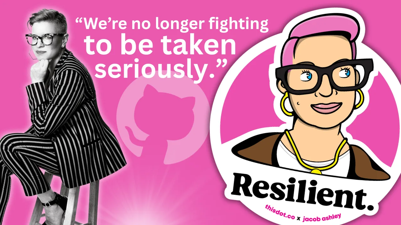
That shift matters, but it’s not the finish line. Ashley is still pushing for change when it comes to burnout, representation, and sustainable metrics that go beyond conference ROI.
> “We’re no longer fighting to be taken seriously. That’s a win. But there’s more work to do.”
Talking Less as a Leader
When we asked what the best advice Ashley ever received, she shared an early lesson she received from a mentor: “Your presence should create safety, not pressure.”
> “It reframed how I saw my role,” she says. “Not as the one with answers, but the one who holds the space.”
Ashley knows what it’s like to be in rooms where it’s hard to speak up. She leads with that memory in mind, and by listening more than talking, normalizing breaks, and creating environments where others can lead too.
> “Leadership is emotional labor. It’s not about being in control. It’s about making it safe for others to lead, too.”
Scaling More Than Just Tech
Having worked inside high-growth companies, Ashley knows firsthand: scaling tech is one thing. Scaling trust is another.
> “Tech will break. Roadmaps will shift. But if there’s trust between product and engineering, between company and community—you can adapt.”
And she’s learned not to fall for premature optimization. Scale what you have. Don’t over-design for problems you don’t have yet.
Free Open Source Isn’t Free
There’s one myth Ashley is eager to debunk: that open source is “free.”
> “Open source isn’t free labor. It’s labor that’s freely given,” she says. “And it includes more than just code. There’s documentation, moderation, mentoring, emotional care. None of it is effortless.”
Open source runs on human energy. And when we treat contributors like an infinite resource, we risk burning them out, and breaking the ecosystem we all rely on.
> “We talk a lot about open source as the foundation of innovation. But we rarely talk about sustaining the people who maintain that foundation.”
Burnout is Not Admirable
Early in her career, Ashley wore burnout like a badge of honor. She doesn’t anymore.
> “Burnout doesn’t prove commitment,” she says. “It just dulls your spark.”
Now, she treats rest as productive. And she’s learned that clarity is kindness—especially when giving feedback.
> “I thought being liked was the same as being kind. It’s not. Kindness is honesty with empathy.”
The Most Underrated GitHub Feature?
Ashley’s pick: personal instructions in GitHub Copilot.
Most users don’t realize they can shape how Copilot writes, like its tone, assumptions, and context awareness.
Her own instructions are specific: empathetic, plainspoken, technical without being condescending. For Ashley, that helps reduce cognitive load and makes the tool feel more human.
> “Most people skip over this setting. But it’s one of the best ways to make Copilot more useful—and more humane.”
Connect with Ashley Willis
She has been building better systems for over a decade. Whether it’s shaping Copilot UX, creating safer teams, or speaking truth about the labor behind open source, she’s doing the quiet work that drives sustainable change.
Follow Ashley on BlueSky to learn more about her work, her maker projects, and the small things that keep her grounded in a fast-moving industry.
Sticker Illustration by Jacob Ashley....