How to Create Dark/Light Mode in your JavaScript project?
Providing our visitors with the ability to toggle between white and dark themes has become one of the most important features of all time. In this article, we will cover the requirements to develop a persistent theme for your website successfully.
The code provided as part of this article will be technology agnostic and can be used with all major front-end frameworks such as Vue, React, or Svelte.
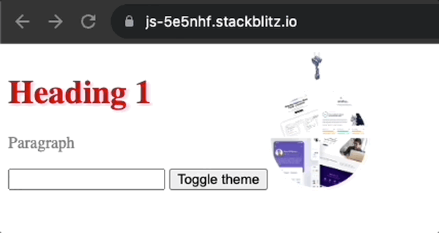
TL;DR If you are in a rush and just want access to the code, you can grab it from this Stackblitz: Light / Dark theme functionality in Vanilla JS.
What is White/Dark Mode
Before we jump into the code, we should first explain what the meaning behind the feature name "White/Dark Mode is".
This feature was first introduced in our Operating system by allowing users to change their default theme into Dark Mode, After this, Dark Mode has slowly made its way into our most used applications and websites as users expected to have a consistent look from their native application to Web App equivalent.
Providing "White/Dark mode" in your site means giving the user the ability to toggle their theme to either align to the Operating system theme settings or override it from the Web App UI.

The above example shows the feature on thisdot.co triggered by the little toggle button available within the main navbar.
Implementing Dark Mode with Javascript
This feature has two main implementation levels. The first is the ability to assign the theme directly from the Operating System preferences, while the second combines the feature of the first plus the ability to override that feature from the UI.
Some websites just offer the first option and allow the site to emulate the OS preferences, even if this is mostly fine for most users, in this post, we will develop the second option as it is the most complicated approach and, therefore the most complete.
The development of this feature is going to be divided into the following steps:
- Ensure CSS variables drive our application
- Create a second set of variables for a dark theme
- Create logic to read user preferences
- Create logic to override the theme preference
- Make our theme selection persistent
Let's dive into the code with our first step and initialize our application.
Move all styles into CSS variables
We are going to start our application by initializing a plain VanillaJs Stackblitz. This creates a simple project with an index.js file that includes our HTML and a style.css file that includes our global styles.
To be able to have a good starting point for our post, we are going to add some more elements on the main page of the app and then define some CSS variables to make our example more appealing.
First, we are going to clean our index.js and just leave the style import:
// Import stylesheets
import './style.css';
Then, we are going to change our index.html with the following content:
<body>
 <span>
   <h1>Heading 1</h1>
   <p>Paragraph</p>
 </span>
 <picture>
   <img width="100" src="https://www.thisdot.co/img/header-light-theme.webp">
 </picture>
</body>
And finally, define some CSS variables and styles in style.css:
:root{
 --text-primary:red;
 --text-secondary: grey;
 --background-color: white;
}
body{
 display: flex;
 background-color: var(--background-color);
}
h1 {
 color: var(--text-primary);
}
p {
 color: var(--text-secondary);
}
If you are new to CSS variables, you can read more about them in the MDN docs: Using CSS custom properties. There is one point to clarify regarding CSS variables and their naming convention. Because the color held within our variables will change (for example from red to blue), the variable name should be based on the color "role" (eg primary, shadow, border") and not on the actual color "blue, green".
In our example, we can see this naming convention in action as the variables are called "primary", "secondary" and "background".
The above should output a very simple but colorful design:

Create a second set of variables for the dark theme
Now that our basic application is set, it is time to create a second set of variables to be able to define the difference between the light and dark theme.
As you may notice, the CSS variables are not a must for this to work, but having all the variables set makes the maintenance of the site much easier than having to update color and styles scattered around.
We are returning to our style.css file and updating a few of the CSS properties. These variables will just be updated if the body has a specific class dark associated with it:
:root {
 --text-primary: red;
 --text-secondary: grey;
 --background-color: white;
}
body.dark {
 --text-primary: white;
 --background-color: black;
}
As the above code shows, because we are just overriding the variables, we do not actually need to redeclare them all and we can just declare the variables that we wish to update.
If we would go back and add a class of "dark" to our body in index.html we would see the following output:

As you can see, both white themes are fully set up and working. All that is left is creating the logic that can handle the theme toggle, but before we do so, there is one more change to add to our CSS.
In fact, some components, such as form controls and scrollbar, use a property called "color-scheme" to change their theme, to give this a try, we will add an in our HTML:
<body class="dark">
 <span>
   <h1>Heading 1</h1>
   <p>Paragraph</p>
   <input type="text" />
 </span>
 <picture>
   <img width="100" src="https://www.thisdot.co/img/header-light-theme.webp" />
 </picture>
</body>
Then, let's see how this would look in our design:

The input is showing a white theme even if the dark theme is selected, and this is happening because we are not changing the "color-scheme" that is what is used for the form input.
Let's fix this by adding another CSS variable and a CSS declaration within our body:
:root {
 --text-primary: red;
 --text-secondary: grey;
 --background-color: white;
 --color-scheme: light;
}
body.dark {
 --text-primary: white;
 --background-color: black;
 --color-scheme: dark;
}
body {
 display: flex;
 background-color: var(--background-color);
 color-scheme: var(--color-scheme);
}
h1 {
 color: var(--text-primary);
}
p {
 color: var(--text-secondary);
}
With the above code, the "color-scheme" variable will be changed to align with our overall theme, as shown below:

Note that settings can be overridden on a component-by-component level. In fact, if you would like to always display the white theme for a button or field, you can just redeclare the "color-scheme" and apply it to the CSS selection of your choice.
It is now time to move forward and include some JS to make the toggling automatic.
Create logic to read user preferences
It is now time to write some JavaScript and make our application dynamic. In this first logical step, we are going to read our Operating System color preference and use it to toggle the class assigned to our body.
To do so, we are going to use the "matchMedia" method to read the "prefer-color-scheme" just like shown in the code below:
const readSystemColorPreferences = () => {
 if (window.matchMedia && window.matchMedia('(prefers-color-scheme: dark)').matches) {
   return "dark";
 } else {
   return "light";
 }
}
The next step is to assign or remove the class from our body depending on the preferred scheme:
var preferredScheme = readSystemColorPreferences();

const updateScheme = (overriddenScheme) => {
   if( preferredScheme === "dark" ) {
   document.querySelector('body').classList.add("dark");
   } else {
   document.querySelector('body').classList.remove("dark");
   }
};
updateScheme();
Let's see if this works. If you are on Mac you can change the preferences by following the following steps:
- System settings
- Appearance
- Change the appearance
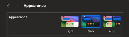
If you change the preferences and refresh your application, you should be able to see the application changing on the fly.
Create logic to override the theme preference
Having to change the full OS just for a single Website theme preference may be a little bit too much. So, in this step, we are going to enhance our logic to be able to override the preferences.
First, we are going to add a simple button in the HTML called Toggle Theme:
<body class="dark">
 <span>
   <h1>Heading 1</h1>
   <p>Paragraph</p>
   <input type="text" />
   <button>Toggle theme</button>
 </span>
 <picture>
   <img width="100" src="https://www.thisdot.co/img/header-light-theme.webp" />
 </picture>
 <button>Toggle theme</button>
</body>
Now, it is time to update the logic. First, we need to allow a way to override the preferences. We can do this by adding an argument to our updateScheme function:
let selectedTheme;
const updateScheme = (overriddenScheme) => {
 const preferredScheme = readSystemColorPreferences();
 selectedTheme = overriddenScheme || preferredScheme;
 localStorage.setItem("selectedTheme", selectedTheme);
 if (selectedTheme === 'dark') {
   document.querySelector('body').classList.add('dark');
 } else {
   document.querySelector('body').classList.remove('dark');
 }
};
updateScheme();
The above code just adds a global variable called selectedTheme and then, as we previously mentioned, adds a parameter of overrideScheme to our method and finally makes sure we use this variable if available selectedTheme = overriddenScheme || preferredScheme.
The next step requires us to be able to update our selectedTheme on a button click:
document.querySelector('button').addEventListener('click', () => {
 var newScheme = selectedTheme === 'dark' ? 'light' : 'dark';
 updateScheme(newScheme);
});
With the above code added to our application, we could override the system preferences, but unfortunately, our work is not completed. The logic we wrote above is not persistent, and the theme selection will be lost if we refresh the page.
Make our theme selection persistent
In this last step, we are going to save our selectedTheme in localStorage using the documentation provided in the MDN documentation: Local Storage.
First, let's save the selectedTheme into local storage by using localStorage.setItem:
const updateScheme = (overriddenScheme) => {
 const preferredScheme = readSystemColorPreferences();
 selectedTheme = overriddenScheme || preferredScheme;
 localStorage.setItem('selectedTheme', selectedTheme);

 if (selectedTheme === 'dark') {
   document.querySelector('body').classList.add('dark');
 } else {
   document.querySelector('body').classList.remove('dark');
 }
};
Then make sure we read this value on load using localStorage.getItem:
const savedTheme = localStorage.getItem('selectedTheme');
updateScheme(savedTheme);
After the above changes, you should be able to toggle the theme, refresh the page and be able to see the correct theme loaded up for you.
NOTE: Due to the way StackBlitz loads the JS, there will be a small flash, but if you would place this code in the head that flash should be extremely minimal.
What about the images
You may have noticed that we have left the image unchanged between the different themes. This was, unfortunately not by choice, as there is no native way to swap images when using class-based theming.
If you were just to implement the theme based on System Preference, you could declare different images using the media query (prefers-color-scheme: dark). This would allow you to declare images like this:
<picture>
   <source srcset="night.jpg" media="(prefers-color-scheme: dark)">
   <img src="day.jpg">
</picture>
The above code will show day.jpg if your theme settings are light or night.jpg if dark. If you would like to implement something similar with a class-based theme, you will have to create a custom image component in your framework of choice that loads the correct theme, but this is outside this tutorial's scope.
Conclusion
It is now time to conclude this post and leave you to go and apply what we learned in your Web applications. Implementing this feature is quite simple, and it helps to improve your user's experience.
The code we have written above is available on StackBlitz: Light / Dark theme functionality in Vanilla JS. But let's see it in action in:
So, in this article, we have introduced CSS variables and ensured our design colors were driven solely by them. We created an override for this variable using a class-based approach; we then learned how some elements, such as input fields, can change the theme using the "color-theme" property.
We then moved into the JS, where we used the media query "prefers-color-scheme" to read the user Operating System theme preferences and, last but not least, created a live toggle that would create and save a personal preference in LocalStorage.