Skip to content

Nuxt DevTools v1.0: Redefining the Developer Experience Beyond Conventional Tools

Nuxt DevTools v1.0: Redefining the Developer Experience Beyond Conventional Tools

In the ever-evolving world of web development, Nuxt.js has taken a monumental leap with the launch of Nuxt DevTools v1.0. More than just a set of tools, it's a game-changer—a faithful companion for developers. This groundbreaking release, available for all Nuxt projects and being defaulted from Nuxt v3.8 onwards, marks the beginning of a new era in developer tools. It's designed to simplify our development journey, offering unparalleled transparency, performance, and ease of use. Join me as we explore how Nuxt DevTools v1.0 is set to revolutionize our workflow, making development faster and more efficient than ever.

What makes Nuxt DevTools so unique?

Alright, let's start delving into the features that make this tool so amazing and unique. There are a lot, so buckle up!

In-App DevTools

The first thing that caught my attention is that breaking away from traditional browser extensions, Nuxt DevTools v1.0 is seamlessly integrated within your Nuxt app. This ensures universal compatibility across browsers and devices, offering a more stable and consistent development experience. This setup also means the tools are readily available in the app, making your work more efficient. It's a smart move from the usual browser extensions, making it a notable highlight.

To use it you just need to press Shift + Option + D (macOS) or Shift + Alt + D (Windows):

Welcome to nuxt 3 start.dev kit with nuxt devtools

With simple keystrokes, the Nuxt DevTools v1.0 springs to life directly within your app, ready for action. This integration eliminates the need to toggle between windows or panels, keeping your workflow streamlined and focused. The tools are not only easily accessible but also intelligently designed to enhance your productivity.

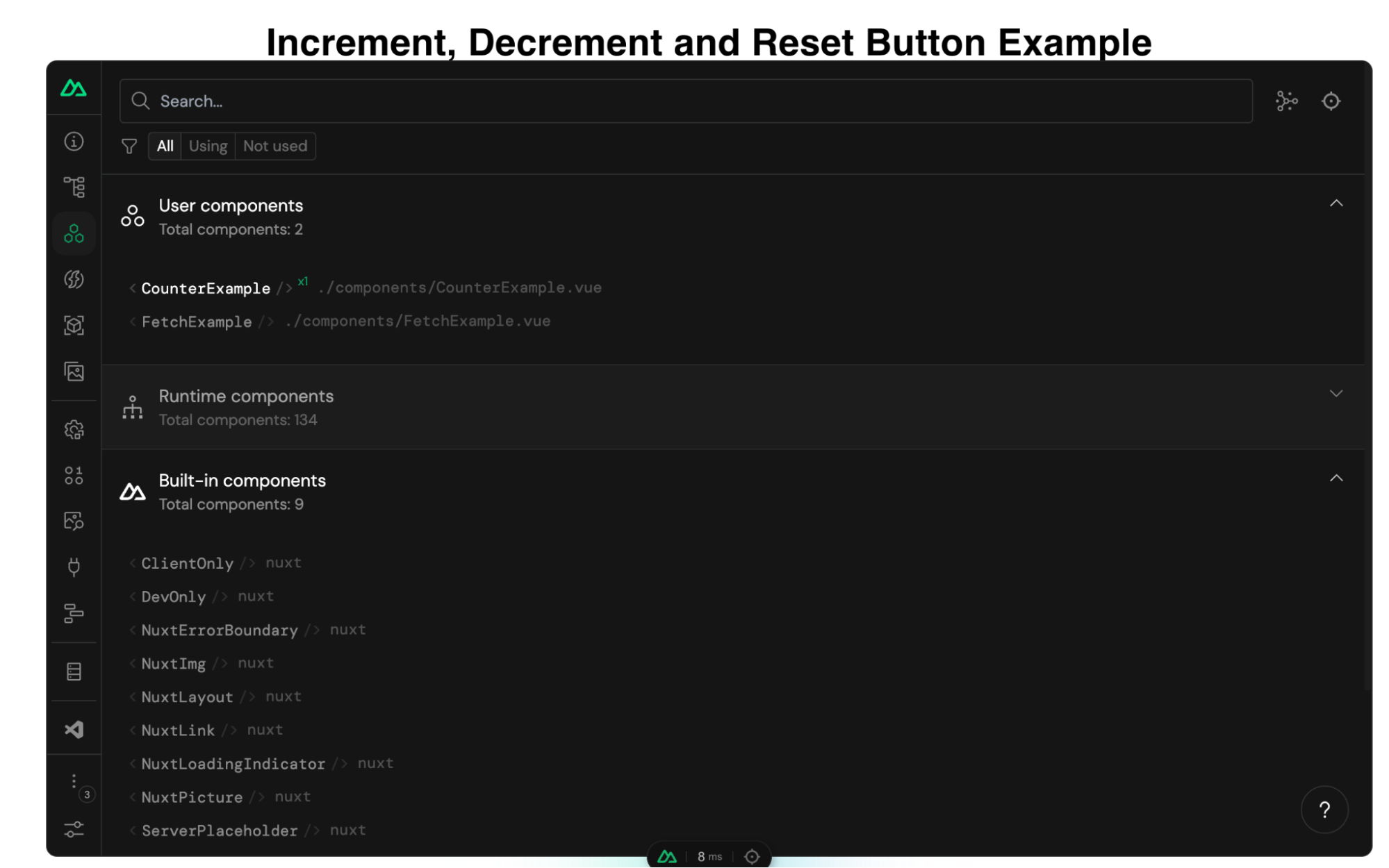
Pages, Components, and Componsables View

The Pages, Components, and Composables View in Nuxt DevTools v1.0 are a clear roadmap for your app. They help you understand how your app is built by simply showing its structure. It's like having a map that makes sense of your app's layout, making the complex parts of your code easier to understand. This is really helpful for new developers learning about the app and experienced developers working on big projects.

Pages View lists all your app's pages, making it easier to move around and see how your site is structured. What's impressive is the live update capability. As you explore the DevTools, you can see the changes happening in real-time, giving you instant feedback on your app's behavior.

counter, nuxt devtools

Components View is like a detailed map of all the parts (components) your app uses, showing you how they connect and depend on each other. This helps you keep everything organized, especially in big projects. You can inspect components, change layouts, see their references, and filter them. increment, decrement and reset button example

graph representing references in nuxt dev tools
demo Nuxt 3 application using nuxt devtools

By showcasing all the auto-imported composables, Nuxt DevTools provides a clear overview of the composables in use, including their source files. This feature brings much-needed clarity to managing composables within large projects. You can also see short descriptions and documentation links in some of them.

built in composables in nuxt dev tools

Together, these features give you a clear picture of your app's layout and workings, simplifying navigation and management.

Modules and Static Assets Management

This aspect of the DevTools revolutionizes module management. It displays all registered modules, documentation, and repository links, making it easy to discover and install new modules from the community! This makes managing and expanding your app's capabilities more straightforward than ever.

nuxt 3 fetch data from api in nuxt dev tools

On the other hand, handling static assets like images and videos becomes a breeze. The tool allows you to preview and integrate these assets effortlessly within the DevTools environment. preview and integrate static assets within nuxt dev tools

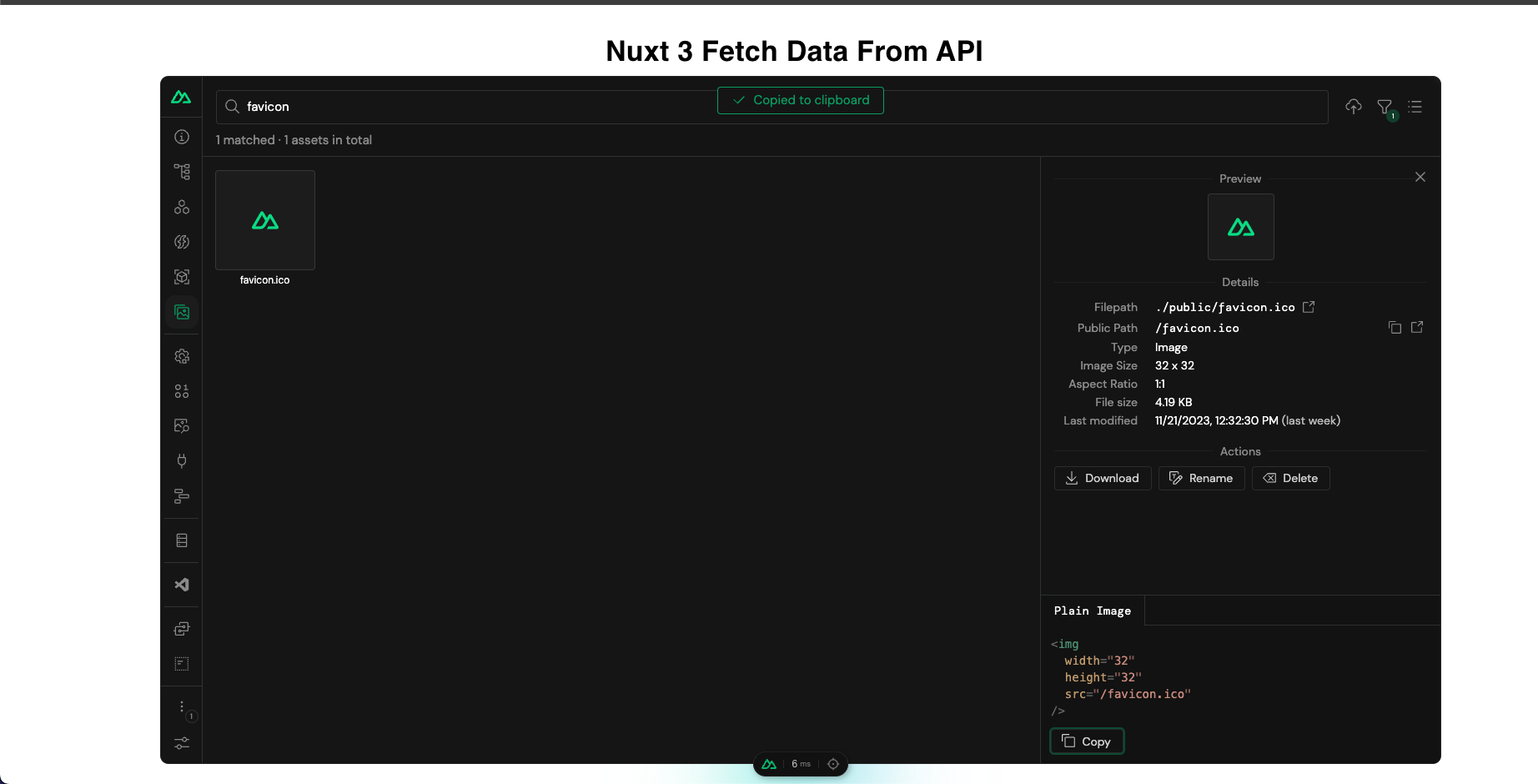
These features significantly enhance the ease and efficiency of managing your app's dynamic and static elements.

The Runtime Config and Payload Editor

The Runtime Config and Payload Editor in Nuxt DevTools make working with your app's settings and data straightforward.

The Runtime Config lets you play with different configuration settings in real time, like adjusting settings on the fly and seeing the effects immediately. This is great for fine-tuning your app without guesswork.

runtime config configuration settings in nuxt dev tools

The Payload Editor is all about managing the data your app handles, especially data passed from server to client. It's like having a direct view and control over the data your app uses and displays. This tool is handy for seeing how changes in data impact your app, making it easier to understand and debug data-related issues.

payload editor in nuxt dev tools

Open Graph Preview

The Open Graph Preview in Nuxt DevTools is a feature I find incredibly handy and a real time-saver. It lets you see how your app will appear when shared on social media platforms. This tool is crucial for SEO and social media presence, as it previews the Open Graph tags (like images and descriptions) used when your app is shared. No more deploying first to check if everything looks right – you can now tweak and get instant feedback within the DevTools. This feature not only streamlines the process of optimizing for social media but also ensures your app makes the best possible first impression online.

/greet endpoint in nuxt devtools

Timeline

The Timeline feature in Nuxt DevTools is another standout tool. It lets you track when and how each part of your app (like composables) is called. This is different from typical performance tools because it focuses on the high-level aspects of your app, like navigation events and composable calls, giving you a more practical view of your app's operation. It's particularly useful for understanding the sequence and impact of events and actions in your app, making it easier to spot issues and optimize performance. This timeline view brings a new level of clarity to monitoring your app's behavior in real-time.

timeline in nuxt devtools

Production Build Analyzer

The Production Build Analyzer feature in Nuxt DevTools v1.0 is like a health check for your app. It looks at your app's final build and shows you how to make it better and faster. Think of it as a doctor for your app, pointing out areas that need improvement and helping you optimize performance.

API Playground

The API Playground in Nuxt DevTools v1.0 is like a sandbox where you can play and experiment with your app's APIs. It's a space where you can easily test and try out different things without affecting your main app. This makes it a great tool for trying out new ideas or checking how changes might work.

Some other cool features

Another amazing aspect of Nuxt DevTools is the embedded full-featured VS Code. It's like having your favorite code editor inside the DevTools, with all its powerful features and extensions. It's incredibly convenient for making quick edits or tweaks to your code.

Then there's the Component Inspector. Think of it as your code's detective tool. It lets you easily pinpoint and understand which parts of your code are behind specific elements on your page. This makes identifying and editing components a breeze.

And remember customization! Nuxt DevTools lets you tweak its UI to suit your style. This means you can set up the tools just how you like them, making your development environment more comfortable and tailored to your preferences.

Conclusion

In summary, Nuxt DevTools v1.0 marks a revolutionary step in web development, offering a comprehensive suite of features that elevate the entire development process. Features like live updates, easy navigation, and a user-friendly interface enrich the development experience. Each tool within Nuxt DevTools v1.0 is thoughtfully designed to simplify and enhance how developers build and manage their applications.

In essence, Nuxt DevTools v1.0 is more than just a toolkit; it's a transformative companion for developers seeking to build high-quality web applications more efficiently and effectively. It represents the future of web development tools, setting new standards in developer experience and productivity.

This Dot is a consultancy dedicated to guiding companies through their modernization and digital transformation journeys. Specializing in replatforming, modernizing, and launching new initiatives, we stand out by taking true ownership of your engineering projects.

We love helping teams with projects that have missed their deadlines or helping keep your strategic digital initiatives on course. Check out our case studies and our clients that trust us with their engineering.

You might also like

Incremental Hydration in Angular cover image

Incremental Hydration in Angular

Incremental Hydration in Angular Some time ago, I wrote a post about SSR finally becoming a first-class citizen in Angular. It turns out that the Angular team really treats SSR as a priority, and they have been working tirelessly to make SSR even better. As the previous blog post mentioned, full-page hydration was launched in Angular 16 and made stable in Angular 17, providing a great way to improve your Core Web Vitals. Another feature aimed to help you improve your INP and other Core Web Vitals was introduced in Angular 17: deferrable views. Using the @defer blocks allows you to reduce the initial bundle size and defer the loading of heavy components based on certain triggers, such as the section entering the viewport. Then, in September 2024, the smart folks at Angular figured out that they could build upon those two features, allowing you to mark parts of your application to be server-rendered dehydrated and then hydrate them incrementally when needed - hence incremental hydration. I’m sure you know what hydration is. In short, the server sends fully formed HTML to the client, ensuring that the user sees meaningful content as quickly as possible and once JavaScript is loaded on the client side, the framework will reconcile the rendered DOM with component logic, event handlers, and state - effectively hydrating the server-rendered content. But what exactly does "dehydrated" mean, you might ask? Here's what will happen when you mark a part of your application to be incrementally hydrated: 1. Server-Side Rendering (SSR): The content marked for incremental hydration is rendered on the server. 2. Skipped During Client-Side Bootstrapping: The dehydrated content is not initially hydrated or bootstrapped on the client, reducing initial load time. 3. Dehydrated State: The code for the dehydrated components is excluded from the initial client-side bundle, optimizing performance. 4. Hydration Triggers: The application listens for specified hydration conditions (e.g., on interaction, on viewport), defined with a hydrate trigger in the @defer block. 5. On-Demand Hydration: Once the hydration conditions are met, Angular downloads the necessary code and hydrates the components, allowing them to become interactive without layout shifts. How to Use Incremental Hydration Thanks to Mark Thompson, who recently hosted a feature showcase on incremental hydration, we can show some code. The first step is to enable incremental hydration in your Angular application's appConfig using the provideClientHydration provider function: ` Then, you can mark the components you want to be incrementally hydrated using the @defer block with a hydrate trigger: ` And that's it! You now have a component that will be server-rendered dehydrated and hydrated incrementally when it becomes visible to the user. But what if you want to hydrate the component on interaction or some other trigger? Or maybe you don't want to hydrate the component at all? The same triggers already supported in @defer blocks are available for hydration: - idle: Hydrate once the browser reaches an idle state. - viewport: Hydrate once the component enters the viewport. - interaction: Hydrate once the user interacts with the component through click or keydown triggers. - hover: Hydrate once the user hovers over the component. - immediate: Hydrate immediately when the component is rendered. - timer: Hydrate after a specified time delay. - when: Hydrate when a provided conditional expression is met. And on top of that, there's a new trigger available for hydration: - never: When used, the component will remain static and not hydrated. The never trigger is handy when you want to exclude a component from hydration altogether, making it a completely static part of the page. Personally, I'm very excited about this feature and can't wait to try it out. How about you?...

Introduction to Zod for Data Validation cover image

Introduction to Zod for Data Validation

As web developers, we're often working with data from external sources like APIs we don't control or user inputs submitted to our backends. We can't always rely on this data to take the form we expect, and we can encounter unexpected errors when it deviates from expectations. But with the Zod library, we can define what our data ought to look like and parse the incoming data against those defined schemas. This lets us work with that data confidently, or to quickly throw an error when it isn't correct. Why use Zod? TypeScript is great for letting us define the shape of our data in our code. It helps us write more correct code the first time around by warning us if we are doing something we shouldn't. But TypeScript can't do everything for us. For example, we can define a variable as a string or a number, but we can't say "a string that starts with user_id_ and is 20 characters long" or "an integer between 1 and 5". There are limits to how much TypeScript can narrow down our data for us. Also, TypeScript is a tool for us developers. When we compile our code, our types are not available to the vanilla JavaScript. JavaScript can't validate that the data we actually use in our code matches what we thought we'd get when we wrote our TypeScript types unless you're willing to manually write code to perform those checks. This is where we can reach for a tool like Zod. With Zod, we can write data schemas. These schemas, in the simplest scenarios, look very much like TypeScript types. But we can do more with Zod than we can with TypeScript alone. Zod schemas let us create additional rules for data parsing and validation. A 20-character string that starts with user_id_? It's z.string().startsWith('user_id_').length(20). An integer between 1 and 5 inclusive? It's z.number().int().gte(1).lte(5). Zod's primitives give us many extra functions to be more specific about *exactly* what data we expect. Unlike TypeScript, Zod schemas aren't removed on compilation to JavaScript—we still have access to them! If our app receives some data, we can verify that it matches the expected shape by passing it to your Zod schema's parse function. You'll either get back your data in exactly the shape you defined in your schema, or Zod will give you an error to tell you what was wrong. Zod schemas aren't a replacement for TypeScript; rather, they are an excellent complement. Once we've defined our Zod schema, it's simple to derive a TypeScript type from it and to use that type as we normally would. But when we really need to be sure our data conforms to the schema, we can always parse the data with our schema for that extra confidence. Defining Data Schemas Zod schemas are the variables that define our expectations for the shape of our data, validate those expectations, and transform the data if necessary to match our desired shape. It's easy to start with simple schemas, and to add complexity as required. Zod provides different functions that represent data structures and related validation options, which can be combined to create larger schemas. In many cases, you'll probably be building a schema for a data object with properties of some primitive type. For example, here's a schema that would validate a JavaScript object representing an order for a pizza: ` Zod provides a number of primitives for defining schemas that line up with JavaScript primitives: string, number, bigint, boolean, date, symbol, undefined, and null. It also includes primitives void, any, unknown, and never for additional typing information. In addition to basic primitives, Zod can define object, array, and other native data structure schemas, as well as schemas for data structures not natively part of JavaScript like tuple and enum. The documentation contains considerable detail on the available data structures and how to use them. Parsing and Validating Data with Schemas With Zod schemas, you're not only telling your program what data should look like; you're also creating the tools to easily verify that the incoming data matches the schema definitions. This is where Zod really shines, as it greatly simplifies the process of validating data like user inputs or third party API responses. Let's say you're writing a website form to register new users. At a minimum, you'll need to make sure the new user's email address is a valid email address. For a password, we'll ask for something at least 8 characters long and including one letter, one number, and one special character. (Yes, this is not really the best way to write strong passwords; but for the sake of showing off how Zod works, we're going with it.) We'll also ask the user to confirm their password by typing it twice. First, let's create a Zod schema to model these inputs: ` So far, this schema is pretty basic. It's only making sure that whatever the user types as an email is an email, and it's checking that the password is at least 8 characters long. But it is *not* checking if password and confirmPassword match, nor checking for the complexity requirements. Let's enhance our schema to fix that! ` By adding refine with a custom validation function, we have been able to verify that the passwords match. If they don't, parsing will give us an error to let us know that the data was invalid. We can also chain refine functions to add checks for our password complexity rules: ` Here we've chained multiple refine functions. You could alternatively use superRefine, which gives you even more fine grained control. Now that we've built out our schema and added refinements for extra validation, we can parse some user inputs. Let's see two test cases: one that's bound to fail, and one that will succeed. ` There are two main ways we can use our schema to validate our data: parse and safeParse. The main difference is that parse will throw an error if validation fails, while safeParse will return an object with a success property of either true or false, and either a data property with your parsed data or an error property with the details of a ZodError explaining why the parsing failed. In the case of our example data, userInput2 will parse just fine and return the data for you to use. But userInput1 will create a ZodError listing all of the ways it has failed validation. ` ` We can use these error messages to communicate to the user how they need to fix their form inputs if validation fails. Each error in the list describes the validation failure and gives us a human readable message to go with it. You'll notice that the validation errors for checking for a valid email and for checking password length have a lot of details, but we've got three items at the end of the error list that don't really tell us anything useful: just a custom error of Invalid input. The first is from our refine checking if the passwords match, and the second two are from our refine functions checking for password complexity (numbers and special characters). Let's modify our refine functions so that these errors are useful! We'll add our own error parameters to customize the message we get back and the path to the data that failed validation. ` Now, our error messages from failures in refine are informative! You can figure out which form fields aren't validating from the path, and then display the messages next to form fields to let the user know how to remedy the error. ` By giving our refine checks a custom path and message, we can make better use of the returned errors. In this case, we can highlight specific problem form fields for the user and give them the message about what is wrong. Integrating with TypeScript Integrating Zod with TypeScript is very easy. Using z.infer<typeof YourSchema> will allow you to avoid writing extra TypeScript types that merely reflect the intent of your Zod schemas. You can create a type from any Zod schema like so: ` Using a TypeScript type derived from a Zod schema does *not* give you any extra level of data validation at the type level beyond what TypeScript is capable of. If you create a type from z.string.min(3).max(20), the TypeScript type will still just be string. And when compiled to JavaScript, even that will be gone! That's why you still need to use parse/safeParse on incoming data to validate it before proceeding as if it really does match your requirements. A common pattern with inferring types from Zod schemas is to use the same name for both. Because the schema is a variable, there's no name conflict if the type uses the same name. However, I find that this can lead to confusing situations when trying to import one or the other—my personal preference is to name the Zod schema with Schema at the end to make it clear which is which. Conclusion Zod is an excellent tool for easily and confidently asserting that the data you're working with is exactly the sort of data you were expecting. It gives us the ability to assert at runtime that we've got what we wanted, and allows us to then craft strategies to handle what happens if that data is wrong. Combined with the ability to infer TypeScript types from Zod schemas, it lets us write and run more reliable code with greater confidence....

Understanding Vue.js's <Suspense> and Async Components cover image

Understanding Vue.js's <Suspense> and Async Components

In this blog post, we will delve into how and async components work, their benefits, and practical implementation strategies to make your Vue.js applications more efficient and user-friendly. Without further ado, let’s get started! Suspense Let's kick off by explaining what Suspense components are. They are a new component that helps manage how your application handles components that need to await for some async resource to resolve, like fetching data from a server, waiting for images to load, or any other task that might take some time to complete before they can be properly rendered. Imagine you're building a web page that needs to load data from a server, and you have 2 components that fetch the data you need as they will show different things. Typically, you might see a loading spinner or a skeleton while the data is being fetched. Suspense components make it easier to handle these scenarios. Instead of manually managing loading states and error messages for each component that needs to fetch data, Suspense components let you wrap all these components together. Inside this wrapper, you can define: 1. What to show while the data is loading (like a loading spinner). 2. The actual content that should be displayed once the data is successfully fetched. This way, Vue Suspense simplifies the process of handling asynchronous operations (like data fetching) and improves the user (and the developer) experience by providing a more seamless and integrated way to show loading states and handle errors. There are two types of async dependencies that can wait on: - Components with an async setup() hook. This includes components using with top-level await expressions. *Note: These can only be used within a component.* - Async Components. Async components Vue's asynchronous components are like a smart loading system for your web app. Imagine your app as a big puzzle. Normally, you'd put together all the pieces at once, which can take time. But what if some pieces aren't needed right away? Asynchronous components help with this. Here's how they work: - Load Only What's Needed: Just like only picking up puzzle pieces you need right now, asynchronous components let your app load only the parts that are immediately necessary. Other parts can be loaded later, as needed. - Faster Start: Your app starts up faster because it doesn't have to load everything at once. It's like quickly starting with the border of a puzzle and filling in the rest later. - Save Resources: It uses your web resources (like internet data) more wisely, only grabbing what’s essential when it's essential. In short, asynchronous components make your app quicker to start and more efficient, improving the overall experience for your users. Example: ` Combining Async Components and Suspense Let's explore how combining asynchronous components with Vue's Suspense feature can enhance your application. When asynchronous components are used with Vue's Suspense, they form a powerful combination. The key point is that async components are "suspensable" by default. This means they can be easily integrated with Suspense to improve how your app handles loading and rendering components. When used together, you can do the following things: - Centralized Loading and Error Handling: With Suspense, you don't have to handle loading and error states individually for each async component. Instead, you can define a single loading indicator or error message within the Suspense component. This unified approach simplifies your code and ensures consistency across different parts of your app. - Flexible and Clean Code Structure: By combining async components with Suspense, your code becomes more organized and easier to maintain. An asynchronous component has the flexibility to operate independently of Suspense's oversight. By setting suspensible: false in its options, the component takes charge of its own loading behavior. This means that instead of relying on Suspense to manage when it appears, the component itself dictates its loading state and presentation. This option is particularly useful for components that have specific loading logic or visuals they need to maintain, separate from the broader Suspense-driven loading strategy in the application. In practice, this combo allows you to create a user interface that feels responsive and cohesive. Users see a well-timed loading indicator while the necessary components are being fetched, and if something goes wrong, a single, well-crafted error message is displayed. It's like ensuring that the entire puzzle is either revealed in its completed form or not at all rather than showing disjointed parts at different times. How it works When a component inside the boundary is waiting for something asynchronous, shows fallback content. This fallback content can be anything you choose, such as a loading spinner or a message indicating that data is being loaded. Example Usage Let’s use a simple example: In the visual example provided, imagine we have two Vue components: one showcasing a selected Pokémon, Eevee, and a carousel showcasing a variety of other Pokémon. Both components are designed to fetch data asynchronously. Without , while the data is being fetched, we would typically see two separate loading indicators: one for the Eevee Pokemon that is selected and another for the carousel. This can make the page look disjointed and be a less-than-ideal user experience. We could display a single, cohesive loading indicator by wrapping both components inside a boundary. This unified loading state would persist until all the data for both components—the single Pokémon display and the carousel—has been fetched and is ready to be rendered. Here's how you might structure the code for such a scenario: ` Here, is the component that's performing asynchronous operations. While loading, the text 'Loading...' is displayed to the user. Great! But what about when things don't go as planned and an error occurs? Currently, Vue's doesn't directly handle errors within its boundary. However, there's a neat workaround. You can use the onErrorCaptured() hook in the parent component of to catch and manage errors. Here's how it works: ` If we run this code, and let’s say that we had an error selecting our Pokemon, this is how it is going to display to the user: The error message is specifically tied to the component where the issue occurred, ensuring that it's the only part of your application that shows an error notification. Meanwhile, the rest of your components will continue to operate and display as intended, maintaining the overall user experience without widespread disruption. This targeted error handling keeps the application's functionality intact while indicating where the problem lies. Conclusion stands out as a formidable feature in Vue.js, transforming the management of asynchronous operations into a more streamlined and user-centric process. It not only elevates the user experience by ensuring smoother interactions during data loading phases but also enhances code maintainability and application performance. I hope you found this blog post enlightening and that it adds value to your Vue.js projects. As always, happy coding and continue to explore the vast possibilities Vue.js offers to make your applications more efficient and engaging!...

“We were seen as amplifiers, not collaborators,” Ashley Willis, Sr. Director of Developer Relations at GitHub, on How DevRel has Changed, Open Source, and Holding Space as a Leader cover image

“We were seen as amplifiers, not collaborators,” Ashley Willis, Sr. Director of Developer Relations at GitHub, on How DevRel has Changed, Open Source, and Holding Space as a Leader

Ashley Willis has seen Developer Relations evolve from being on the sidelines of the tech team to having a seat at the strategy table. In her ten years in the space, she’s done more than give great conference talks or build community—she’s helped shape what the DevRel role looks like for software providers. Now as the Senior Director of Developer Relations at GitHub, Ashley is focused on building spaces where developers feel heard, seen, and supported. > “A decade ago, we were seen as amplifiers, not collaborators,” she says. “Now we’re influencing product roadmaps and shaping developer experience end to end.” DevRel Has Changed For Ashley, the biggest shift hasn’t been the work itself—but how it’s understood. > “The work is still outward-facing, but it’s backed by real strategic weight,” she explains. “We’re showing up in research calls and incident reviews, not just keynotes.” That shift matters, but it’s not the finish line. Ashley is still pushing for change when it comes to burnout, representation, and sustainable metrics that go beyond conference ROI. > “We’re no longer fighting to be taken seriously. That’s a win. But there’s more work to do.” Talking Less as a Leader When we asked what the best advice Ashley ever received, she shared an early lesson she received from a mentor: “Your presence should create safety, not pressure.” > “It reframed how I saw my role,” she says. “Not as the one with answers, but the one who holds the space.” Ashley knows what it’s like to be in rooms where it’s hard to speak up. She leads with that memory in mind, and by listening more than talking, normalizing breaks, and creating environments where others can lead too. > “Leadership is emotional labor. It’s not about being in control. It’s about making it safe for others to lead, too.” Scaling More Than Just Tech Having worked inside high-growth companies, Ashley knows firsthand: scaling tech is one thing. Scaling trust is another. > “Tech will break. Roadmaps will shift. But if there’s trust between product and engineering, between company and community—you can adapt.” And she’s learned not to fall for premature optimization. Scale what you have. Don’t over-design for problems you don’t have yet. Free Open Source Isn’t Free There’s one myth Ashley is eager to debunk: that open source is “free.” > “Open source isn’t free labor. It’s labor that’s freely given,” she says. “And it includes more than just code. There’s documentation, moderation, mentoring, emotional care. None of it is effortless.” Open source runs on human energy. And when we treat contributors like an infinite resource, we risk burning them out, and breaking the ecosystem we all rely on. > “We talk a lot about open source as the foundation of innovation. But we rarely talk about sustaining the people who maintain that foundation.” Burnout is Not Admirable Early in her career, Ashley wore burnout like a badge of honor. She doesn’t anymore. > “Burnout doesn’t prove commitment,” she says. “It just dulls your spark.” Now, she treats rest as productive. And she’s learned that clarity is kindness—especially when giving feedback. > “I thought being liked was the same as being kind. It’s not. Kindness is honesty with empathy.” The Most Underrated GitHub Feature? Ashley’s pick: personal instructions in GitHub Copilot. Most users don’t realize they can shape how Copilot writes, like its tone, assumptions, and context awareness. Her own instructions are specific: empathetic, plainspoken, technical without being condescending. For Ashley, that helps reduce cognitive load and makes the tool feel more human. > “Most people skip over this setting. But it’s one of the best ways to make Copilot more useful—and more humane.” Connect with Ashley Willis She has been building better systems for over a decade. Whether it’s shaping Copilot UX, creating safer teams, or speaking truth about the labor behind open source, she’s doing the quiet work that drives sustainable change. Follow Ashley on BlueSky to learn more about her work, her maker projects, and the small things that keep her grounded in a fast-moving industry. Sticker Illustration by Jacob Ashley....

Let's innovate together!

We're ready to be your trusted technical partners in your digital innovation journey.

Whether it's modernization or custom software solutions, our team of experts can guide you through best practices and how to build scalable, performant software that lasts.

Prefer email? hi@thisdot.co