Conference Application Design
Let’s Chat With is a social platform that facilitates direct peer-to-peer networking between attendees at both remote and in-person conferences.
Overview
LetsChatWith is a mobile-first application that helps to connect conference attendees by interest. We've created a design from the initial idea of 2 primary roles Organizers and Attendees, to the marketing website.
Tasks
- Gather requirements, translate them to a user flow, show the relationship between different parts of the app
- Analyze similar apps in other niches, and take the best practices
- Create mobile wireframes and build clickable prototype
- Build design system in Figma, create clear guidelines
- Create designs for two user roles using mobile first approach
- Design logo that shares the idea of communication
- Create design for marketing website
- Design set of custom illustrations for the app and marketing website
- Build the marketing website via Webflow
Tech-stack
Solutions
User flow
At the initial stages had several meetings with the client to gather requirements and grasp the idea. Then we participated in a bunch of meetings with potential users to define their needs. Base on that info we've built user flow and visualized how different parts of the app and roles are going to be related.

Similar apps
We've analyzed approaches of similar apps in other niches to borrow best practices and adapt them to our niche considering our end users' pain points and needs.

Clickable wireframes
Based on the user flow, we've created wireframes of the main app screens and made them clickable for the attendee role. It helped us to validate the idea and ask for a feedback.

Design system
We've started with the foundations and basic components, during the design process we were growing the system with new components and modules as well as documenting things for other team mates.

Role: Attendee
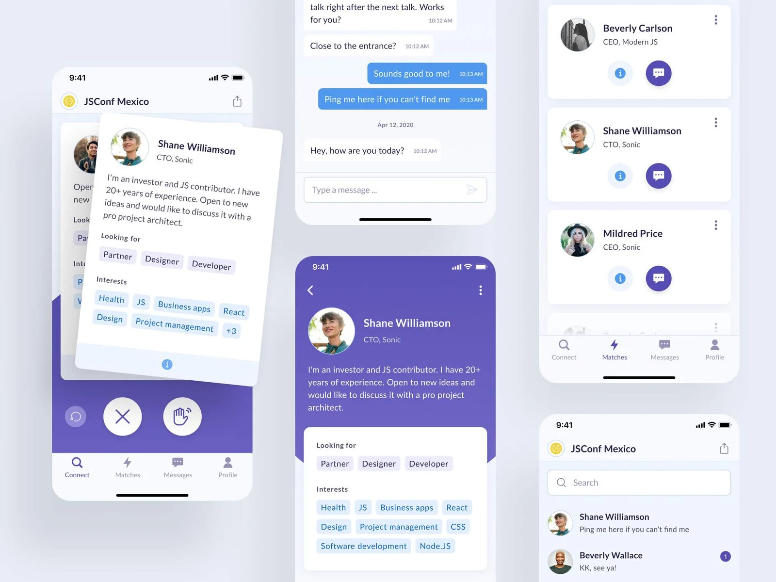
We've started from the attendee user role and created mobile screens. After several user testing sessions through clickable Figma prototype we've got approval and expanded the design to tablet and desktop. All the screens were split by features and device.


Logo design
During the UI phase, we've also developed a logo that represents communication between people. We used simple shapes of conversation bubbles and avatars or heads.

Role: Organizer
At the next stage of the design process, we focused on the Organizer role. We've designed an experience where the user can create his own conference upload his logo and colors, select available interests & connection types, and then analyze his event using the dashboard.


Custom illustrations
To better explain how the app works and add a more solid look and feel we've created a set of custom illustrations that later were used in the app and marketing website pages.


Marketing website
After we created the product design and handed it off to the dev team, we focused on the marketing website that later we built via Webflow.

Outcome
- Responsive app designs for two user roles, organized by user role, device, and features
- Clickable Figma prototype that allows to go through most of the user flows
- Design system that includes all the components. its states, and clear guidelines
- Branding materials including set of custom illustrations, and animated logo
- Fully responsive cross browser marketing website
- Set of product images for potential customers pitches
Let's innovate together!
We're ready to be your trusted technical partners in your digital innovation journey.
Whether it's modernization or custom software solutions, our team of experts can guide you through best practices and how to build scalable, performant software that lasts.


