Skip to content

A Tale of Form Autofill, LitElement and the Shadow DOM

This article was written over 18 months ago and may contain information that is out of date. Some content may be relevant but please refer to the relevant official documentation or available resources for the latest information.

Many web applications utilize forms in places be it for logging in, making payments, or editing a user profile. As a user of web applications, you have probably noticed that the browser is able to autofill in certain fields when a form appears so that you don't have to do it yourself. If you've ever written an application in Lit though, you may have noticed that this doesn't always work as expected.

The Problem

I was working on a frontend project utilizing Lit and had to implement a login form. In essence these aren’t very complicated on the frontend side of life. You just need to define a form, put some input elements inside of it with the correct type attributes assigned to it, then you hook the form up to your backend, API, or whatever you need to call to authenticate by adding a submit handler.

However, there was an issue. The autocomplete doesn’t appear to be working as expected. Only the username field was being filled, but not the password. When this happened, I made sure to check documentation sites such as MDN and looked at examples. But I couldn’t find any differences between theirs and mine. At some point, I prepared a minimal reproducible example without Lit, and I was able to get the form working fine, so it had to do something with my usage of Lit.

After doing a little bit of research and some testing, I found out this happened because Lit relies very heavily on something known as the Shadow DOM. I don’t believe the Shadow DOM is necessarily supposed to break this functionality. But for most major browsers, it doesn’t play nice with autocomplete for the time being. I experienced slightly different behavior in all browsers, and the autocomplete even worked under Shadow DOM with Firefox in the Lit app I was working on.

The solution I ended up settling on was ensuring the form was contained inside of the Light DOM instead of the Shadow DOM, whilst also allowing the Shadow DOM to continue to be used in places where autofillable forms are not present. In this article I will show you how to implement this solution, and how to deal with any problems that might arise from it.

Shadow DOM vs. Light DOM

The Shadow DOM is a feature that provides a way to encapsulate your components and prevent unrelated code and components from affecting them in undesired ways. Specifically, it allows for a way to prevent outside CSS from affecting your components and vice versa by scoping them to a specific shadow root.

When it comes to the Light DOM, even if you’ve never heard of the term, you’ve probably used it. If you’ve ever worked on any website before, and interacted with the standard DOM tree, that is the Light DOM. The Light DOM, and any Shadow DOMs under it for that matter, can contain Shadow DOMs inside of them attached to elements. When you add a Lit component to a page, a shadow root will get attached to it that will contain its subelements, and prevent CSS from outside of that DOM from affecting it.

Using Light DOM with Certain Web Components

By default, Lit attaches a shadow root to all custom elements that extend from LitElement. However, web components don’t actually require a shadow root to function. We can do away with the shadow root by overriding the createRenderRoot method, and returning the web component itself:

createRenderRoot(): ShadowRoot | this {
  return this;
}

Although we can just put this method in any element we want exposed into the Light DOM. We can also make a new component called LightElement that overrides this method that we can extend from instead of LitElement on our own components. This will be useful later when we tackle another problem.

Uh oh, where did my CSS styling and slots go?

The issue with not using a shadow root is Lit has no way to encapsulate your component stylesheets anymore. As a result, your light components will now inherit styles from the root that they are contained in. For example, if your components are directly in the body of the page, then they will inherit all global styles on the page. Similarly when your light components are inside of a shadow root, they will inherit any styles attached to that shadow root.

To resolve this issue, one could simply add style tags to the HTML template returned in the render() method, and accept that other stylesheets in the same root could affect your components. You can use naming conventions such as BEM for your CSS classes to mitigate this for the most part. Although this does work and is a very pragmatic solution, this solution does pollute the DOM with multiple duplicate stylesheets if more than one instance of your component is added to the DOM.

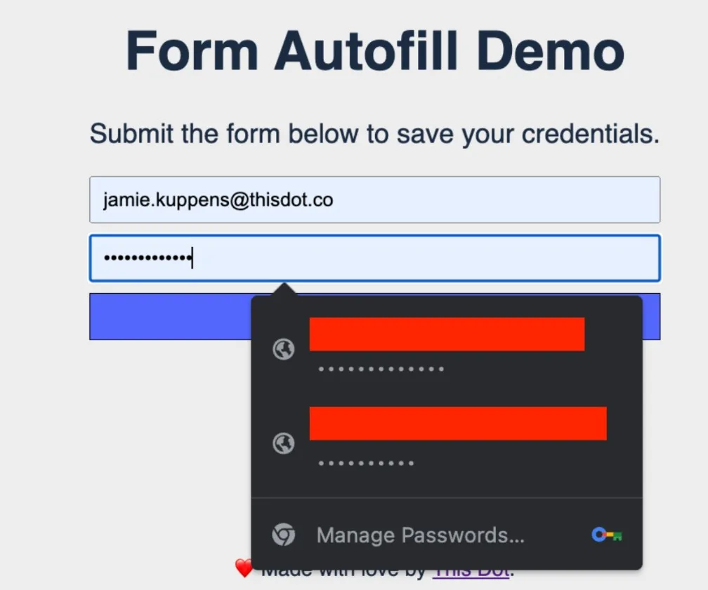
Now, with the CSS problem solved, you can now have a functional Lit web component with form autofill for passwords and other autofillable data! You can view an example using this solution here.

Screenshot 2023-05-23 155514

A Better Approach using Adopted Stylesheets

For a login page where only one instance of the component is in the DOM tree at any given point, the aforementioned solution is not a problem at all. However, this can become a problem if whatever element you need to use the Light DOM with is used in lots of places or repeated many times on a page. An example of this would be a custom input element in a table that contains hundreds of rows. This can potentially cause performance issues, and also pollute the CSS inspector in your devtools resulting in a suboptimal experience both for users and yourself.

The better, though still imperfect, way to work around this problem is to use the adopted stylesheets feature to attach stylesheets related to the web component to the root it is connected in, and reuse that same stylesheet across all instances of the node.

Below is a function that tracks stylesheets using an id and injects them in the root node of the passed in element. Do note that, with this approach, it is still possible for your component’s styles to leak to other components within the same root. And like I advised earlier, you will need to take that into consideration when writing your styles.

export function injectSharedStylesheet(
  element: Element,
  id: string,
  content: string
) {
  const root = element.getRootNode() as DocumentOrShadowRoot;

  if (root.adoptedStyleSheets != null) {
    evictDisconnectedRoots();

    const rootNodes = documentStylesheets[id] ?? [];
    if (rootNodes.find(value => value === root)) {
      return;
    }

    let sharedStylesheet = sharedStylesheets[id];
    if (sharedStylesheet == null) {
      sharedStylesheet = new CSSStyleSheet();
      sharedStylesheet.replaceSync(content);
      sharedStylesheets[id] = sharedStylesheet;
    }

    root.adoptedStyleSheets.push(sharedStylesheet);
    if (documentStylesheets[id] != null) {
      documentStylesheets[id].push(root);
    } else {
      documentStylesheets[id] = [root];
    }
  } else {
    // FALLBACK: Inject <style> manually into the document if adoptedStyleSheets
    // is not supported.

    const target = root === document ? document.head : root;
    if (target?.querySelector(`#${id}`)) {
      return;
    }

    const styleElement = document.createElement('style');
    styleElement.id = id;
    styleElement.appendChild(document.createTextNode(content));

    target.appendChild(styleElement);
  }
}

This solution works for most browsers, and a fallback is included for Safari as it doesn’t support adoptedStylesheets at the time of writing this article. For Safari we inject de-duplicated style elements at the root. This accomplishes the same result effectively.

Let’s go over the evictDisconnectedRoots function that was called inside of the injection function. We need to ensure we clean up global state since the injection function relies on it to keep duplication to a minimum. Our global state holds references to document nodes and shadow roots that may no longer exist in the DOM. We want these to get cleaned up so as to not leak memory. Thankfully, this is easy to iterate through and check because of the isConnected property on nodes.

function evictDisconnectedRoots() {
  Object.entries(documentStylesheets).forEach(([id, roots]) => {
    documentStylesheets[id] = roots.filter(root => root.isConnected);
  });
}

Now we need to get our Lit component to use our new style injection function. This can be done by modifying our LightElement component, and having it iterate over its statically defined stylesheets and inject them. Since our injection function contains the de-duplication logic itself, we don’t need to concern ourselves with that here.

import { CSSResult, LitElement } from 'lit';
import { customElement } from 'lit/decorators.js';
import { injectSharedStylesheet } from './style-injector.js';

export interface SharedStylesheet {
  id: string;
  content: CSSResult;
}

@customElement('light-element')
export class LightElement extends LitElement {
  static sharedStyles: SharedStylesheet[] = [];

  connectedCallback() {
    const { sharedStyles } = this.constructor as any;
    if (sharedStyles) {
      sharedStyles.forEach((stylesheet: SharedStylesheet) => {
        injectSharedStylesheet(
          this,
          stylesheet.id,
          stylesheet.content.toString()
        );
      });
    }

    super.connectedCallback();
  }

  createRenderRoot(): ShadowRoot | this {
    return this;
  }
}

With all that you should be able to get an autocompletable form just like the previous example. The full example using the adopted stylesheets approach can be found here.

Conclusion

I hope this article was helpful for helping you figure out how to implement autofillable forms in Lit. Both examples can be viewed in our blog demos repository. The example using basic style tags can be found here, and the one using adopted stylesheets can be found here.

This Dot is a consultancy dedicated to guiding companies through their modernization and digital transformation journeys. Specializing in replatforming, modernizing, and launching new initiatives, we stand out by taking true ownership of your engineering projects.

We love helping teams with projects that have missed their deadlines or helping keep your strategic digital initiatives on course. Check out our case studies and our clients that trust us with their engineering.

You might also like

Lit 2.0 Released: Building Fast and Lightweight Web Components cover image

Lit 2.0 Released: Building Fast and Lightweight Web Components

In the past months, I've been actively using Web Components to build single-page applications. It has been a great experience so far, not only because I learned a lot about the latest web standards, but also because the web applications ended up being quite fast. The Web Component development story is not something new. In fact, it has been nearly three years since LitElement was introduced as a base class to build Web Components using JavaScript with the addition of great support from TypeScript. On the other hand, lit-html had been released almost four years ago as a way to create small and fast HTML templates in JavaScript. As it was expected, these two worlds evolved favorably. Lit 2.0 was announced as a single library with a major update promising simple and fast Web Components. What's New? Lit 2.0 is coming out with a lot of great new features. Smaller The templating system of Lit 2.0 weights around 2.7 KB minified, and _gzipped_(compressed). Including the component base + reactive elements, it weights 5.8 KB. The previous image shows the bundle size for lit@2.0.0-rc.1 from the BundlePhobia tool. Better This new release also includes several template improvements and a brand new class-based API for creating directives as the below example shows. ` Also, Lit 2.0 introduces the concept of Reactive Controllers which is a powerful primitive for code reuse and composition. A _Reactive Controller_ comes with the ability to "hook" into the component's lifecycle and it has its own creation API. ` In the above code snippet, the component associated with the Reactive Controller instance is called the host component. Faster The Lit team has considered efficient rendering as one of the core values for the library since a good performance is always important when you're building for the web platform. The library authors claim that Lit 2.0 is up to 20% faster on initial rendering and up to 15% faster on updates. Also, it's good to know that Lit templates are efficient in keeping track of the UI, and only updates on re-rendering. These powerful features come along with interoperability in mind: they can work anywhere you use HTML with or without any framework. Server-Side Rendering Yes, Lit 2.0 comes with a server package for rendering Lit templates and components on the server, along with a flexible client-side "hydration". The package name is below @lit-labs/ssr since it's a pre-release software at this time. However, it's expected to support a wide range of use cases: * App rendering frameworks built on top of web components. * Framework-specific plugins for rendering custom elements such as React or Angular. * Integration with static site generators. You can be up-to-date about this server-side rendering support by following the news in this repository. Connect with Lit Lit 2.0 is not only about the cool features that are already described above, it comes along with a brand-new logo, a new website, and a welcoming community. Why Lit? The Web Components written with Lit are natively supported by browsers and they can be a perfect solution to share components across your application. Also, Lit can be a useful solution to create your set of components through the _Design System_ defined by your organization. This is even more helpful when your team uses multiple libraries and frameworks to build applications! Community You can be the first to know the good news about Lit and the upcoming releases. Share your ideas and projects with the community. * Join the conversations on Twitter: @buildWithLit * Send your issues or even better, help with Pull Requests on GitHub * Send your questions and help with technical issues on StackOverflow. Use lit, lit-html and lit-element as the related tags. * Finally, you can be part of lit-and-friends on Slack. Just always remember to be nice to each other! Playground If you are a Developer who really enjoys and thinks through interactive examples, you cannot miss the Lit Playground website, which comes with the classic "Hello World" examples (using JavaScript and TypeScript), and others covering template concepts, directives, and more. Conclusion In case you were using both LitElement and lit-html (like me), it could be a great opportunity to upgrade your code to Lit 2.0. The general idea to do this involves updating the npm packages, importing paths, updating any custom directive, and using the class-based API or even adapt to minor breaking changes. Luckily, there is a guide available for upgrades. If you're new in the world of Web Components, welcome! There is a step-by-step Lit tutorial available too. Feel free to reach out on Twitter if you have any questions. Follow me on GitHub to see more about my work. Be ready for more articles about Lit on this blog....

Web Components Communication Using an Event Bus cover image

Web Components Communication Using an Event Bus

Imagine you're building a Single Page Application using Web Components only. You have several pages, have configured the routes, and need to be able to handle general events or actions. Here's when you start to think about potential solutions as well: Maybe it's time to add state management to the application? Is it a good time to build a "custom" solution? What about using some design patterns in this case? The answers to these questions will depend on the complexity of the current scenario, the experience of the developers, or on the opinions of the team. It is clear that there is no absolute answer! In this article, we'll go over how to communicate between components using a custom Event Bus implementation. What is an Event Bus? The Event Bus idea is generally associated with the Publish-subscribe pattern: > Publish–subscribe is a messaging pattern where senders of messages, called publishers, do not program the messages to be sent directly to specific receivers, called 'subscribers', but instead, categorize published messages into classes without knowledge of subscribers In other words, an Event Bus can be considered as a global way to transport messages or events to make them accessible from any place within the application. Web Components Communication When you're working with Web Components through LitElement, it's usual firing events for sending messages between them. You can use either Standard or Custom events. * Fire a Standard Event using new Event('event') * Fire a Custom Event using new CustomEvent('event', {...options}) For a practical example, let's assume we have two components at this time: The first one could be named as a _parent component_ and the second one as the _child component_ The Child Component The child component is defined as a custom button implementation only. ` The above code snippet does the following: * It creates a model for the data to be passed through a Custom Event. The model is defined as an interface called MyButtonEvent. * Next, the component is created using a TypeScript class with the help of the LitElement decorators * The @customElement decorator allows the component definition using a name for it: my-button. It is applied at the class level. * The static styles attribute defines the styles for the component using a tagged template literal(css) * The @property decorator, which allows declaring properties in a readable way. * The render method returns the HTML content through a template literal(html). This function will be called any time label property changes. Now pay attention to the render() method. It does use the @click binding into the template. And this allows capturing the _click event_ itself in a declarative way. The Parent Component The parent component works as a _container_ since it will be in charge of the custom button rendering. Here's how the template will be using the _child_ component: ` However, in a real-world scenario, this parent component we'll need to handle the child event myClick once it gets fired. ` Find a brief explanation of the previous code snippet before starting to use the Event Bus. * The render function defines a template literal, and makes use of the my-button element using as if it were part of the HTML vocabulary * The @myClick attribute sets a function reference to handle the event in a declarative syntax. * The label attribute sets the text displayed in the button. Anytime it changes, the button will be rendered again. * The handleClick function receives an Event object with more information about it. Open your browser's console, and feel free to inspect this value. In case you require sending data along with the event, the handleClick method can be updated accordingly: ` Event Bus Communication For this example, we can assume that the parent component will act as the "root" of all events to be used through the Event Bus object. Then, let's register an alert event in the constructor method. The purpose of it will be to render an alert message from different places in the application. ` Once you _register_ an event, you can get the Registry object to be able to _unregister_ later. You're ready to go! As a next step, let's dispatch an alert event every time the button gets "clicked". This can be done within the handleClick function: ` Now the Event Bus is working as expected. You can start registering/dispatching other events from other components. They do not need to be related in any way, since the communication channel for this type of event will be the Event Bus. Unregistering from the Event Bus It's important to keep track of the different events you're registering to avoid potential memory leaks in the application. For this example, we'll enable displaying the alert message only for the first time. Other clicks over the "Show Alert" button won't take any effect or dispatch actions through the Event Bus. Let's update the parent component. ` The last line of the handleClick method ensures the _unregistering_ process from the Event Bus. Thus, other calls for the alert event will be ignored. Live Demo Wanna play around with this code? Just open the embedded Stackblitz editor: Conclusion In this article, I described two ways to communicate and pass data between components. * In case the components are related, it is clear that the best way to communicate them is through simple or custom events. * If you're planning to send events across the entire application, no matter the component or the module, then the Event Bus may work for you. In other words, it's a way to just send Events to a common channel without knowing who is going to process the message at the end. Feel free to reach out on Twitter if you have any questions. Follow me on GitHub to see more about my work. Be ready for more articles about Lit in this blog....

Making Seamless Page Transitions with the View Transitions API cover image

Making Seamless Page Transitions with the View Transitions API

Make Seamless Page Transitions using the View Transitions API Traditionally web applications have always had a less polished experience, both functionally and visually speaking, compared to native applications on mobile and other platforms. This has been improving over the years with the introduction of new web APIs and standards. One such new API that bridges that gap is the View Transitions API. What is the View Transitions API? The View Transitions API is a new browser feature that allows developers to more easily create animated transitions between pages and views, similar to how mobile apps have transitions when navigating between pages. Adding view transitions to your application can reduce the cognitive load on your users and make the experience feel less inconsistent. One great thing about view transitions is that they can be used by both SPAs (single-page applications) and MPAs (multi-page applications) alike! Using the View Transitions API for SPAs Let’s see how we can use view transitions ourselves. We will use examples adapted from demos created by the wonderful Jake Archibald and Bramus. There are some alterations to a few of the examples to make them work with the newest version of the View Transitions API, but otherwise, they’re mostly the same. The process of getting view transitions working for SPAs is as simple as calling document.startViewTransition right before starting navigation and replacing your page’s content immediately after that. You need to make this call in your router or in an event listener that triggers your page navigation. The following is an example of how you can hook into page navigation in a vanilla JavaScript application. This example uses the Navigation API if it’s available. As of the time of writing this article only Chromium-based browsers support the Navigation API, but there is a fallback to using a click listener on link elements so that this works with Firefox and Safari. ` If you’re using a framework, then there’s probably a better way to do this specific to that framework than by using this contrived example. For example, if you are implementing usage of this API with a Next application, you may opt for something like next-view-transitions. For this article, we’re going to focus on the way this is done in vanilla JavaScript so that the fundamentals of using the API are understood. Knowing how it’s implemented in vanilla JavaScript should give you enough understanding to implement this in the framework of your choice if there isn’t already a library that does it for you. Now we have a way to know when a navigation is being requested. Using the above utility function we can start the animation and replace our content as follows: ` getMyPageContentSomehow can be any function that returns HTML. How that is implemented will depend on your application and framework of choice. If you want to run these examples on your machine, the demo repository has instructions in its README. In essence, it’s as simple as hosting an HTTP server at the root of the project and visiting localhost. No fancy build system is required! By default, a fade is done that only lasts for a moment. The animation that happens can be configured using CSS with the ::view-transition-group pseudo-element on the element you want to animate, which in our case is the entire page, and we pass in root. ` Given that the animation properties are used, you have much control over what kind of animation to do. You can change the duration and the interpolation, add keyframes and gradients, and even add image masks. You can learn more about the animation properties in CSS on MDN. Using the View Transitions API for MPAs As mentioned, view transitions also work for MPAs with no client-side routing. Setting up view transitions for MPAs is much easier than for SPAs. All you have to do is include the CSS rule on all pages where you want the animations. ` Of course, like how it works with SPAs, you can customize the animations to your heart’s content using the view transition pseudo-elements. Conclusion I hope this article helped you understand the fundamentals of using the View Transitions API. Now that most browsers support it and it’s not too difficult to add it to existing applications, it is a great time to learn how to use it. You can view a full list of examples here (made by Jake Archibald and Bramus) if you want to see how advanced the animations can get. I like the Star Wars ones especially. The README explains how to get all the examples up and running (a total of 43!)....

What does it actually look like to build software with AI today? Not in theory, but in practice. cover image

What does it actually look like to build software with AI today? Not in theory, but in practice.

What does it actually look like to build software with AI today? Not in theory, but in practice. At the Leadership Exchange, this was the question at the center of the Developer Panel, where leaders from across the industry unpacked what’s really changing inside engineering teams and what organizations need to do right now to keep up. The Developer Panel at the Leadership Exchange explored the cutting edge of AI in software engineering and examined what organizations should focus on today to prepare for the future. Moderated by Jeff Cross, Co-Founder & CEO at Nx, the panel featured Victor Savkin, Cofounder & CTO at Nx, Alex Sover, Vice President of Engineering at OpenAP, Brent Zucker, Senior Director of Engineering at Visa, and Jonathan Fontanez, AI Engineering Lead at This Dot Labs. Panelists shared insights into how AI is transforming the software development lifecycle and how teams can adopt tools effectively while preparing for organizational change. Panelists discussed emerging workflows, including CI-in-the-loop, agentic healing, and context engineering. They examined how validation, code reviews, and PRDs are evolving alongside AI capabilities and how teams are integrating external sources such as production traces to improve quality and reliability. The discussion also covered what the next generation of agentic tools might look like and how these capabilities will shape engineering practices in the near future. Adoption of AI comes with challenges. Teams often rely on plugins or extensions without foundational understanding, and individual contributors may fear displacement. Panelists emphasized that education, governance, and skill-building are essential for teams to manage AI agents effectively while maintaining quality. They also highlighted the need to standardize workflows and ensure organizational alignment to fully leverage AI capabilities. The conversation extended beyond technical challenges to organizational implications. Panelists discussed how teams can avoid issues like Conway’s Law, manage distributed teams effectively, and evolve engineering practices alongside AI adoption. Leadership and management strategies play a crucial role in ensuring that AI integration delivers meaningful outcomes while maintaining efficiency and alignment with business objectives. Key Takeaways - AI workflows require both technical and organizational preparation. - Education, governance, and skill development are essential for successful implementation. - Forward-looking teams are rethinking validation, CI pipelines, and context management to fully leverage agentic AI. The discussion highlighted that adopting AI at the cutting edge is not just about new tools - it is about rethinking processes, workflows, and organizational culture. Companies that embrace this holistic approach are most likely to succeed in leveraging AI to its full potential. Are you interested in more conversations like this? Message us for an invite to the next, or for a private discussion around these topics. Tracy can be reached at tlee@thisdot.co....

Let's innovate together!

We're ready to be your trusted technical partners in your digital innovation journey.

Whether it's modernization or custom software solutions, our team of experts can guide you through best practices and how to build scalable, performant software that lasts.

Prefer email? hi@thisdot.co