Animations in Svelte
Animations are more present than ever in our websites and applications. They can make them look and feel different if done right, engaging your users. In this post, we'll learn how animations can be used in Svelte, and how you can extend those that are shipped with the library.
Modules
Svelte ships a series of modules that will help us while creating animations. We'll explore each of these to understand what they do.
- animate
- easing
- motion
- transition
svelte/easing
This package contains a series of functions with equations to produce different easing curves Available curves are:
- back
- bounce
- circ
- cubic
- elastic
- expo
- quad
- quart
- quint
- sine
But you can create your custom function as long as it's a function that will accept 1 parameter varying from 0 to 1 (1 represents the total duration of the animation) and returns another value, also ranging from 0 to 1.
svelte/motion
Two functions are exported in this package: tweened and spring.
Both of them will return a reactive value, interpolating in-between values given a set of parameters.
Note that these functions do not necessarily animate anything visually, but rather, create a ramp between values. These values can then be displayed or assigned to something else, like CSS properties.
Both functions can interpolate numbers, dates, arrays, and objects. You can also provide a different function for interpolating values.
tweened
Let's initialize a new Svelte app to see how it works.
npm init vite

✔ Project name: · svelte-animations
✔ Select a framework: · svelte
✔ Select a variant: · svelte-ts

cd svelte-web-components
pnpm install //use the package manager you prefer
pnpm run dev

// remove default Counter component
rm src/lib/Counter.svelte
Clear the App.svelte component to contain only what we need now.
<script>
	// add imports here
</script>

<main>
</main>

<style>
  :root {
    font-family: -apple-system, BlinkMacSystemFont, 'Segoe UI', Roboto, Oxygen,
      Ubuntu, Cantarell, 'Open Sans', 'Helvetica Neue', sans-serif;
  }

  main {
    text-align: center;
    padding: 1em;
    margin: 0 auto;
  }

  :global(main > * + *)  {
    margin-top: 24px;
  }
</style>
I'll create a new component named Tasks.svelte inside the lib folder.
<script lang="ts">
  import { tweened } from 'svelte/motion';
  export let tasks: { id; title; date }[] = [];

  let selected;
  tasks = tasks.sort((a, b) => {
    if (a.date > b.date) {
      return 1;
    } else if (a.date === b.date) {
      return 0;
    } else {
      return -1;
    }
  });

  function pad(num) {
    if (num < 10) {
      return `0${num}`;
    }
    return num;
  }

  function getDate(date) {
    return date
      ? `${date.getFullYear()}/${pad(date.getMonth() + 1)}/${pad(
          date.getDate(),
        )}`
      : '';
  }

  function getTime(date) {
    return date ? `${pad(date.getHours())}:${pad(date.getMinutes())}` : '';
  }

  let now = new Date();
  let date = tweened(now, { duration: 500 });

  function selectTask(task) {
    selected = task.id;
    date.set(task.date);
  }
</script>

<div class="task-view">
  <div class="task-list">
    <h2>Next tasks</h2>
    <ul>
      {#each tasks as task}
        <li
          class={selected === task.id ? 'selected' : ''}
          on:click={() => selectTask(task)}
        >
          {task.title}
        </li>
      {/each}
    </ul>
  </div>
  <div class="task-details">
    <h2>When?</h2>
    {#if selected}
      <p>{getDate($date)}</p>
      <p>{getTime($date)}</p>
    {/if}
  </div>
</div>

<style>
  .task-view {
    display: flex;
    flex-direction: row;
    justify-content: space-between;
    width: 300px;
    border: 2px solid #4f4f4f;
    border-radius: 8px;
    padding: 16px;
  }
  li {
    padding: 4px 8px;
  }
  li.selected {
    background-color: lightcyan;
  }
  li:hover {
    background-color: lightgray;
  }
</style>
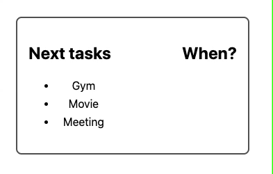
The component will receive a list of tasks with a title and date, and then we'll create a transition between these dates when clicking any of them. (Look at how we auto-subscribe to the reactive value, prepending the variable name with $)
Let's update the App to use this component.
<script lang="ts">
  import Tasks from './lib/Tasks.svelte';

  let tasks = [
    { id: 1, title: 'Meeting', date: new Date('2021-12-17T03:24:00') },
    { id: 2, title: 'Gym', date: new Date('2021-08-22T09:12:00') },
    { id: 3, title: 'Movie', date: new Date('2021-09-01T22:07:00') },
  ];
</script>

<main>
  <Tasks {tasks} />
</main>
<!-- ... -->
And the result looks like this:
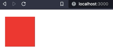
In this example we are animating the value, but we can also apply these changes to CSS properties.
Let's create another example that achieves this. (Tweened.svelte).
<script>
  import { tweened } from 'svelte/motion';
  import { cubicOut } from 'svelte/easing';

  const toColor = tweened([255, 0, 0], {
    duration: 2000,
    easing: cubicOut,
  });

  let loop = () =>
    toColor
      .set([255, 0, 0])
      .then(() => toColor.set([0, 255, 0]))
      .then(() => toColor.set([0, 0, 255]))
      .then(() => loop());
  loop();
</script>

<div style={'background-color:rgb(' + $toColor.join(',') + ')'} />

<style>
  div {
    display: block;
    width: 100px;
    height: 100px;
  }
</style>
Here, we created a single div, and use tweened to interpolate values of an array.
When we set the value using the set function, it will return a promise that resolves when the final value is reached (for our purposes, the animation has ended). Then, we trigger a new value using set again. We can see in action how we can interpolate array values.
We must remember to update our application
<script lang="ts">
// ...
  import Tweened from './lib/Tweened.svelte';
// ...
</script>

<main>
  <!-- ... -->
  <Tweened />
</main>
The possible parameters for tweened are: delay (time before starting), duration (in milliseconds), easing (one of the easing functions shown before), interpolate (a (from, to) => t => value) function
Spring
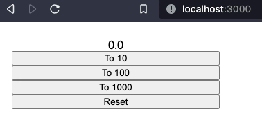
Spring works differently to transition a variable from one value to another. We can set three parameters: stiffness, damping, which will set how the spring behaves while settling in the final value, and precision, which will determine when the value is considered settled.
Let's create a new component named Spring.svelte
<script>
	import { spring } from 'svelte/motion';

	const number = spring(0,{
	stiffness: 0.1,
	damping: 0.08
});

function changeValueTo(newValue) {
	number.set(newValue)
}

function resetValue() {
	number.set(0, {hard:true})
}

</script>

<div>
	<span>{$number.toFixed(1)}</span>
	<button on:click={() => changeValueTo(10)}>To 10</button>
	<button on:click={() => changeValueTo(100)}>To 100</button>
	<button on:click={() => changeValueTo(1000)}>To 1000</button>
	<button	 on:click={() => resetValue()}>Reset</button>
</div>

<style>
	div {
		display: flex;
		flex-direction:column;
		max-width:300px;
	}
</style>
Our component has a number reactive value that will bounce when changed until finally settling in the desired result. The larger the distance to the target value, the more it will bounce.
We need to update our app to import the component.
<script lang="ts">
// ...
  import Spring from './lib/Spring.svelte';
// ...
</script>

<main>
  <!-- ... -->
  <Spring />
</main>
This is what the final result looks like.
svelte/transition
A transition is a function with the following signature:
(node: HTMLElement, params: any) => {
	delay?: number,
	duration?: number,
	easing?: (t: number) => number,
	css?: (t: number, u: number) => string,
	tick?: (t: number, u: number) => void
}
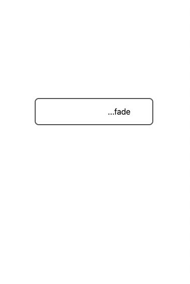
The svelte/transition module includes a series of functions that will let us animate our DOM: blur, draw, fade, fly, scale, slide and crossfade(this last function returns two transition functions)
They are used with the transition, in, or out directives.
Transition is executed when the element enters or leaves the DOM. Four events are available with this directive introstart, introend, outrostart, outroend they are triggered whenever the initial or final animations start and end.
The in and out directives work like transition, but they only act when either the element is added or removed.
Create a new component named Transition.svelte.
<script lang="ts">
  import { onDestroy, onMount } from 'svelte';
  import {
    blur,
    crossfade,
    draw,
    fade,
    fly,
    scale,
    slide,
  } from 'svelte/transition';

  let show = false;
  let interval;

  let [from, to] = crossfade({
    fallback: () => {
      return { css: (t, u) => 'color:red' };
    },
  });

  onMount(() => {
    interval = setInterval(() => {
      show = !show;
    }, 2000);
  })

  onDestroy(() => {
	if (interval) {
	  clearInterval(interval);
    }
  });
</script>

<div class="playground">
  <div class="transition-item">
    <svg
      fill="#ffffff"
      width="32"
      height="32"
      viewBox="0 0 16 16"
      xmlns="http://www.w3.org/2000/svg"
    >
      {#if show}
        <path
          in:draw={{ duration: 1500 }}
          d="M1.414213562373095 0 16 14.585786437626904 L14.585786437626904 16 L0 1.414213562373095"
        />
        <path
          in:draw={{ duration: 1500 }}
          d="M14.585786437626904 0 L16 1.414213562373095 L1.414213562373095 16 L0 14.585786437626904"
        />
      {/if}
    </svg>
  </div>
  <div class="transition-item teleport">
    <div>
      {#if show}
        <span in:from={{ key: 'a' }} out:to={{ key: 'a' }}>cross...</span>
      {/if}
    </div>
    <div>
      {#if !show}
        <span in:from={{ key: 'a' }} out:to={{ key: 'a' }}>...fade</span>
      {/if}
    </div>
  </div>

  {#if show}
    <div class="transition-item" transition:blur>
      <span>Blur</span>
    </div>
    <div class="transition-item" transition:fade>
      <span>Fade</span>
    </div>
    <div class="transition-item" transition:fly={{ x: 30 }}>
      <span>Fly</span>
    </div>
    <div class="transition-item" transition:scale={{ start: 10 }}>
      <span>Scale</span>
    </div>
    <div class="transition-item" transition:slide>
      <span>Slide</span>
    </div>
  {/if}
</div>

<style>
  .teleport {
    display: flex;
    flex-direction: row;
    justify-content: center;
    width: 200px;
    margin-left:auto;
    margin-right:auto;
    border: 2px solid #4f4f4f;
    border-radius: 8px;
    padding: 16px;

  }
  .teleport > div {
      width: 100px;
    }

  svg {
    height: 128px;
    width: 128px;
  }

  path {
    stroke: black;
  }

  .transition-item + .transition-item {
    margin-top: 40px;
  }
</style>
I've added all of the provided animations to this example, so you can play around with them.
Custom transitions
We can create custom transitions by creating a function that accepts an HTML element, and a configuration object, and returns an object with the required properties.
We'll create a new function called skew.
export function skew(node: HTMLElement, {delay = 0, duration = 1000, easing = cubicInOut, deg = 45} = {}) {
        const style = getComputedStyle(node);
        const target_opacity = +style.opacity;
        const transform = style.transform === 'none' ? '' : style.transform;
        return {
            delay,
            duration,
            easing,
            css: (_t, u) => `
                transform: ${transform} skew(${deg * u}deg);
                opacity: ${target_opacity * _t}
            `
        };
}
delay, duration, and easing are pretty standard to all shipped functions, so we'll keep them the same for ease of use. The magic happens in our css property. Based on our parameters, we will add the skew transform. u is nothing but 1-_t, so in this case, we will start from deg (skew is applied) to 0 (no skew) when the element is shown.
The opposite will happen when removed.
Let's test it by creating a new component. (Skew.svelte)
<script lang="ts">
  import { onDestroy, onMount } from 'svelte';
  import { skew } from './skew';

  export let skewOptions = {};

  let show = false;
  let interval;

  onMount(() => {
    interval = setInterval(() => {
      show = !show;
    }, 2000);
  });

  onDestroy(() => {
    if (interval) {
      clearInterval(interval);
    }
  });
</script>

<div class="playground">
  {#if show}
    <div class="transition-item" transition:skew={skewOptions}>
      <span>Skew</span>
    </div>
  {/if}
</div>

svelte/animate
This package exports a single function: flip.
Animations are to be used with the animate directive.
Note that there is a requirement to use this directive. The element that uses the animate directive must be the immediate child of a keyed each block.
Animations are triggered when the elements of an each block are reordered.
The signature of an animation is:
(node: HTMLElement, { from: DOMRect, to: DOMRect } , params: any) => {
	delay?: number,
	duration?: number,
	easing?: (t: number) => number,
	css?: (t: number, u: number) => string,
	tick?: (t: number, u: number) => void
}
As you can see the signature is very similar to those of the transitions. We'll make use of this similarity later.
Create a new component to test what flip and the animate directive do.
<!-- Flip.svelte -->

<script lang="ts">
  import { flip } from 'svelte/animate';
  let things = [
    { id: 1, name: 'foo', ready: true },
    { id: 2, name: 'bar', ready: false },
    { id: 3, name: 'baz', ready: true },
    { id: 4, name: 'fizz', ready: false },
  ];
  let sortBy = { field: 'id', order: 'DESC' };

  let sortedThings = things;

  function sortById() {
    if (
      sortBy.field !== 'id' ||
      (sortBy.field === 'id' && sortBy.order === 'DESC')
    ) {
      sortedThings = things.sort((a, b) => {
        if (a.id > b.id) {
          return 1;
        } else if (a.id < b.id) {
          return -1;
        }
        return 0;
      });
      sortBy = { field: 'id', order: 'ASC' };
    } else {
      sortedThings = things.sort((a, b) => {
        if (a.id > b.id) {
          return -1;
        } else if (a.id < b.id) {
          return 1;
        }
        return 0;
      });
      sortBy = { field: 'id', order: 'DESC' };
    }
  }
  function sortByName() {
    if (
      sortBy.field !== 'name' ||
      (sortBy.field === 'name' && sortBy.order === 'DESC')
    ) {
      sortedThings = things.sort((a, b) => {
        if (a.name > b.name) {
          return 1;
        } else if (a.name < b.name) {
          return -1;
        }
        return 0;
      });
      sortBy = { field: 'name', order: 'ASC' };
    } else {
      sortedThings = things.sort((a, b) => {
        if (a.name > b.name) {
          return -1;
        } else if (a.name < b.name) {
          return 1;
        }
        return 0;
      });
      sortBy = { field: 'name', order: 'DESC' };
    }
  }
  function sortByReadyState() {
    if (
      sortBy.field !== 'ready' ||
      (sortBy.field === 'ready' && sortBy.order === 'DESC')
    ) {
      sortedThings = [
        ...sortedThings.filter((x) => x.ready),
        ...sortedThings.filter((x) => !x.ready),
      ];
      sortBy = { field: 'ready', order: 'ASC' };
    } else {
      sortedThings = [
        ...sortedThings.filter((x) => !x.ready),
        ...sortedThings.filter((x) => x.ready),
      ];
      sortBy = { field: 'ready', order: 'DESC' };
    }
  }
</script>

<div class="container">
  <table>
    <tr>
      <th on:click={sortById}>id</th>
      <th on:click={sortByName}>name</th>
      <th on:click={sortByReadyState}>ready</th>
    </tr>
    {#each sortedThings as thing (thing.id)}
      <tr animate:flip>
        <td>{thing.id}</td>
        <td>
          {thing.name}
        </td>
        <td><input type="checkbox" bind:checked={thing.ready} /></td>
      </tr>
    {/each}
  </table>
</div>

<style>
  td {
    width: 100px;
  }
  .container {
    width: 100vw;
    display: flex;
    flex-direction: row;
  }
  table,
  tr,
  td,
  th {
    border: 1px solid gray;
    border-collapse: collapse;
  }
  th {
    cursor: pointer;
  }
</style>
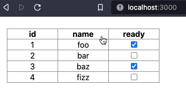
We created a table with 4 rows, and the ability to order rows by different properties.
The elements are inside a keyed each block (remember this is a requirement).
One of the cool things about the animate directive is that only the items that change will be animated. The rest will remain like they were.
The result looks like this.
extending and reusing animations with transitions
Because transitions and animations are so similar, we can use transitions to extend flip or create new animations.
animations from transitions
If we look at both types of functions, we can see that we are able to create a wrapper function to convert our transition into an animation.
export function toAnimation<T>(
  fn: (node: HTMLElement, params) => T,
): (node: HTMLElement, { from, to }, params) => T {
  return (node, _animations, params = {}) => {
    return fn(node, params);
  };
}
Then, we can convert one of our transitions, and apply it with the animate directive.
<!--AnimationFromTransition.svelte -->
<script>
  import { fade } from 'svelte/transition';
  import { toAnimation } from './toAnimation';

  let fadeAnimation = toAnimation(fade);

 // ... same as Flip.svelte
</script>

<div class="container">
  <table>
    <tr>
      <th on:click={sortById}>id</th>
      <th on:click={sortByName}>name</th>
      <th on:click={sortByReadyState}>ready</th>
    </tr>
    {#each sortedThings as thing (thing.id)}
      <tr animate:fadeAnimation={{ duration: 400 }}>
        <td>{thing.id}</td>
        <td>
          {thing.name}
        </td>
        <td><input type="checkbox" bind:checked={thing.ready} /></td>
      </tr>
    {/each}
  </table>
</div>

<style>
  /* same as Flip.svelte*/
</style>
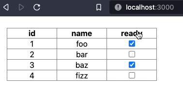
Now, instead of moving, reordered elements fade in/out.
Extending flip
We can also extend the flip animation with transitions. I'll create a wrapper function again.
// extendFlip.ts

import { flip } from 'svelte/animate';
export function extendFlip(fn) {
  return (node, animations, params = {}) => {
    let flipRes = flip(node, animations, params);
    let transitionRes = fn(node, params);

    let getTransform = (str) => {
      let results = str.match(/transform: (.*);/);
      if (results && results.length) {
        return results[results.length - 1];
      }
      return '';
    };

    let mergeTransform = (css1, css2) => {
      return `transform: ${getTransform(css1)} ${getTransform(css2)};`;
    };

    return {
      ...flipRes,
      css: (t, u) =>
        `${transitionRes.css(t, u)}; ${mergeTransform(
          flipRes.css(t, u),
          transitionRes.css(t, u),
        )};`,
    };
  };
}
Our function will get the transition function, and merge the transform property it returns with the one from flip.
Now, let's look at a slightly modified version of the previous component:
<script>
  import { scale, blur } from 'svelte/transition';
  import { extendFlip } from './extendFlip';

  let flipAndBlur = extendFlip(blur);
  let flipAndScale = extendFlip(blur);

  let things = [
    { id: 1, name: 'foo', ready: true },
    { id: 2, name: 'bar', ready: false },
    { id: 3, name: 'baz', ready: true },
    { id: 4, name: 'fizz', ready: false },
  ];

  let sortBy = { field: 'id', order: 'DESC' };

  let sortedThings = things;

  function sortById() {
    if (
      sortBy.field !== 'id' ||
      (sortBy.field === 'id' && sortBy.order === 'DESC')
    ) {
      sortedThings = things.sort((a, b) => {
        if (a.id > b.id) {
          return 1;
        } else if (a.id < b.id) {
          return -1;
        }
        return 0;
      });
      sortBy = { field: 'id', order: 'ASC' };
    } else {
      sortedThings = things.sort((a, b) => {
        if (a.id > b.id) {
          return -1;
        } else if (a.id < b.id) {
          return 1;
        }
        return 0;
      });
      sortBy = { field: 'id', order: 'DESC' };
    }
  }
  function sortByName() {
    if (
      sortBy.field !== 'name' ||
      (sortBy.field === 'name' && sortBy.order === 'DESC')
    ) {
      sortedThings = things.sort((a, b) => {
        if (a.name > b.name) {
          return 1;
        } else if (a.name < b.name) {
          return -1;
        }
        return 0;
      });
      sortBy = { field: 'name', order: 'ASC' };
    } else {
      sortedThings = things.sort((a, b) => {
        if (a.name > b.name) {
          return -1;
        } else if (a.name < b.name) {
          return 1;
        }
        return 0;
      });
      sortBy = { field: 'name', order: 'DESC' };
    }
  }
  function sortByReadyState() {
    if (
      sortBy.field !== 'ready' ||
      (sortBy.field === 'ready' && sortBy.order === 'DESC')
    ) {
      sortedThings = [
        ...sortedThings.filter((x) => x.ready),
        ...sortedThings.filter((x) => !x.ready),
      ];
      sortBy = { field: 'ready', order: 'ASC' };
    } else {
      sortedThings = [
        ...sortedThings.filter((x) => !x.ready),
        ...sortedThings.filter((x) => x.ready),
      ];
      sortBy = { field: 'ready', order: 'DESC' };
    }
  }
</script>

<div class="container">
  <table>
    <tr>
      <th on:click={sortById}>id</th>
      <th on:click={sortByName}>name</th>
      <th on:click={sortByReadyState}>ready</th>
    </tr>
    {#each sortedThings as thing (thing.id)}
      <tr animate:flipAndBlur>
        <td>{thing.id}</td>
        <td>
          {thing.name}
        </td>
        <td><input type="checkbox" bind:checked={thing.ready} /></td>
      </tr>
    {/each}
  </table>
</div>

<style>
  td {
    width: 100px;
  }
  .container {
    width: 100vw;
    display: flex;
    flex-direction: row;
  }
  table,
  tr,
  td,
  th {
    border: 1px solid gray;
    border-collapse: collapse;
  }
  th {
    cursor: pointer;
  }
</style>
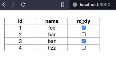
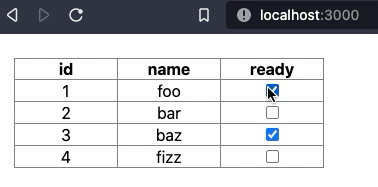
And the results:
Blur + flip
Scale + flip
Final words
Svelte did a great job making animations and transitions easy with their API. The provided functions work great in many scenarios.
I hope this blog post invites you to explore the API, extend what's already there, and share it with other users. These examples are available in this repo.