Skip to content

Exploring Open Props and its Capabilities

Exploring Open Props and its Capabilities

This article was written over 18 months ago and may contain information that is out of date. Some content may be relevant but please refer to the relevant official documentation or available resources for the latest information.

Exploring Open Props and its Capabilities

With its intuitive approach and versatile features, Open Props empowers you to create stunning designs easily. It has the perfect balance between simplicity and power. Whether you're a seasoned developer or just starting, Open Props makes styling websites a breeze. Let's explore how Open Props can help your web development workflow.

What is Open Props

Open Props is a CSS library that packs a set of CSS variables for quickly creating consistent components using “Sub-Atomic” Styles. These web design tokens are crafted to help you get great-looking results from the start using consistent naming conventions and providing lots of possibilities out-of-the-box. At the same time, it's customizable and can be gradually adopted.

Installing open props

There are many ways to get started with open props, each with its advantages. The library can be imported from a CDN or installed using npm. You can import all or specific parts of it, and for greater control of what's bundled or not, you can use PostCSS to include only the variables you used.

From Zero to Open Props

Let's start with the simplest way to test and use open props. I'll create a simple HTML file with some structure, and we'll start from there. Create an index.html file.

mkdir site
touch site/index.html

Edit the content of your HTML file. In this example, we’ll create a landing page containing a few parts: a hero section, a section for describing the features of a service, a section for the different pricing options available and finally a section with a call to action. We’ll start just declaring the document structure. Next we’ll add some styles and finally we’ll switch to using open props variables.

<!DOCTYPE html>
<html lang="en">
<head>
    <meta charset="UTF-8">
    <meta name="viewport" content="width=device-width, initial-scale=1.0">
    <title>Super SaaS</title>
</head>
<body>
    <main>
        <!-- Hero Section -->
       <section class="hero">
            <h1>Super Saas</h1>
            <p>Experience the power of our innovative software solution.</p>
            <a href="#" class="btn">Get Started</a>
        </section>

       <!-- Features Section -->
       <section class="features">
            <div class="feature">
                <img src="feature1.png" alt="Feature 1">
                <h2>Feature 1</h2>
                <p>Lorem ipsum dolor sit amet, consectetur adipiscing elit.</p>
            </div>
            <div class="feature">
                <img src="feature2.png" alt="Feature 2">
                <h2>Feature 2</h2>
                <p>Lorem ipsum dolor sit amet, consectetur adipiscing elit.</p>
            </div>
            <div class="feature">
                <img src="feature3.png" alt="Feature 3">
                <h2>Feature 3</h2>
                <p>Lorem ipsum dolor sit amet, consectetur adipiscing elit.</p>
            </div>
        </section>

        <!-- Pricing section -->
        <section class="pricing">
            <h2>Pricing</h2>
            <div class="pricing-plans">
                <div class="pricing-plan">
                    <h3>Basic</h3>
                    <p>Perfect for individuals</p>
                    <p class="price">$9.99/month</p>
                    <ul>
                        <li>Feature 1</li>
                        <li>Feature 2</li>
                        <li>Feature 3</li>
                    </ul>
                    <a href="#" class="btn">Get Started</a>
                </div>
                <div class="pricing-plan">
                    <h3>Pro</h3>
                    <p>Great for small businesses</p>
                    <p class="price">$19.99/month</p>
                    <ul>
                        <li>Feature 1</li>
                        <li>Feature 2</li>
                        <li>Feature 3</li>
                        <li>Feature 4</li>
                    </ul>
                    <a href="#" class="btn">Get Started</a>
                </div>
                <div class="pricing-plan">
                    <h3>Enterprise</h3>
                    <p>For large organizations</p>
                    <p class="price">$49.99/month</p>
                    <ul>
                        <li>Feature 1</li>
                        <li>Feature 2</li>
                        <li>Feature 3</li>
                        <li>Feature 4</li>
                        <li>Feature 5</li>
                    </ul>
                    <a href="#" class="btn">Get Started</a>
                </div>
            </div>
        </section>

        <!-- Call to Action Section -->
        <section class="cta">
            <h2>Ready to get started?</h2>
            <p>Sign up now and unlock the full potential of our SaaS platform.</p>
            <a href="#" class="btn">Sign Up</a>
            </div>
        </section>
    </main>
</body>
</html>

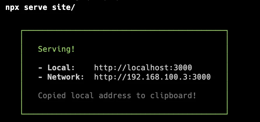
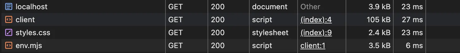
To serve our page, we could just open the file, but I prefer to use serve, which is much more versatile. To see the contents of our file, let's serve our content.

npx serve site

This command will start serving our site on port 3000.

Serving site on port 3000

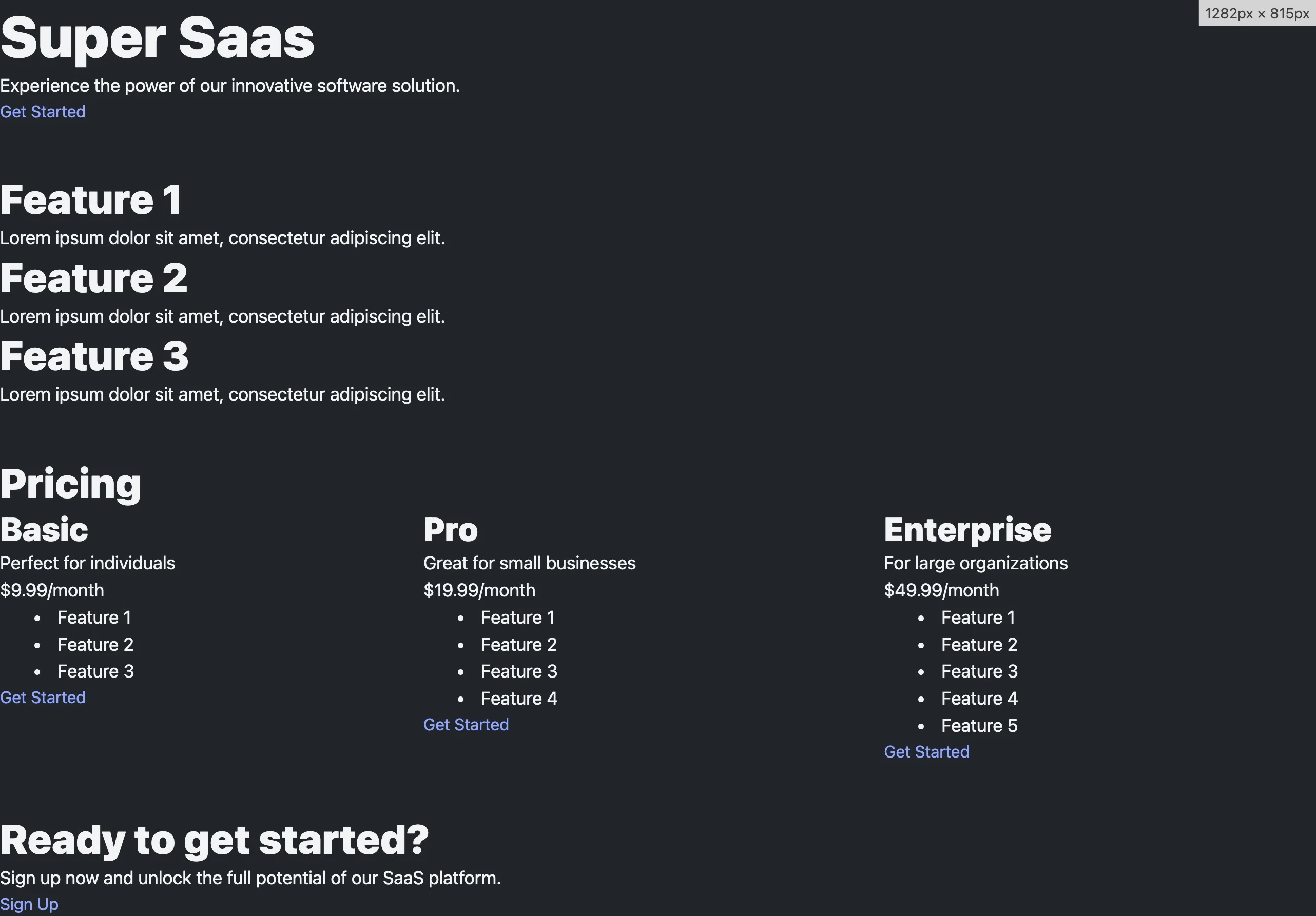
Our site will look something like this:

Site preview

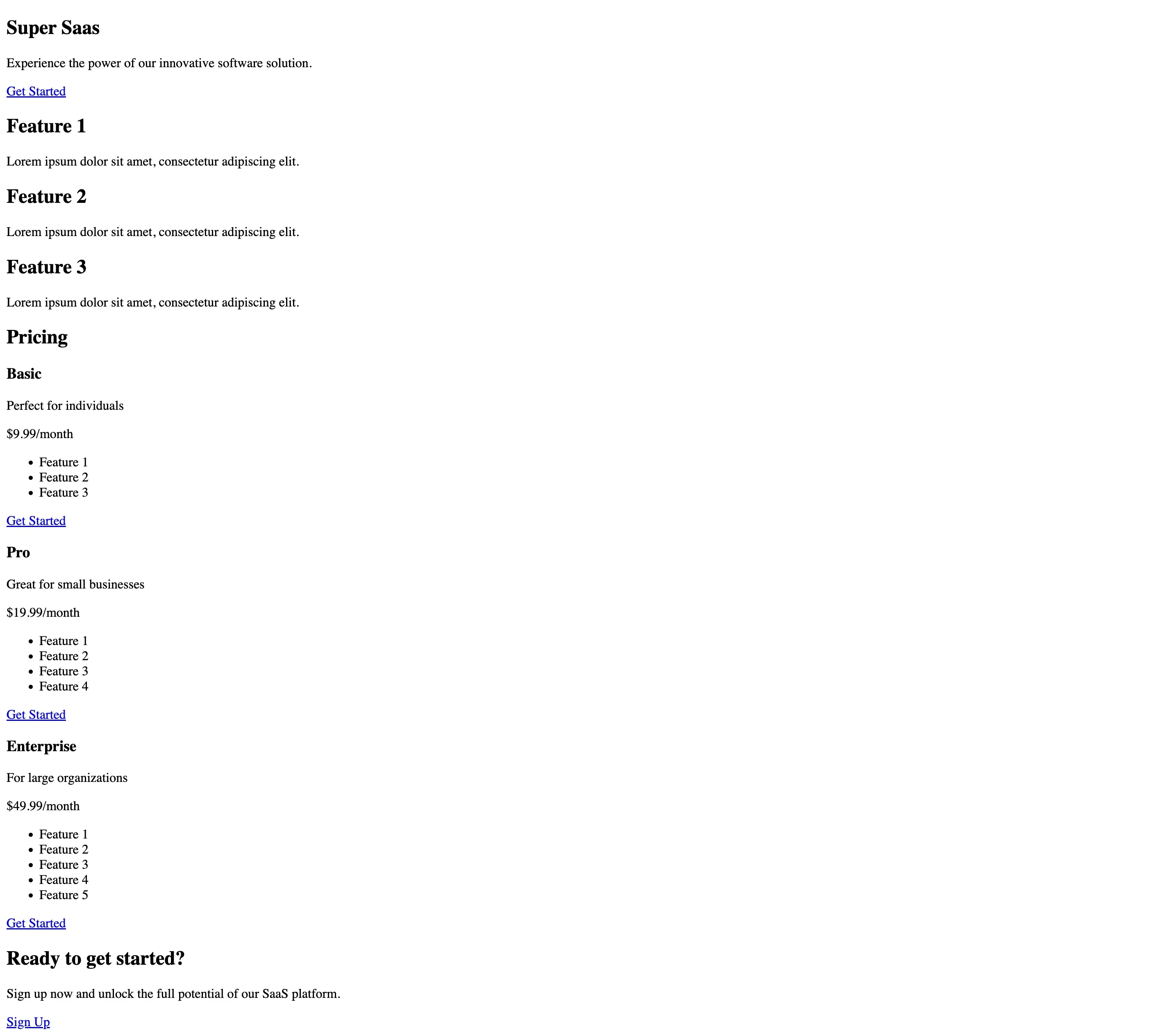
Open-props core does not contain any CSS reset. After all, it’s just a set of CSS variables. This is a good start regarding the document structure.

Adding open props via CDN

Let's add open-props to our project. To get started, add:

<head>
<!-- simplified head content for clarity -->
	<link rel="stylesheet" href="https://unpkg.com/open-props"/>
</head>

This import will make the library's props available for us to use. This is a set of CSS variables. It contains variables for fonts, colors, sizes, and many more. Here is an excerpt of the content of the imported file:

:where(html) {
    --font-sans: system-ui,-apple-system,Segoe UI,Roboto,Ubuntu,Cantarell,Noto Sans,sans-serif,Segoe UI,Roboto,Ubuntu,Cantarell,Noto Sans,sans-serif;
    --font-serif: ui-serif,serif;
    --font-mono: Dank Mono,Operator Mono,Inconsolata,Fira Mono,ui-monospace,SF Mono,Monaco,Droid Sans Mono,Source Code Pro,monospace;
    --font-weight-1: 100;
    --font-weight-2: 200;
    --font-weight-3: 300;
    --font-weight-4: 400;
    --font-weight-5: 500;
    --font-weight-6: 600;
    --font-weight-7: 700;
    --font-weight-8: 800;
    --font-weight-9: 900;
    --font-lineheight-00: .95;
    --font-lineheight-0: 1.1;
    --font-lineheight-1: 1.25;
    --font-lineheight-2: 1.375;
}

The :where pseudo-class wraps all the CSS variables declarations, giving them the least specificity. That means you can always override them with ease. This imported file is all you need to start using open props. It will provide a sensible set of variables that give you some constraints in terms of what values you can use, a palette of colors, etc. Because this is just CSS, you can opt-out by not using the variables provided. I like these constraints because they can help with consistency and allow me to focus on other things. At the same time, you can extend this by creating your own CSS variables or just using any value whenever you want to do something different or if the exact value you want is not there. We should include some styles to add a visual hierarchy to our document.

Working with CSS variables

Let's create a new file to hold our styles.

touch site/styles.css

And add some styles to it. We will be setting a size hierarchy to headings, using open props font-size variables. Additionally, gaps and margins will use the size variables.

h1 {
    font-size: var(--font-size-8)
}
h2 {
    font-size: var(--font-size-6)
}
h3 {
    font-size: var(--font-size-5)
}
.pricing-plans {
    display:flex;
    gap: var(--size-4);
}
.pricing-plan {
    flex-grow:1;
}
section + section {
    margin-block:var(--size-8);
}

We can explore these variables further using open-props’ documentation. It's simple to navigate (single page), and consistent naming makes it easy to learn them. Trying different values sometimes involves changing the number at the end of the variable name. For example: font-size-X, where X ranges from 0 to 8 (plus an additional 00 value). Mapped to font-sizes from 0.5rem up to 3.5rem. If you find your font is too small, you can add 1 to it, until you find the right size. Colors range from 0-12: –red-0 is the lightest one (rgb(255, 245, 245)) while –red-12 is the darkest (rgb(125, 26, 26)). There are similar ranges for many properties like font weight, size (useful for padding and margins), line height and shadows, to name a few. Explore and find what best fits your needs. Now, we need to include these styles on our page.

<head>
<!-- simplified head content for clarity -->
	<link rel="stylesheet" href="https://unpkg.com/open-props"/>
	<link rel="stylesheet" href="/styles.css"/>
</head>

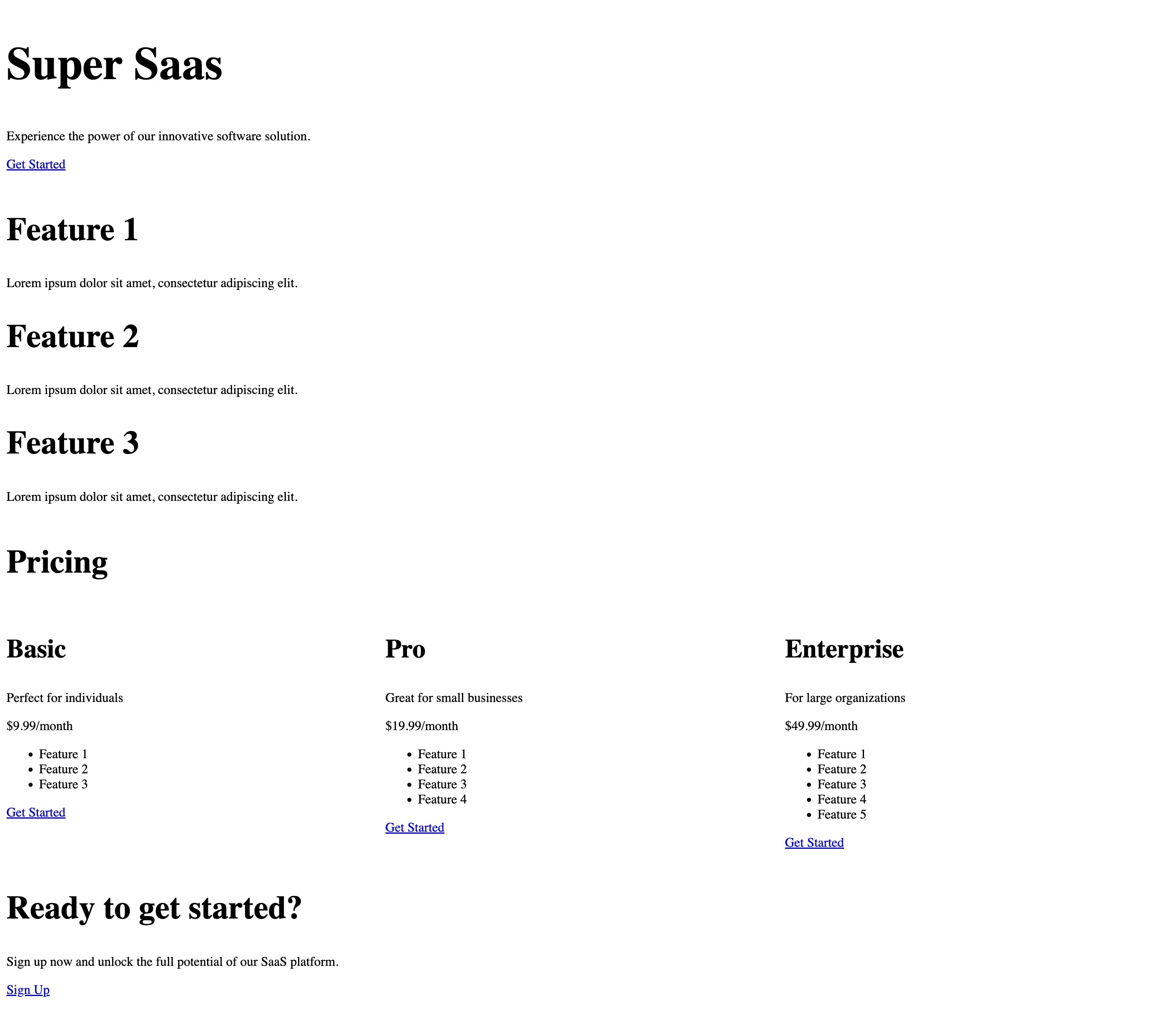
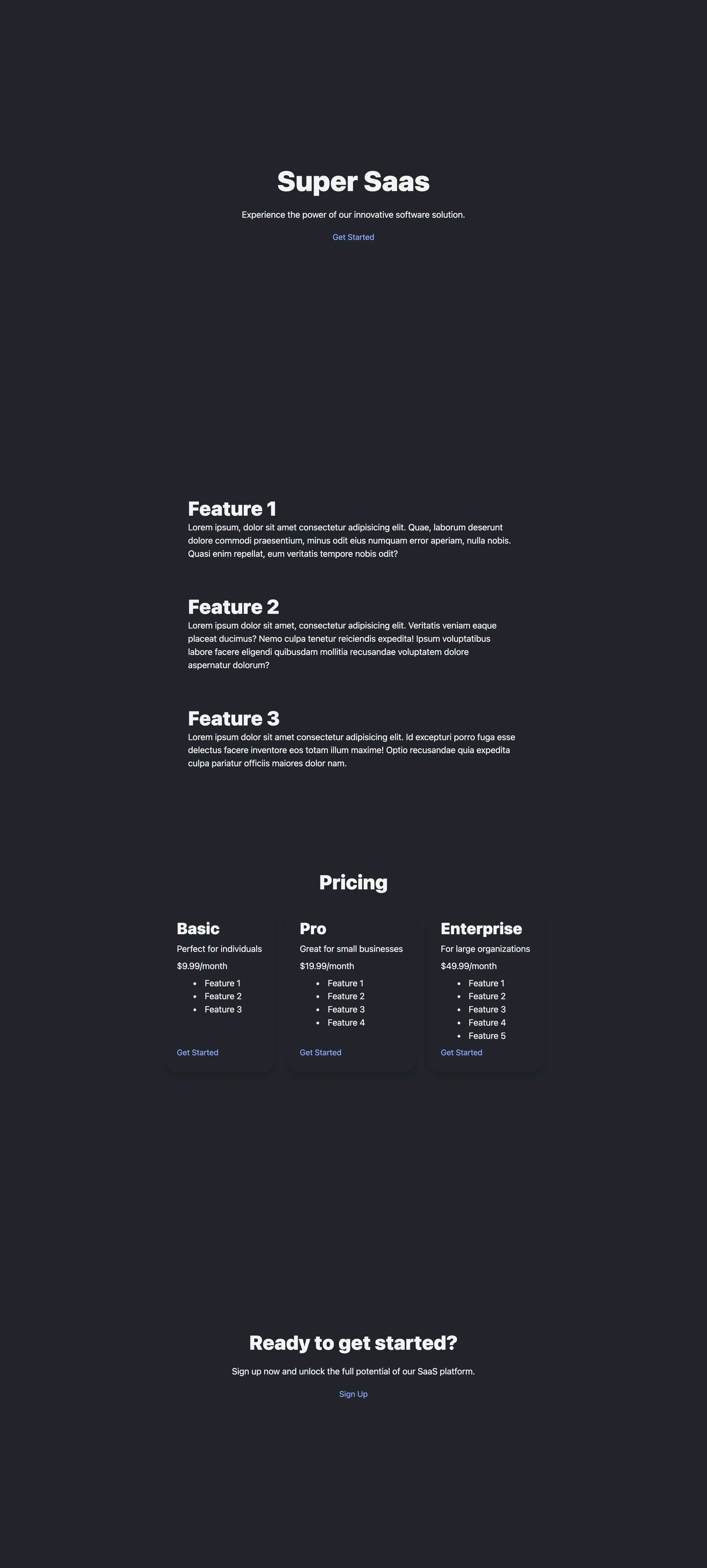
Our page looks better now.

New Site preview

We could keep adding more styles, but we'll take a shortcut and add some defaults with Open Props' built in normalized CSS file. Besides the core of open props (that contains the variables) there’s an optional normalization file that we can use. Let's tweak our recently added styles.css file a bit. Let’s remove the rules for headings. Our resulting css will now look like this.

.pricing-plans {
    display:flex;
    gap: var(--size-4);
}
.pricing-plan {
    flex-grow:1;
}
section + section {
    margin-block:var(--size-8);
}

And add a new import from open-props.

<head>
<!-- simplified head content for clarity -->
    <link rel="stylesheet" href="https://unpkg.com/open-props"/>
    <link rel="stylesheet" href="https://unpkg.com/open-props/normalize.min.css"/>
    <link rel="stylesheet" href="/styles.css"/>
</head>

Open props provides a normalization file for our CSS, which we have included. This will establish a nice-looking baseline for our styles. Additionally, it will handle light/dark mode based on your preferences. I have dark mode set and the result already looks a lot better. Some font styles and sizes have been set, and much more.

Dark mode preview

More CSS Variables

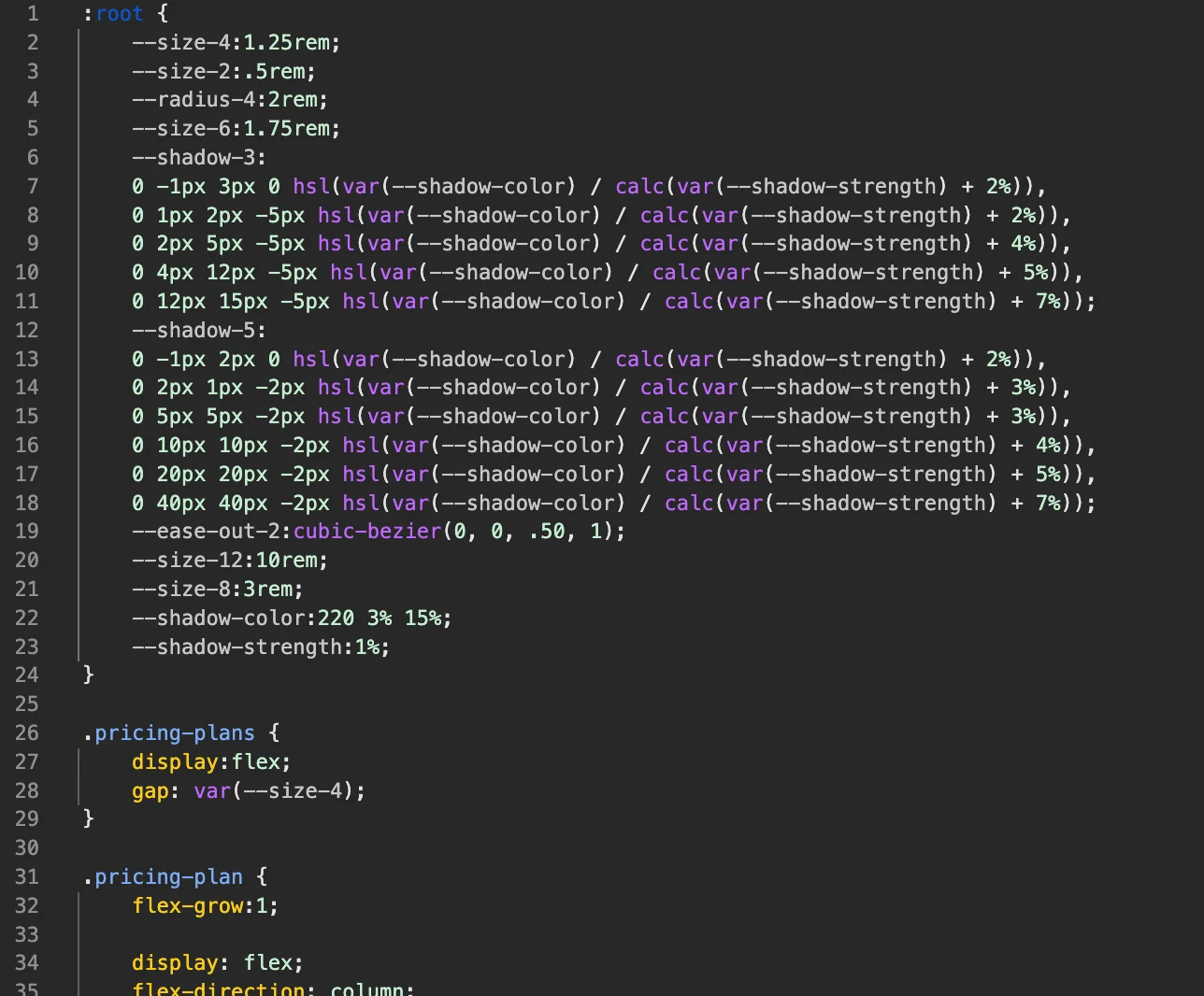
Let's add more styles to our page to explore the variables further. I'd like to give the pricing options a card style. Open Props has a section on borders and shadows that we can use for this purpose. I would also like to add a hover effect to these cards. Also, regarding spacing, I want to add more margins and padding when appropriate.

.pricing-plans {
    display:flex;
    gap: var(--size-4);
}
.pricing-plan {
    flex-grow:1;

    display: flex;
    flex-direction: column;
    gap: var(--size-2);
    justify-content: space-between;
    border-radius: var(--radius-4);
    padding:var(--size-6);
    box-shadow: var(--shadow-3);
}
.pricing-plan > div {
    display: flex;
    flex-direction: column;
    gap: var(--size-2);
}
.pricing-plan:hover{
    box-shadow: var(--shadow-5);
    transition: box-shadow 0.3s var(--ease-out-2);
}
@media(max-width: 768px){
    .pricing-plans {
        flex-direction: column;
        width: 100%;
    }
    .pricing-plan {
        width: 100%;
        flex-direction: row;
        flex-wrap: wrap;
    }
}
section + section {
    margin-block:var(--size-12);
}
.feature + .feature {
    margin-block-start:var(--size-8);
}
section {
    display:flex;
    flex-direction: column;
    justify-content: center;
    align-items: center;
    padding: var(--size-4) var(--size-6);
    gap: var(--size-4);
}
.hero, .cta{
    min-block-size: 100vh;
}
.features {
    justify-content: space-between;
}

With so little CSS added and using many open props variables for sizes, borders, shadows, and easing curves, we can quickly have a better-looking site.

Boders and shadows preview

Optimizing when using the CDN

Open props is a pretty light package; however, using the CDN will add more CSS than you'll probably use. Importing individual parts of these props according to their utility is possible. For example, import just the gradients.

<link rel="stylesheet" href="https://unpkg.com/open-props/gradients.min.css"/>

Or even a subset of colors

<link rel="stylesheet" href="https://unpkg.com/open-props/indigo.min.css"/>

These are some options to reduce the size of your app if using the CDN.

Open Props with NPM

Open Props is framework agnostic. I want my site to use Vite. Vite is used by many frameworks nowadays and is perfect to show you the next examples and optimizations.

cd site
npm init -y
npm i -D vite

Let's add a script to our package.json file to start our development server.

{
 "scripts": {
    "dev": "vite"
  }
}

Now, we can start our application on port 5173 (default) by running the following command:

npm run dev

Your application should be the same as before, but we will change how we import open props. Stop the application and remove the open-props and normalize imports from index.html. Now in your terminal install the open-props package from npm.

npm i -D open-props

Once installed, import the props and the normalization files at the beginning of your styles.css file.

@import "open-props/style";
@import "open-props/normalize";

Restart your development server, and you should see the same results.

Optimizing when using NPM

Let's analyze the size of our package.

Package sizes

34.4 kb seems a bit much, but note that this is uncompressed. When compressed with gzip, it's closer to 9 kb.

Similar to what we did when using the CDN, we can add individual sections of the package. For example in our CSS file we could import open-props/animations or open-props/sizes. If this concerns you, don't worry; we can do much better.

JIT Props

To optimize our bundled styles, we can use a PostCSS plugin called posts-jit-props. This package will ensure that we only ship the props that we are using. Vite has support for PostCSS, so setting it up is straightforward. Let's install the plugin:

npm i -D postcss-jit-props

After the installation finishes, let's create a configuration file to include it.

touch postcss.config.js

The content of your file should look like this:

// postcss.config.js
const postcssJitProps = require('postcss-jit-props');
const OpenProps = require('open-props');
module.exports = {
  plugins: [
    postcssJitProps(OpenProps),
  ]
}

Finally, remove the open-props/style import from styles.css. Remember that this file contains the CSS variables we will add "just in time". Our page should still look the same, but if we analyze the size of our styles.css file again, we can see that it has already been reduced to 13.2kb. If you want to know where this size is coming from, the answer is that Open Props is adding all the variables used in the normalize file + the ones that we require in our file.

file sizes

If we were to remove the normalize import, we would end up with much smaller CSS files, and the number of props added just in time would be minimal. Try removing commenting it out (the open-props/normalize import) from the styles.css file. The page will look different, but it will be useful to show how just the props used are added.

file sizes 2

2.4kB uncompressed. That's a lot less for our example. If we take a quick look at our generated file, we can see the small list of CSS variables added from open props at the top of our file (those that we use later on the file).

generated file

Open props ships with tons of variables for:

  • Colors
  • Gradients
  • Shadows
  • Aspect Ratios
  • Typography
  • Easing
  • Animations
  • Sizes
  • Borders
  • Z-Index
  • Media Queries
  • Masks You probably won't use all of these but it's hard to tell what you'll be using from the beginning of a project. To keep things light, add what you need as you go, or let JIT handle it for you.

Conclusion

Open props has much to offer and can help speed your project by leveraging some decisions upfront and providing a sensible set of predefined CSS Variables. We've learned how to install it (or not) using different methods and showcased how simple it is to use. Give it a try!

This Dot is a consultancy dedicated to guiding companies through their modernization and digital transformation journeys. Specializing in replatforming, modernizing, and launching new initiatives, we stand out by taking true ownership of your engineering projects.

We love helping teams with projects that have missed their deadlines or helping keep your strategic digital initiatives on course. Check out our case studies and our clients that trust us with their engineering.

You might also like

How to Truncate Strings Easily with CSS cover image

How to Truncate Strings Easily with CSS

You'll often need to truncate text when working with user interfaces, especially when displaying content within a limited space. CSS provides a straightforward way to handle this scenario, ensuring that long text strings are cut off gracefully without affecting the overall layout. CSS Truncation Techniques Single-Line Truncation If you want to truncate a single line of text, CSS provides a simple solution. The key properties to use here are overflow, white-space, and text-overflow. ` Explanation of properties: * white-space: nowrap: This ensures the text stays on a single line, preventing wrapping. * overflow: hidden: This hides any content that overflows the container. * text-overflow: ellipsis: This adds the ellipsis (…) at the end of the truncated text. Multi-Line Truncation While truncating a single line of text is common, sometimes you may want to display multiple lines but still cut off the text when it exceeds a certain number of lines. You can use a combination of CSS properties such as -webkit-line-clamp along with the display and overflow properties. ` Live example: Explanation of properties: * display: -webkit-box: This is a legacy flexbox-like display property that works with the -webkit-line-clamp property. * -webkit-line-clamp: Specifies the number of lines to show before truncating. * -webkit-box-orient: vertical: Ensures the box is laid out vertically for proper multi-line truncation. * overflow: hidden: Prevents content overflow. * text-overflow: ellipsis: Adds an ellipsis after the truncated content. Why Use CSS for Text Truncation Over JavaScript Techniques? While it’s possible to truncate text using JavaScript, CSS is often a better choice for this task for several reasons. Let's explore why CSS-based truncation techniques are generally preferred over JavaScript. Performance Efficiency CSS operates directly within the browser's layout engine, meaning it doesn’t require additional processing or event handling as JavaScript does. When using JavaScript to truncate text, the script needs to run on page load (or after DOM manipulation), and sometimes, it needs to listen for events such as window resizing to adjust truncation. This can introduce unnecessary overhead, especially in complex or resource-constrained environments like mobile devices. CSS, on the other hand, is declarative. Once applied, it allows the browser to handle text rendering without any further execution or processing. This leads to faster load times and a smoother user experience. Simplicity and Maintainability CSS solutions are much simpler to implement and maintain than their JavaScript counterparts. All it takes is a few lines of CSS to implement truncation. In contrast, a JavaScript solution would require you to write and maintain a function that manually trims strings, inserts ellipses, and re-adjusts the text whenever the window is resized. Here's the JavaScript Truncation Example to compare the complexity: JavaScript Truncation Example: ` At the example above, we truncated the text to 50 characters which may be 1 line on large screens and 6 lines on mobile and in that case we will need to add more code to truncate it responsively. As you can see, the CSS solution we used earlier is more concise and readable, whereas the JavaScript version is more verbose and requires managing the string length manually. Responsiveness Without Extra Code With CSS, truncation can adapt automatically to different screen sizes and layouts. You can use relative units (like percentages or vw/vh), media queries, or flexbox/grid properties to ensure the text truncates appropriately in various contexts. If you were using JavaScript, you’d need to write additional logic to detect changes in the viewport size and update the truncation manually. This would likely involve adding event listeners for window resize events, which can degrade performance and lead to more complex code. CSS Example for Responsive Truncation: ` To achieve this in JavaScript, you’d need to add more code to handle the width adjustments dynamically, making it more complex to maintain and troubleshoot. Separation of Concerns CSS handles the presentation layer of your website, while JavaScript should focus on dynamic functionality or data manipulation. By keeping truncation logic within your CSS, you're adhering to the principle of separation of concerns, where each layer of your web application has a clear, well-defined role. Using JavaScript for visual tasks like truncation mixes these concerns, making your codebase harder to maintain, debug, and scale. CSS is purpose-built for layout and visual control, and truncation is naturally a part of that domain. Browser Support and Cross-Browser Consistency Modern CSS properties like text-overflow and -webkit-line-clamp are widely supported across all major browsers. This means that CSS solutions for truncation are generally consistent and reliable. JavaScript solutions, on the other hand, may behave differently depending on the browser environment and require additional testing and handling for cross-browser compatibility. While older browsers may not support specific CSS truncation techniques (e.g., multi-line truncation), fallback options (like single-line truncation) can be easily managed through CSS alone. With JavaScript, more complex logic might be required to handle such situations. Reduced Risk of Layout Shifting JavaScript-based text truncation risks causing layout shifting, especially during initial page loads or window resizes. The browser may need to recalculate the layout multiple times, leading to content flashing or jumpy behavior as text truncation is applied. CSS-based truncation is applied as part of the browser’s natural rendering flow, eliminating this risk and ensuring a smoother experience for the user. Conclusion CSS is the optimal solution for truncating text in most cases due to its simplicity, efficiency, and responsiveness. It leverages the power of the browser’s rendering engine, avoids the overhead of JavaScript, and keeps your code clean and maintainable. While JavaScript truncation has its use cases, CSS should always be your go-to solution for truncating strings, especially in static or predictable layouts. If you like this post, check out the other CSS posts on our blog!...

:where functional pseudo-selectors :is valuable in CSS cover image

:where functional pseudo-selectors :is valuable in CSS

If you’ve written CSS before, you’ve used pseudo selectors. Typically, we’d use them to style :hover events or select every :nth-of-type() In recent years CSS has become a lot more powerful, and with that, we now have many more pseudo-selectors available to use. Let’s explore some functional pseudo-selectors together and see how to use them to enhance our front-end code. Functional pseudo-classes While there are a wide range of pseudo-classes, I want to focus on the _functional_ ones today. :is :is works very similar to a regular CSS class list at first glance ` One of its main benefits is that you can group CSS classes to form more readable and maintainable conditions. ` For deep nesting, this can make your CSS significantly easier to understand, simplifying editing at a later date. ` You may be thinking that CSS has another solution that improves readability in a similar way: nesting. That’s true, and in this context, you can use them interchangeably, though the syntax is still shorter. ` However deeper nesting using nested CSS can become complex quickly. Sometimes it makes sense to use :is to help avoid this complexity. ` :is also provides a specificity modifier you don’t get with nested css. If you write: ` Every selector within the:is would be treated as if it had the same specificity value as the ID. With :is, the highest value applies to all other values within the :is. This does not apply to nested CSS. :not It does exactly what you think it does. The :not selector grabs everything _except_ the classes you define: ` Like the other pseudo-classes, you can negate multiple classes if you choose: ` This can be powerful when combined with other pseudo-selectors: ` :where Using the :where pseudo-class is great for creating low-specificity CSS. If you create a library or plugin that’s going to be used by other people and you want them to style it themselves, but don’t want it to appear ugly when they first set it up, :where is the way to do that. For example, let’s style all our links with an underline using :where ` With this approach, we can override our link’s default styles without having to create difficult to maintain CSS: ` If we didn't use :where above, import order would matter if we wanted to override this. But because we planned ahead, we can just use a standard a tag. Without using :where we’re stuck with options that are much harder to work with: ` :where also has the same benefits of class grouping that :is does but without the specificity, so you can do something like this and then override it easily later. ` :has One of the most powerful pseudo selectors is :has, which gives you the option to style a tag or class based on other classes or tags associated with it. ` An incredible benefit :has brings is the ability to create parent selector functionality. This gives you a wide variety of options to style the parent based on the state of the children. ` You can also combine this with the :not selector to select elements that don’t have specific children. ` Benefits of Pseudo-Classes Readability One of the benefits of all of these pseudo-selectors is that they can act similarly to nested CSS. It’s possible to use these to make your code more readable. ` Using :is this way is effectively the same as using nested CSS, but if you need lower specificity you could use :where, or :not if you want to exclude (instead of include) some classes. Functionality :not and :has provide new options which weren’t possible before, allowing you to style more dynamically and provide better experiences while simplifying your code. Before these options were available, the only solution was to style the code using JavaScript. While this technically allows you to achieve your styling goals, it’s not ideal. Mixing CSS operations into JS files makes it much harder to maintain long-term because it adds a layer of abstraction to your solution, while the built-in CSS option is much simpler. While :is and :where don’t provide as much new functionality, they still allow you to write more understandable CSS with less ambiguity or workarounds, making maintenance significantly easier. Summing up Modern CSS allows us to be much more flexible with our styles, all while writing less code. Simplifying CSS and removing the need to compensate, either by writing extra CSS or styling through JS, means our CSS files are more explicit and easier to maintain in the long term. They may not be needed often, but they’re an incredibly important part of your front-end toolbelt. Have you found any interesting ways to use functional pseudo-classes? Send us a post on X or message us on LinkedIn and show me what cool things you’ve made....

What is Cypress Studio? cover image

What is Cypress Studio?

Introduction Cypress Studio has been around for some time. It was introduced in Cypress v6.3.0, removed in v10, and reintroduced in v10.7.0. This blog post will dive into its current state and how to use it today. What is Cypress Studio Cypress Studio is a tool built on top of Cypress. It offers an interface for creating tests as if you were using your site without requiring code to be written. It adds functionality to query elements and to add assertions from the interface. It's important to note that Cypress Studio is still under an experimental flag and lacks support for Component Testing (another feature of Cypress). Creating an app to test We first need a working app because the tool we will use is meant for end-to-end tests. I'll pick Svelte and Vite for this demo, but you can choose any framework. Cypress is agnostic in that matter. ` Make sure to select the Svelte and Typescript options to follow along. Now open your project location, install dependencies, and start your app to ensure everything works correctly. ` Installing and setting up Cypress Studio Now it's time to add Cypress to our dev dependencies. ` With our dependency installed, let's launch it so we can start configuring it. But first let’s add an entry under scripts in our package.json file. ` ` A new window will open that will guide us through the initial setup. Select the "E2E Testing" option to create the required configuration files. Then, you can close the window. A new folder called cypress and a configuration file cypress.config.ts are created at the root of our project. To enable Cypress Studio, we must open the newly created configuration file and add the experimentalStudio property. ` For this project, we need to ensure that TypeScript is configured properly for Cypress when it runs, as it conflicts with the one in our root folder. We will extend the original typescript configuration and override some properties. Create a new tsconfig.json file inside the' cypress' folder. ` You can find more information on setting up TypeScript with Cypress in their documentation Creating tests Now that our setup is complete let's write our first test. We will create a folder called e2e and a new test file. ` Open the new file and create an outline of your tests. Don't add anything to them. I initialized my file with a few tests. ` There is an option to create spec files from the interface, but it will contain some initial content that you most likely remove. There’s third option to scaffold multiple specs files, these can serve as a learning resource for writing tests as it contains many different scenarios tested. Make sure your app is running and, in another terminal, start cypress. ` Select E2E testing and Chrome. You should now see a list with all your test files. Click on home.cy.ts. Your tests will run and pass because we have not made any assertions. This looks the same as if we haven't enabled Studio, but there's a new detail added when you hover on any of the tests: a magic wand that you can click to start recording events and adding assertions directly in the UI. Let's start with our first tests and check what assertions we can make. The first step is to navigate to a page. This interaction will be recorded and added to the test. To make assertions, right-click on an element and select the ones you want to add. After we complete our test, let's review our generated code. Go to the test file and see the changes made to it. It should look something like this. ` Cypress Studio will attempt to pick the best selector for the element. In this case, it was able to choose button because it is unique to the page. If there were more buttons, the selector would've been different. You can interact with elements as if you were using the page regularly. Note that Studio supports a limited set of commands: check, click, select, type, and uncheck. Let's record our second test and verify that the button will increase its count when clicked. That was quick. Let's review our generated test. ` So far, our tests have been very accurate and didn't need any modifications. However, take Studio as a helper to write tests visually and their selector as suggestions. Let's take the bottom link with the text "SvelteKit" as an example. It will generate the assertion: ` This selector is accurate, but modifying the elements' structure or order would break the tests. We don’t want tests to break for reasons that do not affect our users. A change in order does not have the same impact for the user as changing the text of a button or changing the url of a link. These selectors should be as specific as possible, but rely as less as possible on implementation details. Selecting images by its alt attribute it’s a way to find a specific element and at the same time ensure that element is accessible. (Accessibility has a direct impact on users) As a counterpart, when clicking any of the logos above, we will get very interesting selectors (and assertions). ` With these assertions, we check that our images have an alt attribute set and are tied to a specified link. Conclusion As with any other automated tool, check the output and solve any issues that you may find. Results depend on the structure of the page and Cypress Studio's ability to choose an adequate selector. Overall, this tool can still help you write complex tests with plenty of interactions, and you can later modify any selectors. Besides the selector, I found it helpful in writing the assertions. If you’re new to Cypress or e2e testing, it can be of great help to go from an idea to a working test. Reviewing these tests can be a great way to learn how these tests are built....

The simplicity of deploying an MCP server on Vercel cover image

The simplicity of deploying an MCP server on Vercel

The current Model Context Protocol (MCP) spec is shifting developers toward lightweight, stateless servers that serve as tool providers for LLM agents. These MCP servers communicate over HTTP, with OAuth handled clientside. Vercel’s infrastructure makes it easy to iterate quickly and ship agentic AI tools without overhead. Example of Lightweight MCP Server Design At This Dot Labs, we built an MCP server that leverages the DocuSign Navigator API. The tools, like `get_agreements`, make a request to the DocuSign API to fetch data and then respond in an LLM-friendly way. ` Before the MCP can request anything, it needs to guide the client on how to kick off OAuth. This involves providing some MCP spec metadata API endpoints that include necessary information about where to obtain authorization tokens and what resources it can access. By understanding these details, the client can seamlessly initiate the OAuth process, ensuring secure and efficient data access. The Oauth flow begins when the user's LLM client makes a request without a valid auth token. In this case they’ll get a 401 response from our server with a WWW-Authenticate header, and then the client will leverage the metadata we exposed to discover the authorization server. Next, the OAuth flow kicks off directly with Docusign as directed by the metadata. Once the client has the token, it passes it in the Authorization header for tool requests to the API. ` This minimal set of API routes enables me to fetch Docusign Navigator data using natural language in my agent chat interface. Deployment Options I deployed this MCP server two different ways: as a Fastify backend and then by Vercel functions. Seeing how simple my Fastify MCP server was, and not really having a plan for deployment yet, I was eager to rewrite it for Vercel. The case for Vercel: * My own familiarity with Next.js API deployment * Fit for architecture * The extremely simple deployment process * Deploy previews (the eternal Vercel customer conversion feature, IMO) Previews of unfamiliar territory Did you know that the MCP spec doesn’t “just work” for use as ChatGPT tooling? Neither did I, and I had to experiment to prove out requirements that I was unfamiliar with. Part of moving fast for me was just deploying Vercel previews right out of the CLI so I could test my API as a Connector in ChatGPT. This was a great workflow for me, and invaluable for the team in code review. Stuff I’m Not Worried About Vercel’s mcp-handler package made setup effortless by abstracting away some of the complexity of implementing the MCP server. It gives you a drop-in way to define tools, setup https-streaming, and handle Oauth. By building on Vercel’s ecosystem, I can focus entirely on shipping my product without worrying about deployment, scaling, or server management. Everything just works. ` A Brief Case for MCP on Next.js Building an API without Next.js on Vercel is straightforward. Though, I’d be happy deploying this as a Next.js app, with the frontend features serving as the documentation, or the tools being a part of your website's agentic capabilities. Overall, this lowers the barrier to building any MCP you want for yourself, and I think that’s cool. Conclusion I'll avoid quoting Vercel documentation in this post. AI tooling is a critical component of this natural language UI, and we just want to ship. I declare Vercel is excellent for stateless MCP servers served over http....

Let's innovate together!

We're ready to be your trusted technical partners in your digital innovation journey.

Whether it's modernization or custom software solutions, our team of experts can guide you through best practices and how to build scalable, performant software that lasts.

Prefer email? hi@thisdot.co