Svelte 4: Unveiled Speed Enhancements and Developer-Centric Features
Svelte, a widely favored framework for building user interfaces, unveiled its much-anticipated version 4 on June 22. This major release, while paving the way for future advancements, brings a plethora of remarkable enhancements. Focusing on enriching the development experience and boosting performance, Svelte 4 is indeed reshaping the landscape of frontend development.
In this post, we'll delve into the specifics of this exciting release, covering the significant performance boosts, enriched developer tools and features, revamped websites, and simplified migration guide.
A Deeper Look at Performance Enhancements
Svelte 4 delivers remarkable improvements in performance, focusing on shrinking the Svelte package size, and enhancing hydration efficiency.
Streamlined Svelte Package
Svelte 4 has substantially slimmed down, reducing its overall package size from 10.6 MB to a sleek 2.8 MB - a 75% decrease. This reduction in dependencies from 61 to 16 not only lightens Svelte but also optimizes SvelteKit, significantly accelerating the REPL experience and npm install times. For instance, npm install times have been trimmed from over 5 minutes to less than a minute, a leap in quality that any developer will appreciate.
NPM I Before:

NPM I After:

Bundle Size Before:
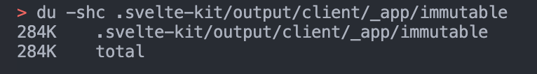
Bundle Size After:

Optimized Hydration and Performance Scores
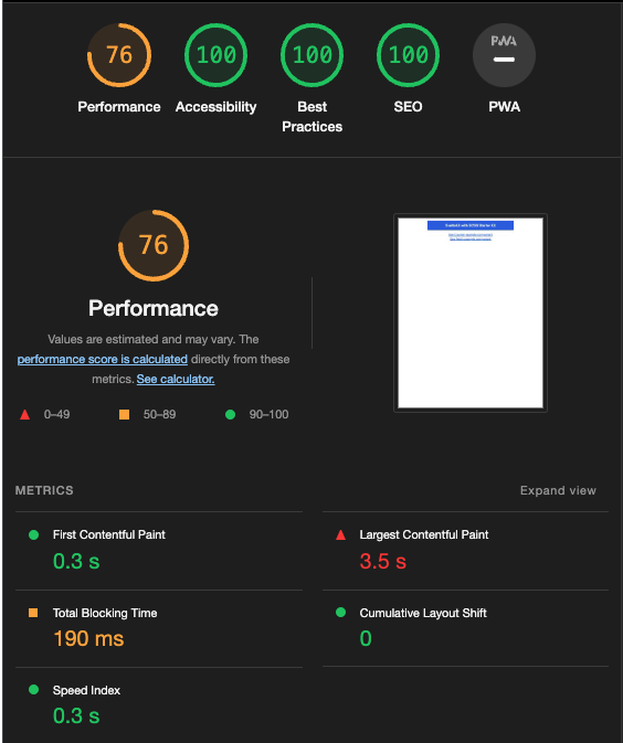
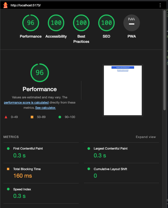
Alongside the impressive package size reduction, Svelte 4 offers more efficient code hydration, reducing the generated code size for the SvelteKit website by nearly 13%. This leaner codebase contributes to higher performance on benchmarks like Google Lighthouse. The performance score for the new Svelte 4 starter on starter.dev has soared from 75% to a near perfect 95+%.
Overall, the performance enhancements introduced with Svelte 4 mean a faster, more efficient, and smoother developer experience.
Before:
After:
Enhanced Developer Experience in Svelte 4
Localized Transitions
Transitions in Svelte 4 are local by default, preventing potential conflicts during page loading.
// Transitions are now local in Svelte 4
let transition = local(/* ... */);
Improved Web Component Authoring
Web Components authoring is simplified with the dedicated customElement attribute in svelte:options.
<svelte:options
  customElement={{
    tag: 'custom-element',
    shadow: 'none',
    props: {
      name: {
        reflect: true,
        type: 'Number',
        attribute: 'element-index'
      }
    }
  }}
/>
Stricter Type Enforcement
Svelte 4 introduces stricter types for createEventDispatcher, Action, ActionReturn, and onMount.
import { createEventDispatcher } from 'svelte';

const dispatch = createEventDispatcher<{
  optional: number | null;
  required: string;
  noArgument: null;
}>();

// Svelte version 3:
dispatch('optional');
dispatch('required'); // I can still omit the detail argument
dispatch('noArgument', 'surprise'); // I can still add a detail argument

// Svelte version 4 using TypeScript strict mode:
dispatch('optional');
dispatch('required'); // error, missing argument
dispatch('noArgument', 'surprise'); // error, cannot pass an argument
These changes collectively offer a streamlined, robust, and efficient coding experience.
Revamped Svelte Websites
With Svelte 4, the team has also revamped its main website, offering an improved and more user-friendly experience.
The Tutorial Website
The Svelte tutorial website has been overhauled for an enhanced learning journey. New improvements include a visible file structure, fewer elements in the navbar, smoother navigation between sections, and a new dark mode.
The Svelte Website
The primary Svelte website received a makeover too, including better mobile navigation, improved TypeScript documentation, and a handy dark mode.
These website updates aim to provide a more engaging, intuitive, and user-friendly experience for all Svelte users.
A Smooth Migration to Svelte 4
Transitioning from Svelte 3 to Svelte 4 is designed to be as straightforward as possible. The Svelte team has provided an updated migration tool to simplify this process.
Here is a step-by-step guide for the transition:
-
Run the Svelte migration tool.
npx svelte-migrate@latest svelte-4 -
Remove Svelte 3 packages.
npm uninstall @babel/core babel-loader @sveltejs/package svelte-loader -
Update your
eslintrc.jsonconfiguration file.{ "root": true, "parser": "@typescript-eslint/parser", "extends": [ "eslint:recommended", "plugin:@typescript-eslint/recommended", "plugin:svelte/recommended", "prettier", "plugin:storybook/recommended" ], "plugins": ["@typescript-eslint", "prettier"], "ignorePatterns": ["*.cjs"], "overrides": [ { "files": ["*.svelte"], "parser": "svelte-eslint-parser", "parserOptions": { "parser": "@typescript-eslint/parser" } } ], "parserOptions": { "sourceType": "module", "ecmaVersion": 2020 }, "env": { "browser": true, "es2017": true, "node": true }, "globals": { "NodeJS": true, "svelte": true } } -
Upgrade Storybook related packages to the latest v7. Note: as of the publishing of this article, the latest version is 7.0.26.
npx storybook@latest upgrade
Do note that the minimum version requirements have changed. You will now need:
- NodeJS 16 or higher
- SvelteKit 1.20.4 or higher
- TypeScript 5 or higher
For more detailed instructions and information, please refer to the official Svelte 4 migration guide or you can take a look at our Svelte 4 starter kit on starter.dev.
The focus is to ensure a hassle-free transition, allowing developers to take advantage of the new features and enhancements Svelte 4 offers without significant obstacles.
Conclusion
Svelte 4, with its performance enhancements and streamlined development process, offers a new pinnacle in the realm of JavaScript frameworks. If you're keen on shifting from Svelte 3 to Svelte 4, a comprehensive migration guide is provided to facilitate a smooth transition.
For a quick start with Svelte 4, check out our ready-to-use Svelte Kit with SCSS Starter Kit. In addition, we've developed two showcases demonstrating Svelte 4's power:
- Svelte Kit with SCSS & 7GUIs - A comprehensive demo showcasing various UI challenges.
- GitHub Replica Showcase - A clone of the popular code hosting platform, GitHub, demonstrating the potential of Svelte 4 in building complex and high-performance web applications.
In conclusion, Svelte 4 brings numerous performance improvements and enriches the development experience, thereby increasing developer productivity and enabling the creation of more efficient applications. Its thoughtful design, alongside the streamlined migration process, is set to expand its adoption in the web development community.