Skip to content

A Deep Dive into SvelteKit Routing with Our Starter.dev GitHub Showcase Example

Introduction

SvelteKit is an excellent framework for building web applications of all sizes, with a beautiful development experience and flexible filesystem-based routing. At the heart of SvelteKit is a filesystem-based router. The routes of your app — i.e. the URL paths that users can access — are defined by the directories in your codebase.

In this tutorial, we are going to discuss SvelteKit routing with an awesome SvelteKit GitHub showcase built by This Dot Labs. The showcase is built with the SvelteKit starter kit on starter.dev.

We are going to tackle:

  • Filesystem-based router
    • +page.svelte
    • +page.server
    • +layout.svelte
    • +layout.server
    • +error.svelte
  • Advanced Routing
    • Rest Parameters
    • (group) layouts
    • Matching

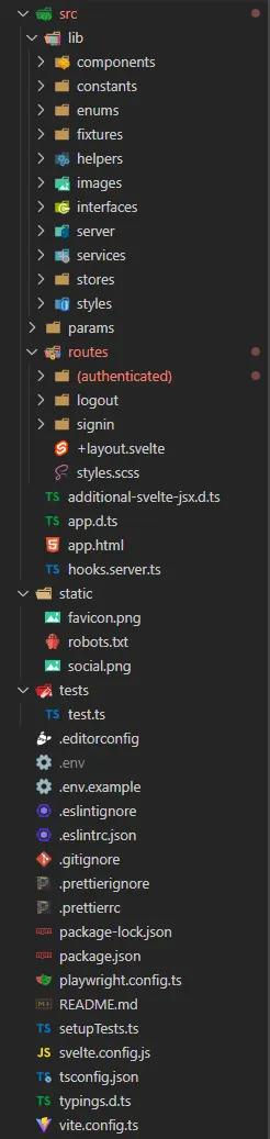
Below is the current routes folder.

Project Structure Sveltekit Showcase

Prerequisites

You will need a development environment running Node.js; this tutorial was tested on Node.js version 16.18.0, and npm version 8.19.2.

Filesystem-based router

The src/routes is the root route. You can change src/routes to a different directory by editing the project config.

// svelte.config.js

/** @type {import('@sveltejs/kit').Config} */
const config = {
  kit: {
    routes: "src/routes", // 👈 you can change it here to anything you want
  },
};

Each route directory contains one or more route files, which can be identified by their + prefix.

+page.svelte

A +page.svelte component defines a page of your app. By default, pages are rendered both on the server (SSR) for the initial request, and in the browser (CSR) for subsequent navigation.

In the below example, we see how to render a simple login page component:

// src/routes/signin/(auth)/+page.svelte

<script>
  import Auth from '$lib/components/auth/Auth.svelte';
</script>

<Auth />

+page.ts

Often, a page will need to load some data before it can be rendered. For this, we add a +page.js (or +page.ts, if you're TypeScript-inclined) module that exports a load function.

+page.server.ts

If your load function can only run on the server— ie, if it needs to fetch data from a database or you need to access private environment variables like API key— then you can rename +page.js to +page.server.js, and change the PageLoad type to PageServerLoad.

To pass top user repository data, and user’s gists to the client-rendered page, we do the following:

// src/routes/(authenticated)/(home)/+page.server.ts

import type { PageServerLoad } from "./$types";
import { mapUserReposToTopRepos, mapGistsToHomeGists } from "$lib/helpers";
import type {
  UserGistsApiResponse,
  UserReposApiResponse,
} from "$lib/interfaces";
import { ENV } from "$lib/constants/env";

export const load: PageServerLoad = async ({ fetch, parent }) => {
  const repoURL = new URL("/user/repos", ENV.GITHUB_URL);
  repoURL.searchParams.append("sort", "updated");
  repoURL.searchParams.append("per_page", "20");

  const { userInfo } = await parent();

  const gistsURL = new URL(
    `/users/${userInfo?.username}/gists`,
    ENV.GITHUB_URL
  );

  try {
    const reposPromise = await fetch(repoURL);

    const gistsPromise = await fetch(gistsURL);

    const [repoRes, gistsRes] = await Promise.all([reposPromise, gistsPromise]);

    const gists = (await gistsRes.json()) as UserGistsApiResponse;

    const repos = (await repoRes.json()) as UserReposApiResponse;

    return {
      topRepos: mapUserReposToTopRepos(repos),
      gists: mapGistsToHomeGists(gists),
      username: userInfo?.username,
    };
  } catch (err) {
    console.log(err);
  }
};

The page.svelte gets access to the data by using the data variable which is of type PageServerData.

    <!-- src/routes/(authenticated)/(home)/+page.svelte -->

    <script lang="ts">
    import TopRepositories from '$lib/components/TopRepositories/TopRepositories.svelte';
    import Gists from '$lib/components/Gists/Gists.svelte';
    import type { PageServerData } from './$types';
    export let data: PageServerData;
    </script>

    <div class="container">
      <div class="page-container">
        <aside>
        {#if data?.gists}
            <Gists gists={data.gists} />
        {/if}
        </aside>
        {#if data?.topRepos}
        <TopRepositories repos={data.topRepos} username={data?.username} />
        {/if}
      </div>
    </div>

    <style lang="scss">
    @use 'src/lib/styles/variables.scss';

    .page-container {
        display: grid;
        grid-template-columns: 1fr;
        background: variables.$gray100;
        @media (min-width: variables.$md) {
          grid-template-columns: 24rem 1fr;
        }
    }

    aside {
        background: variables.$white;
        padding: 2rem;
        @media (max-width: variables.$md) {
          order: 2;
        }
    }
    </style>

+layout.svelte

As there are elements that should be visible on every page, such as top-level navigation or a footer. Instead of repeating them in every +page.svelte, we can put them in layouts.

The only requirement is that the component includes a <slot> for the page content. For example, let's add a nav bar:

    <!-- src/routes/(authenticated)/+layout.svelte -->

    <script lang="ts">
    import NavBar from '$lib/components/NavBar/NavBar.svelte';
    import type { LayoutServerData } from './$types';

    export let data: LayoutServerData;
    </script>

    <div class="page">
    <header class="nav">
        <NavBar username={data?.userInfo.username} userAvatar={data?.userInfo.avatar} />
    </header>
    <main class="main">
        <slot />  // 👈  child routes of the layout page
    </main>
    </div>

+layout.server.ts

Just like +page.server.ts, your +layout.svelte component can get data from a load function in +layout.server.js, and change the type from PageServerLoad type to LayoutServerLoad.

// src/routes/(authenticated)/+layout.server.ts

import { ENV } from "$lib/constants/env";
import { remapContextUserAsync } from "$lib/helpers/context-user";
import type { LayoutServerLoad } from "./$types";
import { mapUserInfoResponseToUserInfo } from "$lib/helpers/user";

export const load: LayoutServerLoad = async ({ locals, fetch }) => {
  const getContextUserUrl = new URL("/user", ENV.GITHUB_URL);
  const response = await fetch(getContextUserUrl.toString());
  const contextUser = await remapContextUserAsync(response);
  locals.user = contextUser;
  return {
    userInfo: mapUserInfoResponseToUserInfo(locals.user),
  };
};

+error.svelte

If an error occurs during load, SvelteKit will render a default error page. You can customize this error page on a per-route basis by adding an +error.svelte file.

File Structure (authenticated) Github Showcase SvelteKit

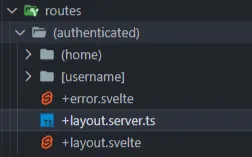
In the showcase, an error.svelte page has been added for authenticated view in case of an error.

    <script>
        import { page } from '$app/stores';
        import ErrorMain from '$lib/components/ErrorPage/ErrorMain.svelte';
        import ErrorFlash from '$lib/components/ErrorPage/ErrorFlash.svelte';
    </script>

    <ErrorFlash message={$page.error?.message} />
    <ErrorMain status={$page.status} />

Advanced Routing

Rest Parameters

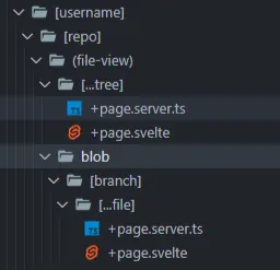
If the number of route segments is unknown, you can use spread operator syntax. This is done to implement Github’s file viewer.

/[org]/[repo]/tree/[branch]/[...file]

svelte-kit-scss.starter.dev/thisdot/starter.dev/blob/main/starters/svelte-kit-scss/README.md would result in the following parameters being available to the page:

{
  org: ‘thisdot’,
  repo: 'starter.dev',
  branch: 'main',
  file:/starters/svelte-kit-scss/README.md'
}

(group) layouts

By default, the layout hierarchy mirrors the route hierarchy. In some cases, that might not be what you want.

In the GitHub showcase, we would like an authenticated user to be able to have access to the navigation bar, error page, and user information. This is done by grouping all the relevant pages which an authenticated user can access.

File Structure (authenticated) Github Showcase SvelteKit

Grouping can also be used to tidy your file tree and ‘group’ similar pages together for easy navigation, and understanding of the project.

Blob File Structure Github Showcase SvelteKit

Matching

In the Github showcase, we needed to have a page to show issues and pull requests for a single repo. The route src/routes/(authenticated)/[username]/[repo]/[issues] would match /thisdot/starter.dev-github-showcases/issues or /thisdot/starter.dev-github-showcases/pull-requests but also /thisdot/starter.dev-github-showcases/anything and we don't want that. You can ensure that route parameters are well-formed by adding a matcher— which takes only issues or pull-requests, and returns true if it is valid– to your params directory.

// src/params/issue_search_type.ts

import { IssueSearchPageTypeFiltersMap } from "$lib/constants/matchers";
import type { ParamMatcher } from "@sveltejs/kit";

export const match: ParamMatcher = (param: string): boolean => {
  return Object.keys(IssueSearchPageTypeFiltersMap).includes(
    param?.toLowerCase()
  );
};
	// src/lib/constants/matchers.ts

    import { IssueSearchQueryType } from './issues-search-query-filters';

    export const IssueSearchPageTypeFiltersMap = {
        issues: ‘issues’,
        pulls: ’pull-requests’,
    };

    export type IssueSearchTypePage = keyof typeof IssueSearchPageTypeFiltersMap;

...and augmenting your routes:

[issueSearchType=issue_search_type]
Matching Routing Github Showcase SvelteKit

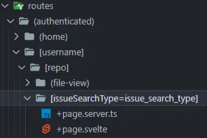
If the pathname doesn't match, SvelteKit will try to match other routes (using the sort order specified below), before eventually returning a 404.

Note: Matchers run both on the server and in the browser.

Conclusion

In this article, we learned about basic and advanced routing in SvelteKit by using the SvelteKit showcase example. We looked at how to work with SvelteKit's Filesystem-based router, rest parameters, and (group) layouts.

If you want to learn more about SvelteKit, please check out the SvelteKit and SCSS starter kit and the SvelteKit and SCSS GitHub showcase. All the code for our showcase project is open source. If you want to collaborate with us or have suggestions, we're always welcome to new contributions.

Thanks for reading!

If you have any questions, or run into any trouble, feel free to reach out on Twitter.

This Dot Labs is a development consultancy that is trusted by top industry companies, including Stripe, Xero, Wikimedia, Docusign, and Twilio. This Dot takes a hands-on approach by providing tailored development strategies to help you approach your most pressing challenges with clarity and confidence. Whether it's bridging the gap between business and technology or modernizing legacy systems, you’ll find a breadth of experience and knowledge you need. Check out how This Dot Labs can empower your tech journey.

You might also like

Harnessing the Power of Threlte - Building Reactive Three.js Scenes in Svelte cover image

Harnessing the Power of Threlte - Building Reactive Three.js Scenes in Svelte

Introduction Web development has evolved to include immersive 3D experiences through libraries like Three.js. This powerful JavaScript library enables the creation of captivating 3D scenes within browsers. Three.js: The 3D Powerhouse Three.js democratizes 3D rendering, allowing developers of all skill levels to craft interactive 3D worlds. Svelte Ecosystem: Svelte Cubed and Svelthree The Svelte ecosystem presents solutions like Svelte Cubed and Svelthree, which bridges Svelte with Three.js, offering streamlined reactivity for 3D web experiences. Introducing Threlte v6: Uniting SvelteKit 1.0, Svelte 4, and TypeScript Threlte v6 is a rendering and component library for Svelte that seamlessly integrates Three.js. By harnessing TypeScript's types, it provides a robust and delightful coding experience. In this tutorial, we'll showcase Threlte's capabilities by building an engaging website header: an auto-rotating sphere that changes color on mouse down. Using Threlte v6, SvelteKit 1.0, and Three.js, we're set to create a visually stunning experience. Let's dive in! Setting up Threlte Before building our scene, we need to set up Threlte. We can scaffold a new project using the CLI or manually install Threlte in an existing project. Option 1: Scaffold a New Threlte Project Create a new SvelteKit project and install Threlte with: `bash npm create threlte my-project ` Option 2: Manual Installation For an existing project, select the necessary Threlte packages and install: `bash npm install three @threlte/core @threlte/extras @threlte/rapier @dimforge/rapier3d-compat @threlte/theatre @theatre/core @theatre/studio @types/three ` Configuration adjustments for SvelteKit can be made in the "vite.config.js" file: `js const config = { // ... ssr: { noExternal: ['three'] } }; ` With Threlte configured, we're ready to build our interactive sphere. In the next chapter, we'll lay the groundwork for our exciting 3D web experience! Exploring the Boilerplate of Threlte Upon scaffolding a new project using npm create threlte`, a few essential boilerplate files are generated. In this chapter, we'll examine the code snippets from three of these files: `lib/components/scene.svelte`, `routes/+page.svelte`, and `lib/components/app.svelte`. 1. lib/components/scene.svelte`: This file lays the foundation for our 3D scene. Here's a brief breakdown of its main elements: - Perspective Camera**: Sets up the camera view with a specific field of view and position, and integrates `OrbitControls` for auto-rotation and zoom management. - Directional and Ambient Lights**: Defines the lighting conditions to illuminate the scene. - Grid**: A grid structure to represent the ground. - ContactShadows**: Adds shadow effects to enhance realism. - Float**: Wraps around 3D mesh objects and defines floating properties, including intensity and range. Various geometrical shapes like BoxGeometry, TorusKnotGeometry, and IcosahedronGeometry are included here. 2. routes/+page.svelte`: This file handles the ui of the index page and imports all necessary components we need to bring our vibrant design to life. 3. lib/components/app.svelte`: This file is where you would typically define the main application layout, including styling and embedding other components. Heading to the Fun Stuff With the boilerplate components explained, we're now ready to dive into the exciting part of building our interactive 3D web experience. In the next section, we'll begin crafting our auto-rotating sphere, and explore how Threlte's robust features will help us bring it to life. Creating a Rotating Sphere Scene In this chapter, we'll walk you through creating an interactive 3D sphere scene using Threlte. We'll cover setting up the scene, the sphere, the camera and lights, and finally the interactivity that includes a scaling effect and color changes. 1. Setting Up the Scene First, we need to import the required components and utilities from Threlte. `typescript import { T } from '@threlte/core'; import { OrbitControls } from '@threlte/extras'; ` 2. Setting Up the Sphere We'll create the 3D sphere using Threlte's ` and `` components. `svelte ` 1. `: This is a component from Threlte that represents a 3D object, which in this case is a sphere. It's the container that holds the geometry and material of the sphere. 2. `: This is the geometry of the sphere. It defines the shape and characteristics of the sphere. The `args` attribute specifies the parameters for the sphere's creation: - The first argument (1`) is the radius of the sphere. - The second argument (32`) represents the number of width segments. - The third argument (32`) represents the number of height segments. 3. `: This is the material applied to the sphere. It determines how the surface of the sphere interacts with light. The `color` attribute specifies the color of the material. In this case, the color is dynamic and defined by the `sphereColor` variable, which updates based on user interaction. The `roughness` attribute controls the surface roughness of the sphere, affecting how it reflects light. 3. Setting Up the Camera and Lights Next, we'll position the camera and add lights to create a visually appealing scene. `svelte ` 1. `: This component represents the camera in the scene. It provides the viewpoint through which the user sees the 3D objects. The `position` attribute defines the camera's position in 3D space. In this case, the camera is positioned at `(-10, 20, 10)`. The `fov` attribute specifies the field of view, which affects how wide the camera's view is. - makeDefault`: This attribute makes this camera the default camera for rendering the scene. 2. `: This component provides controls for easy navigation and interaction with the scene. It allows the user to pan, zoom, and orbit around the objects in the scene. The attributes within the `` component configure its behavior: - enableZoom`: Disables zooming using the mouse scroll wheel. - enablePan`: Disables panning the scene. - enableDamping`: Enables a damping effect that smoothens the camera's movement. - autoRotate`: Enables automatic rotation of the camera around the scene. - autoRotateSpeed`: Defines the speed of the auto-rotation. 3. `: This component represents a directional light source in the scene. It simulates light coming from a specific direction. The attributes within the `` component configure the light's behavior: - intensity`: Specifies the intensity of the light. - position.x` and `position.y`: Define the position of the light source in the scene. 4. `: This component represents an ambient light source in the scene. It provides even lighting across all objects in the scene. The `intensity` attribute controls the strength of the ambient light. 4. Interactivity: Scaling and Color Changes Now we'll add interactivity to the sphere, allowing it to scale and change color in response to user input. First, we'll import the required utilities for animation and set up a spring object to manage the scale. `typescript import { spring } from 'svelte/motion'; import { onMount } from 'svelte'; import { interactivity } from '@threlte/extras'; interactivity(); const scale = spring(0, { stiffness: 0.1 }); onMount(() => { scale.set(1); }); ` We'll update the sphere definition to include scaling: `svelte scale.set(1.1)} on:pointerleave={() => scale.set(1)}> ` Lastly, we'll add code to update the color of the sphere based on the mouse's position within the window. `typescript let mousedown = false; let rgb: number[] = []; function updateSphereColor(e: MouseEvent) { if (mousedown) { rgb = [ Math.floor((e.pageX / window.innerWidth) 255), Math.floor((e.pageY / window.innerHeight) 255), 150 ]; } } window.addEventListener('mousedown', () => (mousedown = true)); window.addEventListener('mouseup', () => (mousedown = false)); window.addEventListener('mousemove', updateSphereColor); $: sphereColor = rgb.join(','); ` We have successfully created a rotating sphere scene with scaling and color-changing interactivity. By leveraging Threlte's capabilities, we have built a visually engaging 3D experience that responds to user input, providing a dynamic and immersive interface. Adding Navigation and Scroll Prompt in `app.svelte` In this chapter, we'll add a navigation bar and a scroll prompt to our scene. The navigation bar provides links for user navigation, while the scroll prompt encourages the user to interact with the content. Here's a step-by-step breakdown of the code: 1. Importing the Canvas and Scene The Canvas` component from Threlte serves as the container for our 3D scene. We import our custom `Scene` component to render within the canvas. `typescript import { Canvas } from '@threlte/core'; import Scene from './Scene.svelte'; ` 2. Embedding the 3D Scene The Canvas` component wraps the `Scene` component to render the 3D content. It is positioned absolutely to cover the full viewport, and the `z-index` property ensures that it's layered behind the navigation elements. `svelte ` 3. Adding the Navigation Bar We use a ` element to create a horizontal navigation bar at the top of the page. It contains a home link and two navigation list items. The styling properties ensure that the navigation bar is visually appealing and positioned correctly. `svelte Home Explore Learn ` 4. Adding the Scroll Prompt We include a "Give a scroll" prompt with an ` element to encourage user interaction. It's positioned near the bottom of the viewport and styled for readability against the background. `svelte Give a scroll ` 5. Styling the Components Finally, the provided CSS styles control the positioning and appearance of the canvas, navigation bar, and scroll prompt. The CSS classes apply appropriate color, font, and layout properties to create a cohesive and attractive design. `css .sphere-canvas { width: 100%; height: 100%; position: absolute; top: 0; left: 0; z-index: 1; } nav { display: flex; color: white; z-index: 2; position: relative; padding: 4rem 8rem; justify-content: space-between; align-items: center; } nav a { text-decoration: none; color: white; font-weight: bold; } nav ul { display: flex; list-style: none; gap: 4rem; } h1 { color: white; z-index: 2; position: absolute; font-size: 3rem; left: 50%; top: 75%; transform: translate(-50%, -75%); } ` Head to the github repo to view the full code.** Check out the result: https://threlte6-spinning-ball.vercel.app/** Conclusion We've successfully added navigation and a scroll prompt to our Threlte project in the app.svelte` file. By layering 2D HTML content with a 3D scene, we've created an interactive user interface that combines traditional web design elements with immersive 3D visuals....

State of Svelte Wrap-up cover image

State of Svelte Wrap-up

In this State of Svelte event, our panelists discussed updates, LTS releases, and APIs, with Node.js maintainers, technical steering committee members, and collaborators. In this wrap-up, we will take a deeper look into these latest developments, and explore what is on the horizon for Svelte. You can watch the full State of Svelte event on the This Dot Media YouTube Channel. Here is a complete list of the host and panelists that participated in this online event. Hosts:__ - Tracy Lee, CEO, This Dot Labs, @ladyleet - Rob Ocel, Team Lead & Software Architect, @robocell Panelists:__ - Scott Spence, Svelte Society, Developer Relations Engineer at Storyblok, @spences10 - Brittney Postma, Founder Svelte Sirens & Software Engineer Design Systems at Provi, @BrittneyPostma - Geoff Rich, Senior Software Engineer, Ordergroove | Svelte Core Team, @geoffrich - Simon Holthausen, Software Engineer at Vercel | Full-time Svelte maintainer, @dummdidumm - Kevin Åberg Kultalahti, Co-founder & Technical Community Builder at Svelte Society, Main Organizer at Svelte Summit, @kevmodrome Svelte 4 The chat got off to a great start with a discussion about Svelte 4, and what we can expect with that release. Simon spoke about how it will be more of a maintenance update than anything else. This version of Svelte will raise the minimum required Node version and use newer versions of Typescript as well. There will also be other minor breaking changes, but the release will mainly be focused on internally updating the repository by converting it to a mono-repo. As soon as these updates are done, Simon said they will immediately begin work on Svelte 5. Typescript and Svelte Scott brings up the reasons for not using Typescript in Svelte. Simon said a decision was made to transition the Svelte repository from using Typescript to using Javascript. There were questions about why types and type safety were being taken away from the repository. Simon clarified that the repository will be getting rid of .TS files, but they are not getting rid of type checking with Typescript, and the code will still be fully typed checked at the same level as before. The plan is to do it through JS Docs. JS Docs provides the same level of type safety you get through Typescript, but there is no longer a need for a compile step when using JS Docs. There is also no need to ship any Source Maps, and it should be easier to debug. Kevin also wanted to be clear that Typescript can still be used when building a Svelte app. Why Svelte? Rob notes that the official release of Svelte happened about 4 months ago, and asks the panelists how the launch has been going so far. Kevin goes first, talking about how everyone with whom he has talked about it has been very excited about it. He talks about how the form actions and data loading are very popular. In other frameworks, you have to attach event listeners, and then do the fetching on clients. Svelte simplifies all of that, and allows you to get rid of a lot of code by using the features in Svelte. Svelte REPL Kevin talks about the Svelte REPL, and how it plays into why Svelte is getting so big. Svelte isn’t just easy, it’s the fact that it is social in the fact that you can share a REPL and show someone how to do something with Svelte. If you have an issue, you can usually find a solution in the Svelte REPL. Server and Client Geoff talks about this aspect of Svelte. He says that they were treated as two separate entities, and there was talk about how to make them more interconnected so that it’s easier to use the server data, and get it into components. In SvelteKit, you have a load function in a separate file that defines how that data is loaded. Svelte also calls a JSON endpoint and then that component in the JSON data. State Management Geoff brings up the simple state management model that Svelte has, and they really don’t want to give that up by implementing too many things like short syntax. Simon adds that there is no real reason to bloat the syntax in the Svelte files. He doesn’t want the interoperability that Svelte currently offers. Signals vs Store A question is brought up about Signals vs Store, and if they are the same. Simon talks more about how they are related, but they are not necessarily the same. He explains that the API for Store is a little more settled right now where the API for Signals is a little more in exploration. Usability is also different because Signals is more primitive, and everything is composed of functions which you call in a certain way. With Stores, you wrap a store and map the values that are pushed into something different. How the panelists found out about Svelte The latter part of this event focused on how each panelist found Svelte and got involved with it. It was a very interesting part of the conversation to hear the backgrounds of each panelist, and why they got more and more involved with Svelte and everything that was going with it. It went very in depth, and would be worth exploring more by watching the conversation unfold on the event video. Conclusion The panelists were very engaged, and there was a lot of dialogue about Svelte and the exciting things being done. The panelists also finished by bringing up ways to get involved with the Svelte community. You can watch the full State of Svelte event on the This Dot Media Youtube Channel....

Svelte 4: Unveiled Speed Enhancements and Developer-Centric Features cover image

Svelte 4: Unveiled Speed Enhancements and Developer-Centric Features

Svelte 4: Unveiled Speed Enhancements and Developer-Centric Features Svelte, a widely favored framework for building user interfaces, unveiled its much-anticipated version 4 on June 22. This major release, while paving the way for future advancements, brings a plethora of remarkable enhancements. Focusing on enriching the development experience and boosting performance, Svelte 4 is indeed reshaping the landscape of frontend development. In this post, we'll delve into the specifics of this exciting release, covering the significant performance boosts, enriched developer tools and features, revamped websites, and simplified migration guide. A Deeper Look at Performance Enhancements Svelte 4 delivers remarkable improvements in performance, focusing on shrinking the Svelte package size, and enhancing hydration efficiency. Streamlined Svelte Package Svelte 4 has substantially slimmed down, reducing its overall package size from 10.6 MB to a sleek 2.8 MB - a 75% decrease. This reduction in dependencies from 61 to 16 not only lightens Svelte but also optimizes SvelteKit, significantly accelerating the REPL experience and npm` install times. For instance, `npm install` times have been trimmed from over 5 minutes to less than a minute, a leap in quality that any developer will appreciate. NPM I Before: NPM I After: Bundle Size Before: Bundle Size After: Optimized Hydration and Performance Scores Alongside the impressive package size reduction, Svelte 4 offers more efficient code hydration, reducing the generated code size for the SvelteKit website by nearly 13%. This leaner codebase contributes to higher performance on benchmarks like Google Lighthouse. The performance score for the new Svelte 4 starter on starter.dev has soared from 75% to a near perfect 95+%. Overall, the performance enhancements introduced with Svelte 4 mean a faster, more efficient, and smoother developer experience. Before: After: Enhanced Developer Experience in Svelte 4 Localized Transitions Transitions in Svelte 4 are local by default, preventing potential conflicts during page loading. `javascript // Transitions are now local in Svelte 4 let transition = local(/ ... */); ` Improved Web Component Authoring Web Components authoring is simplified with the dedicated customElement` attribute in `svelte:options`. `javascript ` Stricter Type Enforcement Svelte 4 introduces stricter types for createEventDispatcher`, `Action`, `ActionReturn`, and `onMount`. `javascript import { createEventDispatcher } from 'svelte'; const dispatch = createEventDispatcher(); // Svelte version 3: dispatch('optional'); dispatch('required'); // I can still omit the detail argument dispatch('noArgument', 'surprise'); // I can still add a detail argument // Svelte version 4 using TypeScript strict mode: dispatch('optional'); dispatch('required'); // error, missing argument dispatch('noArgument', 'surprise'); // error, cannot pass an argument ` These changes collectively offer a streamlined, robust, and efficient coding experience. Revamped Svelte Websites With Svelte 4, the team has also revamped its main website, offering an improved and more user-friendly experience. The Tutorial Website The Svelte tutorial website has been overhauled for an enhanced learning journey. New improvements include a visible file structure, fewer elements in the navbar, smoother navigation between sections, and a new dark mode. The Svelte Website The primary Svelte website received a makeover too, including better mobile navigation, improved TypeScript documentation, and a handy dark mode. These website updates aim to provide a more engaging, intuitive, and user-friendly experience for all Svelte users. A Smooth Migration to Svelte 4 Transitioning from Svelte 3 to Svelte 4 is designed to be as straightforward as possible. The Svelte team has provided an updated migration tool to simplify this process. Here is a step-by-step guide for the transition: 1. Run the Svelte migration tool. `shell npx svelte-migrate@latest svelte-4 ` 2. Remove Svelte 3 packages. `shell npm uninstall @babel/core babel-loader @sveltejs/package svelte-loader ` 3. Update your eslintrc.json` configuration file. `json { "root": true, "parser": "@typescript-eslint/parser", "extends": [ "eslint:recommended", "plugin:@typescript-eslint/recommended", "plugin:svelte/recommended", "prettier", "plugin:storybook/recommended" ], "plugins": ["@typescript-eslint", "prettier"], "ignorePatterns": [".cjs"], "overrides": [ { "files": [".svelte"], "parser": "svelte-eslint-parser", "parserOptions": { "parser": "@typescript-eslint/parser" } } ], "parserOptions": { "sourceType": "module", "ecmaVersion": 2020 }, "env": { "browser": true, "es2017": true, "node": true }, "globals": { "NodeJS": true, "svelte": true } } ` 4. Upgrade Storybook related packages to the latest v7. Note: as of the publishing of this article, the latest version is 7.0.26. `shell npx storybook@latest upgrade ` Do note that the minimum version requirements have changed. You will now need: - NodeJS 16 or higher - SvelteKit 1.20.4 or higher - TypeScript 5 or higher For more detailed instructions and information, please refer to the official Svelte 4 migration guide or you can take a look at our Svelte 4 starter kit on starter.dev. The focus is to ensure a hassle-free transition, allowing developers to take advantage of the new features and enhancements Svelte 4 offers without significant obstacles. Conclusion Svelte 4, with its performance enhancements and streamlined development process, offers a new pinnacle in the realm of JavaScript frameworks. If you're keen on shifting from Svelte 3 to Svelte 4, a comprehensive migration guide is provided to facilitate a smooth transition. For a quick start with Svelte 4, check out our ready-to-use Svelte Kit with SCSS Starter Kit. In addition, we've developed two showcases demonstrating Svelte 4's power: 1. Svelte Kit with SCSS & 7GUIs - A comprehensive demo showcasing various UI challenges. 2. GitHub Replica Showcase - A clone of the popular code hosting platform, GitHub, demonstrating the potential of Svelte 4 in building complex and high-performance web applications. In conclusion, Svelte 4 brings numerous performance improvements and enriches the development experience, thereby increasing developer productivity and enabling the creation of more efficient applications. Its thoughtful design, alongside the streamlined migration process, is set to expand its adoption in the web development community....

Being a CTO at Any Level: A Discussion with Kathy Keating, Co-Founder of CTO Levels cover image

Being a CTO at Any Level: A Discussion with Kathy Keating, Co-Founder of CTO Levels

In this episode of the engineering leadership series, Kathy Keating, co-founder of CTO Levels and CTO Advisor, shares her insights on the role of a CTO and the challenges they face. She begins by discussing her own journey as a technologist and her experience in technology leadership roles, including founding companies and having a recent exit. According to Kathy, the primary responsibility of a CTO is to deliver the technology that aligns with the company's business needs. However, she highlights a concerning statistic that 50% of CTOs have a tenure of less than two years, often due to a lack of understanding and mismatched expectations. She emphasizes the importance of building trust quickly in order to succeed in this role. One of the main challenges CTOs face is transitioning from being a technologist to a leader. Kathy stresses the significance of developing effective communication habits to bridge this gap. She suggests that CTOs create a playbook of best practices to enhance their communication skills and join communities of other CTOs to learn from their experiences. Matching the right CTO to the stage of a company is another crucial aspect discussed in the episode. Kathy explains that different stages of a company require different types of CTOs, and it is essential to find the right fit. To navigate these challenges, Kathy advises CTOs to build a support system of advisors and coaches who can provide guidance and help them overcome obstacles. Additionally, she encourages CTOs to be aware of their own preferences and strengths, as self-awareness can greatly contribute to their success. In conclusion, this podcast episode sheds light on the technical aspects of being a CTO and the challenges they face. Kathy Keating's insights provide valuable guidance for CTOs to build trust, develop effective communication habits, match their skills to the company's stage, and create a support system for their professional growth. By understanding these key technical aspects, CTOs can enhance their leadership skills and contribute to the success of their organizations....