Skip to content

Introducing the All New SvelteKit and SCSS Kit for starter.dev

Introduction

At This Dot Labs, we love Svelte. We've even created a starter.dev kit for SvelteKit that you can use to scaffold your next frontend project using SCSS, TypeScript, Vitest and Storybook.

What is starter.dev?

Starter.dev helps developers get started building web apps with a variety of frameworks, showcasing how various libraries can fit together to solve similar problems. To do that, This Dot Labs has built a series of showcase apps that recreate the experience of using GitHub.

What is SvelteKit? How is it unique?

SvelteKit is a full-stack framework that gives you the best of both worlds: the page is server-side rendered on your first visit, but when you navigate to other pages, they are client-side rendered. SvelteKit gives you levers for your pages to use SSR (server-side rendering), CSR (client-side rendering), SSG (static site generation), SPA (single page application) & MPA (multi page application). The core of SvelteKit provides a highly configurable rendering engine.

Why SvelteKit and not Svelte?

SvelteKit isn’t built on top of Svelte, but it’s a backend web framework where Svelte is used as the view layer. In theory, you could rip it out and replace it with another component framework that supports server-side rendering, and the same is true for other web frameworks.

This allows us to deploy everything as a Node server, or even use Vercel and serverless functions.

Other reasons to use SvelteKit include:

  1. Pages (file based routing)
  2. Endpoints (API routes)
  3. Nested layouts (way more powerful than just nesting files because the segment of the URL maps to your component hierarchy)
  4. Hot module replacement (instant updates in the browser when you make a change preserving application state)
  5. Preprocessing (TypeScript, SCSS, and Pug among others)
  6. Building component libraries (creating and publishing npm packages)
  7. Deployment options (adapters for any platform)

Building a SvelteKit showcase presented several challenges given its uniqueness and different approach to building web apps. This blog post details what we chose to include in our SvelteKit GitHub clone, and how we integrated them.

Project Structures and Naming Conventions

SvelteKit-SCSS Project Structure

SvelteKit has unique conventions in its project structure and naming conventions.
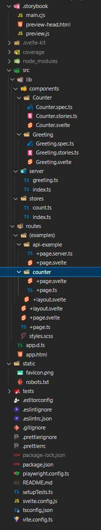
Project Files

src

This is the meat of the project:

  • lib contains your library code, which can be imported via the $lib alias, or packaged up for distribution using svelte-package. It can be imported by using the $lib/* alias.
    • server contains your server-only library code. SvelteKit will prevent you from importing these in client code.
    • components contain single responsibility components that are imported in our routes. They typically contain three files: .spec.ts for unit tests, .svelte and .stories.ts for storybook stories. Barrel files were not necessary here.
    • images contains images that can be imported, and used in the project.
    • stores contains state that needs to be accessed by multiple unrelated components, or by a regular JS module.
    • styles contains styles that can be imported in our Svelte applications.
  • params contains any param matchers your app needs
  • routes contains the routes of your application
  • app.html is your page template — an HTML document containing the following placeholders:
    • %sveltekit.head% — link and script elements needed by the app, plus any head content
    • %sveltekit.body% — the markup for a rendered page. This should live inside a <div> or other element, rather than directly inside the body element, to prevent bugs caused by browser extensions injecting elements that are then destroyed by the hydration process. SvelteKit will warn you in development if this is not the case
    • %sveltekit.assets% — either paths.assets, if specified, or a relative path to paths.base
    • %sveltekit.nonce% — a CSP nonce for manually included links and scripts, if used
  • hooks.server.ts contains your application's hooks

static

Any static assets that should be served as-is, like robots.txt or favicon.png, go in here.

svelte.config.js

This file contains your Svelte and SvelteKit configuration.

tsconfig.json

Since SvelteKit relies on certain configuration being set a specific way, it generates its own .svelte-kit/tsconfig.json file, which your own config extends.

vite.config.js

A SvelteKit project is really just a Vite project that uses the @sveltejs/kit/vite plugin, along with any other Vite configuration.

Routing

To get a deep dive of how routing works with SvelteKit, please check out this article.

SCSS

SvelteKit supports a number of CSS preprocessors.

For people who are new to Svelte or SvelteKit, the syntax for using SCSS or SASS is simple, just need to add the lang="sass" attribute to the style tag.

    <style lang="scss">
        ul {
            list-style-type: circle;
            li {
                position: relative;
            }
        }
    </style>
    npm i -D sass

Then add SCSS support with the svelte-preprocess package.

// svelte.config.js

import adapter from "@sveltejs/adapter-auto";
import preprocess from "svelte-preprocess";

/** @type {import('@sveltejs/kit').Config} */
const config = {
  // Consult https://github.com/sveltejs/svelte-preprocess
  // for more information about preprocessors
  preprocess: preprocess({ typescript: true, scss: true }),

  kit: {
    adapter: adapter(),
  },
};

export default config;

Why SCSS and not Tailwind?

Tailwind CSS has been used by several other starter kits. We otherwise decided to go with SCSS as the syntax is simple and easily understood by even beginners.

Vitest

Test Driven Development (TDD) is one of the best ways to ensure your code works like it's supposed to work. It can also help you create reliable builds during continuous deployments.

Vitest is an up-and-coming testing framework which has similar functionality to Jest.

Since we are using Vite as our build tool for Svelte in this kit, Vitest has very good integration with Vite, and offers a similar testing environment without needing extra configuration.

To test Svelte components that seemed to be hard to test. Such as two-way bindings, name slots, Context API, etc., we need to add more configuration.

We added @testing-library/svelte, jsdom and @testing-library/jest-dom that allow for similar functionality as Jest.

npm i -D @testing-library/svelte @testing-library/jest-dom jsdom

We ensured the $lib alias is supported in our tests by resolving the alias in our vite.config.ts. We also added a setupTest.ts to add @testing-library/jest-dom matchers & mocks of SvelteKit modules.

// vite.config.ts

import { sveltekit } from "@sveltejs/kit/vite";
import type { UserConfig } from "vite";
import { configDefaults, type UserConfig as VitestConfig } from "vitest/config";
import path from "path";

const config: UserConfig & { test: VitestConfig["test"] } = {
  plugins: [sveltekit()],
  define: {
    // Eliminate in-source test code
    "import.meta.vitest": "undefined",
  },
  test: {
    // jest like globals
    globals: true,
    environment: "jsdom",
    // in-source testing
    includeSource: ["src/**/*.{js,ts,svelte}"],
    // Add @testing-library/jest-dom matchers & mocks of SvelteKit modules
    setupFiles: ["./setupTests.ts"],
    // Exclude files in c8
    coverage: {
      exclude: ["setupTest.ts"],
    },
    deps: {
      // Put Svelte component here, e.g., inline: [/svelte-multiselect/, /msw/]
      inline: [],
    },
    // Exclude playwright tests folder
    exclude: [...configDefaults.exclude, "tests"],
  },

  // Ensure the $lib alias is supported in our tests
  resolve: {
    alias: {
      $lib: path.resolve(__dirname, "./src/lib"),
    },
  },
};

export default config;
// setupTest.ts

/* eslint-disable @typescript-eslint/no-empty-function */
import matchers from "@testing-library/jest-dom/matchers";
import { expect, vi } from "vitest";
import type { Navigation, Page } from "@sveltejs/kit";
import { readable } from "svelte/store";
import * as environment from "$app/environment";
import * as navigation from "$app/navigation";
import * as stores from "$app/stores";

// Add custom jest matchers
expect.extend(matchers);

// Mock SvelteKit runtime module $app/environment
vi.mock("$app/environment", (): typeof environment => ({
  browser: false,
  dev: true,
  building: false,
  version: "any",
}));

// Mock SvelteKit runtime module $app/navigation
vi.mock("$app/navigation", (): typeof navigation => ({
  afterNavigate: () => {},
  beforeNavigate: () => {},
  disableScrollHandling: () => {},
  goto: () => Promise.resolve(),
  invalidate: () => Promise.resolve(),
  invalidateAll: () => Promise.resolve(),
  preloadData: () => Promise.resolve(),
  preloadCode: () => Promise.resolve(),
}));

// Mock SvelteKit runtime module $app/stores
vi.mock("$app/stores", (): typeof stores => {
  const getStores: typeof stores.getStores = () => {
    const navigating = readable<Navigation | null>(null);
    const page = readable<Page>({
      url: new URL("http://localhost"),
      params: {},
      route: {
        id: null,
      },
      status: 200,
      error: null,
      data: {},
      form: undefined,
    });
    const updated = {
      subscribe: readable(false).subscribe,
      check: () => false,
    };

    return { navigating, page, updated };
  };

  const page: typeof stores.page = {
    subscribe(fn) {
      return getStores().page.subscribe(fn);
    },
  };
  const navigating: typeof stores.navigating = {
    subscribe(fn) {
      return getStores().navigating.subscribe(fn);
    },
  };
  const updated: typeof stores.updated = {
    subscribe(fn) {
      return getStores().updated.subscribe(fn);
    },
    check: () => false,
  };

  return {
    getStores,
    navigating,
    page,
    updated,
  };
});

If you want to see some test recipes you can use on your SvelteKit projects, check out our SvelteKit-SCSS Github showcase.

Storybook

Like many of the other starter.dev kits, the SvelteKit starter uses Storybook to interactively view and build components in isolation.

For more information on Storybook and SvelteKit visit the article.

Linting

ESLint and Prettier are useful tools for keeping the project neat and consistent among multiple contributors.

To quickly format your project, run:

    npm run format

Running ESLint and Prettier as part of your git workflow is important because it helps you fail fast. This helps us, as contributors, to have a more consistent production codebase.

We achieved this in our SvelteKit-SCSS Github showcase with the help of Husky, lint-staged and Prettier.

How does lint-staged work? It's specifically designed to work on "staged" files, which are files you've changed or created, but haven't yet committed to your project. Working on staged files limits the number of files you need to lint at any given time, and makes the workflow faster.

We configured lint-staged in our package.json. This runs Prettier pre-commit, and ensures the code is up to our ESLint standards.

    // package.json
    "lint-staged": {
        "src/**/*{.js,.ts,.html,.css,.svelte}": [
            "prettier --plugin-search-dir . --write ."
        ],
        "src/**/*{.js,.ts,.svelte}": "eslint ."
    },

The commands you configure will run "pre-commit". As you're attempting to commit files to your project you'll see ESLint run in your terminal. Once it's done you may have successfully committed, or find yourself with linting errors you need to fix before you're able to commit the code.

This works hand-in-hand with husky. Husky uses distinct bash files with filenames that match the workflow step they correspond to, e.g. "pre-commit".

    #!/bin/sh
    . "$(dirname "$0")/_/husky.sh"

    cd svelte-kit-scss
    npx lint-staged

Running ESLint, or Prettier as part of your git workflow is important because it helps you fail fast, which helps contributors have a more consistent production codebase.

Conclusion

SvelteKit is a relatively new and novel framework. The structure represents our best judgment of how a basic SvelteKit application should be. We welcome everyone to take a look, and contribute back to the SvelteKit-SCSS and our SvelteKit-SCSS Github showcase if you have any improvements that you would like to propose!

This Dot Labs is a development consultancy that is trusted by top industry companies, including Stripe, Xero, Wikimedia, Docusign, and Twilio. This Dot takes a hands-on approach by providing tailored development strategies to help you approach your most pressing challenges with clarity and confidence. Whether it's bridging the gap between business and technology or modernizing legacy systems, you’ll find a breadth of experience and knowledge you need. Check out how This Dot Labs can empower your tech journey.

You might also like

Introducing the SolidStart, TanStack Query and Tailwind CSS Starter kit cover image

Introducing the SolidStart, TanStack Query and Tailwind CSS Starter kit

We are delighted to announce our SolidStart + TanStack + Tailwind Starter Kit on Starter.dev to help you build your next project with SolidStart, TanStack Solid Query, and Tailwind CSS in no time. In this article, we will walk you through the kit and how it is great for building your next project. Why SolidStart? Solid.js is a really cool new framework with a lot of amazing features. Its syntax is mostly like React syntax. However, they work in completely different ways behind the scenes. Solid.js is a declarative, component-based library for building user interfaces. It is a highly customizable, low-level framework that gives you all of the building blocks you need to build bespoke designs without any opinionated styles that you have to fight to override. SolidStart is a meta-framework that helps you build your Solid.js apps with ease. It supports Client-side rendering, Server-side rendering, Streaming SSR, and Static site generation. Vite Vite is a new frontend build tool that significantly improves the frontend development experience. It consists of two major parts: - A dev server that provides rich feature enhancements over native ES Module imports (e.g. module hot-reloading, proper dependency analysis, etc). - A build command that bundles your code with Rollup, pre-configured to output highly optimized static assets for production. Vite is designed from the ground up for the es-module era, and as such, it doesn't require a bundler like webpack or Parcel during development. It also doesn't require a complicated configuration file like snowpack. Instead, it leverages the browser's native support for ES modules (i.e. native ES imports) and the new spec proposal for importing CSS as modules. This means that Vite can provide instant feedback during development, and also enables features that are simply impossible with other tools, such as server-side rendering and static site generation. Vite is designed to be framework-agnostic. It is not opinionated about your choice of framework, and it is also framework-agnostic in the sense that it doesn't require you to use a specific framework-specific toolchain. You can use Vite with any framework that supports native ES imports, including React, Vue, Svelte, Angular, and even vanilla JS. Vite is also designed to be plugin-based. It is built on top of Rollup, which is a powerful and flexible bundler. However, Vite is not a wrapper around Rollup. Instead, it is a plugin-based build tool that uses Rollup under the hood. This means that you can use any Rollup plugin with Vite, and you can also create your own Vite plugins to customize Vite's behavior. Why Tanstack? TanStack is a full-stack framework for building web applications with Solid, Tailwind CSS, and TypeScript. It is a highly customizable, low-level framework that gives you all of the building blocks you need to build bespoke designs without any annoying opinionated styles that you have to fight to override. Why Tailwind CSS? Tailwind CSS is a utility-first CSS framework for rapidly building custom user interfaces. It is a highly customizable, low-level CSS framework that gives you all of the building blocks you need to build bespoke designs without any annoying opinionated styles you have to fight to override. Testing This kit comes with Vitest pre-configured. Vitest is a tool that is built with Vite in mind from the start, taking advantage of its improvements in DX, like its instant Hot Module Reload (HMR). This is Vitest, a blazing fast unit-test framework powered by Vite. It's a great alternative to Jest. It's fast and easy to use. Conclusion SolidStart is still in the beta phase. However, it has a lot of good DX improvements. This kit is great if you want to build a fast and lightweight fullstack web application. It provides you with everything you need from backend to frontend, even data caching and Tailwind configurations with two examples out of the box. For more SolidJS resources, check our solidjs.framework.dev, where you can find courses, tutorials, and libraries for SolidJS. Also, you can create your next SolidJS project. Try our SolidJS starter kit from Starter.dev. It has a lot of tools pre-configured for you. If you have any questions or suggestions, please feel free to send them to us or reach out to us on Twitter....

A Deep Dive into SvelteKit Routing with Our Starter.dev GitHub Showcase Example cover image

A Deep Dive into SvelteKit Routing with Our Starter.dev GitHub Showcase Example

Introduction SvelteKit is an excellent framework for building web applications of all sizes, with a beautiful development experience and flexible filesystem-based routing. At the heart of SvelteKit is a filesystem-based router. The routes of your app — i.e. the URL paths that users can access — are defined by the directories in your codebase. In this tutorial, we are going to discuss SvelteKit routing with an awesome SvelteKit GitHub showcase built by This Dot Labs. The showcase is built with the SvelteKit starter kit on starter.dev. We are going to tackle: - Filesystem-based router - +page.svelte - +page.server - +layout.svelte - +layout.server - +error.svelte - Advanced Routing - Rest Parameters - (group) layouts - Matching Below is the current routes folder. Prerequisites You will need a development environment running Node.js; this tutorial was tested on Node.js version 16.18.0, and npm version 8.19.2. Filesystem-based router The src/routes` is the root route. You can change `src/routes` to a different directory by editing the project config. `js // svelte.config.js / @type {import('@sveltejs/kit').Config} */ const config = { kit: { routes: "src/routes", // 👈 you can change it here to anything you want }, }; ` Each route directory contains one or more route files, which can be identified by their + prefix. +page.svelte A +page.svelte` component defines a page of your app. By default, pages are rendered both on the server (SSR) for the initial request, and in the browser (CSR) for subsequent navigation. In the below example, we see how to render a simple login page component: ` // src/routes/signin/(auth)/+page.svelte import Auth from '$lib/components/auth/Auth.svelte'; ` +page.ts Often, a page will need to load some data before it can be rendered. For this, we add a +page.js` (or `+page.ts`, if you're TypeScript-inclined) module that exports a load function. +page.server.ts` If your load function can only run on the server— ie, if it needs to fetch data from a database or you need to access private environment variables like API key— then you can rename +page.js` to `+page.server.js`, and change the `PageLoad` type to `PageServerLoad`. To pass top user repository data, and user’s gists to the client-rendered page, we do the following: `ts // src/routes/(authenticated)/(home)/+page.server.ts import type { PageServerLoad } from "./$types"; import { mapUserReposToTopRepos, mapGistsToHomeGists } from "$lib/helpers"; import type { UserGistsApiResponse, UserReposApiResponse, } from "$lib/interfaces"; import { ENV } from "$lib/constants/env"; export const load: PageServerLoad = async ({ fetch, parent }) => { const repoURL = new URL("/user/repos", ENV.GITHUBURL); repoURL.searchParams.append("sort", "updated"); repoURL.searchParams.append("perpage", "20"); const { userInfo } = await parent(); const gistsURL = new URL( /users/${userInfo?.username}/gists`, ENV.GITHUBURL ); try { const reposPromise = await fetch(repoURL); const gistsPromise = await fetch(gistsURL); const [repoRes, gistsRes] = await Promise.all([reposPromise, gistsPromise]); const gists = (await gistsRes.json()) as UserGistsApiResponse; const repos = (await repoRes.json()) as UserReposApiResponse; return { topRepos: mapUserReposToTopRepos(repos), gists: mapGistsToHomeGists(gists), username: userInfo?.username, }; } catch (err) { console.log(err); } }; ` The page.svelte` gets access to the data by using the data variable which is of type `PageServerData`. `html import TopRepositories from '$lib/components/TopRepositories/TopRepositories.svelte'; import Gists from '$lib/components/Gists/Gists.svelte'; import type { PageServerData } from './$types'; export let data: PageServerData; {#if data?.gists} {/if} {#if data?.topRepos} {/if} @use 'src/lib/styles/variables.scss'; .page-container { display: grid; grid-template-columns: 1fr; background: variables.$gray100; @media (min-width: variables.$md) { grid-template-columns: 24rem 1fr; } } aside { background: variables.$white; padding: 2rem; @media (max-width: variables.$md) { order: 2; } } ` +layout.svelte As there are elements that should be visible on every page, such as top-level navigation or a footer. Instead of repeating them in every +page.svelte, we can put them in layouts. The only requirement is that the component includes a ` for the page content. For example, let's add a nav bar: `html import NavBar from '$lib/components/NavBar/NavBar.svelte'; import type { LayoutServerData } from './$types'; export let data: LayoutServerData; // 👈 child routes of the layout page ` +layout.server.ts Just like +page.server.ts`, your `+layout.svelte` component can get data from a load function in `+layout.server.js`, and change the type from `PageServerLoad` type to LayoutServerLoad. `ts // src/routes/(authenticated)/+layout.server.ts import { ENV } from "$lib/constants/env"; import { remapContextUserAsync } from "$lib/helpers/context-user"; import type { LayoutServerLoad } from "./$types"; import { mapUserInfoResponseToUserInfo } from "$lib/helpers/user"; export const load: LayoutServerLoad = async ({ locals, fetch }) => { const getContextUserUrl = new URL("/user", ENV.GITHUBURL); const response = await fetch(getContextUserUrl.toString()); const contextUser = await remapContextUserAsync(response); locals.user = contextUser; return { userInfo: mapUserInfoResponseToUserInfo(locals.user), }; }; ` +error.svelte If an error occurs during load, SvelteKit will render a default error page. You can customize this error page on a per-route basis by adding an +error.svelte file. In the showcase, an error.svelte` page has been added for authenticated view in case of an error. `html import { page } from '$app/stores'; import ErrorMain from '$lib/components/ErrorPage/ErrorMain.svelte'; import ErrorFlash from '$lib/components/ErrorPage/ErrorFlash.svelte'; ` Advanced Routing Rest Parameters If the number of route segments is unknown, you can use spread operator syntax. This is done to implement Github’s file viewer. ` /[org]/[repo]/tree/[branch]/[...file] ` svelte-kit-scss.starter.dev/thisdot/starter.dev/blob/main/starters/svelte-kit-scss/README.md` would result in the following parameters being available to the page: `js { org: ‘thisdot’, repo: 'starter.dev', branch: 'main', file: ‘/starters/svelte-kit-scss/README.md' } ` (group) layouts By default, the layout hierarchy mirrors the route hierarchy. In some cases, that might not be what you want. In the GitHub showcase, we would like an authenticated user to be able to have access to the navigation bar, error page, and user information. This is done by grouping all the relevant pages which an authenticated user can access. Grouping can also be used to tidy your file tree and ‘group’ similar pages together for easy navigation, and understanding of the project. Matching In the Github showcase, we needed to have a page to show issues and pull requests for a single repo. The route src/routes/(authenticated)/[username]/[repo]/[issues]` would match `/thisdot/starter.dev-github-showcases/issues` or `/thisdot/starter.dev-github-showcases/pull-requests` but also `/thisdot/starter.dev-github-showcases/anything` and we don't want that. You can ensure that route parameters are well-formed by adding a matcher— which takes only `issues` or `pull-requests`, and returns true if it is valid– to your params directory. `ts // src/params/issuesearch_type.ts import { IssueSearchPageTypeFiltersMap } from "$lib/constants/matchers"; import type { ParamMatcher } from "@sveltejs/kit"; export const match: ParamMatcher = (param: string): boolean => { return Object.keys(IssueSearchPageTypeFiltersMap).includes( param?.toLowerCase() ); }; ` `ts // src/lib/constants/matchers.ts import { IssueSearchQueryType } from './issues-search-query-filters'; export const IssueSearchPageTypeFiltersMap = { issues: ‘issues’, pulls: ’pull-requests’, }; export type IssueSearchTypePage = keyof typeof IssueSearchPageTypeFiltersMap; ` ...and augmenting your routes: ` [issueSearchType=issuesearch_type] ` If the pathname doesn't match, SvelteKit will try to match other routes (using the sort order specified below), before eventually returning a 404. Note: Matchers run both on the server and in the browser.` Conclusion In this article, we learned about basic and advanced routing in SvelteKit by using the SvelteKit showcase example. We looked at how to work with SvelteKit's Filesystem-based router, rest parameters, and (group) layouts. If you want to learn more about SvelteKit, please check out the SvelteKit and SCSS starter kit and the SvelteKit and SCSS GitHub showcase. All the code for our showcase project is open source. If you want to collaborate with us or have suggestions, we're always welcome to new contributions. Thanks for reading! If you have any questions, or run into any trouble, feel free to reach out on Twitter....

Avoiding Null and Undefined with NonNullable<T> in TypeScript cover image

Avoiding Null and Undefined with NonNullable<T> in TypeScript

Use Cases Use Case 1: Adding Two Numbers Scenario: A function that adds two numbers and returns their sum. But if one of the numbers is undefined or null, it returns the other number as-is. ` function addNumbers(a: number, b?: number | null): NonNullable { return a + (b ?? 0); } const sum1 = addNumbers(2, 3); // Returns 5 const sum2 = addNumbers(2, null); // Returns 2 const sum3 = addNumbers(2, undefined); // Returns 2 ` In this code snippet, the addNumbers()` function takes two parameters, `a` and `b`. `a` is a required parameter of type `number`, while `b` is an optional parameter of type `number` or `null`. The function uses the NonNullable&lt;T&gt; conditional type to ensure that the return value is not null or undefined. If `b` is null or undefined, the function returns the value of `a`. Otherwise, it adds `a` and `b` together and returns the sum. To handle the case where `b` is null or undefined, the code uses the nullish coalescing operator, `??`, which returns the value on its left-hand side if it is not null or undefined, and the value on its right-hand side otherwise. Use Case 2: Checking Contact Information Scenario: A class representing a person, but with optional email and phone properties. The contact()` function logs the email and phone numbers if they are defined and not null. Otherwise, it logs a message saying that no contact information is available. ` class Person { name: string; email?: string | null; phone?: string | null; constructor(name: string, email?: string | null, phone?: string | null) { this.name = name; this.email = email ?? null; this.phone = phone ?? null; } contact() { if(this.email !== undefined && this.email !== null && this.phone !== undefined && this.phone !== null) { console.log(${this.name} can be reached at ${this.email} or ${this.phone}`); } else { console.log(${this.name} has no contact information available`); } } } const john = new Person('John Doe', 'john.doe@example.com', '(123) 456-7890'); const jane = new Person('Jane Smith', null, '987-654-3210'); john.contact(); // logs 'John Doe can be reached at john.doe@example.com or (123) 456-7890' jane.contact(); // logs 'Jane Smith has no contact information available' ` Explanation: In this code snippet, the Person` class has a `name` property and optional `email` and `phone` properties. The `contact()` function checks if both `email` and `phone` are not undefined and not null before logging the details. Otherwise, it logs a message saying that no contact information is available. To initialize the properties with null, the constructor uses the nullish coalescing operator, `??`. When creating a new `Person`, you can pass null or undefined as arguments, and the class will interpret them as null. Conclusion Understanding and correctly implementing conditional types like NonNullable&lt;T&gt; in TypeScript is crucial to reduce potential code pitfalls. By reviewing examples of numerical operations and contact information handling, we've seen how this conditional type helps reinforce our code against null or undefined values. This highlights the utility of TypeScript's conditional types not only for enhancing code stability, but also for easing our coding journey. So keep experimenting and finding the best ways to deploy these tools for creating robust, secure, and efficient programs!...

Nuxt DevTools v1.0: Redefining the Developer Experience Beyond Conventional Tools cover image

Nuxt DevTools v1.0: Redefining the Developer Experience Beyond Conventional Tools

In the ever-evolving world of web development, Nuxt.js has taken a monumental leap with the launch of Nuxt DevTools v1.0. More than just a set of tools, it's a game-changer—a faithful companion for developers. This groundbreaking release, available for all Nuxt projects and being defaulted from Nuxt v3.8 onwards, marks the beginning of a new era in developer tools. It's designed to simplify our development journey, offering unparalleled transparency, performance, and ease of use. Join me as we explore how Nuxt DevTools v1.0 is set to revolutionize our workflow, making development faster and more efficient than ever. What makes Nuxt DevTools so unique? Alright, let's start delving into the features that make this tool so amazing and unique. There are a lot, so buckle up! In-App DevTools The first thing that caught my attention is that breaking away from traditional browser extensions, Nuxt DevTools v1.0 is seamlessly integrated within your Nuxt app. This ensures universal compatibility across browsers and devices, offering a more stable and consistent development experience. This setup also means the tools are readily available in the app, making your work more efficient. It's a smart move from the usual browser extensions, making it a notable highlight. To use it you just need to press Shift + Option + D` (macOS) or `Shift + Alt + D` (Windows): With simple keystrokes, the Nuxt DevTools v1.0 springs to life directly within your app, ready for action. This integration eliminates the need to toggle between windows or panels, keeping your workflow streamlined and focused. The tools are not only easily accessible but also intelligently designed to enhance your productivity. Pages, Components, and Componsables View The Pages, Components, and Composables View in Nuxt DevTools v1.0 are a clear roadmap for your app. They help you understand how your app is built by simply showing its structure. It's like having a map that makes sense of your app's layout, making the complex parts of your code easier to understand. This is really helpful for new developers learning about the app and experienced developers working on big projects. Pages View lists all your app's pages, making it easier to move around and see how your site is structured. What's impressive is the live update capability. As you explore the DevTools, you can see the changes happening in real-time, giving you instant feedback on your app's behavior. Components View is like a detailed map of all the parts (components) your app uses, showing you how they connect and depend on each other. This helps you keep everything organized, especially in big projects. You can inspect components, change layouts, see their references, and filter them. By showcasing all the auto-imported composables, Nuxt DevTools provides a clear overview of the composables in use, including their source files. This feature brings much-needed clarity to managing composables within large projects. You can also see short descriptions and documentation links in some of them. Together, these features give you a clear picture of your app's layout and workings, simplifying navigation and management. Modules and Static Assets Management This aspect of the DevTools revolutionizes module management. It displays all registered modules, documentation, and repository links, making it easy to discover and install new modules from the community! This makes managing and expanding your app's capabilities more straightforward than ever. On the other hand, handling static assets like images and videos becomes a breeze. The tool allows you to preview and integrate these assets effortlessly within the DevTools environment. These features significantly enhance the ease and efficiency of managing your app's dynamic and static elements. The Runtime Config and Payload Editor The Runtime Config and Payload Editor in Nuxt DevTools make working with your app's settings and data straightforward. The Runtime Config lets you play with different configuration settings in real time, like adjusting settings on the fly and seeing the effects immediately. This is great for fine-tuning your app without guesswork. The Payload Editor is all about managing the data your app handles, especially data passed from server to client. It's like having a direct view and control over the data your app uses and displays. This tool is handy for seeing how changes in data impact your app, making it easier to understand and debug data-related issues. Open Graph Preview The Open Graph Preview in Nuxt DevTools is a feature I find incredibly handy and a real time-saver. It lets you see how your app will appear when shared on social media platforms. This tool is crucial for SEO and social media presence, as it previews the Open Graph tags (like images and descriptions) used when your app is shared. No more deploying first to check if everything looks right – you can now tweak and get instant feedback within the DevTools. This feature not only streamlines the process of optimizing for social media but also ensures your app makes the best possible first impression online. Timeline The Timeline feature in Nuxt DevTools is another standout tool. It lets you track when and how each part of your app (like composables) is called. This is different from typical performance tools because it focuses on the high-level aspects of your app, like navigation events and composable calls, giving you a more practical view of your app's operation. It's particularly useful for understanding the sequence and impact of events and actions in your app, making it easier to spot issues and optimize performance. This timeline view brings a new level of clarity to monitoring your app's behavior in real-time. Production Build Analyzer The Production Build Analyzer feature in Nuxt DevTools v1.0 is like a health check for your app. It looks at your app's final build and shows you how to make it better and faster. Think of it as a doctor for your app, pointing out areas that need improvement and helping you optimize performance. API Playground The API Playground in Nuxt DevTools v1.0 is like a sandbox where you can play and experiment with your app's APIs. It's a space where you can easily test and try out different things without affecting your main app. This makes it a great tool for trying out new ideas or checking how changes might work. Some other cool features Another amazing aspect of Nuxt DevTools is the embedded full-featured VS Code. It's like having your favorite code editor inside the DevTools, with all its powerful features and extensions. It's incredibly convenient for making quick edits or tweaks to your code. Then there's the Component Inspector. Think of it as your code's detective tool. It lets you easily pinpoint and understand which parts of your code are behind specific elements on your page. This makes identifying and editing components a breeze. And remember customization! Nuxt DevTools lets you tweak its UI to suit your style. This means you can set up the tools just how you like them, making your development environment more comfortable and tailored to your preferences. Conclusion In summary, Nuxt DevTools v1.0 marks a revolutionary step in web development, offering a comprehensive suite of features that elevate the entire development process. Features like live updates, easy navigation, and a user-friendly interface enrich the development experience. Each tool within Nuxt DevTools v1.0 is thoughtfully designed to simplify and enhance how developers build and manage their applications. In essence, Nuxt DevTools v1.0 is more than just a toolkit; it's a transformative companion for developers seeking to build high-quality web applications more efficiently and effectively. It represents the future of web development tools, setting new standards in developer experience and productivity....