
In my previous posts, I explained how to create a project based on LitElement and TypeScript from scratch. Also, I added the routing management and explained how to have more control over the navigation lifecycle.
Let's deep dive over the Web Components creation to understand how to reuse them, respond to any property change, and dispatch custom events.
Writing a Web Component
Let's define a base template to display an overview of every blog post in our web application.
<div class="blog-card">
  <div class="blog-description">
    <h1>Title</h1>
    <h2>Author</h2>
    <p>
      Brief Description
    </p>
    <p class="blog-footer">
      <a class="blog-link">Read More</a>
    </p>
  </div>
</div>
With this template, we should expect to draw a simple card to display the post content. It will define the internal DOM for our new component.
Let's create the Web Component using LitElement and the @customElement decorator:
// blog-card.ts

import { LitElement, html, customElement, css } from 'lit-element';
import { Post } from './post';

@customElement('blog-card')
export class BlogCard extends LitElement {
  static styles = css`
  .blog-card {
    margin: 20px;
    display: flex;
    flex-direction: column;
    margin-bottom: 15px;
    background: white;
    border-radius: 5px;
    overflow: hidden;
    border-radius: 10px;
  }
  .blog-description {
    padding: 20px;
    background: white;
  }
  .blog-footer {
    text-align: right;
  }
  .blog-link {
    color: #008cba;
  }
  h1 {
    margin: 0;
    font-size: 1.5rem;
  }
  h2 {
    font-size: 1rem;
    font-weight: 300;
    color: #5e5e5e;
    margin-top: 5px;
  }
  `;

  render() {
    return html`
      <div class="blog-card">
        <div class="blog-description">
          <h1>Title</h1>
          <h2>Author</h2>
          <p>
            Brief Description
          </p>
          <p class="blog-footer">
            <a class="blog-link">Read More</a>
          </p>
        </div>
      </div>
    `;
  }
}
This component is ready to be rendered. However, it cannot be reused since the content will remain always the same. We need a way to configure this component so that it can display different content for each instance of it(That should be ideal, right?).
Adding Properties
The TypeScript-way to declare the element's properties is as follows:
// blog-card.ts

@customElement('blog-card')
export class BlogCard extends LitElement {

  @property({ type: String }) postTitle?: string;
  @property({ type: String }) author?: string;
  @property({ type: String }) description?: string;
}
That looks enough to configure our new component and being able to display an overview of a blog post. However, what will happen if we decide to add other attributes? The properties list will be growing in number and maybe it's not the best way to handle this scenario.
The other option is define a Post model through a TypeScript Interface:
// post.ts
export interface Post {
  id: number;
  title: string;
  author: string;
  description: string;
}
Then, let's define a single property that expects a Post object:
// blog-card.ts

@customElement('blog-card')
export class BlogCard extends LitElement {

  @property({ type: Object }) post?: Post;
}
Binding Properties
It's time to improve the render function and create property bindings into the template.
// blog-card.ts

  render() {
    return html`
      <div class="blog-card">
        <div class="blog-description">
          <h1>${this.post?.title}</h1>
          <h2>${this.post?.author}</h2>
          <p>
            ${this.post?.description}
          </p>
          <p class="blog-footer">
            <a class="blog-link">Read More</a>
          </p>
        </div>
      </div>
    `;
  }
The @property declaration(defined before) will render the template every time the given property changes.
Adding Events
There are different ways to add event listeners for our Web Components. In this case, we can use a declarative event listener using @event notation:
  render() {
    return html`
      <div class="blog-card">
        <div class="blog-description">
          <h1>${this.post?.title}</h1>
          <h2>${this.post?.author}</h2>
          <p>
            ${this.post?.description}
          </p>
          <p class="blog-footer">
            <a class="blog-link" @click="${this.handleClick}">Read More</a>
          </p>
        </div>
      </div>
    `;
  }

  private handleClick() {
    this.dispatchEvent(
      new CustomEvent('readMore', { detail: this.post })
    );
  }
The event listener @click="${this.handleClick}" will be added once the template gets rendered in the browser. The click action will be handled by the handleClick function.
This function will fire an event from our Lit-based web component. The CustomEvent allows an object Post to be propagated along with it.
Parent-Child Component Communication
The blog-card component is ready to be integrated into the application.
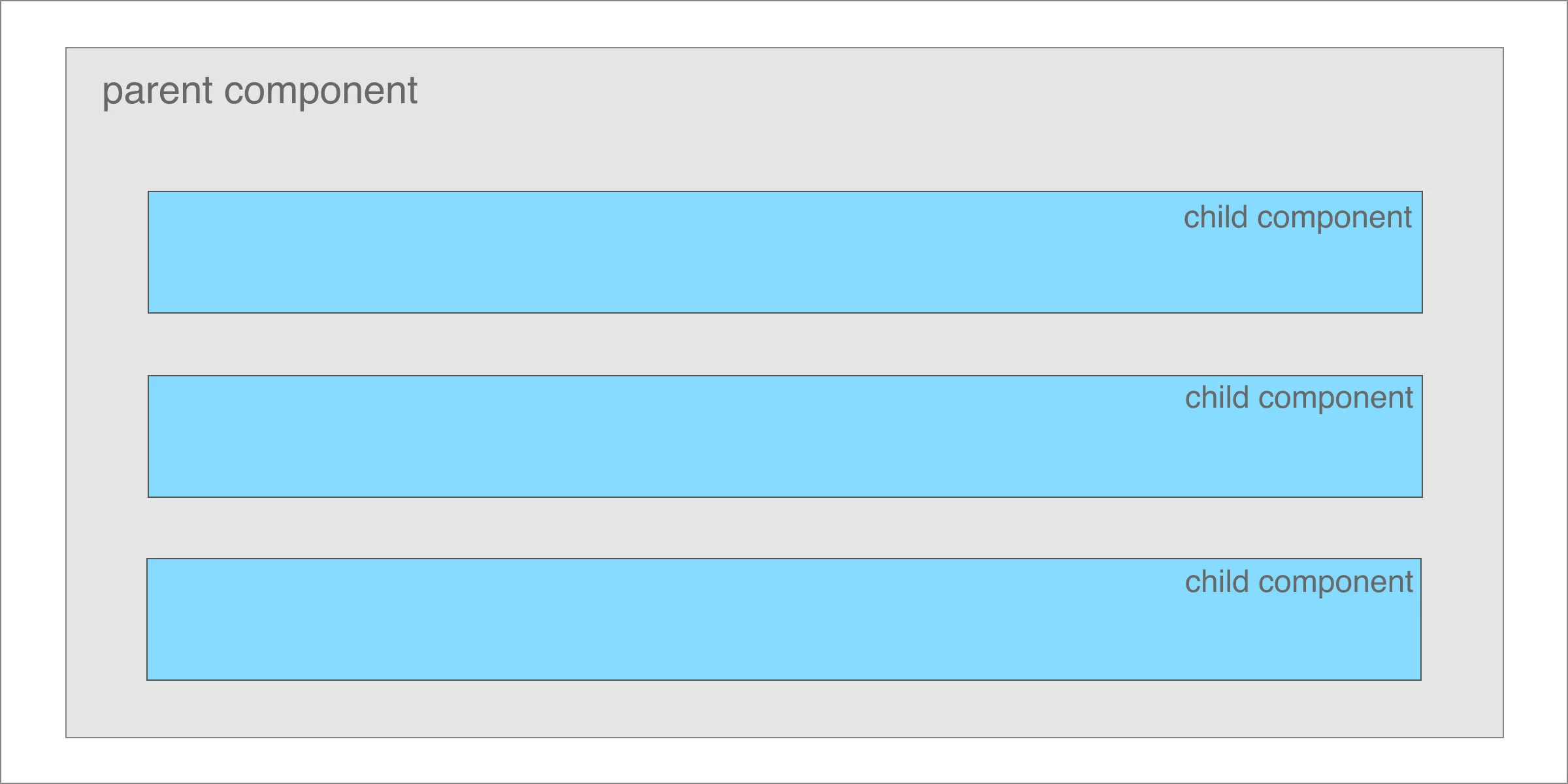
Let's think in the Blog Posts page as the parent and the Blog Card as the child component:
// blog-posts.ts

import { POSTS } from './data';
import { Post } from './post';

@customElement('lit-blog-posts')
export class BlogPosts extends LitElement {

  @property({ type: Array }) blogPosts?: Post[];

  constructor() {
    super();
  }

  render() {
    return html`
      <h2>Blog Posts</h2>
      ${this.blogPosts?.map(
        post => html`<blog-card .post="${post}"></blog-card>`
      )}
    `;
  }

  firstUpdated() {
    this.blogPosts = POSTS;
  }
}
The parent component defines a property to store a set of blog posts using @property({ type: Array }) blogPosts?: Post[];.
If you have the Web component template and want to bind properties, take into account the following rules:
- Text content:
<p>${...}</p> - Attribute:
<p id="${...}"></p> - Boolean attribute:
?disabled="${...}" - Property:
.value="${...}" - Event handler:
@event="${...}"
The firstUpdated function will be called after the element's DOM has been updated the first time. In a real-world scenario, the app would need to perform an HTTP call to get the data.
For this example, let's load the data from data.ts file:
// data.ts
import { Post } from './post';
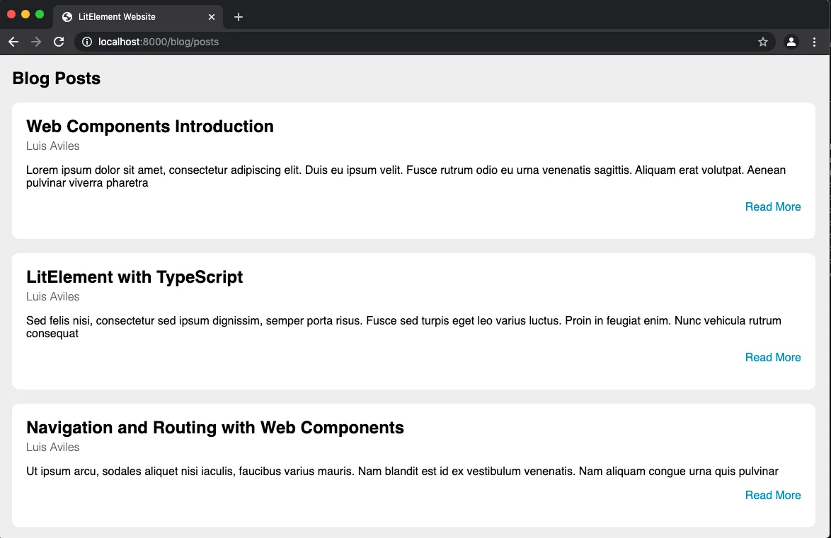
export const POSTS: Post[] = [
{
id: 0,
title: 'Web Components Introduction',
author: 'Luis Aviles',
description:
'Lorem ipsum dolor sit amet, consectetur adipiscing elit...',
},
{
id: 1,
title: 'LitElement with TypeScript',
author: 'Luis Aviles',
description:
'Sed felis nisi, consectetur sed ipsum dignissim, semper porta risus...',
},
{
id: 2,
title: 'Navigation and Routing with Web Components',
author: 'Luis Aviles',
description:
'Ut ipsum arcu, sodales aliquet nisi iaculis, faucibus varius mauris...',
},
];
Listen to Child Events
The parent component is ready to display the blog posts. However, it would be great to listen every time the "Read More" link has been clicked and take the control from the Blog Posts page:
// blog-posts.ts

  firstUpdated() {
    this.blogPosts = POSTS;
    this.addEventListener('readMore', event => {
      const post = (event as CustomEvent).detail as Post; //event.detail has a the Post object
      Router.go(`/blog/posts/${post.id}`); // Get the Post id and redirect
    });
  }
The event listener will be executed after the first paint. This way of adding them can be useful when you're adding several listeners.
This should be the final result:
Source Code Project
Find the complete project in this GitHub repository: https://github.com/luixaviles/litelement-website. Do not forget to give it a star ⭐️ and play around with the code.
You can follow me on Twitter and GitHub to see more about my work.