Skip to content

Build Advanced Components in Vue 3 using $attrs

This article was written over 18 months ago and may contain information that is out of date. Some content may be relevant but please refer to the relevant official documentation or available resources for the latest information.

In the third major release of Vue js, we have seen many new features and improvements land on our remote working computers.

In this article, we are going to cover the $attrs attribute. We will explain what it is used for, how its implementation differs from Vue 2's (former $attrs, class, @listener), and build a code example to help understand its power.

Understanding this feature can really support your skills in developing easy to use and scalable components advanced components.

What is $attrs?

The definition of $attrs, varies between the two major versions of the framework, but in this article, we are going to mainly cover Vue 3, where @attrs can be seen as:

A component property that holds all of the attribute, property, and custom events that are not currently defined within the component.

$attrs can also be seen as a safety net, that captures anything that you may not have declared within a component. Let's consider a component that has just a single property and event handler, like the following example:

<template>
  <h1 @click="$emit('custom', 'change title')>{{title}}</h1>
</template>
<script>
export default {
  name: 'Example',
  props: ['title'],
  emits: ['custom'] //This is the new way to declare custom events in vue 3.
}
</script>

If we would instantiate our component like so:

<example 
  id="myId" 
  class="myClass" 
  data-cy="cypress-testing" 
  @blur="...." 
  title="this was expected"
  description="non declared props"
  @custom="..."
/>

Our example component would have access to a $attrs property with the following information:

$attrs = {
  id: "myId" 
  class: "myClass" 
  data-cy: "cypress-testing" 
  @blur: "...." 
  description: "non declared props"
}

If the above is not yet making sense, it is absolutely fine. In the next few sections, we will cover, in more granular details, how to actually make use of this feature.

$attrs V3 vs $attrs V2

Even if I do not want this article to be a comparison between V2 and V3, it is essential that we touch base on the differences that the $attrs feature offers betweent the two major versions.

If you have used VueJs in the past (version 2), there is a significant chance that you have already used $attrs before. The main reason is that almost all the attributes included in the $attrs property were already present in the previous version of the framework. Just split it into different properties.

If we take into consideration the example proposed above, the $attrs object is going to appear as follows:

vue 2 vs v3 $attrs

Main differences to notice in V2 are:

  • custom events go into a @listerner bucket
  • the class is not available (using class in this way requires you to set a property).

Most of the content provided in the following chapter can still be applied in V2, as long as we adhere to the above differences and define the extra properties ($listners and a class property).

Real Life example

As with most of my content, I like to always cover a real life example. Building something from the bottom up, can really help in understanding the reason beind a feature, and help you introduce its usage within your codebase.

In the following sections, we are going to build a nice slider (or more precisely a few of them). The complete code can be found on Stackblitz following the following link (stackblitz-vue-example).

Let's start from scratch

The first step requires us to create a simple component. This is going to be plain Vue and will have nothing to do with the $attrs feature (yet).

// Slider-1.vue

<template>
  <input 
    class="slider__input"
    type="range" 
    :value="modelValue"
    @input="$emit('update:modelValue', $event.target.value)" />
</template>

<script>
export default {
  name: "Slider",
  props: {
    modelValue: [Number, String]
  }
};
</script>

<style lang="scss">
  // The style of this slider have been taken from the W3School website. Link available here: https://www.w3schools.com/howto/howto_js_rangeslider.asp
  // See the Stackblitz link for the full CSS.
</style>

The above code will create a slider that includes single HTML element at the root, and a simple two way binding for a property called value.

To use the above component we would do something like this:

    <Slider-1 v-model="value" />

The result should be something like this: vue-attrs-1

Let's add some attributes

The above "hello world" example, would never stand the real web development industry.

As we know, our components are always full of requirements and specifications, and are never this simple. So to make it a bit more realistic, let's add a couple of attributes (min, max, class, id, data-cy, @keydown and aria-label).

    <Slider-1
      v-model="value"
      min="0"
      max="50"
      class="blue_slider"
      id="special_id"
      data-cy="cypress-slider"
      @keydown="() => true"
      aria-label="Example slider"
    />

If we would run the app with the above changes, we would see that all changes take effect. In fact, analysing the app will show the following UI and HTML:

vue-$attrs-2

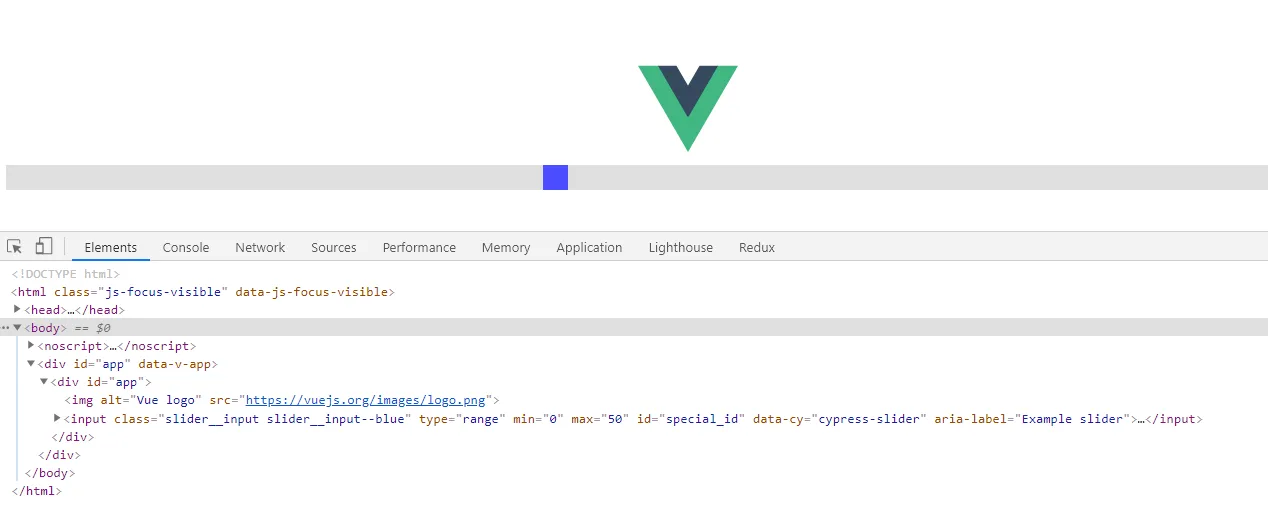
As we can notice, all the information has already been applied to our HTML.

WAIT A SECOND... Why did I make such a big introduction to $attrs, when all the "non property/event" attributes are already automatically applied to the inner HTML element?

Do not worry, I have not wasted your time.. In the next section, we will shake things a bit, because as we know, requirements always change.. :)

Change request: Add a title and value

In this section we are going to apply some further changes to our component. More precisely, our product owner has assigned us the following ticket:

As a user of the slider, I would like to be able to see a title, and its value in numerical form being shown on screen.

The modified component will look like this:

// Slider-2.vue

<template>
  <div class="slider">
    <h1>{{ title }}</h1>
    <input 
      type="range" 
      :value="modelValue"
      @input="$emit('update:modelValue', $event.target.value)"
      class="slider__input" />
      <div>Value: {{ value }}</div>
  </div>
</template>

<script>
export default {
  name: "Slider-2",
  props: {
    modelValue: [Number, String]
    title: [String],
    value: [Number, String],
  }
};
</script>
vue-attrs-3

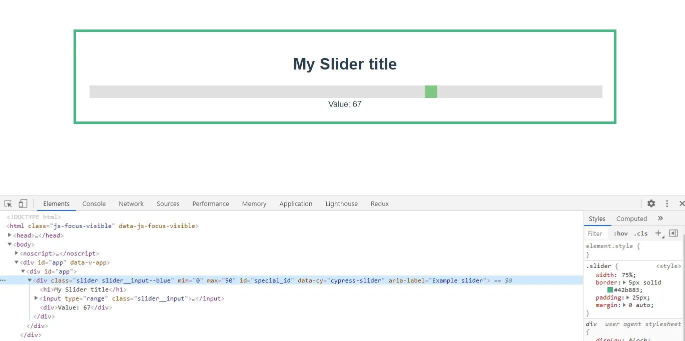
At first glance, everthing seemed to work, but if we look closely, we can see that something is not right.

First, the slider is not blue. Second, the value is going way over 50, and lastly if we look at the html, we'll notice that all of our extra attributes (min, max, data-cy) are assigned to the root element, and not our input element anymore!

The best way to solve the above problem would be to find a way to "apply" all the properties, classes, arguments, and events directly to the input field, without them needing to manually declare them- something like a "bucket" of data.. !$ATTRS!

Let's jump in the next section and see how we can use $atts to accomplish our goals.

$attrs to the rescue

At the start of this article, we introduced $attrs as a bucket of information. It is a place that holds all the "undeclared" properties and events, and this is precisely what we need to solve our issue.

To use this feature, we can just apply the $attrs property to one or more HTML element, using the v-bind operator:

<template>
  <div class="slider">
    <h1>{{ title }}</h1>
    <input 
      type="range"  
      v-bind="$attrs"
      :value="modelValue"
      @input="$emit('update:modelValue', $event.target.value)"
      class="slider__input" />
      <div>Value: {{ modelValue }}</div>
  </div>
</template>

As we can see, the above change will make things much better. The use of attrs in our component will act as bridge that copies all out attributes (class, attribute, property and custom events) to one or more elements:

vue-attrs-4

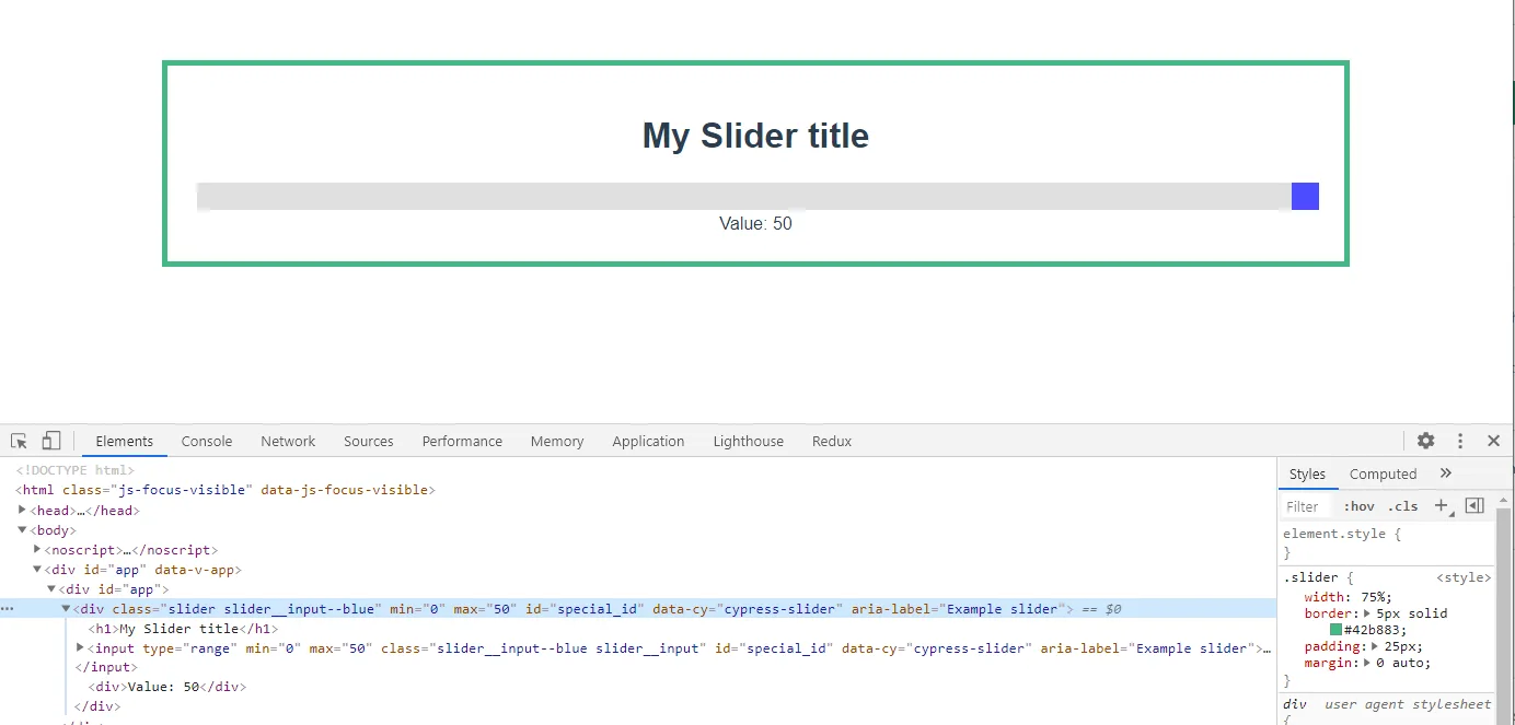
The slider thumb is back to being blue. The max value is set to 100, and our extra attributes are set correctly... almost.

There is only one problem- our extra attributes have not only been assigned to the input element, but also to the root element!

In this case, there is no visual change to show us this issue (and usually there isn't one in real life either. That is why I have not created any). But these extra variables can really create some side effects. Let's fix this.

inheritAttrs: false

By default, any extra argument being passed to a component is automatically applied to the root element (and to all elements that have the $attrs binding).

To switch this feature off, and get control of what elements receive this extra attribute, we can use a flag called inheritAttrs, and set it to false.

Our script tag will look like this:

export default {
  name: "Slider",
  inheritAttrs: false,
  props: {
    title: [String],
    modelValue: [Number, String],
  }
};

After this change, our HTML is nice and clean. All the extra properties are applied to the Input element only.

Conclusion

Before we wrap up, there are a couple of extra points that I want to share, so that you can make furhter use of this feature and understand it more deeply.

  1. I prefer not to use the v-model so that I can actually also omit the update:modelValue event (you can see at the file name Slider.vue in the stackblitz code)
  2. You can access, and play with the individual properties of the $attrs. So for example, you could apply the $attrs.class to one element, and the $attrs['aria-label]' to another.
  3. It is always best to declare property and events, and just use this when you have an element that emits a native event and/or accepts many attributes (like video tag, or all Input fields).

Time to say goodbye

I have personally taken some time to fully understand this feature, but I really hope that this article may help you in understanding this feature, and helps you define complex but very readable components.

This Dot is a consultancy dedicated to guiding companies through their modernization and digital transformation journeys. Specializing in replatforming, modernizing, and launching new initiatives, we stand out by taking true ownership of your engineering projects.

We love helping teams with projects that have missed their deadlines or helping keep your strategic digital initiatives on course. Check out our case studies and our clients that trust us with their engineering.

You might also like

Understanding Vue's Reactive Data cover image

Understanding Vue's Reactive Data

Introduction Web development has always been about creating dynamic experiences. One of the biggest challenges developers face is managing how data changes over time and reflecting these changes in the UI promptly and accurately. This is where Vue.js, one of the most popular JavaScript frameworks, excels with its powerful reactive data system. In this article, we dig into the heart of Vue's reactivity system. We unravel how it perfectly syncs your application UI with the underlying data state, allowing for a seamless user experience. Whether new to Vue or looking to deepen your understanding, this guide will provide a clear and concise overview of Vue's reactivity, empowering you to build more efficient and responsive Vue 3 applications. So, let’s kick off and embark on this journey to decode Vue's reactive data system. What is Vue's Reactive Data? What does it mean for data to be ”'reactive”? In essence, when data is reactive, it means that every time the data changes, all parts of the UI that rely on this data automatically update to reflect these changes. This ensures that the user is always looking at the most current state of the application. At its core, Vue's Reactive Data is like a superpower for your application data. Think of it like a mirror - whatever changes you make in your data, the user interface (UI) reflects these changes instantly, like a mirror reflecting your image. This automatic update feature is what we refer to as “reactivity”. To visualize this concept, let's use an example of a simple Vue application displaying a message on the screen: ` In this application, 'message' is a piece of data that says 'Hello Vue!'. Let's say you change this message to 'Goodbye Vue!' later in your code, like when a button is clicked. ` With Vue's reactivity, when you change your data, the UI automatically updates to 'Goodbye Vue!' instead of 'Hello Vue!'. You don't have to write extra code to make this update happen - Vue's Reactive Data system takes care of it. How does it work? Let's keep the mirror example going. Vue's Reactive Data is the mirror that reflects your data changes in the UI. But how does this mirror know when and what to reflect? That's where Vue's underlying mechanism comes into play. Vue has a behind-the-scenes mechanism that helps it stay alerted to any changes in your data. When you create a reactive data object, Vue doesn't just leave it as it is. Instead, it sends this data object through a transformation process and wraps it up in a Proxy. Proxy objects are powerful and can detect when a property is changed, updated, or deleted. Let's use our previous example: ` Consider our “message” data as a book in a library. Vue places this book (our data) within a special book cover (the Proxy). This book cover is unique - it's embedded with a tracking device that notifies Vue every time someone reads the book (accesses the data) or annotates a page (changes the data). In our example, the reactive function creates a Proxy object that wraps around our state object. When you change the 'message': ` The Proxy notices this (like a built-in alarm going off) and alerts Vue that something has changed. Vue then updates the UI to reflect this change. Let’s look deeper into what Vue is doing for us and how it transforms our object into a Proxy object. You don't have to worry about creating or managing the Proxy; Vue handles everything. ` In the example above, we encapsulate our object, in this case, “state”, converting it into a Proxy object. Note that within the second argument of the Proxy, we have two methods: a getter and a setter. The getter method is straightforward: it merely returns the value, which in this instance is “state.message” equating to 'Hello Vue!' Meanwhile, the setter method comes into play when a new value is assigned, as in the case of “state.message = ‘Hey young padawan!’”. Here, “value” becomes our new 'Hey young padawan!', prompting the property to update. This action, in turn, triggers the reactivity system, which subsequently updates the DOM. Venturing Further into the Depths If you have been paying attention to our examples above, you might have noticed that inside the Proxy method, we call the functions track and trigger to run our reactivity. Let’s try to understand a bit more about them. You see, Vue 3 reactivity data is more about Proxy objects. Let’s create a new example: ` In this example, when you click on the button, the message's value changes. This change triggers the effect function to run, as it's actively listening for any changes in its dependencies. How does the effect property know when to be called? Vue 3 has three main functions to run our reactivity: effect, track, and trigger. The effect function is like our supervisor. It steps in and takes action when our data changes – similar to our effect method, we will dive in more later. Next, we have the track function. It notes down all the important data we need to keep an eye on. In our case, this data would be state.message. Lastly, we've got the trigger function. This one is like our alarm bell. It alerts the effect function whenever our important data (the stuff track is keeping an eye on) changes. In this way, trigger, track, and effect work together to keep our Vue application reacting smoothly to changes in data. Let’s go back to them: ` Tracking (Dependency Collection) Tracking is the process of registering dependencies between reactive objects and the effects that depend on them. When a reactive property is read, it's "tracked" as a dependency of the current running effect. When we execute track(), we essentially store our effects in a Set object. But what exactly is an "effect"? If we revisit our previous example, we see that the effect method must be run whenever any property changes. This action — running the effect method in response to property changes — is what we refer to as an "Effect"! (computed property, watcher, etc.) > Note: We'll outline a basic, high-level overview of what might happen under the hood. Please note that the actual implementation is more complex and optimized, but this should give you an idea of how it works. Let’s see how it works! In our example, we have the following reactive object: ` We need a way to reference the reactive object with its effects. For that, we use a WeakMap. Which type is going to look something like this: ` We are using a WeakMap to set our object state as the target (or key). In the Vue code, they call this object targetMap. Within this targetMap object, our value is an object named depMap of Map type. Here, the keys represent our properties (in our case, that would be message and showSword), and the values correspond to their effects – remember, they are stored in a Set that in Vue 3 we refer to as dep. Huh… It might seem a bit complex, right? Let's make it more straightforward with a visual example: With the above explained, let’s see what this Track method kind of looks like and how it uses this targetMap. This method essentially is doing something like this: ` At this point, you have to be wondering, how does Vue 3 know what activeEffect should run? Vue 3 keeps track of the currently running effect by using a global variable. When an effect is executed, Vue temporarily stores a reference to it in this global variable, allowing the track function to access the currently running effect and associate it with the accessed reactive property. This global variable is called inside Vue as activeEffect. Vue 3 knows which effect is assigned to this global variable by wrapping the effects functions in a method that invokes the effect whenever a dependency changes. And yes, you guessed, that method is our effect method. ` This method behind the scenes is doing something similar to this: ` The handling of activeEffect within Vue's reactivity system is a dance of careful timing, scoping, and context preservation. Let’s go step by step on how this is working all together. When we run our Effect method for the first time, we call the get trap of the Proxy. ` When running the get trap, we have our activeEffect so we can store it as a dependency. ` This coordination ensures that when a reactive property is accessed within an effect, the track function knows which effect is responsible for that access. Trigger Method Our last method makes this Reactive system to be complete. The trigger method looks up the dependencies for the given target and key and re-runs all dependent effects. ` Conclusion Diving into Vue 3's reactivity system has been like unlocking a hidden superpower in my web development toolkit, and honestly, I've had a blast learning about it. From the rudimentary elements of reactive data and instantaneous UI updates to the intricate details involving Proxies, track and trigger functions, and effects, Vue 3's reactivity is an impressively robust framework for building dynamic and responsive applications. In our journey through Vue 3's reactivity, we've uncovered how this framework ensures real-time and precise updates to the UI. We've delved into the use of Proxies to intercept and monitor variable changes and dissected the roles of track and trigger functions, along with the 'effect' method, in facilitating seamless UI updates. Along the way, we've also discovered how Vue ingeniously manages data dependencies through sophisticated data structures like WeakMaps and Sets, offering us a glimpse into its efficient approach to change detection and UI rendering. Whether you're just starting with Vue 3 or an experienced developer looking to level up, understanding this reactivity system is a game-changer. It doesn't just streamline the development process; it enables you to create more interactive, scalable, and maintainable applications. I love Vue 3, and mastering its reactivity system has been enlightening and fun. Thanks for reading, and as always, happy coding!...

Understanding Vue.js's <Suspense> and Async Components cover image

Understanding Vue.js's <Suspense> and Async Components

In this blog post, we will delve into how and async components work, their benefits, and practical implementation strategies to make your Vue.js applications more efficient and user-friendly. Without further ado, let’s get started! Suspense Let's kick off by explaining what Suspense components are. They are a new component that helps manage how your application handles components that need to await for some async resource to resolve, like fetching data from a server, waiting for images to load, or any other task that might take some time to complete before they can be properly rendered. Imagine you're building a web page that needs to load data from a server, and you have 2 components that fetch the data you need as they will show different things. Typically, you might see a loading spinner or a skeleton while the data is being fetched. Suspense components make it easier to handle these scenarios. Instead of manually managing loading states and error messages for each component that needs to fetch data, Suspense components let you wrap all these components together. Inside this wrapper, you can define: 1. What to show while the data is loading (like a loading spinner). 2. The actual content that should be displayed once the data is successfully fetched. This way, Vue Suspense simplifies the process of handling asynchronous operations (like data fetching) and improves the user (and the developer) experience by providing a more seamless and integrated way to show loading states and handle errors. There are two types of async dependencies that can wait on: - Components with an async setup() hook. This includes components using with top-level await expressions. *Note: These can only be used within a component.* - Async Components. Async components Vue's asynchronous components are like a smart loading system for your web app. Imagine your app as a big puzzle. Normally, you'd put together all the pieces at once, which can take time. But what if some pieces aren't needed right away? Asynchronous components help with this. Here's how they work: - Load Only What's Needed: Just like only picking up puzzle pieces you need right now, asynchronous components let your app load only the parts that are immediately necessary. Other parts can be loaded later, as needed. - Faster Start: Your app starts up faster because it doesn't have to load everything at once. It's like quickly starting with the border of a puzzle and filling in the rest later. - Save Resources: It uses your web resources (like internet data) more wisely, only grabbing what’s essential when it's essential. In short, asynchronous components make your app quicker to start and more efficient, improving the overall experience for your users. Example: ` Combining Async Components and Suspense Let's explore how combining asynchronous components with Vue's Suspense feature can enhance your application. When asynchronous components are used with Vue's Suspense, they form a powerful combination. The key point is that async components are "suspensable" by default. This means they can be easily integrated with Suspense to improve how your app handles loading and rendering components. When used together, you can do the following things: - Centralized Loading and Error Handling: With Suspense, you don't have to handle loading and error states individually for each async component. Instead, you can define a single loading indicator or error message within the Suspense component. This unified approach simplifies your code and ensures consistency across different parts of your app. - Flexible and Clean Code Structure: By combining async components with Suspense, your code becomes more organized and easier to maintain. An asynchronous component has the flexibility to operate independently of Suspense's oversight. By setting suspensible: false in its options, the component takes charge of its own loading behavior. This means that instead of relying on Suspense to manage when it appears, the component itself dictates its loading state and presentation. This option is particularly useful for components that have specific loading logic or visuals they need to maintain, separate from the broader Suspense-driven loading strategy in the application. In practice, this combo allows you to create a user interface that feels responsive and cohesive. Users see a well-timed loading indicator while the necessary components are being fetched, and if something goes wrong, a single, well-crafted error message is displayed. It's like ensuring that the entire puzzle is either revealed in its completed form or not at all rather than showing disjointed parts at different times. How it works When a component inside the boundary is waiting for something asynchronous, shows fallback content. This fallback content can be anything you choose, such as a loading spinner or a message indicating that data is being loaded. Example Usage Let’s use a simple example: In the visual example provided, imagine we have two Vue components: one showcasing a selected Pokémon, Eevee, and a carousel showcasing a variety of other Pokémon. Both components are designed to fetch data asynchronously. Without , while the data is being fetched, we would typically see two separate loading indicators: one for the Eevee Pokemon that is selected and another for the carousel. This can make the page look disjointed and be a less-than-ideal user experience. We could display a single, cohesive loading indicator by wrapping both components inside a boundary. This unified loading state would persist until all the data for both components—the single Pokémon display and the carousel—has been fetched and is ready to be rendered. Here's how you might structure the code for such a scenario: ` Here, is the component that's performing asynchronous operations. While loading, the text 'Loading...' is displayed to the user. Great! But what about when things don't go as planned and an error occurs? Currently, Vue's doesn't directly handle errors within its boundary. However, there's a neat workaround. You can use the onErrorCaptured() hook in the parent component of to catch and manage errors. Here's how it works: ` If we run this code, and let’s say that we had an error selecting our Pokemon, this is how it is going to display to the user: The error message is specifically tied to the component where the issue occurred, ensuring that it's the only part of your application that shows an error notification. Meanwhile, the rest of your components will continue to operate and display as intended, maintaining the overall user experience without widespread disruption. This targeted error handling keeps the application's functionality intact while indicating where the problem lies. Conclusion stands out as a formidable feature in Vue.js, transforming the management of asynchronous operations into a more streamlined and user-centric process. It not only elevates the user experience by ensuring smoother interactions during data loading phases but also enhances code maintainability and application performance. I hope you found this blog post enlightening and that it adds value to your Vue.js projects. As always, happy coding and continue to explore the vast possibilities Vue.js offers to make your applications more efficient and engaging!...

Getting started with Vitepress cover image

Getting started with Vitepress

Getting started with Vitepress to create your blog site Have you heard about Vitepress, but you have not checked it out at it yet? Well, in this article, we are going to cover the basic setup and share what all the fuss about this new fantastic static site generator. If you are looking for something that would allow you to quickly create a static site with Markdown support, search, Light/Dark theme, advertisement, navigation, and much more, then Vitepress is what you are looking for. Suppose you want some proof of Vitepress's power without having to invest any further time, I suggest you head over to the main Vitepress site (vitepress.dev) and experience what Vitepress can do, as the official site is built on Vitepress! What is Vitepress Vitepress is a powerful Static Site Generator powered by Vite mainly used for Documentation and Blogs with the default theme, and open to customization to be used for anything you may need it to with custom themes and theme overrides.. Vitepress power comes from its low learning curve, powerful configuration settings, and the ability to easily customize it. For example, internationalization is built-in, Theme toggling is built-in and even full-site searches require a single line in the config to be set up. What makes Vitepress so powerful is its extensive configuration and the fact that it can be customized by overriding the existing theme, creating your theme, or simply enhancing pages with custom Vue code. Prerequisites To successfully run the following demo, you will need: - Node.js version 18 or higher. - Terminal for accessing VitePress via its command line interface (CLI). - Text Editor with Markdown syntax support. - VSCode is recommended, along with the official Vue extension. Create your project To create the project, we will follow the steps shown in the official Getting Started guide. If you want to set up a Vitepress project quickly, run the following steps: - Create a new folder mkdir vitepress-tutorial - Access the folder cd vitepress-tutorial - Install Vitepress npm add -D vitepress - Run the Wizard npx vitepress init - Answer the questions: - Where should VitePress initialize the config? - Site title - Site Description - Theme - Do you want Typescript support? - run npm run docs:dev - Enjoy your site. After you run the above steps, your Vitepress will be ready and running as shown below What is available out of the box The site comes fully set up with enough to get you started. Let's see what features are available within the software: - Navbar: The site comes with a Navbar that already includes links to our blog pages - Light/Dark theme: Out of the box theming - Home page: Basic Homepage layout - Blogs: Two different blog posts with sidebar navigation All of the above is available with just 4 files! Let's move forward and see how to customize our app. Overriding the homepage It is time to modify our site by accessing its folders. What you will probably notice when opening the site, is that Vitepress follows a very simple file structure, in fact, a new installation just includes 4 extra files on top of the expected package.json and node_modules. Let's update our homepage to make it more unique. Because Vitepress follows a "file-system based router" we can find this file within the root of the project within a file called index.md. This file will be accessible at "/" or "/index.html" of your site. The content of the file is the following: ` As you can see, the file has no code in it, and it is just driven by configuration, or more specifically in this case Markdown frontmatter, that is a set of configurations accepted by markdown files that help you set up your options such as title, description, og:image. We will describe frontmatter in more detail later in the article. Before we jump into modifying the configuration of the file, you should know that Vitepress has a very extensive and well-detailed documentation site where you can find help if you are stuck or would like to learn more. In this case, we are overriding the "home" page, so the documentation can be found here: Home Page Default Theme configuration. If you read the current file within the homepage, you will notice that it defines a "layout" of "home". This layout displays a main header with CTAs and a set of feature blocks. There are three different layouts available in the Default theme: "home", "doc" and "page". The title and description have already been set from the information we provided from the installation wizard. But the rest is just a basic boiler template. Let's see what we can change: 1) Add a hero image. This image can either be externally sourced or saved within the repository. ` 2) Update the action buttons. ` As shown above, Action buttons have two themes "brand" or "alt" and can accept internal or external links. Vitepress is clever enough to set the external links to open in a new tab and set the rel="noreferrer". 3) Change the feature blocks: Features blocks are great for engaging with the user and telling them what makes your site special. This accepts an icon and some text, so let's change ours with the following: ` The homepage is now completed and updated and it should look like this: Please note that what we did on the homepage is just changing the markdown front matter of the "home" layout. What this means is that if you want to, you can easily customise the page further by either adding more blocks to the layout file or actually by writing and styling the rest of the page as normal. Site configuration In this step, we are going learn about the main site configuration and how we can use it to customize our site. The configuration file can be found in the .vitepress folder under the name of "config.mjs". Just like the homepage layout, the configuration used in the preset file is self-explanatory: ` This file is very important and you are probably going to have it open at all times as it is going to be responsible for the layout of the sidebar navigations of your site. In this section, we are going to learn how to use the Vitepress configuration file to achieve the following: - Modify the sidebar navigation - Enable Search - Add Favicon to your site Modify the sidebar navigation The sidebar is the component displayed on the left-hand side of the blog pages. This is not automatically generated, but it is manually set in this file. You can have more than one navigation, so, for example, you could specify sidebar navigation that shows in pages that have "/blog/" within their path and another one for all markdown pages that have "/tutorials/". Let's see how to implement this: ` With the above code, there will be 2 different sidebars. One will just show if the URL includes "/blog" and the other will be displayed if the path includes "tutorials". Clicking on the above items will give a 404 error as we do not have any pages in that specific location. Still, we can easily fix the issue by creating the two folders "blog" and "tutorial" and creating the required files within these folders in our case are "index.md" and "one.md" for the blog and "index.md" and "two.md" for tutorials. The sidebar has further settings like the ability to create a nested tree or create collapsable menus. You can learn more by checking out the the official documentation on default theme sidebar. Enable Search No documentation or blog site is complete until a search is fully implemented on it. Luckily for us, enabling a site-wide search is extremely simple with Vitepress. Vitepress supports two different search types: a full-text search using minisearch and Algolia based search. In this tutorial, we are going to enable the full-text search. This is fully built-in and requires no external accounts. To enable search, we need to add a "Search" parameter within our themeConfig and set the provider to "local". We can add this right below the socialLinks. ` With just a simple config change, our site will now have a full site search working as shown below: The official search documentation has further information about the look and functionality of the search. Add Favicon to your site Even if the site configuration is very extensive, there are times when you will need to add something within the site-wise page that is not available. In this section we are going to learn how to add specific attributes to the of our site, and specifically how to add a favicon. To add custom values to the head, we are going to use the "head" properties available with the Vitepress configuration. The "head" configuration is an array that accepts an array with the element type (eg. link, script, meta), and an object including all the attributes for that specific element. So for example to replicate the following HTML: ` we would define the following head config: ` We can use this technique to set up metadata and even load fonts or Google Analytics. More info in the site-config head Writing your post In the last section of this article, we are going to learn how to actually write a blog post and also learn how to customize the pages with JS and styles. Writing your first page In the previous section, we created a couple of markdown files, but they are currently empty. Let's see how to create beautiful documentation using the built-in feature of Vitepress. In this section, we are going to work on the file stored in /blog/index.md. This file can be accessed in your browser by accessing "http://localhost:5174/blog/index.html". Blog Frontmatter Every file needs to have a frontmatter defined. This is used to define basic information on the page, such as the title, description, and more. For best SEO results, it is best practice to always define a title and description for a new page. We can do this by adding the following code at the top of our file: ` Frontmatter in Markdown files are delimited by the "---". In the above code, we set our title and description. Vitepress frontmatter supports further config like lastUpdates, sidebar, outline, and more. You can find info on the frontmatter-config documentation. Frontmatter has some global configuration, such as title and description, but also "layout specific" settings that are just available on specific layouts. This is clearly explained in the documentation. Blog Markdown Now that our post frontmatter is set, it is time to write the content of it. This is done using a very extensive markdown engine. Let's start with the basics and write a heading with some text and a link as shown below: ` After saving, our development environment will show the following results: Let's add a couple of headings and a table of contents to our document using [[toc]] to the top of our page: ` The above will produce an unordered list with all our links. The last feature that I want to share about the Vitepress markdown engine is the code editors. The markdown engine used in Vitepress offers extensive features when it comes to code rendering. Features available are "code highlight", "code focus", external snippets loading and much more. The full list of features can be found in the markdown docs. Let's implement a simple code snippet with a line of code focused. This can be achieved by adding "// [!code focus]" at the end of our row. Let's give it a try: ` The output of this will be: Customize your blog with Vue In this last section, we will learn how to customize our code by adding js logic, style, and external components. Before we begin, it is important to understand that when you use the default template of Vitepress, your pages are going to be rendered with Vue. This means that we can expand the individual page's functionality by rendering other vue components and/or writing logic and styles directly on the page. To better explain this concept, we are going to create a team page. Create a file called team.md within the root of our repository. This file will be accessible on "http://localhost:5174/team.html" and will be just a simple Markdown file. First, we set up the frontmatter as before. In this case, we have to specify an additional config called "layout". This will ensure the page has no style or components loaded such as sidebar or aside. ` Then we will have to create our team variable, just like a normal Vue component; we can do so by defining a script setup tag and defining the constant there. ` In the above code, we have imported the VPTeamMembers component from the vitepress/theme and defined an array of members. The values used in the members array are hardcoded, but as you may expect, you can load this information directly from an API. We now have to use the "members" variable within our file. We can do so by writing normal JavaScript. The markdown file will evaluate the JavaScript and render it, so in the following example it will render a specific component. ` Before we move forward we need to define some style as the page is unstyled since we have loaded the layout of "page". Just like we did with the tag, we can load a tag and update our styles: ` The completed file will look like this: ` The file above now includes: - A frontmatter that specifies a "page" layout - A script tag that loads an external component and defines a variable - Styles to make the page pretty - Markdown with a custom component The completed team page would render the following: Conclusion Vitepress is an extremely flexible static site generator. Its default theme provides you with everything you need to get started quickly. The ability to load external themes, enhance the current theme, and or write custom code within your page makes this tool extremely powerful. In future articles, we will discover what components are available within the Default Theme and see how you can make the most of your Vitepress site but keep on coding....

Vercel BotID: The Invisible Bot Protection You Needed cover image

Vercel BotID: The Invisible Bot Protection You Needed

Nowadays, bots do not act like “bots”. They can execute JavaScript, solve CAPTCHAs, and navigate as real users. Traditional defenses often fail to meet expectations or frustrate genuine users. That’s why Vercel created BotID, an invisible CAPTCHA that has real-time protections against sophisticated bots that help you protect your critical endpoints. In this blog post, we will explore why you should care about this new tool, how to set it up, its use cases, and some key considerations to take into account. We will be using Next.js for our examples, but please note that this tool is not tied to this framework alone; the only requirement is that your app is deployed and running on Vercel. Why Should You Care? Think about these scenarios: - Checkout flows are overwhelmed by scalpers - Signup forms inundated with fake registrations - API endpoints draining resources with malicious requests They all impact you and your users in a negative way. For example, when bots flood your checkout page, real customers are unable to complete their purchases, resulting in your business losing money and damaging customer trust. Fake signups clutter the app, slowing things down and making user data unreliable. When someone deliberately overloads your app’s API, it can crash or become unusable, making users angry and creating a significant issue for you, the owner. BotID automatically detects and filters bots attempting to perform any of the above actions without interfering with real users. How does it work? A lightweight first-party script quickly gathers a high set of browser & environment signals (this takes ~30ms, really fast so no worry about performance issues), packages them into an opaque token, and sends that token with protected requests via the rewritten challenge/proxy path + header; Vercel’s edge scores it, attaches a verdict, and checkBotId() function simply reads that verdict so your code can allow or block. We will see how this is implemented in a second! But first, let’s get started. Getting Started in Minutes 1. Install the SDK: ` 1. Configure redirects Wrap your next.config.ts with BotID’s helper. This sets up the right rewrites so BotID can do its job (and not get blocked by ad blockers, extensions, etc.): ` 2. Integrate the client on public-facing pages (where BotID runs checks): Declare which routes are protected so BotID can attach special headers when a real user triggers those routes. We need to create instrumentation-client.ts (place it in the root of your application or inside a src folder) and initialize BotID once: ` instrumentation-client.ts runs before the app hydrates, so it’s a perfect place for a global setup! If we have an inferior Next.js version than 15.3, then we would need to use a different approach. We need to render the React component inside the pages or layouts you want to protect, specifying the protected routes: ` 3. Verify requests on your server or API: ` - NOTE: checkBotId() will fail if the route wasn’t listed on the client, because the client is what attaches the special headers that let the edge classify the request! You’re all set - your routes are now protected! In development, checkBotId() function will always return isBot = false so you can build without friction. To disable this, you can override the options for development: ` What happens on a failed check? In our example above, if the check failed, we return a 403, but it is mostly up to you what to do in this case; the most common approaches for this scenario are: - Hard block with a 403 for obviously automated traffic (just what we did in the example above) - Soft fail (generic error/“try again”) when you want to be cautious. - Step-up (require login, email verification, or other business logic). Remember, although rare, false positives can occur, so it’s up to you to determine how you want to balance your fail strategy between security, UX, telemetry, and attacker behavior. checkBotId() So far, we have seen how to use the property isBot from checkBotId(), but there are a few more properties that you can leverage from it. There are: isHuman (boolean): true when BotID classifies the request as a real human session (i.e., a clear “pass”). BotID is designed to return an unambiguous yes/no, so you can gate actions easily. isBot (boolean): We already saw this one. It will be true when the request is classified as automated traffic. isVerifiedBot (boolean): Here comes a less obvious property. Vercel maintains and continuously updates a comprehensive directory of known legitimate bots from across the internet. This directory is regularly updated to include new legitimate services as they emerge. This could be helpful for allowlists or custom logic per bot. We will see an example in a sec. verifiedBotName? (string): The name for the specific verified bot (e.g., “claude-user”). verifiedBotCategory? (string): The type of the verified bot (e.g., “webhook”, “advertising”, “ai_assistant”). bypassed (boolean): it is true if the request skipped BotID check due to a configured Firewall bypass (custom or system). You could use this flag to avoid taking bot-based actions when you’ve explicitly bypassed protection. Handling Verified Bots - NOTE: Handling verified bots is available in botid@1.5.0 and above. It might be the case that you don’t want to block some verified bots because they are not causing damage to you or your users, as it can sometimes be the case for AI-related bots that fetch your site to give information to a user. We can use the properties related to verified bots from checkBotId() to handle these scenarios: ` Choosing your BotID mode When leveraging BotID, you can choose between 2 modes: - Basic Mode: Instant session-based protection, available for all Vercel plans. - Deep Analysis Mode: Enhanced Kasada-powered detection, only available for Pro and Enterprise plan users. Using this mode, you will leverage a more advanced detection and will block the hardest to catch bots To specify the mode you want, you must do so in both the client and the server. This is important because if either of the two does not match, the verification will fail! ` Conclusion Stop chasing bots - let BotID handle them for you! Bots are and will get smarter and more sophisticated. BotID gives you a simple way to push back without slowing your customers down. It is simple to install, customize, and use. Stronger protection equals fewer headaches. Add BotID, ship with confidence, and let the bots trample into a wall without knowing what’s going on....

Let's innovate together!

We're ready to be your trusted technical partners in your digital innovation journey.

Whether it's modernization or custom software solutions, our team of experts can guide you through best practices and how to build scalable, performant software that lasts.

Prefer email? hi@thisdot.co