Getting started with Vitepress to create your blog site
Have you heard about Vitepress, but you have not checked it out at it yet? Well, in this article, we are going to cover the basic setup and share what all the fuss about this new fantastic static site generator.
If you are looking for something that would allow you to quickly create a static site with Markdown support, search, Light/Dark theme, advertisement, navigation, and much more, then Vitepress is what you are looking for.
Suppose you want some proof of Vitepress's power without having to invest any further time, I suggest you head over to the main Vitepress site (vitepress.dev) and experience what Vitepress can do, as the official site is built on Vitepress!

What is Vitepress
Vitepress is a powerful Static Site Generator powered by Vite mainly used for Documentation and Blogs with the default theme, and open to customization to be used for anything you may need it to with custom themes and theme overrides.. Vitepress power comes from its low learning curve, powerful configuration settings, and the ability to easily customize it.
For example, internationalization is built-in, Theme toggling is built-in and even full-site searches require a single line in the config to be set up.
What makes Vitepress so powerful is its extensive configuration and the fact that it can be customized by overriding the existing theme, creating your theme, or simply enhancing pages with custom Vue code.
Prerequisites
To successfully run the following demo, you will need:
- Node.js version 18 or higher.
- Terminal for accessing VitePress via its command line interface (CLI).
- Text Editor with Markdown syntax support.
- VSCode is recommended, along with the official Vue extension.
Create your project
To create the project, we will follow the steps shown in the official Getting Started guide.
If you want to set up a Vitepress project quickly, run the following steps:
- Create a new folder
mkdir vitepress-tutorial - Access the folder
cd vitepress-tutorial - Install Vitepress
npm add -D vitepress - Run the Wizard
npx vitepress init - Answer the questions:
- Where should VitePress initialize the config?
- Site title
- Site Description
- Theme
- Do you want Typescript support?
- run
npm run docs:dev - Enjoy your site.
After you run the above steps, your Vitepress will be ready and running as shown below

What is available out of the box
The site comes fully set up with enough to get you started. Let's see what features are available within the software:
- Navbar: The site comes with a Navbar that already includes links to our blog pages
- Light/Dark theme: Out of the box theming
- Home page: Basic Homepage layout
- Blogs: Two different blog posts with sidebar navigation
All of the above is available with just 4 files! Let's move forward and see how to customize our app.
Overriding the homepage
It is time to modify our site by accessing its folders. What you will probably notice when opening the site, is that Vitepress follows a very simple file structure, in fact, a new installation just includes 4 extra files on top of the expected package.json and node_modules.
Let's update our homepage to make it more unique. Because Vitepress follows a "file-system based router" we can find this file within the root of the project within a file called index.md. This file will be accessible at "/" or "/index.html" of your site.
The content of the file is the following:
---
# https://vitepress.dev/reference/default-theme-home-page
layout: home

hero:
 name: "Vitepress tutorial"
 text: "A VitePress Site"
 tagline: My great project tagline
 actions:
   - theme: brand
     text: Markdown Examples
     link: /markdown-examples
   - theme: alt
     text: API Examples
     link: /api-examples

features:
 - title: Feature A
   details: Lorem ipsum dolor sit amet, consectetur adipiscing elit
 - title: Feature B
   details: Lorem ipsum dolor sit amet, consectetur adipiscing elit
 - title: Feature C
   details: Lorem ipsum dolor sit amet, consectetur adipiscing elit
---
As you can see, the file has no code in it, and it is just driven by configuration, or more specifically in this case Markdown frontmatter, that is a set of configurations accepted by markdown files that help you set up your options such as title, description, og:image. We will describe frontmatter in more detail later in the article.
Before we jump into modifying the configuration of the file, you should know that Vitepress has a very extensive and well-detailed documentation site where you can find help if you are stuck or would like to learn more. In this case, we are overriding the "home" page, so the documentation can be found here: Home Page Default Theme configuration.
If you read the current file within the homepage, you will notice that it defines a "layout" of "home". This layout displays a main header with CTAs and a set of feature blocks.
There are three different layouts available in the Default theme: "home", "doc" and "page".
The title and description have already been set from the information we provided from the installation wizard. But the rest is just a basic boiler template. Let's see what we can change:
- Add a hero image. This image can either be externally sourced or saved within the repository.
hero:
 name: "Vitepress tutorial"
 text: "A VitePress Site"
 tagline: My great project tagline
 image:
   src: 'assets/logo.png'
   alt: 'My logo'
- Update the action buttons.
 actions:
   - theme: brand
     text: First Blog
     link: /first
   - theme: alt
     text: Thisdot.co
     link: https://thisdot.co
As shown above, Action buttons have two themes "brand" or "alt" and can accept internal or external links.
Vitepress is clever enough to set the external links to open in a new tab and set the rel="noreferrer".

- Change the feature blocks:
Features blocks are great for engaging with the user and telling them what makes your site special. This accepts an icon and some text, so let's change ours with the following:
features:
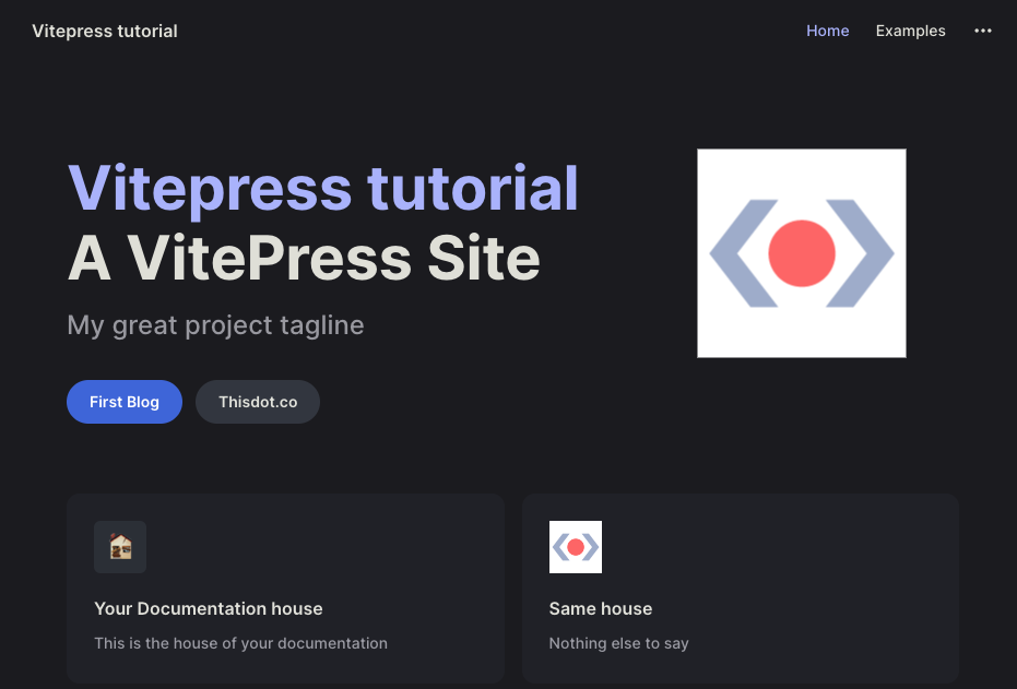
- icon: 🏚️
title: Your Documentation house
details: This is the house of your documentation
- icon:
src: https://emojipedia.org/house
title: This is the logo
details: Nothing else to say
The homepage is now completed and updated and it should look like this:
Please note that what we did on the homepage is just changing the markdown front matter of the "home" layout. What this means is that if you want to, you can easily customise the page further by either adding more blocks to the layout file or actually by writing and styling the rest of the page as normal.
Site configuration
In this step, we are going learn about the main site configuration and how we can use it to customize our site.
The configuration file can be found in the .vitepress folder under the name of "config.mjs".
Just like the homepage layout, the configuration used in the preset file is self-explanatory:
import { defineConfig } from 'vitepress'

// https://vitepress.dev/reference/site-config
export default defineConfig({
 title: "Vitepress tutorial",
 description: "A VitePress Site",
 themeConfig: {
   // https://vitepress.dev/reference/default-theme-config
   nav: [
     { text: 'Home', link: '/' },
     { text: 'Examples', link: '/markdown-examples' }
   ],

   sidebar: [
     {
       text: 'Examples',
       items: [
         { text: 'Markdown Examples', link: '/markdown-examples' },
         { text: 'Runtime API Examples', link: '/api-examples' }
       ]
     }
   ],

   socialLinks: [
     { icon: 'github', link: 'https://github.com/vuejs/vitepress' }
   ]
 }
})
This file is very important and you are probably going to have it open at all times as it is going to be responsible for the layout of the sidebar navigations of your site.
In this section, we are going to learn how to use the Vitepress configuration file to achieve the following:
- Modify the sidebar navigation
- Enable Search
- Add Favicon to your site
Modify the sidebar navigation
The sidebar is the component displayed on the left-hand side of the blog pages. This is not automatically generated, but it is manually set in this file.
You can have more than one navigation, so, for example, you could specify sidebar navigation that shows in pages that have "/blog/" within their path and another one for all markdown pages that have "/tutorials/".
Let's see how to implement this:
{
   sidebar: {
     '/blog/': [
       {
         text: 'Blog',
         items: [
           { text: 'Index', link: '/blog/' },
           { text: 'One', link: '/blog/one' }
         ]
       }
     ],

     '/tutorials/': [
       {
         text: 'Tutorial',
         items: [
           { text: 'Index', link: '/tutorials/' },
           { text: 'Two', link: '/tutorials/two' }
         ]
       }
     ]
   },
}
With the above code, there will be 2 different sidebars. One will just show if the URL includes "/blog" and the other will be displayed if the path includes "tutorials".
Clicking on the above items will give a 404 error as we do not have any pages in that specific location. Still, we can easily fix the issue by creating the two folders "blog" and "tutorial" and creating the required files within these folders in our case are "index.md" and "one.md" for the blog and "index.md" and "two.md" for tutorials.
The sidebar has further settings like the ability to create a nested tree or create collapsable menus. You can learn more by checking out the the official documentation on default theme sidebar.
Enable Search
No documentation or blog site is complete until a search is fully implemented on it. Luckily for us, enabling a site-wide search is extremely simple with Vitepress.
Vitepress supports two different search types: a full-text search using minisearch and Algolia based search.
In this tutorial, we are going to enable the full-text search. This is fully built-in and requires no external accounts.
To enable search, we need to add a "Search" parameter within our themeConfig and set the provider to "local". We can add this right below the socialLinks.
   socialLinks: [
     { icon: 'github', link: 'https://github.com/vuejs/vitepress' }
   ],
   search: {
     provider: 'local'
   }
 }
With just a simple config change, our site will now have a full site search working as shown below:
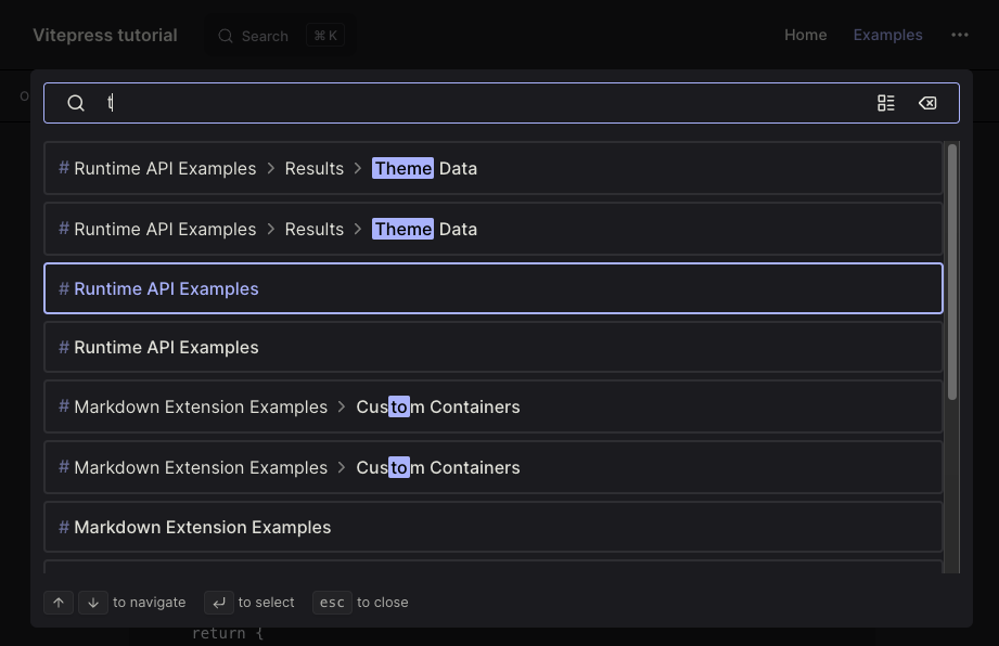
The official search documentation has further information about the look and functionality of the search.
Add Favicon to your site
Even if the site configuration is very extensive, there are times when you will need to add something within the site-wise page that is not available.
In this section we are going to learn how to add specific attributes to the <head> of our site, and specifically how to add a favicon.
To add custom values to the head, we are going to use the "head" properties available with the Vitepress configuration.
The "head" configuration is an array that accepts an array with the element type (eg. link, script, meta), and an object including all the attributes for that specific element.
So for example to replicate the following HTML:
<link rel="icon" href="/image/favicon.ico"/>
we would define the following head config:
 head: [
   [ 'link', { rel: 'icon', href: '/images/favicon.ico' } ],
 ]
We can use this technique to set up metadata and even load fonts or Google Analytics. More info in the site-config head
Writing your post
In the last section of this article, we are going to learn how to actually write a blog post and also learn how to customize the pages with JS and styles.
Writing your first page
In the previous section, we created a couple of markdown files, but they are currently empty. Let's see how to create beautiful documentation using the built-in feature of Vitepress.
In this section, we are going to work on the file stored in /blog/index.md. This file can be accessed in your browser by accessing "http://localhost:5174/blog/index.html".
Blog Frontmatter
Every file needs to have a frontmatter defined. This is used to define basic information on the page, such as the title, description, and more.
For best SEO results, it is best practice to always define a title and description for a new page. We can do this by adding the following code at the top of our file:
---
title: My Blog post title
description: My unique description
---
Frontmatter in Markdown files are delimited by the "---". In the above code, we set our title and description.
Vitepress frontmatter supports further config like lastUpdates, sidebar, outline, and more. You can find info on the frontmatter-config documentation.
Frontmatter has some global configuration, such as title and description, but also "layout specific" settings that are just available on specific layouts. This is clearly explained in the documentation.
Blog Markdown
Now that our post frontmatter is set, it is time to write the content of it. This is done using a very extensive markdown engine.
Let's start with the basics and write a heading with some text and a link as shown below:
## My heading one

My text

[link](thisdot.co)
After saving, our development environment will show the following results:

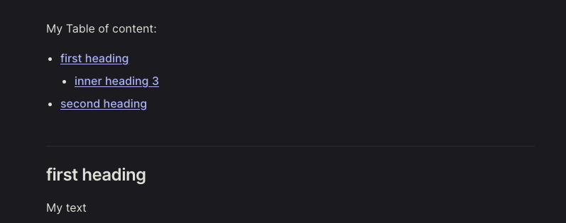
Let's add a couple of headings and a table of contents to our document using [[toc]] to the top of our page:
My Table of Contents:
[[toc]]

## first heading
My text

[link](thisdot.co)

### inner heading 3

## second heading
My text

[link](thisdot.co)
The above will produce an unordered list with all our links.
The last feature that I want to share about the Vitepress markdown engine is the code editors. The markdown engine used in Vitepress offers extensive features when it comes to code rendering.
Features available are "code highlight", "code focus", external snippets loading and much more. The full list of features can be found in the markdown docs.
Let's implement a simple code snippet with a line of code focused. This can be achieved by adding "// [!code focus]" at the end of our row. Let's give it a try:
const myNewFunction = () => {
   externalApi();
   const newCode = true; // [!code focus]
   return newCode;
}
The output of this will be:

Customize your blog with Vue
In this last section, we will learn how to customize our code by adding js logic, style, and external components.
Before we begin, it is important to understand that when you use the default template of Vitepress, your pages are going to be rendered with Vue.
This means that we can expand the individual page's functionality by rendering other vue components and/or writing logic and styles directly on the page.
To better explain this concept, we are going to create a team page. Create a file called team.md within the root of our repository.
This file will be accessible on "http://localhost:5174/team.html" and will be just a simple Markdown file.
First, we set up the frontmatter as before. In this case, we have to specify an additional config called "layout". This will ensure the page has no style or components loaded such as sidebar or aside.
---
layout: page
title: My team page
---
Then we will have to create our team variable, just like a normal Vue component; we can do so by defining a script setup tag and defining the constant there.
<script setup>
import {
 VPTeamMembers
} from 'vitepress/theme'

const members = [
 {
   avatar: 'assets/logo.png',
   name: 'Simone',
   title: 'Software Architect',
   links: [
     { icon: 'github', link: 'https://github.com/#' },
     { icon: 'Twitter', link: 'https://twitter.com/#' }
   ]
 },
 {
   avatar: 'assets/logo.png',
   name: "This Dot",
   title: "Software Company"
 }
]
</script>
In the above code, we have imported the VPTeamMembers component from the vitepress/theme and defined an array of members. The values used in the members array are hardcoded, but as you may expect, you can load this information directly from an API.
We now have to use the "members" variable within our file. We can do so by writing normal JavaScript. The markdown file will evaluate the JavaScript and render it, so in the following example it will render a specific component.
## Our Team

Say hello to our awesome team.
<VPTeamMembers size="small" :members="members" />
Before we move forward we need to define some style as the page is unstyled since we have loaded the layout of "page".
Just like we did with the <script> tag, we can load a <style> tag and update our styles:
<style>
h1 {
   color: red;
}
h1, p {
   text-align: center;
}
</style>
The completed file will look like this:
---
layout: page
title: My team page
---
<script setup>
import {
 VPTeamPage,
 VPTeamPageTitle,
 VPTeamMembers
} from 'vitepress/theme'

const members = [
 {
   avatar: 'assets/logo.png',
   name: 'Simone',
   title: 'Software Architect',
   links: [
     { icon: 'github', link: 'https://github.com/#' },
     { icon: 'Twitter', link: 'https://twitter.com/#' }
   ]
 },
 {
   avatar: 'assets/logo.png',
   name: "This Dot",
   title: "Software Company"
 }
]
</script>

<style>
h2 {
   color: red;
}
h2, p {
   text-align: center;
}
</style>
## Our Team

Say hello to our awesome team.

<VPTeamMembers size="small" :members="members" />
The file above now includes:
- A frontmatter that specifies a "page" layout
- A script tag that loads an external component and defines a variable
- Styles to make the page pretty
- Markdown with a custom component
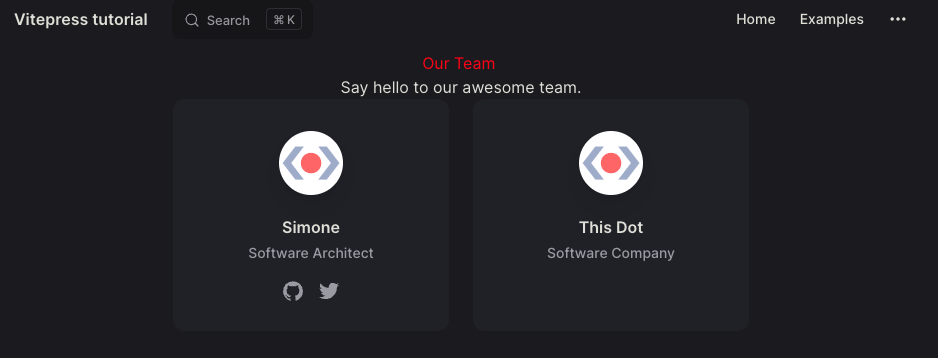
The completed team page would render the following:
Conclusion
Vitepress is an extremely flexible static site generator. Its default theme provides you with everything you need to get started quickly. The ability to load external themes, enhance the current theme, and or write custom code within your page makes this tool extremely powerful.
In future articles, we will discover what components are available within the Default Theme and see how you can make the most of your Vitepress site but keep on coding.