What is Flexbox?
Do you apply a lot of hacks when you design a page, like aligning the items, distributing space between multiple items in a container, etc?
Yes, we all do it, but all those hacks have now been replaced by Flexbox. It has replaced floats and tables which were being used for the alignment of the items. Flexbox distributes an allocated space amongst the items in a container even when the size of the items is dynamic. Flex helps in the best utilization of space. Its' main purpose is to alter the height/width of the items in a container based on the available space or shrink them in case of overflow.
We can call Flexbox an elegant layout for designing in the present era.
Flexbox has two components: A container and the items within it.

-
The main axis is the axis running in the direction the flex items are being laid out in. The start and end of this axis are called the main start and main end.
-
The cross axis is the axis running perpendicular to the direction the flex items are being laid out in. The start and end of this axis are called the cross start and cross end.
Let's have a look at some flex properties:
1. display - It enables flex context for all the direct children, once applied to the parent.display:flex is all it takes to get started with the use of Flex. Then you can add on other properties.
.component {
  padding: 10px;
  display: flex;
  max-width: 200px;
}
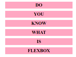
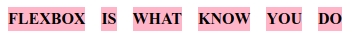
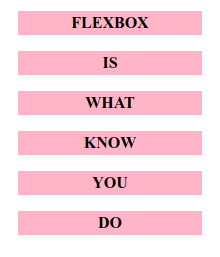
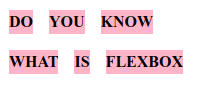
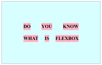
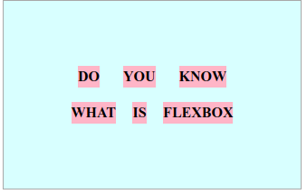
The below image shows how flex dynamically alots the space to it's item.
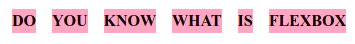
2. flex-direction - Flex is one dimensional, with flex-direction it helps to change the direction across the main axis.
We can changes the directions like: row | row-reverse | column | column-reverse.
.component {
  flex-direction: column;
}
.component {
  flex-direction: row;
}
.component {
  flex-direction: row-reverse;
}
.component {
  flex-direction: column-reverse;
}
3. flex-wrap - Flex gives a wrap feature that allows you to wrap your items in different ways.
.component{
  flex-wrap: wrap;
}
nowrap(default): all flex items will be on one linewrap: flex items will wrap onto multiple lines, from top to bottom.wrap-reverse: flex items will wrap onto multiple lines from bottom to top.
4. justify-content - This property helps us to fill the left over space along the main axis.
.component {
  justify-content: flex-start;
}
.component {
  justify-content: flex-end;
}
.component {
  justify-content: space-around;
}
.component {
  justify-content: space-between;
}
.component {
  justify-content: space-evenly;
}
5. align-content - This is very similar to justify-content. In this case, the items are aligned in the available space along the cross-axis.
.component {
  align-content: flex-start | flex-end | center | space-between | space-
  around | space-evenly;
}
6. align-items - It controls the alignment of items on the Cross Axis.
.component {
  align-items: stretch | flex-start | flex-end | center | baseline;
}
7. align-self - It is used to align the selected items inside the current flex line and override align-items' values.
.item {
  align-self: auto | flex-start | flex-end | center | baseline | stretch;
}
These are some very basic flex properties that can help us achieve a responsive design. Flexbox also reduces the inclusion of media queries in our css. I hope by looking at the sample images you will better understand these properties.
Below is the working demo for some of the above-explained properties. Try playing around by adding other properties and see the changes on it.
https://codesandbox.io/s/jolly-herschel-3ixi5
To conclude, Flexbox has a vast range of properties that you can check on the below link. The properties I covered are some basic concepts that I learned as a beginner. I hope this helps people who are looking for a start.
While working on this article I came across a fun link to enjoy your experience with Flexbox.
Reference: https://flexboxfroggy.com/ Reference: https://css-tricks.com/snippets/css/a-guide-to-flexbox/
This article was written by Megha Sachdev who is an apprentice at This Dot.
You can follow them on Twitter at @_megsachdev.