Skip to content

Using React In Your Qwik Application

Introduction

React, developed by Meta, is a JavaScript library for building user interfaces, and it is one of the most used UI JavaScript libraries in the world. React will be turning a decade old by May 2023. It has gained a lot of popularity over the years, and its latest version, React 18, was released in March 2022.

Qwik is a new JavaScript framework by Misko Hevery, creator of Angular, for building frontend browser applications. The major benefit of Qwik is its performance optimization, which features resumability and lazy loading.

As it stands now, there are virtually no Qwik third-party packages or libraries that currently exist, but luckily the Qwik team factored this in, making it easy for developers to easily integrate React libraries or your old React components into your Qwik project without too much difficulty.

In this article, I will show you how to easily integrate React libraries or components into your Qwik project.

Project Set Up

To get started, we need to create a new Qwik app. We can do this by running the following command in our terminal:

npm create qwik@latest

You can also get additional tools and configurations using our starter.dev kit by running the command in your terminal:

npm create @this-dot/starter --kit qwik-graphql-tailwind

You will be prompted to enter the name of your project (let’s call it qwik-react), choose the default option when asked to select a starter, and then install npm dependencies.

create qwik app

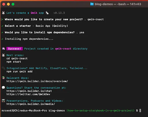
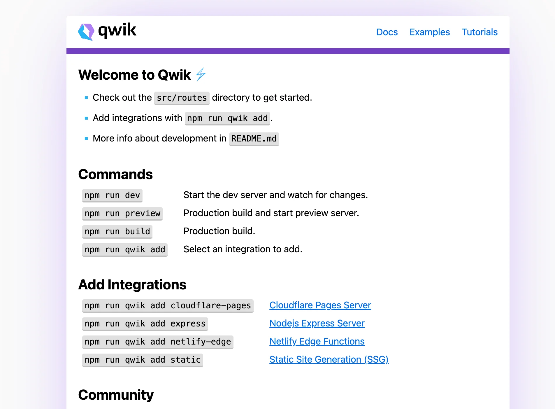
Now we have our Qwik application ready to go. Let’s start the development server and see what it looks like;

npm run dev
successful running app

Now that our app is up and running we will see how we can integrate a React package and component into our Qwik project.

Integrating React in Qwik

Like most JavaScript frontend libraries or frameworks, React makes use of hydration, which has its drawbacks and might be more expensive than you think. Qwik needs no hydration on load. It’s just pure HTML. This makes Qwik qwiker to load UIs, with which users can start interacting. You should keep this in mind when considering to include React components in your Qwik applications.

QwikReact is a tool that allows you to use React components in Qwik, including the whole ecosystem of component libraries such as Material UI, Threejs and React Spring. To get started, we need to run this command inside our Qwik app:

npm run qwik add react

This will install needed dependencies such as qwik-react, react, and react-dom. It will also add emotion and mui, which you can uninstall if you don’t intend to use them.

qwik react

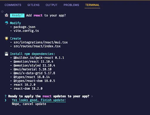
If we check our project, we should now have some new folders generated. The most important is the src/integrations/react. This is where all our React components will be implemented or React packages will be used.
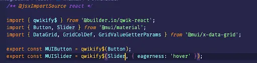
Qwikify$

The qwikify$ function is exported from @builder.io/qwik-react, which converts React components into Qwik components that you can use across your application, and allows Qwik to implement partial hydration of React components. You cannot use React components in Qwik without converting them first to remove React’s hydration pattern, which is not supported in Qwik, using qwikify$().

Another important thing to remember is to make sure the file containing your React component has this;

/** @jsxImportSource react */

This needs to be imported at the top of the file as this serves as instructions to the compiler to use React as the JSX factory. This means you cannot mix your React components with a Qwik component.

qwikify - 1

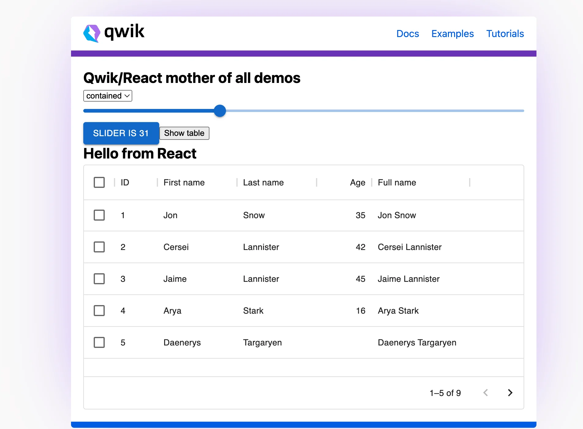
The code above is from the Qwik demo. You can see how the React components are wrapped with the qwikify$() function.

If your React package requires some configuration, don’t try to pass it as a props. Instead, do every configuration right inside the file, ensuring only the dynamic data is passed through.

qwikify - 2

The code above is from our Qwik GitHub showcase. Check out the full source code here.

So once you are done with Qwikifying your React component, you can now import and use it just as you would normally do a Qwik component.

importing qwik react component
rendering react component in qwik

Let’s run our application, and navigate to the React page at http://localhost:5173/react to view the default Qwik demo;

npm run dev
react table running successfully

Interactivity

Qwik tries to reduce or completely remove hydrations, but React heavily depends on it. This means we have to find a way to hydrate our React Component without affecting the concept of Qwik. Qwik allows you to decide when to hydrate your components by using the client: JSX properties. This technique is commonly referred to as “partial hydration”. For more information on this checkout Adding Interactivity on Qwik Docs.

Conclusion

In this article, we saw how to convert React to a Qwik component. We also learned about the dos and don’ts of using React in Qwik, as well as how to handle hydration. I hope you enjoyed this article. Thank you for reading!

If you have any questions or run into any trouble, feel free to join the discussions going on at starter.dev or on our Discord.

This Dot Labs is a development consultancy that is trusted by top industry companies, including Stripe, Xero, Wikimedia, Docusign, and Twilio. This Dot takes a hands-on approach by providing tailored development strategies to help you approach your most pressing challenges with clarity and confidence. Whether it's bridging the gap between business and technology or modernizing legacy systems, you’ll find a breadth of experience and knowledge you need. Check out how This Dot Labs can empower your tech journey.

You might also like

Announcing Qwik for starter.dev cover image

Announcing Qwik for starter.dev

Hello there! Today, I'm so excited to introduce our new Qwik starter kit, which comes with 4 different technologies configured, and is ready for use. These technologies are: Qwik City, Storybook, Tailwind CSS, and GraphQL. In this short article, we will talk about the core framework, the routing, example apps to get you started, the tools and technologies used in this kit, and how it is a great out-of-the-box starter for your next Qwik project. Qwik Qwik is a new JavaScript framework by Misko Hevery, creator of Angular, for building frontend browser applications. The major benefit of Qwik is its performance optimization, which features resumability and lazy loading. Today we will be focusing on the Qwik framework starter kit. Technologies Used in the Starter Kit - Qwik City The kit is configured to make use of Qwik City, which offers directory-based routing (you don’t have to worry about colocation) and much more. Qwik City is a meta-framework of Qwik. It brings an opinionated and performant way to build sites at scale. - Storybook Storybook is a frontend workshop for building UI components and pages in isolation, testing, and documentation. It is open source and free. It is a great tool for testing and visualizing your components in different states. Qwik currently doesn’t have out-of-the-box support for Storybook, but we have figured out a way to configure it for Qwik. For more information on how we set up Storybook in Qwik, visit here. - Tailwind CSS Because Tailwind CSS is one of the most loved CSS libraries, we also included in this kit. Tailwind CSS is an open-source CSS framework. There is no special configuration to use Tailwind CSS in your Qwik app. You can use module CSS, or follow along with the kit (i.e we export the CSS classes as a variable). We will still achieve the same result, and make our code a bit cleaner, unlike when we write the CSS classes in the JSX directly. - GraphQL GraphQL is another great tool that was added to the kit. This gives you an out-of-the-box configuration to start making API calls to your GraphQL backend. GraphQL is an open-source data query and manipulation language for APIs, and a runtime for fulfilling queries with existing data. How to Get Started To get started, visit the Qwik starter.dev page for all the steps needed to create a new application with our starter.dev CLI, and run the application on your local system. Example Apps in the Starter Kit In this starter kit, we have two main components; - Counter - Greeting In the Counter component, we see how we can utilize the useStore hook provided by Qwik to store our counter state. In the Greeting component, we made use of the GraphQL config in the starter kit. The app sends a query request with the value entered in the input field, which is then returned back as a response from the API. With all of these configurations and code samples, we believe that with this Qwik starter kit, you can start building your production-scale application. Conclusion Qwik is still in its early days, and we will continue to update as we learn more. We welcome everyone to take a look, and if you have any questions or run into any trouble feel free to join the discussions going on at starter.dev or on our Discord....

Unit Testing Qwik Components cover image

Unit Testing Qwik Components

Unit Testing Qwik Components Qwik is a new, superfast JavaScript framework from builder.io. Created by Miško Hevery, the author of AngularJS, Qwik aims to deliver instant loading web applications of any size or complexity through resumability. This is accomplished partially by delaying the execution and download of JavaScript for as long as possible while providing an excellent developer experience. > "You know React? You know Qwik." > — qwik.builder.io Given Miško's background as the creator of AngularJS, it's interesting that writing Qwik feels very similar to writing React. It even has a React compatibility mode. Personally, I have experience using mostly Angular, but I found that developing with Qwik was very smooth and enjoyable. So, although I am definitely hesitant to jump on new technologies, after attending Miško's workshop, browsing through all the resources at framework.dev tinkering with Qwik, and building a couple of apps with it, I became a fan. However, being a responsible software developer, I then wanted to add unit tests to my Qwik app. And because Qwik is relatively new, I found out there was little documentation on how to do this. Furthermore, until recently, there were no tools to easily set up and interact with Qwik components in unit tests. But that didn't stop me. I explored, asked, and waited for a PR to be merged, and now I am proud to present a comprehensive guide to unit testing Qwik apps. So, without further ado, let's dive into setting up our testing environment. Configuring a Testing Environment There are several options when it comes to choosing a testing framework, and I have even experimented with using Jest, as it is the popular choice for unit testing. However, since Qwik uses Vite, I found that using Vitest was the most straightforward and efficient option. Vitest is specifically designed to be the go-to test runner for Vite projects, which makes it a great fit. If you are familiar with Jest, you will be happy to know that the Vitest API is very similar, so you won't have to learn much to use it effectively. Before moving further to the actual setup, let's make sure you have a Qwik project to test. If you don't yet, you can simply create one by running npm create qwik@latest`. Now, let's set up vitest in our Qwik project. It takes 3 easy steps: 1. Install Vitest as a dev dependency by running npm i vitest --save-dev` from the root of your project. This will update the __devDependencies__ array in your __package.json__ file. 2. Update your vite.config.ts__ file to include a test configuration in the `defineConfig` function. You can start with an empty object for now, but you can always add configuration options later on. Your __vite.config.ts__ should look something like this: ` JavaScript // ./vite.config.ts import { defineConfig } from 'vite'; import { qwikVite } from '@builder.io/qwik/optimizer'; import { qwikCity } from '@builder.io/qwik-city/vite'; import tsconfigPaths from 'vite-tsconfig-paths'; export default defineConfig(() => { return { plugins: [qwikCity(), qwikVite(), tsconfigPaths()], preview: { headers: { 'Cache-Control': 'public, max-age=600', }, }, test: {}, // this is the config entry we are adding }; }); ` 3. Update the "scripts" section of your package.json__ file to include commands for running vitest once, running it in watch mode, and for generating coverage reports. Your "scripts" section should look something like this: ` JSON "scripts": { ... "test": "vitest --run", "test.watch": "vitest", "coverage": "vitest run --coverage" } ` After completing these steps, you should be able to run npm run test` and `npm run coverage` from your terminal to use Vitest. Note that if you run npm run test` and you don't have any tests yet, which is likely the case at this point, you will see the message `No test files found, exiting with code 1`. Don't worry. We are about to add some tests shortly. Writing Tests By default, vitest will look for files with names that match the pattern '**/*.{test,spec}.{js,mjs,cjs,ts,mts,cts,jsx,tsx}`. In a Qwik project that uses TypeScript and returns JSX elements, it makes sense to use the `*.spec.tsx` or `*.test.tsx` pattern. I prefer to use the`.spec` suffix. But `.test` works just as well, and is equally valid. Feel free to choose the one that you like best. To proceed with writing a unit test, we will need a component to test. For this example, we will use a simple counter component that has a div` that displays a number and a `button` that increments it. To create the component, follow these steps: 1. Go to the src/components__ directory, and create a new folder called __counter__. 2. Inside the counter__ folder, create a new file called __counter.tsx__ and add the following code: ` TypeScript import { component$, useStore } from "@builder.io/qwik"; export const Counter = component$(() => { const state = useStore({ count: 0, }); return ( state.count++}> + {state.count} ); }); ` 3. Next to the counter.tsx__ file, create a new file called __counter.spec.tsx__ file next to it. This file will contain the unit tests for the Counter component. Now that we have our component and our test file, we can proceed to write our unit tests. Let's open counter.spec.tsx__ and add some boilerplate along with a simple test to verify we have everything set up correctly: ` TypeScript import { describe, expect, it } from "vitest"; import { Counter } from "./counter"; describe("Counter component", function () { it('should assert true', async () => { // this should always pass expect(true).toBe(true); }); }); ` We have a describe` method that groups related tests together (in our case, we're grouping all the tests we will write for our Counter component), an `expect` method which is used to make assertions about the values returned by the code being tested, and an `it` method that defines an individual test. If we now run npm run test`, we should see the following output: ` Test Files 1 passed (1) Tests 1 passed (1) ` Writing a Simple Test Case Now that we verified that our dummy test work, let's actually test our component's behavior. First, we want to test that it renders correctly, so we will remove our dummy test and leverage the new createDOM method from @builder.io/qwik.testing` to render our Counter component inside the test: ` TypeScript import { createDOM } from "@builder.io/qwik/testing"; // import the createDOM method import { describe, expect, it } from "vitest"; import { Counter } from "./counter"; describe("Counter component", function () { it("should render", async () => { // create the component's DOM and get back the container and a render method const { screen, render } = await createDOM(); // call the render method with the JSX node of our Counter component as a parameter await render(); // get the div that displays the count from our container const countElement = screen.querySelector(".count"); // assert the displayed count is "0" which is the default value expect(countElement?.textContent).toBe("0"); }); }); ` Rerunning the test should result in a pass if we did everything correctly. Now we know our component does render and displays zero as the count. Testing Interactions "Great," you say, "but I want to test the component's logic, not just the initial render!". Well, you're in luck because the createDOM` method returns one more property - `userEvent` - that you can use to interact with the component's DOM. This allows us to simulate user interactions, such as clicking a button, and test whether the component responds correctly. For example, we can test whether our counter correctly increments the count by clicking the button. Here is the updated code example: ` TypeScript it("should increment on click", async () => { // we retrieve the userEvent` method along with `screen` and `render` const { screen, render, userEvent } = await createDOM(); // render the component await render(); // get the div that displays the count from our container const countElement = screen.querySelector(".count"); // assert the displayed count is "0" which is the default value expect(countElement?.textContent).toBe("0"); // pass a selector that matches the increment button as a first parameter // and the name of the event we want to trigger ("click") as the second parameter await userEvent("button.increment", "click"); // assert the displayed count is now incremented from 0 to 1 expect(countElement?.textContent).toBe("1"); }); ` With this additional test, we can be confident that our Counter component not only renders correctly, but also updates the count as expected when the increment button is clicked. Voilà, our component's behavior has been verified! Mocking Qwik Hooks So far, we have a test that verifies the component's logic, which is great! However, there may come a time when we need to mock parts of the component's logic to test certain scenarios. Unfortunately, here comes a little trade-off for the sake of Qwik's quickness. The component$ wrapper does not expose the internals of the component, so we cannot easily modify it for our tests. Fortunately, the most common thing we need to mock in Qwik components are hooks__ such as `useLocation()` or `useStore()`. We can do this by using `vi.mock`. As we can read in the Vitest docs, the `vi.mock` method takes two arguments: the path to the module that we want to mock, and a function that returns the mocked module. For example, if we want to modify the initial count in our useStore()` hook to be _1_, we can mock the entire @builder.io/qwik module and return the actual module with the modified initial value. We can use the JavaScript `bind` method to do this. The call to `vi.mock` can be placed anywhere in the code as it is hoisted and will always be called before modules are imported, but for clarity, we will put it in a `beforeAll` block: ` TypeScript import { createDOM } from "@builder.io/qwik/testing"; import { describe, expect, it, vi, beforeAll } from "vitest"; import { Counter } from "./counter"; beforeAll(() => { // mock useStore to start with count of 1 instead of 0 vi.mock("@builder.io/qwik", async () => { const qwik = await vi.importActual( "@builder.io/qwik" ); return { ...qwik, // return most of the module unchanged // leverage bind to set the initial state of useStore useStore: qwik.useStore.bind("initialState", { count: 1 }), }; }); }); describe("Counter component", function () { it("should increment on click", async () => { // we retrieve the userEvent` method along with `screen` and `render` const { screen, render, userEvent } = await createDOM(); // render the component await render(); // get the div that displays the count from our container const countElement = screen.querySelector(".count"); // assert the displayed count is "1" - the default value set by our mock expect(countElement?.textContent).toBe("1"); // pass a selector that matches the increment button as a first parameter // and the name of the event we want to trigger ("click") as the second parameter await userEvent("button.increment", "click"); // assert the displayed count is now incremented from 1 to 2 expect(countElement?.textContent).toBe("2"); }); }); ` Mocking the useLocation` hook is even simpler, as it is not expected to change during a test. In this case, we can directly return an object from the mock. Here is an example of how to mock the `useLocation` hook: ` TypeScript vi.mock("@builder.io/qwik", async () => { const qwik = await vi.importActual( "@builder.io/qwik" ); return { ...qwik, // return a hardcoded object for every useLocation call useLocation: { params: {}, href: "/mock", pathname: "mock", query: {}, } }; }); ` Conclusion As a newcomer to the world of JavaScript frameworks, Qwik offers a unique approach to building fast, efficient web applications. However, we shouldn't forget about the quality and robustness of our code. In this blog post, we provided a comprehensive guide on how to set up and write tests for your Qwik components. Setting up a testing environment for a Qwik app is relatively straightforward. Qwik uses Vite as its build tool, which means that the most efficient option for unit testing is to use Vitest, a test runner specifically designed for Vite projects. We showed how to install Vitest and update the Vite config file to include a test configuration, and went through examples of how to write tests for Qwik components, including how to mock hooks and test interactions with the DOM. By following the steps and examples in this post, you can easily add unit tests to your Qwik app, and ensure that your components are working correctly. This will give you confidence in your code, and allow you to build more complex and robust applications with Qwik. And if you found this article a bit overwhelming, do not worry, you can check out the Qwik starter kit which includes examples of already implemented tests. Have fun writing Qwik and reliable apps!...

How to Setup Storybook in a Qwik Project cover image

How to Setup Storybook in a Qwik Project

Introduction Storybook is a great tool for testing and visualizing your components in different states. In this article, we will see how to setup Storybook in a Qwik project. Qwik Qwik is a new JavaScript framework by Misko Hevery, creator of Angular, for building frontend browser applications. The major benefit of Qwik is its performance optimization, and this is achieved through zero loading, resumability, lazy loading, reduced rendering, scalability, and code once. For more information on Qwik, you can check out the docs, github repo, and discord. Project Set Up To get started, we need to create a new Qwik app. We can do this by running the following command in our terminal: `shell npm create qwik@latest ` Initialize Storybook Storybook, unfortunately, doesn’t have a Qwik template yet because it is a new Framework. So the work around is to use the html` template . Using the command below, we can initialize Storybook: `shell npx storybook init --type html ` During the initialization, Storybook would ask to automatically install some optional dependencies such as; EslintPlugin and npm7, you can accept or reject it. To accept, type y` and hit `Enter` to progress. Storybook would try to setup a default stories` folder, which is based on the ```–type``` template we choose, which is ```html```. It is not compatible with the Qwik compiler and will result in compilation errors, so we will have to delete it to avoid running into such errors. Project Structure Our project structure is already setup by Qwik, and Storybook initialization has created a .storybook` folder. But we need to make some changes to the Storybook file extension since our project is in TypeScript. This is a snippet of the folders in our project: `text ├── .storybook ├── main.ts ├── preview.ts └── preview-head.html ├── public ├── vite.config.ts └── src ` Configuring Storybook Since Qwik runs on Vite, we need to set up the viteFinal function in our main.ts file, which will give us the config that we will use to register our Qwik Vite plugin. Add this line of code in the configuration object: `js viteFinal: async (config, options) => { const { qwikVite: qwikVite } = await import('@builder.io/qwik/optimizer'); config.plugins?.unshift(qwikVite()); return config; }, ` In the preview.ts file, this is where we configure how Storybook renders our stories. We need to execute Qwikloader. This will help in registering global browser events, and much more Qwik related benefits. We will replace the content in the file with the code below: `js import { JSXNode } from '@builder.io/qwik'; import { QWIKLOADER } from '@builder.io/qwik/loader/index'; import { render } from '@builder.io/qwik'; import '../src/global.css'; eval(QWIKLOADER); export const decorators = [ (Story: () => JSXNode) => { const parent = document.createElement('div'); const jsxNode = Story(); render(parent, jsxNode); return parent; }, ]; ` This solution was found in this discussion: How to do component testing with Qwik?. I believe when the Qwik Storybook type template becomes available these configurations will be there by default. Now we are done with the configuration, let's run storybook and see what we have: `shell npm run storybook ` Creating Stories We can create our first story, we will create a story for our Qwik app component. We will create this story for our default Qwik Header component. I modified the Header component to accept a menus props: `js import { Meta } from '@storybook/html'; import Header, { HeaderProps } from './header'; export default { title: 'Header', } as Meta; const Template = (args: HeaderProps) => ; export const Demo: any = Template.bind({ menus: [] }); Demo.args = { menus: [ { name: 'Docs', link: 'https://qwik.builder.io/docs/components/overview/', }, { name: 'Examples', link: 'https://qwik.builder.io/examples/introduction/hello-world/', }, { name: 'Tutorials', link: 'https://qwik.builder.io/tutorial/welcome/overview/', }, ] }; ` Conclusion In this article, we saw how to setup Storybook in a Qwik project. We also saw how to create our first story. I hope you enjoyed this article. Thanks for reading. If you don't want to do these steps yourself, check out our starter.dev Qwik kit that already has Storybook enabled for your use here. A link to the project repo can be found here. If you have any questions or run into any trouble, feel free to reach out on Twitter....

Nuxt DevTools v1.0: Redefining the Developer Experience Beyond Conventional Tools cover image

Nuxt DevTools v1.0: Redefining the Developer Experience Beyond Conventional Tools

In the ever-evolving world of web development, Nuxt.js has taken a monumental leap with the launch of Nuxt DevTools v1.0. More than just a set of tools, it's a game-changer—a faithful companion for developers. This groundbreaking release, available for all Nuxt projects and being defaulted from Nuxt v3.8 onwards, marks the beginning of a new era in developer tools. It's designed to simplify our development journey, offering unparalleled transparency, performance, and ease of use. Join me as we explore how Nuxt DevTools v1.0 is set to revolutionize our workflow, making development faster and more efficient than ever. What makes Nuxt DevTools so unique? Alright, let's start delving into the features that make this tool so amazing and unique. There are a lot, so buckle up! In-App DevTools The first thing that caught my attention is that breaking away from traditional browser extensions, Nuxt DevTools v1.0 is seamlessly integrated within your Nuxt app. This ensures universal compatibility across browsers and devices, offering a more stable and consistent development experience. This setup also means the tools are readily available in the app, making your work more efficient. It's a smart move from the usual browser extensions, making it a notable highlight. To use it you just need to press Shift + Option + D` (macOS) or `Shift + Alt + D` (Windows): With simple keystrokes, the Nuxt DevTools v1.0 springs to life directly within your app, ready for action. This integration eliminates the need to toggle between windows or panels, keeping your workflow streamlined and focused. The tools are not only easily accessible but also intelligently designed to enhance your productivity. Pages, Components, and Componsables View The Pages, Components, and Composables View in Nuxt DevTools v1.0 are a clear roadmap for your app. They help you understand how your app is built by simply showing its structure. It's like having a map that makes sense of your app's layout, making the complex parts of your code easier to understand. This is really helpful for new developers learning about the app and experienced developers working on big projects. Pages View lists all your app's pages, making it easier to move around and see how your site is structured. What's impressive is the live update capability. As you explore the DevTools, you can see the changes happening in real-time, giving you instant feedback on your app's behavior. Components View is like a detailed map of all the parts (components) your app uses, showing you how they connect and depend on each other. This helps you keep everything organized, especially in big projects. You can inspect components, change layouts, see their references, and filter them. By showcasing all the auto-imported composables, Nuxt DevTools provides a clear overview of the composables in use, including their source files. This feature brings much-needed clarity to managing composables within large projects. You can also see short descriptions and documentation links in some of them. Together, these features give you a clear picture of your app's layout and workings, simplifying navigation and management. Modules and Static Assets Management This aspect of the DevTools revolutionizes module management. It displays all registered modules, documentation, and repository links, making it easy to discover and install new modules from the community! This makes managing and expanding your app's capabilities more straightforward than ever. On the other hand, handling static assets like images and videos becomes a breeze. The tool allows you to preview and integrate these assets effortlessly within the DevTools environment. These features significantly enhance the ease and efficiency of managing your app's dynamic and static elements. The Runtime Config and Payload Editor The Runtime Config and Payload Editor in Nuxt DevTools make working with your app's settings and data straightforward. The Runtime Config lets you play with different configuration settings in real time, like adjusting settings on the fly and seeing the effects immediately. This is great for fine-tuning your app without guesswork. The Payload Editor is all about managing the data your app handles, especially data passed from server to client. It's like having a direct view and control over the data your app uses and displays. This tool is handy for seeing how changes in data impact your app, making it easier to understand and debug data-related issues. Open Graph Preview The Open Graph Preview in Nuxt DevTools is a feature I find incredibly handy and a real time-saver. It lets you see how your app will appear when shared on social media platforms. This tool is crucial for SEO and social media presence, as it previews the Open Graph tags (like images and descriptions) used when your app is shared. No more deploying first to check if everything looks right – you can now tweak and get instant feedback within the DevTools. This feature not only streamlines the process of optimizing for social media but also ensures your app makes the best possible first impression online. Timeline The Timeline feature in Nuxt DevTools is another standout tool. It lets you track when and how each part of your app (like composables) is called. This is different from typical performance tools because it focuses on the high-level aspects of your app, like navigation events and composable calls, giving you a more practical view of your app's operation. It's particularly useful for understanding the sequence and impact of events and actions in your app, making it easier to spot issues and optimize performance. This timeline view brings a new level of clarity to monitoring your app's behavior in real-time. Production Build Analyzer The Production Build Analyzer feature in Nuxt DevTools v1.0 is like a health check for your app. It looks at your app's final build and shows you how to make it better and faster. Think of it as a doctor for your app, pointing out areas that need improvement and helping you optimize performance. API Playground The API Playground in Nuxt DevTools v1.0 is like a sandbox where you can play and experiment with your app's APIs. It's a space where you can easily test and try out different things without affecting your main app. This makes it a great tool for trying out new ideas or checking how changes might work. Some other cool features Another amazing aspect of Nuxt DevTools is the embedded full-featured VS Code. It's like having your favorite code editor inside the DevTools, with all its powerful features and extensions. It's incredibly convenient for making quick edits or tweaks to your code. Then there's the Component Inspector. Think of it as your code's detective tool. It lets you easily pinpoint and understand which parts of your code are behind specific elements on your page. This makes identifying and editing components a breeze. And remember customization! Nuxt DevTools lets you tweak its UI to suit your style. This means you can set up the tools just how you like them, making your development environment more comfortable and tailored to your preferences. Conclusion In summary, Nuxt DevTools v1.0 marks a revolutionary step in web development, offering a comprehensive suite of features that elevate the entire development process. Features like live updates, easy navigation, and a user-friendly interface enrich the development experience. Each tool within Nuxt DevTools v1.0 is thoughtfully designed to simplify and enhance how developers build and manage their applications. In essence, Nuxt DevTools v1.0 is more than just a toolkit; it's a transformative companion for developers seeking to build high-quality web applications more efficiently and effectively. It represents the future of web development tools, setting new standards in developer experience and productivity....