Developer Insights
Join millions of viewers! Our engineers craft human-written articles solving real-world problems weekly. Enjoy fresh technical content and numerous interviews featuring modern web advancements with industry leaders and open-source authors.
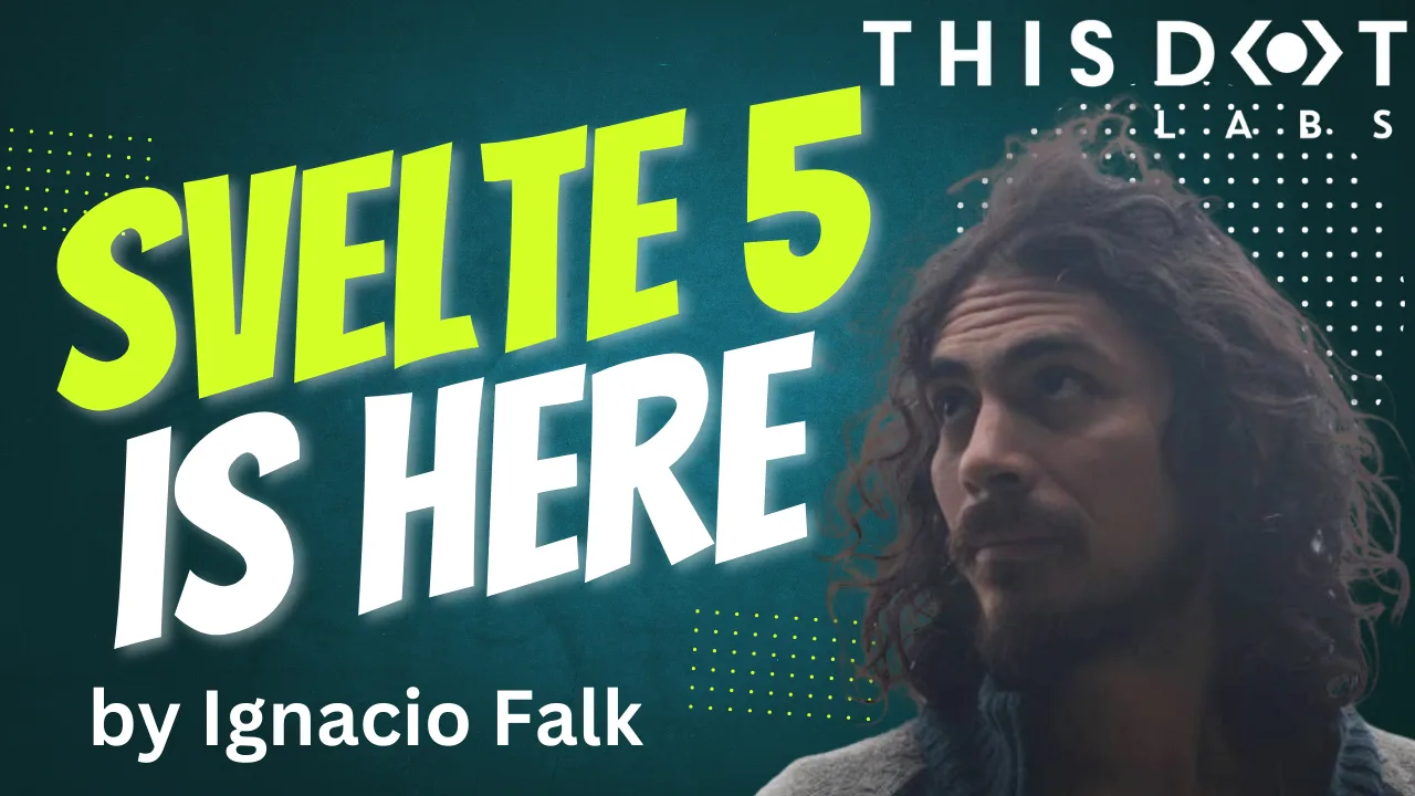
Svelte 5 is Here!
Svelte 5 was finally released after a long time in development. Fortunately, we've been able to test it for some time, and now it has a stable release....
Nov 27, 2024
4 mins
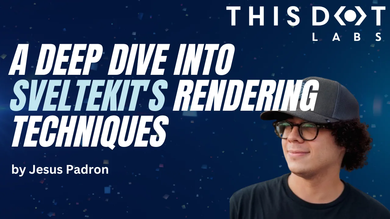
A Deep Dive into SvelteKit's Rendering Techniques
SvelteKit is a meta-framework for Svelte that allows you to develop pages based on their content. At its core, SvelteKit introduces three fundamental strategies out of the box, each designed to streamline the development process and...
May 1, 2024
7 mins

Harnessing the Power of Threlte - Building Reactive Three.js Scenes in Svelte
Introduction Web development has evolved to include immersive 3D experiences through libraries like Three.js. This powerful JavaScript library enables the creation of captivating 3D scenes within browsers. Three.js: The 3D Powerhouse Three.js democratizes 3D rendering, allowing developers of all skill levels to craft interactive 3D worlds. Svelte Ecosystem: Svelte Cubed and Svelthree The Svelte ecosystem presents solutions like Svelte Cubed and Svelthree, which bridges Svelte with Three.js, offering streamlined reactivity for 3D web experiences. Introducing Threlte v6: Uniting SvelteKit 1.0, Svelte 4, and TypeScript Threlte v6 is a rendering and component library for Svelte that seamlessly integrates Three.js. By harnessing TypeScript's types, it provides a robust and delightful coding experience. In this tutorial, we'll showcase Threlte's capabilities by building an engaging website header: an auto-rotating sphere that changes color on mouse down. Using Threlte v6, SvelteKit 1.0, and Three.js, we're set to create a visually stunning experience. Let's dive in! Setting up Threlte Before building our scene, we need to set up Threlte. We can scaffold a new project using the CLI or manually install Threlte in an existing project. Option 1: Scaffold a New Threlte Project Create a new SvelteKit project and install Threlte with: ` Option 2: Manual Installation For an existing project, select the necessary Threlte packages and install: ` Configuration adjustments for SvelteKit can be made in the "vite.config.js" file: ` With Threlte configured, we're ready to build our interactive sphere. In the next chapter, we'll lay the groundwork for our exciting 3D web experience! Exploring the Boilerplate of Threlte Upon scaffolding a new project using npm create threlte, a few essential boilerplate files are generated. In this chapter, we'll examine the code snippets from three of these files: lib/components/scene.svelte, routes/+page.svelte, and lib/components/app.svelte. 1. lib/components/scene.svelte: This file lays the foundation for our 3D scene. Here's a brief breakdown of its main elements: - Perspective Camera: Sets up the camera view with a specific field of view and position, and integrates OrbitControls for auto-rotation and zoom management. - Directional and Ambient Lights: Defines the lighting conditions to illuminate the scene. - Grid: A grid structure to represent the ground. - ContactShadows: Adds shadow effects to enhance realism. - Float: Wraps around 3D mesh objects and defines floating properties, including intensity and range. Various geometrical shapes like BoxGeometry, TorusKnotGeometry, and IcosahedronGeometry are included here. 2. routes/+page.svelte: This file handles the ui of the index page and imports all necessary components we need to bring our vibrant design to life. 3. lib/components/app.svelte: This file is where you would typically define the main application layout, including styling and embedding other components. Heading to the Fun Stuff With the boilerplate components explained, we're now ready to dive into the exciting part of building our interactive 3D web experience. In the next section, we'll begin crafting our auto-rotating sphere, and explore how Threlte's robust features will help us bring it to life. Creating a Rotating Sphere Scene In this chapter, we'll walk you through creating an interactive 3D sphere scene using Threlte. We'll cover setting up the scene, the sphere, the camera and lights, and finally the interactivity that includes a scaling effect and color changes. 1. Setting Up the Scene First, we need to import the required components and utilities from Threlte. ` 2. Setting Up the Sphere We'll create the 3D sphere using Threlte's and components. ` 1. : This is a component from Threlte that represents a 3D object, which in this case is a sphere. It's the container that holds the geometry and material of the sphere. 2. : This is the geometry of the sphere. It defines the shape and characteristics of the sphere. The args attribute specifies the parameters for the sphere's creation: - The first argument (1) is the radius of the sphere. - The second argument (32) represents the number of width segments. - The third argument (32) represents the number of height segments. 3. : This is the material applied to the sphere. It determines how the surface of the sphere interacts with light. The color attribute specifies the color of the material. In this case, the color is dynamic and defined by the sphereColor variable, which updates based on user interaction. The roughness attribute controls the surface roughness of the sphere, affecting how it reflects light. 3. Setting Up the Camera and Lights Next, we'll position the camera and add lights to create a visually appealing scene. ` 1. : This component represents the camera in the scene. It provides the viewpoint through which the user sees the 3D objects. The position attribute defines the camera's position in 3D space. In this case, the camera is positioned at (-10, 20, 10). The fov attribute specifies the field of view, which affects how wide the camera's view is. - makeDefault: This attribute makes this camera the default camera for rendering the scene. 2. : This component provides controls for easy navigation and interaction with the scene. It allows the user to pan, zoom, and orbit around the objects in the scene. The attributes within the component configure its behavior: - enableZoom: Disables zooming using the mouse scroll wheel. - enablePan: Disables panning the scene. - enableDamping: Enables a damping effect that smoothens the camera's movement. - autoRotate: Enables automatic rotation of the camera around the scene. - autoRotateSpeed: Defines the speed of the auto-rotation. 3. : This component represents a directional light source in the scene. It simulates light coming from a specific direction. The attributes within the component configure the light's behavior: - intensity: Specifies the intensity of the light. - position.x and position.y: Define the position of the light source in the scene. 4. : This component represents an ambient light source in the scene. It provides even lighting across all objects in the scene. The intensity attribute controls the strength of the ambient light. 4. Interactivity: Scaling and Color Changes Now we'll add interactivity to the sphere, allowing it to scale and change color in response to user input. First, we'll import the required utilities for animation and set up a spring object to manage the scale. ` We'll update the sphere definition to include scaling: ` Lastly, we'll add code to update the color of the sphere based on the mouse's position within the window. ` We have successfully created a rotating sphere scene with scaling and color-changing interactivity. By leveraging Threlte's capabilities, we have built a visually engaging 3D experience that responds to user input, providing a dynamic and immersive interface. Adding Navigation and Scroll Prompt in app.svelte In this chapter, we'll add a navigation bar and a scroll prompt to our scene. The navigation bar provides links for user navigation, while the scroll prompt encourages the user to interact with the content. Here's a step-by-step breakdown of the code: 1. Importing the Canvas and Scene The Canvas component from Threlte serves as the container for our 3D scene. We import our custom Scene component to render within the canvas. ` 2. Embedding the 3D Scene The Canvas component wraps the Scene component to render the 3D content. It is positioned absolutely to cover the full viewport, and the z-index property ensures that it's layered behind the navigation elements. ` 3. Adding the Navigation Bar We use a element to create a horizontal navigation bar at the top of the page. It contains a home link and two navigation list items. The styling properties ensure that the navigation bar is visually appealing and positioned correctly. ` 4. Adding the Scroll Prompt We include a "Give a scroll" prompt with an element to encourage user interaction. It's positioned near the bottom of the viewport and styled for readability against the background. ` 5. Styling the Components Finally, the provided CSS styles control the positioning and appearance of the canvas, navigation bar, and scroll prompt. The CSS classes apply appropriate color, font, and layout properties to create a cohesive and attractive design. ` Head to the github repo to view the full code. Check out the result: https://threlte6-spinning-ball.vercel.app/ Conclusion We've successfully added navigation and a scroll prompt to our Threlte project in the app.svelte file. By layering 2D HTML content with a 3D scene, we've created an interactive user interface that combines traditional web design elements with immersive 3D visuals....
Aug 14, 2023
6 mins
Svelte 4: Unveiled Speed Enhancements and Developer-Centric Features
Svelte 4: Unveiled Speed Enhancements and Developer-Centric Features Svelte, a widely favored framework for building user interfaces, unveiled its much-anticipated version 4 on June 22. This major release, while paving the way for future advancements, brings a plethora of remarkable enhancements. Focusing on enriching the development experience and boosting performance, Svelte 4 is indeed reshaping the landscape of frontend development. In this post, we'll delve into the specifics of this exciting release, covering the significant performance boosts, enriched developer tools and features, revamped websites, and simplified migration guide. A Deeper Look at Performance Enhancements Svelte 4 delivers remarkable improvements in performance, focusing on shrinking the Svelte package size, and enhancing hydration efficiency. Streamlined Svelte Package Svelte 4 has substantially slimmed down, reducing its overall package size from 10.6 MB to a sleek 2.8 MB - a 75% decrease. This reduction in dependencies from 61 to 16 not only lightens Svelte but also optimizes SvelteKit, significantly accelerating the REPL experience and npm install times. For instance, npm install times have been trimmed from over 5 minutes to less than a minute, a leap in quality that any developer will appreciate. NPM I Before: NPM I After: Bundle Size Before: Bundle Size After: Optimized Hydration and Performance Scores Alongside the impressive package size reduction, Svelte 4 offers more efficient code hydration, reducing the generated code size for the SvelteKit website by nearly 13%. This leaner codebase contributes to higher performance on benchmarks like Google Lighthouse. The performance score for the new Svelte 4 starter on starter.dev has soared from 75% to a near perfect 95+%. Overall, the performance enhancements introduced with Svelte 4 mean a faster, more efficient, and smoother developer experience. Before: After: Enhanced Developer Experience in Svelte 4 Localized Transitions Transitions in Svelte 4 are local by default, preventing potential conflicts during page loading. ` Improved Web Component Authoring Web Components authoring is simplified with the dedicated customElement attribute in svelte:options. ` Stricter Type Enforcement Svelte 4 introduces stricter types for createEventDispatcher, Action, ActionReturn, and onMount. ` These changes collectively offer a streamlined, robust, and efficient coding experience. Revamped Svelte Websites With Svelte 4, the team has also revamped its main website, offering an improved and more user-friendly experience. The Tutorial Website The Svelte tutorial website has been overhauled for an enhanced learning journey. New improvements include a visible file structure, fewer elements in the navbar, smoother navigation between sections, and a new dark mode. The Svelte Website The primary Svelte website received a makeover too, including better mobile navigation, improved TypeScript documentation, and a handy dark mode. These website updates aim to provide a more engaging, intuitive, and user-friendly experience for all Svelte users. A Smooth Migration to Svelte 4 Transitioning from Svelte 3 to Svelte 4 is designed to be as straightforward as possible. The Svelte team has provided an updated migration tool to simplify this process. Here is a step-by-step guide for the transition: 1. Run the Svelte migration tool. ` 2. Remove Svelte 3 packages. ` 3. Update your eslintrc.json configuration file. ` 4. Upgrade Storybook related packages to the latest v7. Note: as of the publishing of this article, the latest version is 7.0.26. ` Do note that the minimum version requirements have changed. You will now need: - NodeJS 16 or higher - SvelteKit 1.20.4 or higher - TypeScript 5 or higher For more detailed instructions and information, please refer to the official Svelte 4 migration guide or you can take a look at our Svelte 4 starter kit on starter.dev. The focus is to ensure a hassle-free transition, allowing developers to take advantage of the new features and enhancements Svelte 4 offers without significant obstacles. Conclusion Svelte 4, with its performance enhancements and streamlined development process, offers a new pinnacle in the realm of JavaScript frameworks. If you're keen on shifting from Svelte 3 to Svelte 4, a comprehensive migration guide is provided to facilitate a smooth transition. For a quick start with Svelte 4, check out our ready-to-use Svelte Kit with SCSS Starter Kit. In addition, we've developed two showcases demonstrating Svelte 4's power: 1. Svelte Kit with SCSS & 7GUIs - A comprehensive demo showcasing various UI challenges. 2. GitHub Replica Showcase - A clone of the popular code hosting platform, GitHub, demonstrating the potential of Svelte 4 in building complex and high-performance web applications. In conclusion, Svelte 4 brings numerous performance improvements and enriches the development experience, thereby increasing developer productivity and enabling the creation of more efficient applications. Its thoughtful design, alongside the streamlined migration process, is set to expand its adoption in the web development community....
Jul 26, 2023
5 mins
Svelte 4 Launch Party Recap
In this Svelte 4 Launch Party event, our panelists discussed the release of Svelte 4. In this wrap-up, we will talk about panel discussions with Svelte core team members, which is an in-depth exploration of the Svelte 4 release, highlighting its key features and performance enhancements. You can watch the full Svelte 4 Launch Party event on the This Dot Media's YouTube channel. Here is a complete list of the host and panelists that participated in this online event: Hosts: - Tracy Lee, CEO, This Dot, @ladyleet - Rob Ocel, Team Lead & Software Architect, This Dot, @robocell Panelists: - Geoff Rich, Svelte Core Team, @geoffrich_ - Simon Holthausen, Full-time Svelte maintainer, @dummdidumm_ - Puru Vijay, Svelte Core Team, @puruvjdev - Benn McCann, SvelteKit Maintainer, @BenjaminMcCann Introductions Geoff, one of the Svelte maintainers, started the introductions. He expressed his excitement about the new major version of Svelte and shared his years of experience using the framework. In his day job, Geoff is a Senior Software Engineer at Ordergroove. Simon, a full-time Svelte maintainer working at Vercel, was busy preparing and finally releasing Svelte 4. He happily noted that there were very few bugs, and everything seemed to be working smoothly. Simon's dedication to maintaining the framework has contributed significantly to its success. Puru, a college student, showcased his impressive skills by working on the website and the REPL for Svelte. Balancing his studies with web development, Puru demonstrated his passion for Svelte and his contributions to its ecosystem. Ben primarily focuses on Svelte Kit, but also pitched in with Svelte 4. Besides his work on Svelte, Ben is an entrepreneur, adding an extra dimension to his diverse skill set. His contributions to the Svelte community have been invaluable. What Should Everyone Be Excited About in Svelte 4? Svelte 4 has arrived, and while it may not be packed with mind-blowing features, there are several neat little improvements that are worth getting excited about. The main focus of this release was on maintenance and cleaning up the framework to pave the way for the big Svelte 5 release. So don't worry, there are bigger things in the pipeline! One of the first things to note is that file sizes in Svelte 4 have significantly decreased by about 10 to 12 fold. This means that your website will load much faster, thanks to the reduced bundle size. Additionally, improvements have been made in hydration, which affects the speed at which pages hydrate. The core around hydration has become smaller, resulting in improved performance. Another noteworthy enhancement in Svelte 4 is the complete overhaul of custom element support. This change, although technically a breaking one, introduces a new wrapper approach. Previously, in Svelte 3, you had to use every Svelte component as a custom element, even if you wanted to keep certain components as internal implementation details. With the wrapper approach, you now have the flexibility to use components as regular Svelte components internally, fixing a range of bugs and fulfilling numerous feature requests. This change proved to be a tremendous success, resolving multiple issues in one fell swoop. Svelte 4 brings value to your day-to-day development experience. For example, the improved type generation and autocomplete have made working with Svelte components a lot smoother. The autocomplete feature now grabs the correct import, eliminating the frustrations of navigating to the wrong files. Additionally, the introduction of declaration maps allows you to see the actual source code, providing a better understanding of the inner workings of Svelte. There's also good news for those who want to contribute to the Svelte codebase. In Svelte 4, the entire codebase has been converted from TypeScript to JavaScript with JS Docs. While type checking is still in place to ensure error-free development, this change simplifies the process of working with the source code. Developers can now directly edit the source and test changes without worrying about the mapping between TypeScript and JavaScript. In terms of performance, the reduction in bundle sizes has made a significant impact. Although the size reduction percentage may have been misunderstood by some, primarily referring to the compiler size rather than the runtime bundle, it has tangible benefits in scenarios like online tutorials and interactive experiences. Beyond the technical improvements, Svelte 4 also brings updates to the documentation site and the main website. The team has put in considerable effort to enhance the user experience, making it easier to navigate and find the information you need. Puru Does a Run Through of the Updates to the Svelte.dev Site Puru shares exciting news to share about the overhaul of the svelte.dev website. First things first, let's talk about the star of the show: dark mode. It's finally here, and it's a game-changer. They’ve given the entire site a fresh redesign, taking inspiration from the sleek look of kit.svelte.dev. You'll notice some similarities, but they’ve added their own unique touch to make it shine. They’re now linking to the improved tutorial on learn.svelte.dev, which is definitely worth checking out. Now, let's dive into the docs. They've made some significant changes to make your browsing experience a breeze. Instead of a single page, they've divided everything into multiple pages, making it super easy to find what you're looking for. Each component, logic block, and style module has its own dedicated page. It's all organized and up-to-date, thanks to the auto-generation from the source code. Say goodbye to outdated information and hello to hassle-free browsing. They've introduced some fantastic new features that you're going to love. In the REPL, they've added multiple cursors, making coding even more efficient. Plus, they've created a REPL User Guide, packed with handy shortcuts and nifty tips and tricks. And here's the best part: our code snippets now support TypeScript. Just a simple click, and you'll have the TypeScript equivalent at your fingertips. It couldn't get any easier to level up your coding game! So, head over to the new website, immerse yourself in the revamped docs, and enjoy all the fantastic updates we've made. And don't forget to check out the blog section for more in-depth information. Happy browsing, and get ready to experience the best of the new and improved website! Upgrading from Svelte 3 to Svelte 4 Well there are a few things you need to know. But don't worry, it's not too complicated. First off, you'll find all the breaking changes highlighted and summarized on the migration Doc Page. So, if something breaks, you can check it out there. If you're still on Svelte 3, the best way to start is by using the migration script. Just type in npx svelte-migrate svelte-4 in your command line, and it will go through your code base and automatically update things like tightened up types and local transitions. The migration script will even ask you if you want to migrate your global transitions or not. It's like a little questionnaire to make sure everything goes smoothly. The migration script does a lot of the heavy lifting for you, updating dependencies in your package.json and ensuring peer dependency versions match up. It takes care of most things, but there might be a few other changes you'll need to handle. That's where the migration guide comes in handy. It covers all the other changes and helps you navigate through them. Now keep in mind that upgrading to Svelte 4 might require at least Node 16. So, if you're using older dependencies that are holding you back from upgrading Node, it's time to poke your manager or tech lead and emphasize the need to stay current. After all, using outdated versions can pose security vulnerabilities. So make a strong case for the upgrade and let them know it's time to invest in keeping things up to date. Geoff talked about how he has already upgraded a few sites to Svelte 4, and honestly, just upgraded the dependencies, and it worked like a charm. He didn't even bother running the migration script himself. Different projects may have different needs, so it's always good to be aware of any potential obstacles. Stay up to date and remember, keeping things secure is a top priority! Svelte 4 and How It Works with Svelte Kit If you're using Svelte Kit and thinking about upgrading to Svelte 4, here's what you need to know. The good news is that you can stick with your current version of Svelte Kit if you want, but there will be a warning about the peer dependencies not matching up. We made a small change to officially support Svelte 4 within Svelte Kit. But other than that, not much else has changed. One important thing to remember is to upgrade the plugins file that Svelte Kit uses. You can do this by updating your lock file or simply upgrading to the latest Svelte Kit, which will take care of it for you. The migration script handles all the necessary updates, so running it will ensure everything works smoothly. When it comes to impact, Svelte 4 brings some improvements. Your hydration code will be smaller, and the hydration speed will be faster, which means your final app bundle could be around 10% smaller. We've been working on even more performance enhancements, and using the Chrome performance tab in the developer tools can help you identify areas that need improvement. So, in a nutshell, upgrading to Svelte 4 is optional for Svelte Kit users. But, it brings benefits like smaller code and faster hydration. Just remember to update the plugins file and use the migration script to handle any necessary changes. Keep an eye on the Chrome performance tab for optimization opportunities. Are Svelte and Svelte Kit Going to be Paired in the Future in Updates or Stay Independent? When it comes to updates for Svelte and Svelte Kit, there's a relationship between the two, but they also have their own focuses. The development of Svelte and Svelte Kit is somewhat interconnected, with learnings and improvements transferring between them. While the maintainers tend to focus on one major project at a time to gather feedback and make meaningful changes, they do draw lessons from both and apply them accordingly. For example, the decision to make transitions local by default in Svelte 4 stemmed from insights gained during the development of Svelte Kit. Although there may be periods of emphasis on either Svelte or Svelte Kit, they are designed to complement each other and take advantage of each other's features. The development teams work on both code bases, ensuring a coordinated approach. While there may be a Svelte Kit 2 in the future, it's important to note that the release of Svelte 5 doesn't automatically mean a corresponding major update for Svelte Kit. The decision to introduce a new version depends on various factors, such as API changes and compatibility with the latest versions of Svelte, Node.js, and bundlers. Ultimately, the goal is to provide a seamless and optimized experience for developers using Svelte and Svelte Kit. By developing them in tandem and leveraging the benefits of each, the teams behind these projects ensure continuous improvements and adaptability to the evolving needs of the community. Svelte Dev Tools Repo and Funding for Svelte So, regarding the Svelte Dev Tools repo, it used to be a community-maintained project led by a contributor named Red Hatter. She developed and published it independently. But more recently, she transferred the repository to the Svelte team so that they could also contribute and provide support. Currently, the team hasn't been able to publish new versions of the extension to the store, so there might still be the Svelte 3 version available. However, they are working on publishing a new version and may ask users to switch over to it for Svelte 4. Now, let's talk about funding for Svelte. While financial support is definitely appreciated, the team also values something equally important—time. Companies can make a significant impact by allowing their employees to work on Svelte or Svelte Kit, fixing bugs, and contributing their time and expertise to improving the projects. Donations are welcome, of course, but finding skilled developers like Pooria (one of the Svelte team members) can be challenging even with funding available. So, giving employees the time and freedom to work on Svelte-related projects is highly appreciated and can have a significant positive impact. It's not just about money; it's about investing resources, whether financial or human, into the growth and development of the Svelte community. Getting Involved in Open Source If you're interested in getting involved in open source for Svelte, the journey can take different paths. One way to start is by creating projects or contributing to existing ones in the Svelte ecosystem. For example, Peru mentioned that he initially created a Svelte version of a tool called MacOS, which gained attention and led to him becoming a Svelte ambassador. Being active in the community, showcasing your work, and advocating for Svelte through speaking engagements or participating in events like Svelte Summit can also help raise your profile. Becoming a Svelte ambassador or being recognized by the core team doesn't necessarily require direct contributions to the Svelte codebase. You can contribute in various ways, such as creating engaging content like videos or blog posts that benefit the community, maintaining popular Svelte libraries, assisting users on platforms like Discord or Stack Overflow, and participating in GitHub discussions. The core team and community value not only code contributions but also the positive impact and dedication you bring to the Svelte community. It's worth noting that the journey can be unique for each person. Even if you haven't contributed to the Svelte codebase directly, like the ambassadors Hunter Byte and Joy of Code, you can still make a significant impact and be recognized for your contributions. For instance, Pooria mentioned that his first contribution was focused on creating the Svelte website rather than working on the core Svelte codebase. So, anyone with a passion for Svelte and a willingness to contribute can become a Svelte ambassador and actively participate in the open-source community. Contributing to Open Source Contributing to open-source projects like Svelte may seem daunting, but you don't have to understand the entire codebase from the start. Start by looking for beginner-friendly issues labeled as "good first issue" or similar tags. These provide a starting point to dive into the codebase. Follow the code path, use failing tests as guidance, and utilize features like control-clicking to navigate to relevant implementations. Documentation and contribution guides are valuable resources for newcomers. Svelte Kit, for instance, has focused on making its codebase beginner-friendly. If you encounter difficulties, join the project's Discord channel and seek guidance from experienced contributors. Providing feedback on areas where more documentation is needed can help improve the contributor experience. You can also contribute to adjacent tools related to Svelte, such as Prettier or ESLint plugins, which are maintained by the core team. These projects are often smaller in size and provide a manageable entry point. Additionally, non-coding contributions like improving project workflows or setting up testing and CI processes are also valuable. Remember that contributions, regardless of their scale, have a positive impact on the project and the open-source community. Focus on understanding the specific area you want to work on, leverage available resources, engage with the community, and consider contributing to adjacent projects. With these steps, you can jump into contributing to open source and start making a difference. Closing Thoughts from Panelists Simon shared his enthusiasm for the future of Svelte, particularly the highly anticipated Svelte 5. The recent addition of Dominic to the team has already made a significant impact, and the brainstorming sessions have been rewarding. Exciting things are on the horizon for Svelte users. Geoff encouraged everyone to give Svelte 4 a try and welcomes feedback and issue reports as they continue to refine and improve the framework. He emphasized that they are still in the early stages after the release and appreciate the community's support in upgrading their apps and providing valuable insights. Peru gave a special shout-out to Paulo Ricca, who has been instrumental in resolving issues with the new REPL. With Paulo's assistance, the REPL is now as stable and impressive as before. Peru expresses his gratitude for the collaboration. Ben extended his appreciation to the ecosystem integrations, mentioning the Storybook team and Jesse Beech, who contributed to optimizing file sizes and ensuring Svelte's compatibility with other JavaScript projects. The Svelte team is open to supporting and collaborating with anyone seeking to integrate Svelte with other tools in the ecosystem. Overall, the panelists were thankful, excited about the future, and grateful for the community's contributions and collaborations. The energy and positive feedback drove their motivation, and they encouraged everyone to continue exploring and pushing the boundaries of what Svelte can achieve. Conclusion In this Svelte 4 Launch Party, the panelists express their gratitude to the vibrant Svelte community for their unwavering support and positive energy. The launch of Svelte 4 and the promising developments of Svelte 5 have generated excitement and anticipation among developers. The core team's commitment to continuous improvement, collaboration with ecosystem integrations, and dedication to addressing user feedback are evident. As Svelte evolves, the contributions of individuals, whether through code, documentation, or community engagement, are valued and celebrated. With the momentum and enthusiasm surrounding Svelte, the future looks bright for this innovative framework and its passionate community....
Jun 30, 2023
12 mins

State of Svelte Wrap-up
In this State of Svelte event, our panelists discussed updates, LTS releases, and APIs, with Node.js maintainers, technical steering committee members, and collaborators. In this wrap-up, we will take a deeper look into these latest developments, and explore what is on the horizon for Svelte. You can watch the full State of Svelte event on the This Dot Media YouTube Channel. Here is a complete list of the host and panelists that participated in this online event. Hosts: - Tracy Lee, CEO, This Dot Labs, @ladyleet - Rob Ocel, Team Lead & Software Architect, @robocell Panelists: - Scott Spence, Svelte Society, Developer Relations Engineer at Storyblok, @spences10 - Brittney Postma, Founder Svelte Sirens & Software Engineer Design Systems at Provi, @BrittneyPostma - Geoff Rich, Senior Software Engineer, Ordergroove | Svelte Core Team, @geoffrich_ - Simon Holthausen, Software Engineer at Vercel | Full-time Svelte maintainer, @dummdidumm_ - Kevin Åberg Kultalahti, Co-founder & Technical Community Builder at Svelte Society, Main Organizer at Svelte Summit, @kevmodrome Svelte 4 The chat got off to a great start with a discussion about Svelte 4, and what we can expect with that release. Simon spoke about how it will be more of a maintenance update than anything else. This version of Svelte will raise the minimum required Node version and use newer versions of Typescript as well. There will also be other minor breaking changes, but the release will mainly be focused on internally updating the repository by converting it to a mono-repo. As soon as these updates are done, Simon said they will immediately begin work on Svelte 5. Typescript and Svelte Scott brings up the reasons for not using Typescript in Svelte. Simon said a decision was made to transition the Svelte repository from using Typescript to using Javascript. There were questions about why types and type safety were being taken away from the repository. Simon clarified that the repository will be getting rid of .TS files, but they are not getting rid of type checking with Typescript, and the code will still be fully typed checked at the same level as before. The plan is to do it through JS Docs. JS Docs provides the same level of type safety you get through Typescript, but there is no longer a need for a compile step when using JS Docs. There is also no need to ship any Source Maps, and it should be easier to debug. Kevin also wanted to be clear that Typescript can still be used when building a Svelte app. Why Svelte? Rob notes that the official release of Svelte happened about 4 months ago, and asks the panelists how the launch has been going so far. Kevin goes first, talking about how everyone with whom he has talked about it has been very excited about it. He talks about how the form actions and data loading are very popular. In other frameworks, you have to attach event listeners, and then do the fetching on clients. Svelte simplifies all of that, and allows you to get rid of a lot of code by using the features in Svelte. Svelte REPL Kevin talks about the Svelte REPL, and how it plays into why Svelte is getting so big. Svelte isn’t just easy, it’s the fact that it is social in the fact that you can share a REPL and show someone how to do something with Svelte. If you have an issue, you can usually find a solution in the Svelte REPL. Server and Client Geoff talks about this aspect of Svelte. He says that they were treated as two separate entities, and there was talk about how to make them more interconnected so that it’s easier to use the server data, and get it into components. In SvelteKit, you have a load function in a separate file that defines how that data is loaded. Svelte also calls a JSON endpoint and then that component in the JSON data. State Management Geoff brings up the simple state management model that Svelte has, and they really don’t want to give that up by implementing too many things like short syntax. Simon adds that there is no real reason to bloat the syntax in the Svelte files. He doesn’t want the interoperability that Svelte currently offers. Signals vs Store A question is brought up about Signals vs Store, and if they are the same. Simon talks more about how they are related, but they are not necessarily the same. He explains that the API for Store is a little more settled right now where the API for Signals is a little more in exploration. Usability is also different because Signals is more primitive, and everything is composed of functions which you call in a certain way. With Stores, you wrap a store and map the values that are pushed into something different. How the panelists found out about Svelte The latter part of this event focused on how each panelist found Svelte and got involved with it. It was a very interesting part of the conversation to hear the backgrounds of each panelist, and why they got more and more involved with Svelte and everything that was going with it. It went very in depth, and would be worth exploring more by watching the conversation unfold on the event video. Conclusion The panelists were very engaged, and there was a lot of dialogue about Svelte and the exciting things being done. The panelists also finished by bringing up ways to get involved with the Svelte community. You can watch the full State of Svelte event on the This Dot Media Youtube Channel....
Apr 28, 2023
4 mins
Introducing the All New SvelteKit and SCSS Kit for starter.dev
Explore the power of SvelteKit with This Dot Labs' SvelteKit-SCSS starter kit. Harness SSR, CSR, and Vitest and Storybook all ready and configured for you to use....
Apr 12, 2023
7 mins
A Deep Dive into SvelteKit Routing with Our Starter.dev GitHub Showcase Example
Introduction SvelteKit is an excellent framework for building web applications of all sizes, with a beautiful development experience and flexible filesystem-based routing. At the heart of SvelteKit is a filesystem-based router. The routes of your app — i.e. the URL paths that users can access — are defined by the directories in your codebase. In this tutorial, we are going to discuss SvelteKit routing with an awesome SvelteKit GitHub showcase built by This Dot Labs. The showcase is built with the SvelteKit starter kit on starter.dev. We are going to tackle: - Filesystem-based router - +page.svelte - +page.server - +layout.svelte - +layout.server - +error.svelte - Advanced Routing - Rest Parameters - (group) layouts - Matching Below is the current routes folder. Prerequisites You will need a development environment running Node.js; this tutorial was tested on Node.js version 16.18.0, and npm version 8.19.2. Filesystem-based router The src/routes is the root route. You can change src/routes to a different directory by editing the project config. ` Each route directory contains one or more route files, which can be identified by their + prefix. +page.svelte A +page.svelte component defines a page of your app. By default, pages are rendered both on the server (SSR) for the initial request, and in the browser (CSR) for subsequent navigation. In the below example, we see how to render a simple login page component: ` +page.ts Often, a page will need to load some data before it can be rendered. For this, we add a +page.js (or +page.ts, if you're TypeScript-inclined) module that exports a load function. +page.server.ts If your load function can only run on the server— ie, if it needs to fetch data from a database or you need to access private environment variables like API key— then you can rename +page.js to +page.server.js, and change the PageLoad type to PageServerLoad. To pass top user repository data, and user’s gists to the client-rendered page, we do the following: ` The page.svelte gets access to the data by using the data variable which is of type PageServerData. ` +layout.svelte As there are elements that should be visible on every page, such as top-level navigation or a footer. Instead of repeating them in every +page.svelte, we can put them in layouts. The only requirement is that the component includes a for the page content. For example, let's add a nav bar: ` +layout.server.ts Just like +page.server.ts, your +layout.svelte component can get data from a load function in +layout.server.js, and change the type from PageServerLoad type to LayoutServerLoad. ` +error.svelte If an error occurs during load, SvelteKit will render a default error page. You can customize this error page on a per-route basis by adding an +error.svelte file. In the showcase, an error.svelte page has been added for authenticated view in case of an error. ` Advanced Routing Rest Parameters If the number of route segments is unknown, you can use spread operator syntax. This is done to implement Github’s file viewer. ` svelte-kit-scss.starter.dev/thisdot/starter.dev/blob/main/starters/svelte-kit-scss/README.md would result in the following parameters being available to the page: ` (group) layouts By default, the layout hierarchy mirrors the route hierarchy. In some cases, that might not be what you want. In the GitHub showcase, we would like an authenticated user to be able to have access to the navigation bar, error page, and user information. This is done by grouping all the relevant pages which an authenticated user can access. Grouping can also be used to tidy your file tree and ‘group’ similar pages together for easy navigation, and understanding of the project. Matching In the Github showcase, we needed to have a page to show issues and pull requests for a single repo. The route src/routes/(authenticated)/[username]/[repo]/[issues] would match /thisdot/starter.dev-github-showcases/issues or /thisdot/starter.dev-github-showcases/pull-requests but also /thisdot/starter.dev-github-showcases/anything and we don't want that. You can ensure that route parameters are well-formed by adding a matcher— which takes only issues or pull-requests, and returns true if it is valid– to your params directory. ` ` ...and augmenting your routes: ` If the pathname doesn't match, SvelteKit will try to match other routes (using the sort order specified below), before eventually returning a 404. Note: Matchers run both on the server and in the browser. Conclusion In this article, we learned about basic and advanced routing in SvelteKit by using the SvelteKit showcase example. We looked at how to work with SvelteKit's Filesystem-based router, rest parameters, and (group) layouts. If you want to learn more about SvelteKit, please check out the SvelteKit and SCSS starter kit and the SvelteKit and SCSS GitHub showcase. All the code for our showcase project is open source. If you want to collaborate with us or have suggestions, we're always welcome to new contributions. Thanks for reading! If you have any questions, or run into any trouble, feel free to reach out on Twitter....
Mar 22, 2023
5 mins
Introducing the SolidStart, TanStack Query and Tailwind CSS Starter kit
We are delighted to announce our SolidStart + TanStack + Tailwind Starter Kit on Starter.dev to help you build your next project with SolidStart, TanStack Solid Query, and Tailwind CSS in no time. In this article, we will walk you through the kit and how it is great for building your next project. Why SolidStart? Solid.js is a really cool new framework with a lot of amazing features. Its syntax is mostly like React syntax. However, they work in completely different ways behind the scenes. Solid.js is a declarative, component-based library for building user interfaces. It is a highly customizable, low-level framework that gives you all of the building blocks you need to build bespoke designs without any opinionated styles that you have to fight to override. SolidStart is a meta-framework that helps you build your Solid.js apps with ease. It supports Client-side rendering, Server-side rendering, Streaming SSR, and Static site generation. Vite Vite is a new frontend build tool that significantly improves the frontend development experience. It consists of two major parts: - A dev server that provides rich feature enhancements over native ES Module imports (e.g. module hot-reloading, proper dependency analysis, etc). - A build command that bundles your code with Rollup, pre-configured to output highly optimized static assets for production. Vite is designed from the ground up for the es-module era, and as such, it doesn't require a bundler like webpack or Parcel during development. It also doesn't require a complicated configuration file like snowpack. Instead, it leverages the browser's native support for ES modules (i.e. native ES imports) and the new spec proposal for importing CSS as modules. This means that Vite can provide instant feedback during development, and also enables features that are simply impossible with other tools, such as server-side rendering and static site generation. Vite is designed to be framework-agnostic. It is not opinionated about your choice of framework, and it is also framework-agnostic in the sense that it doesn't require you to use a specific framework-specific toolchain. You can use Vite with any framework that supports native ES imports, including React, Vue, Svelte, Angular, and even vanilla JS. Vite is also designed to be plugin-based. It is built on top of Rollup, which is a powerful and flexible bundler. However, Vite is not a wrapper around Rollup. Instead, it is a plugin-based build tool that uses Rollup under the hood. This means that you can use any Rollup plugin with Vite, and you can also create your own Vite plugins to customize Vite's behavior. Why Tanstack? TanStack is a full-stack framework for building web applications with Solid, Tailwind CSS, and TypeScript. It is a highly customizable, low-level framework that gives you all of the building blocks you need to build bespoke designs without any annoying opinionated styles that you have to fight to override. Why Tailwind CSS? Tailwind CSS is a utility-first CSS framework for rapidly building custom user interfaces. It is a highly customizable, low-level CSS framework that gives you all of the building blocks you need to build bespoke designs without any annoying opinionated styles you have to fight to override. Testing This kit comes with Vitest pre-configured. Vitest is a tool that is built with Vite in mind from the start, taking advantage of its improvements in DX, like its instant Hot Module Reload (HMR). This is Vitest, a blazing fast unit-test framework powered by Vite. It's a great alternative to Jest. It's fast and easy to use. Conclusion SolidStart is still in the beta phase. However, it has a lot of good DX improvements. This kit is great if you want to build a fast and lightweight fullstack web application. It provides you with everything you need from backend to frontend, even data caching and Tailwind configurations with two examples out of the box. For more SolidJS resources, check our solidjs.framework.dev, where you can find courses, tutorials, and libraries for SolidJS. Also, you can create your next SolidJS project. Try our SolidJS starter kit from Starter.dev. It has a lot of tools pre-configured for you. If you have any questions or suggestions, please feel free to send them to us or reach out to us on Twitter....
Mar 20, 2023
3 mins
Integrating Storybook with SvelteKit, TypeScript, and SCSS
Introduction Storybook is a great tool for testing, and visualizing your components in different states. Storybook allows teams to collaborate to develop durable UIs in isolation. It allows users to implement reusable components without fussing with data, APIs, or business logic. In this article, we will discuss how to integrate Storybook in a SvelteKit project with TypeScript, and SCSS support. Zero-config set up To get started, run the following in the root of an existing Svelte project: ` This detects the project type, installs @storybook/svelte, and adds some sample files to demonstrate the basics of Storybook. Running npm run storybook gives you the following zero-config set up on http://localhost:6006 Project Structure Our project structure is already set up by SvelteKit, and Storybook initialization has created a .storybook folder. Still, we need to make some changes to the Storybook file extension, since our project is in TypeScript. This is a snippet of the folders in our project: ├── .storybook ├── main.cjs ├── preview.js └── preview-head.html ├── vite.config.ts └── src Add SCSS support To add SCSS support, we need the @storybook/preset-scss addon. Install sass, @storybook/preset-scss, and other relevant style loaders. ` Navigate to storybook/main.cjs Add @storybook/preset-scss to the addons' array. ` Add $lib alias support Navigate to .storybook/main.cjs. Import mergeConfig from Vite. This deeply merges two Vite configs. Import path. The path module provides utilities for working with file, and directory paths. Finally, we need to resolve the $lib to point to ../src/lib for Storybook. ` Your .storybook/main.cjs should contain the following: ` Creating Stories We will start by creating a Greeting.svelte file that receives a message from our server. ` Then a Greeting.stories.ts with a message argument: ` Simply run npm run storybook to see if your story is running: You can edit the argument to test different messages. Conclusion In this article, we learned how to set up Storybook in a SvelteKit project, and created our first story. If you are looking to bootstrap your next project, check out our starter kit that uses SvelteKit and SCSS. Thanks for reading! If you have any questions or run into any trouble, feel free to reach out on Twitter....
Mar 16, 2023
3 mins
How to Quickly Build and Deploy a Static Markdown Blog with SvelteKit
Introduction SvelteKit is an awesome framework for building Server-Side Rendered pages which addresses the performance and search engine optimization issues of single-page JavaScript applications. In contrast to client-side rendering, it generates static content on the server before sending it over to the user's browser. This allows you to spend less time building and more time writing awesome content for your audience. In this tutorial, we are going to use starter.dev to create a SvelteKit application that already provides you with TypeScript, SCSS, and Storybook to allow you to build applications on the go. Prerequisites You will need a development environment running Node.js; this tutorial was tested on Node.js version 16.18.0, and npm version 8.19.2. Development Setup project with SvelteKit and SCSS starter kit 1. Create a new starter kit project ` 2. Select SvelteKit and SCSS 3. Enter the name of the Project. markdown-blog-sveltekit 4. Run cd markdown-blog-sveltekit 5. npm install Let’s get started. Configuring Markdown We’re going to use mdsvex, a markdown preprocessor for Svelte, to render our Markdown posts. ` Then we will add a mdsvex.config.js in our root folder. This file is responsible for mdsvex config options. ` Next, we will import mdsvex in our svelte.config.js. ` Creating posts Each post is a Markdown file and lives in the /src/lib/posts directory we created before. Now let’s create three blog posts: ` ` ` Wonder what the triple dashed lines are? They indicate front matter, which is a way to set metadata for the page. They will be used for storing useful information such as the title, date, author, SEO metadata, etc. We need to get the posts data rendered on the posts page. We will create a function to get and parse this data in src/lib/server/posts.ts. ` There’s a bit going on so let’s break it down. SvelteKit has a feature that any lib in $lib/server can only be imported into server-side code and throws an error: Cannot import $lib/server/data/posts.ts into public-facing code:. To learn more about this feature, visit SvelteKit server-only-modules. Then, we collect all the post modules in the $lib/posts directory: ` Then, we sort the posts by date: ` Posts Page We then need to render all the posts on one page. We will add the src/routes/+page.server.ts file and the src/routes/+page.svelte file ` ` Single Post Page Finally, we need to render the layout of each individual post. We will create a blog/[slug] directory in routes, and create a new src/routes/blog/[slug]/+page.server.ts file. This will check the slug params against the post filename located in our posts directory src/lib/posts and return the post data to the client. ` Then we create src/routes/blog/[slug]/page.ts, which loads the markdown file based on the slug. ` Finally, we render the blog layout with src/routes/blog/[slug]/page.svelte. ` Conclusion Want to start building your blog with SvelteKit today? Check out our https://starter.dev/kits/svelte-kit-scss/ to help you get started! Thanks for reading! If you have any questions or run into any trouble, feel free to reach out on Twitter....
Feb 6, 2023
3 mins
Building Mobile Applications with Svelte and NativeScript
Have you ever wanted to build a mobile application using a language you already know? In this tutorial, we'll learn how to start building a mobile application using Svelte and NativeScript....
Oct 17, 2022
5 mins
Let's innovate together!
We're ready to be your trusted technical partners in your digital innovation journey.
Whether it's modernization or custom software solutions, our team of experts can guide you through best practices and how to build scalable, performant software that lasts.